
2017
Re-branding of a Creative Studio
Entrant Company
Canvus Pte Ltd
Category
Marketing Branding & Design - Corporate Identity
Client's Name
Canvus Pte Ltd
Country / Region
Singapore
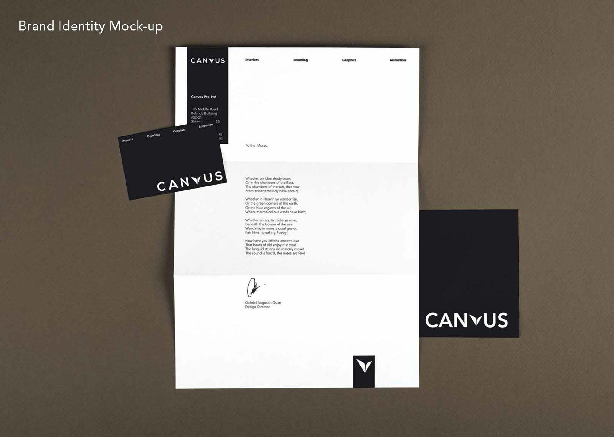
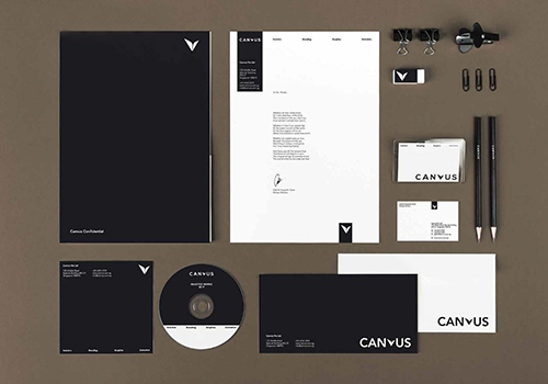
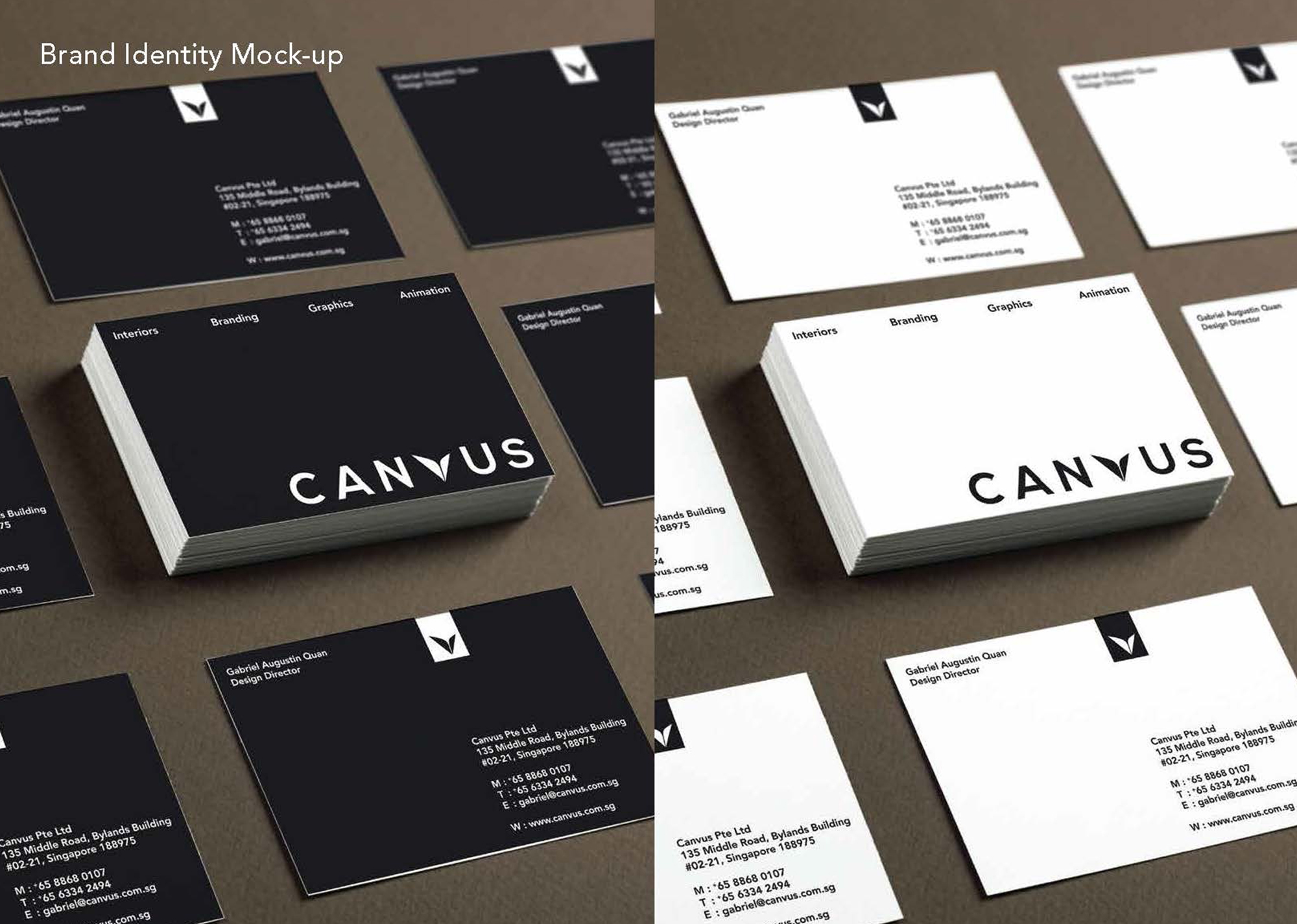
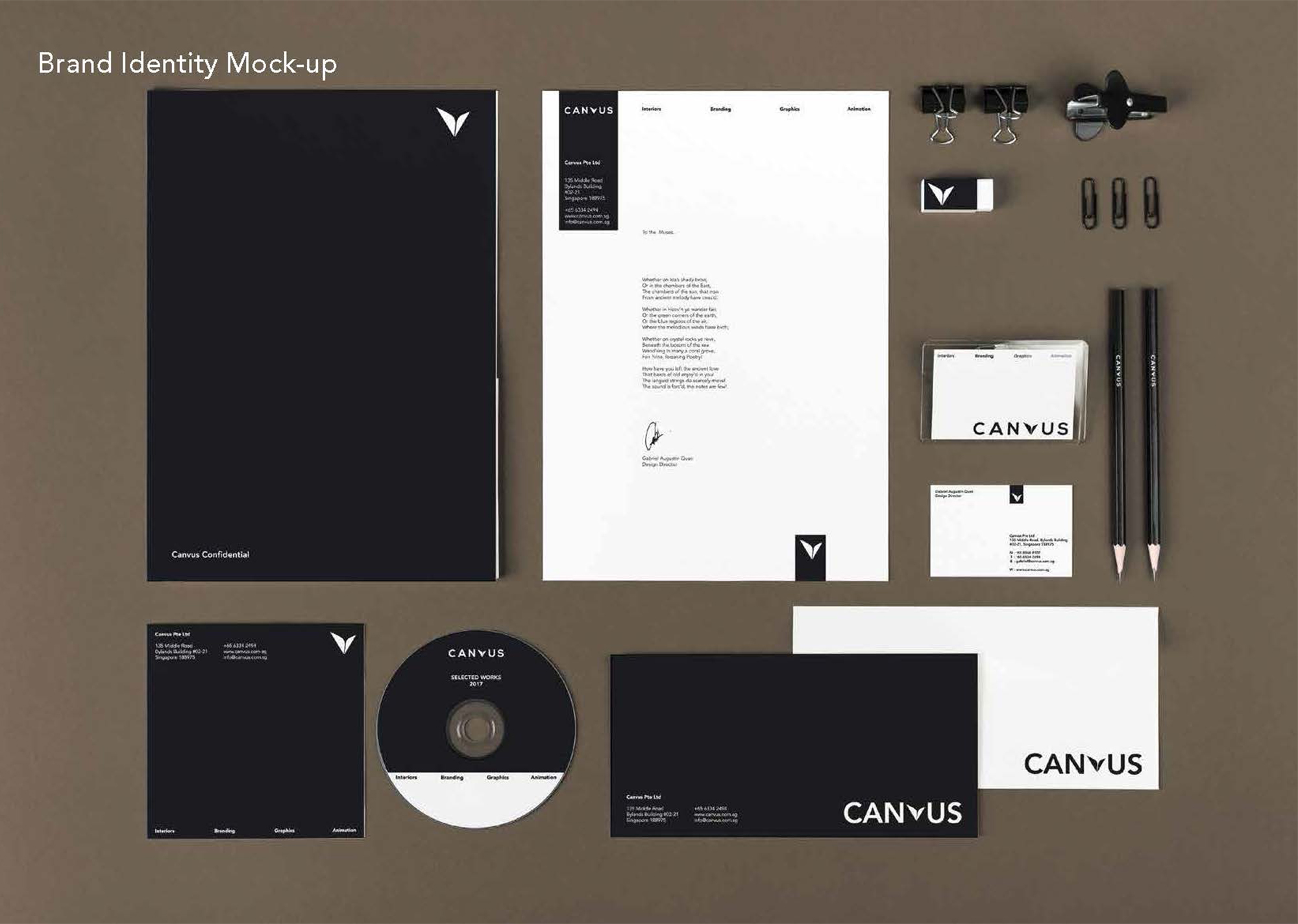
The Canvus brand begun as an idea of a loving and creative relationship between its two partners. The pencil tip was adopted as a symbol of its creative essence and expressed as an asymetrical element to resemble a heart. The initial cursive typeface was intended to represent the fluidity between various design disciplines that we dabbled in. After two years in the business, we realized a need to re-brand the company's brand identity with the intent to focus on our targeted clientele - corporate organisations with a desire for meaningful design.
Credits

Entrant Company
Harlo
Category
Website - Microsite
Country / Region
United States
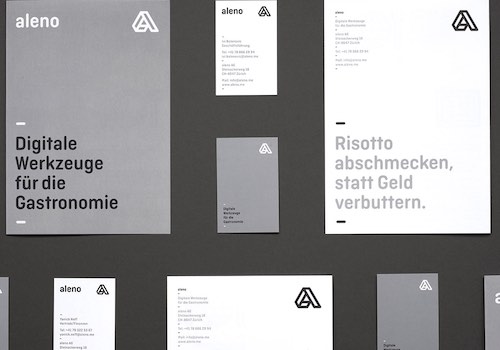
Entrant Company
Studio Eusebio
Category
Marketing Branding & Design - Corporate Identity
Country / Region
Switzerland

Entrant Company
The Girl Mirage
Category
Photography - Fine Art
Country / Region
United States

Entrant Company
PINCH / MARTIN TREMBLAY PHOTOGRAPHER
Category
Photography - People / Portrait
Country / Region
Canada