2017
Herbalife Vehicle Graphic Design
Entrant Company
Nokua Design Sdn Bhd
Category
Outdoor Advertising - Vehicle Graphics
Client's Name
Herbalife
Country / Region
Malaysia
The purpose of the design is to help promote Herbalife brand and identity.
While the use of green, black and white is to match Herbalife coporate identity, green colour also closely represent nature, freshness and health, which is similar to Herbalife identity, which is about healthy and active lifestyle. The use of black and white is to show contrast, to achieve the balance in the visual.
As for the use of wave graphic, it is because a powerful wave mean it is able to push forward regardless how strong the obstacles are, much like how Herbalife help one to achieve a healthy and confidence lifestyle, able to face everyday challenge.


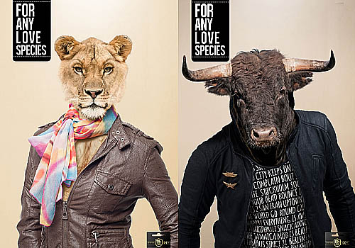
Entrant Company
Avance Carat Guatemala
Category
Advertising - Advertising Campaign
Country / Region
Guatemala
![MUSE Advertising Awards - Devi [Child Sexual Exploitation Awareness Film]](https://musecreativeawards.com/upload/entry/winimg/7bb6cw6hcwb715ck.jpg)
Entrant Company
CurleyStreet Media Pvt. Ltd.
Category
Video - Nonprofit / Religious
Country / Region
India
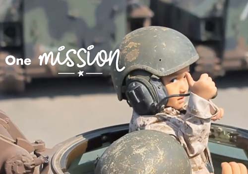
Entrant Company
True North Inc.
Category
Video - Budget below $3000
Country / Region
United States
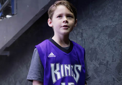
Entrant Company
Sacramento Kings
Category
Video - Sports
Country / Region
United States