2018
FAI
Entrant
First American (India)
Category
Corporate Identity - Logo
Client's Name
First American (India)
Country / Region
India
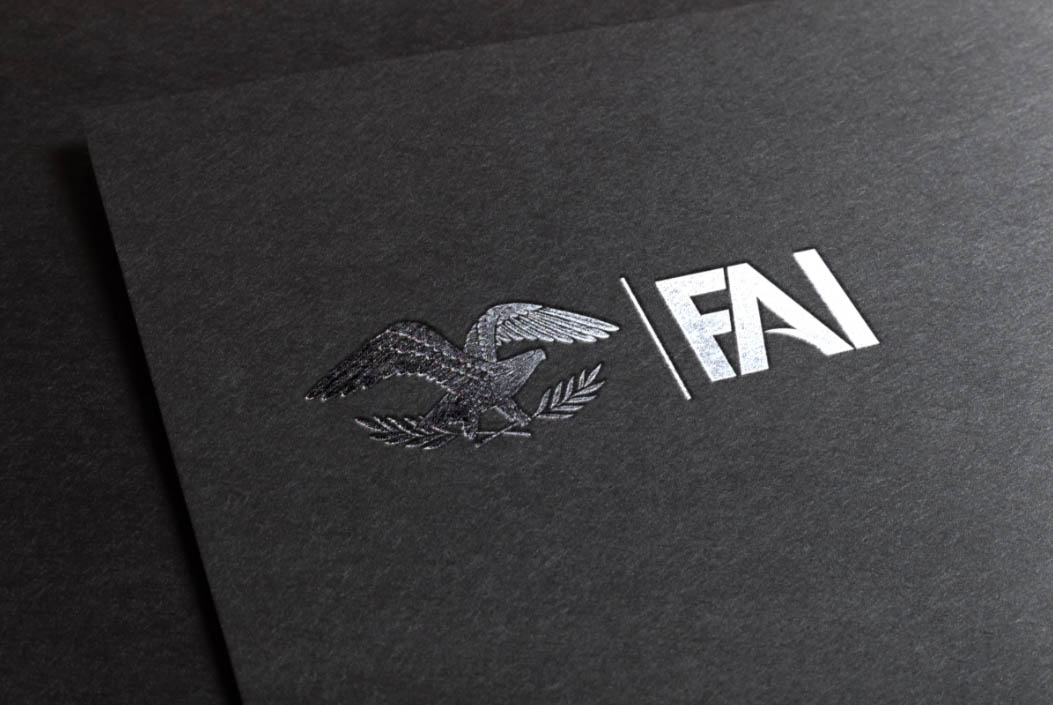
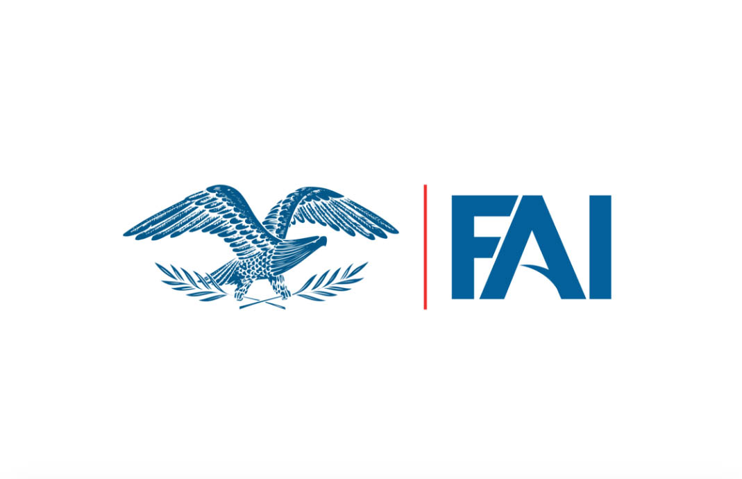
Eagle is an earthly being that soars at great heights in the sky. Similarly, FAI wants to scale new heights without letting go of its roots. The olive branches stands for care and support that our services aim to provide.
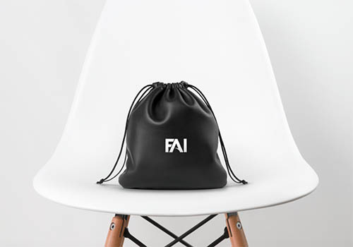
First American India has been rebranded as FAI to increase its recall value and simultaneously maintain a strong connect with the millennials. The horizontal bar of ‘A’ in FAI is in the shape of a wing as we want to fly high while giving wings to everyone associated with us. The color blue represents trust and stability which are the core values of our company. The vertical red line symbolizes our determination to go higher and achieve more as red stands for determination and vertical line for the direction ‘up’.
Credits

Entrant
Stratabeat, Inc.
Category
Website - Business to Business
Country / Region
United States

Entrant
ChappellRoberts
Category
Website - Health
Country / Region
United States

Entrant
Vimax Media
Category
Content Marketing - Email Marketing / Newsletter
Country / Region
United States
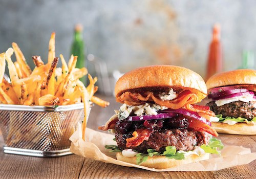
Entrant
Vimax Media
Category
Photography - Food & Beverage
Country / Region
United States