
2021
Chupa Chups
Entrant
Vibranding Design SL
Category
Corporate Identity - Brand Identity
Client's Name
Chupa Chups
Country / Region
Spain
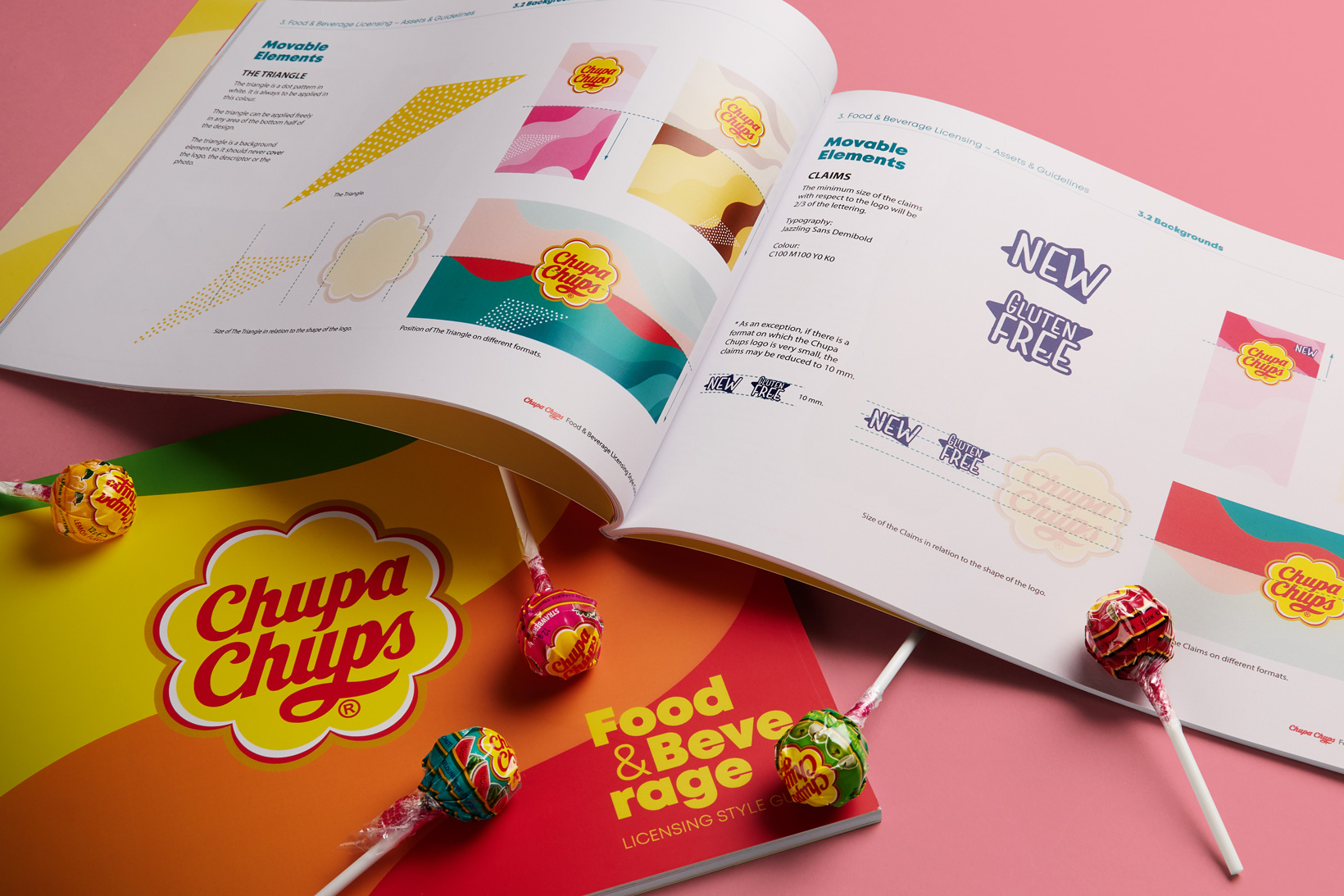
If there is one brand that is instantly recognisable on account of its logotype and its visual identity, then that brand is Chupa Chups. Its visual code is powerful, colourful, psychedelic, a bit motley… It is unique, as brands should be. And they came to us with this request: How can we continue to build our brand in the food products that we license? The answer was obvious: with imagination, relish and charm.
Brand architecture helps to diversify corporate identity. Branding is marvelous when it opens up new territories without losing its entity.
We were commissioned with creating the graphic criteria to ensure that any company with a Chupa Chups food product licence can develop their packaging and sales communication elements within a specific visual code. And the foundation for this visual code was a very simple idea: the actual Chupa Chups flavours.
The flavour of a Chupa Chups is a very powerful element in the brand’s identity. The most powerful one? Possibly the most powerful one, together with its logotype. This is why the idea was to graphically represent this forcefulness of its flavours. This gave rise to the pattern that we created as a leitmotif in the brand architecture for this project. Waves of colours that represent the Chupa Chups flavours, peppered all over the place.
Another one of Chupa Chups’ highly representative aspects is the combination of colours associated with each flavour. We maintained this concept in the new visual universe for the licenses and created some new codes, such as multi-flavour or tropical flavours. Since the added value offered by Chupa Chups to its licences is precisely the flavour, we wanted the latter to take all the limelight. In this way, the licensed product (an ice cream, cereals, a soft drink or muffins) is quickly recognised within the brand’s visual universe
We also established the complementary graphic elephants, typefaces and uses, flavour pictograms, the icons that we needed to complement the identity of the licensed designs…


Credits

Entrant
NDM Studios
Category
Video - Real Estate
Country / Region
United States

Entrant
Just Add Video
Category
Video - TV Ad
Country / Region
United States
Entrant
Trigger(House
Category
Experiential & Immersive - Promotions & Stunts
Country / Region
United States

Entrant
Mitchell and ValueLabs
Category
Experiential & Immersive - Experiential & Immersive / Other___
Country / Region
India