2022
Down to Earth Nutrition Brand Identity
Entrant Company
Lisa Gorham Creative
Category
Corporate Identity - Logos
Client's Name
Down to Earth Nutrition
Country / Region
United States
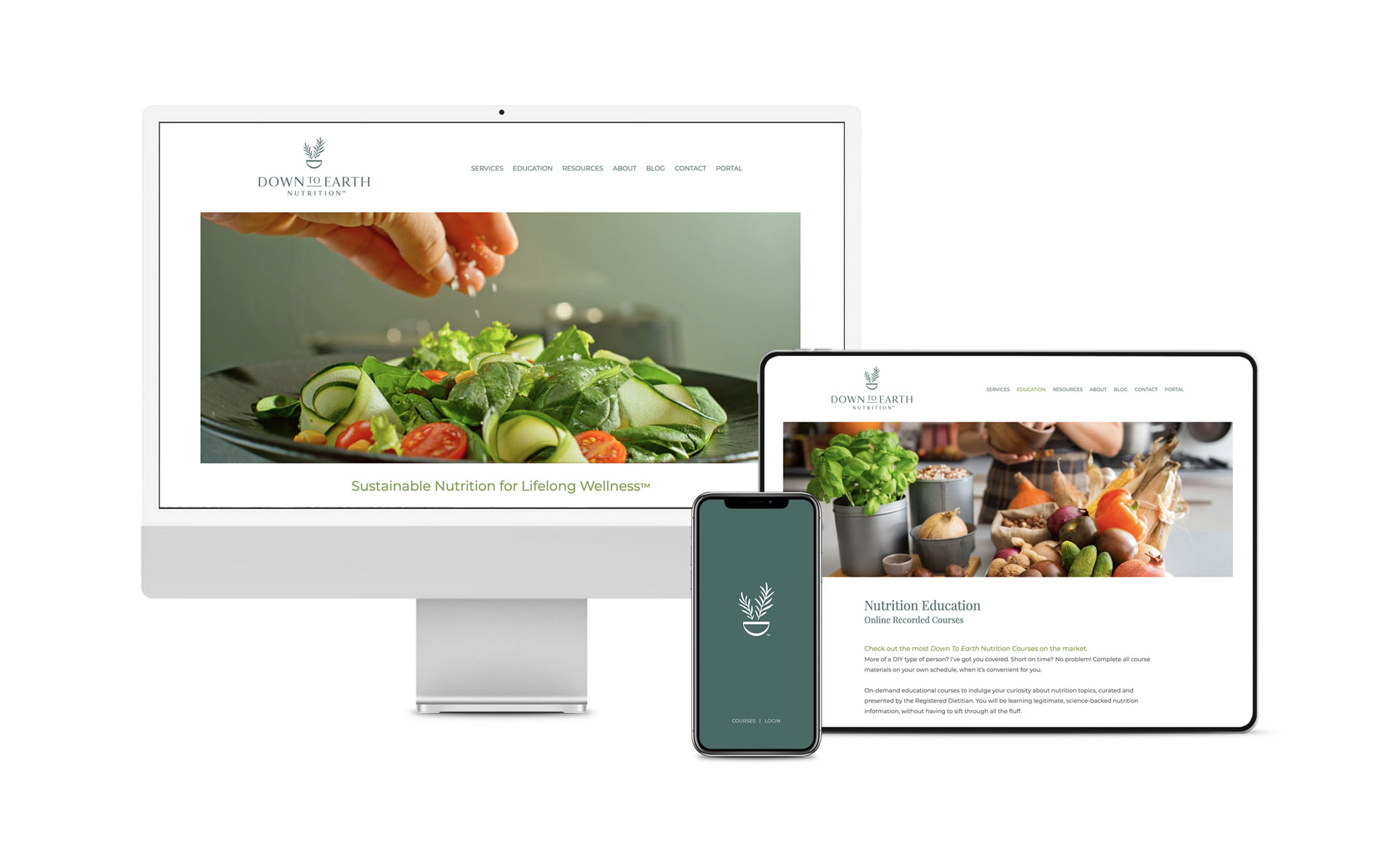
Down to Earth Nutrition (DTEN) is changing the way people look at nutrition and overall health and wellness. Owner and registered dietitian Cristina Luibil’s mission is to take wellness back from the clutches of diet culture by reframing nutrition. DTEN helps clients and their families create sustainable and practical dietary habits that help them maintain a lifestyle that supports their individual goals.
As a new business in a concentrated and highly competitive industry landscape, we needed to establish a differentiated brand. We set out to develop a refined, approachable visual identity that would accurately depict the practice, align with its mission and sustainable wellness philosophy, and distinguish DTEN from competitors within the marketplace. During brand discovery we assessed business goals, guiding principles, target audience, the industry landscape, and top competitors. We established customer experience, brand attributes, and visual identity goals. We also determined the need for additional core elements beyond the primary logo in order to support various print and digital touchpoints, and sustain growing marketing needs.
With the discovery and foundational work completed, we dove into visual identity and tagline development. In alignment with the newly established attributes, the DTEN brand identity suite is refined, classic, and evokes a sense of health and balance. The suite consists of a primary logo, secondary acronym logo, and a secondary seal. At the heart of the identity is a lively brandmark that showcases two rosemary sprigs flourishing from its earthy basin, which also doubles as a downward-facing ‘D.’ In our research we found that rosemary was the perfect icon to represent DTEN, with its numerous health benefits and long history of symbolic meaning and usages. The mark was meticulously illustrated to unify with the customized logotype and to translate crisply and clearly at both large and small sizes. The fresh, organic color palette further supports the brand and identity, communicating a sense of growth, harmony, sustainability, and stability. The new tagline gets right down to the essence of the brand with candor and confidence, summing up what DTEN stands for and delivers on… Sustainable Nutrition for Lifelong Wellness.


Credits

Entrant Company
WHM Creative
Category
Integrated Marketing - Integrated Marketing Campaign
Country / Region
United States

Entrant Company
1DS Collective
Category
Video - Health & Fitness
Country / Region
United States
Entrant Company
Leona Design Pty Ltd.
Category
Corporate Identity - Brand Identity
Country / Region
Australia

Entrant Company
eContent Digital
Category
Video - Health & Fitness
Country / Region
United States