2022
Menlo Security - Brand Development
Entrant Company
WHM Creative
Category
Corporate Identity - Brand Identity
Client's Name
Menlo Security, Inc.
Country / Region
United States
Historically, there’s been an inherent tradeoff between security and productivity. Menlo Security makes it possible to have both. We wanted to help Menlo tell a much-bigger-than-malware story.
In our interviews with security professionals, one clear idea came through: They all feel their job is to add the word “safely” at the end of everything the business wants to do. And when analyzing the security landscape, we noticed most companies are protecting things (users, data, apps, endpoints). And they’re doing it “fast and easy.” Yawn.
So we asked ourselves, “What if instead of protecting against attacks on vectors, we protected against attacks on people and their work? We know that today, all work is internet work - so what if Menlo Security could help people work without worry?”
Our brand narrative moved beyond protecting against malware to protecting productivity while securing work. It’s a message that owns the emotional outcome and appeals to the higher needs and aspirations of both security professionals and business leaders.
In terms of the visual identity, we evolved Menlo Security’s legacy light bulb logo to a more modern wordmark. The word splits into two parts, which speaks to Menlo’s isolation-powered technology platform. The lightning bolt shape of the “N” winks at the power of the platform.
Rather than jump on classic security bandwagon visuals (Cue eagles, hawks, owls, and falcons on dark backgrounds), we kept the brand light, modern, human, and friendly with colors not commonly used in the security space. This gave us a way to convey the concept of ease without having to say it.
The bold and direct voice also highlights a human (and modern) vibe with clever and inventive wordplay. Smart turns of phrase demonstrate Menlo’s intelligence (and respect for the audience’s intelligence, too). There is always a unique breeziness to the messaging that aligns with the idea of work without worry.
Credits
Entrant Company
WeAreTeachers
Category
Social Media - Facebook Page
Country / Region
United States


Entrant Company
Kokopelli
Category
Corporate Identity - Logos
Country / Region
United States


Entrant Company
APV
Category
Video - Insurance
Country / Region
Hong Kong SAR
Entrant Company
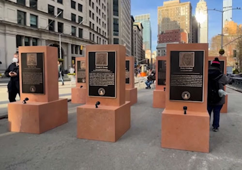
The Daily Show with Trevor Noah
Category
Experiential & Immersive - Interactive Outdoor Event
Country / Region
United States