2022
GAFA DMA LOGO DESIGN
Entrant
KLDesign
Category
Corporate Identity - Logos
Client's Name
Guangzhou Academy of Fine Arts
Country / Region
China
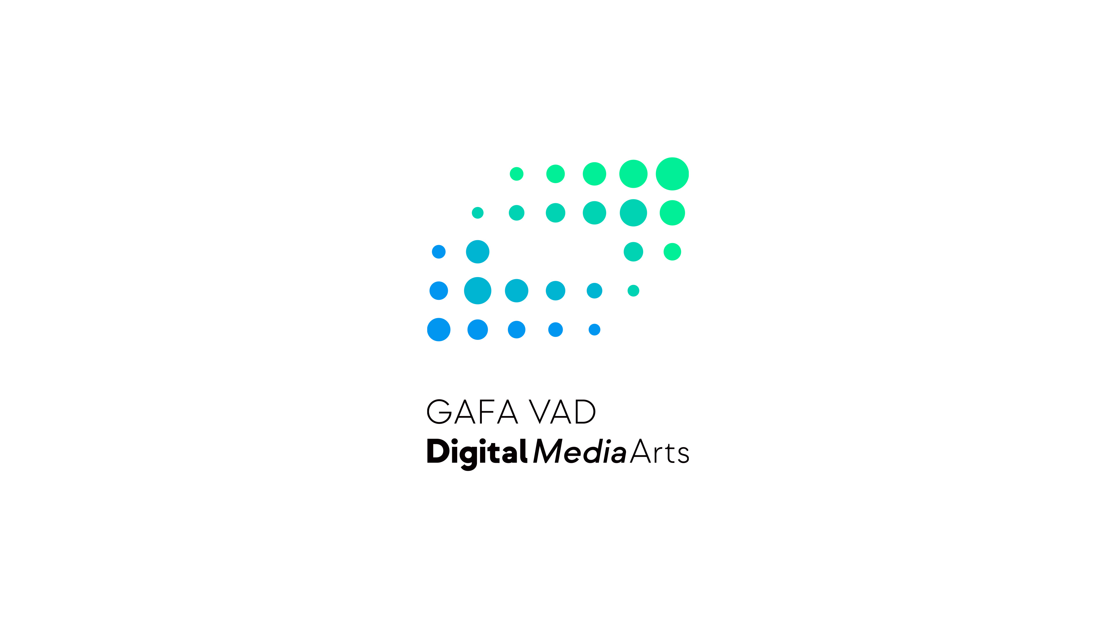
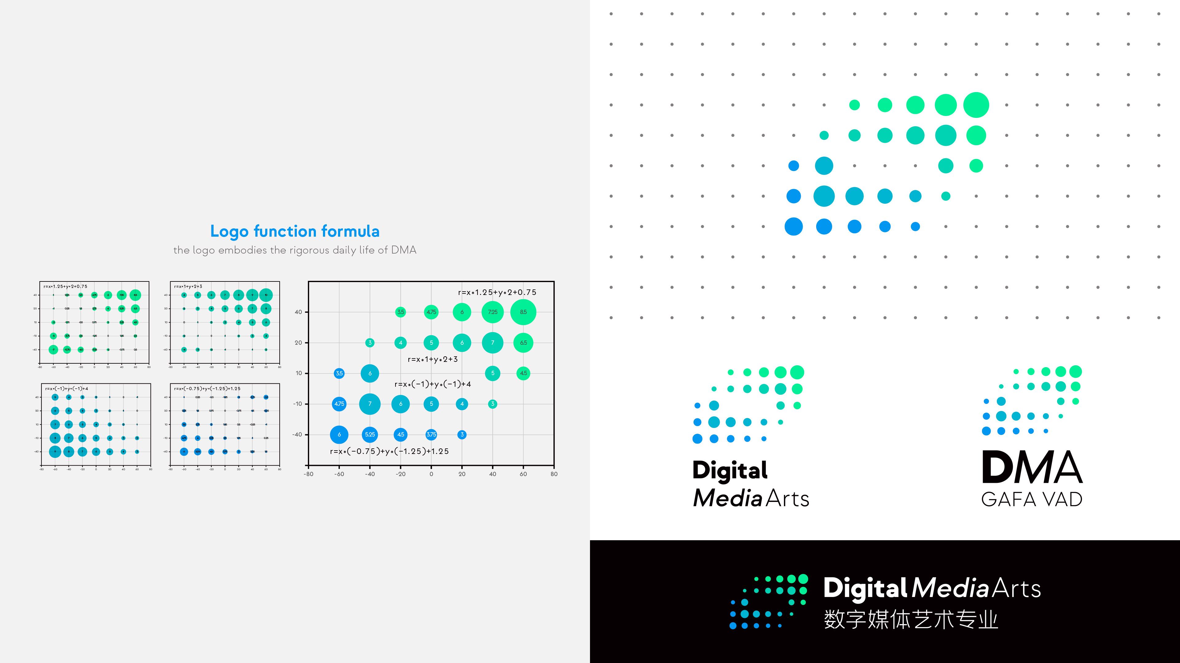
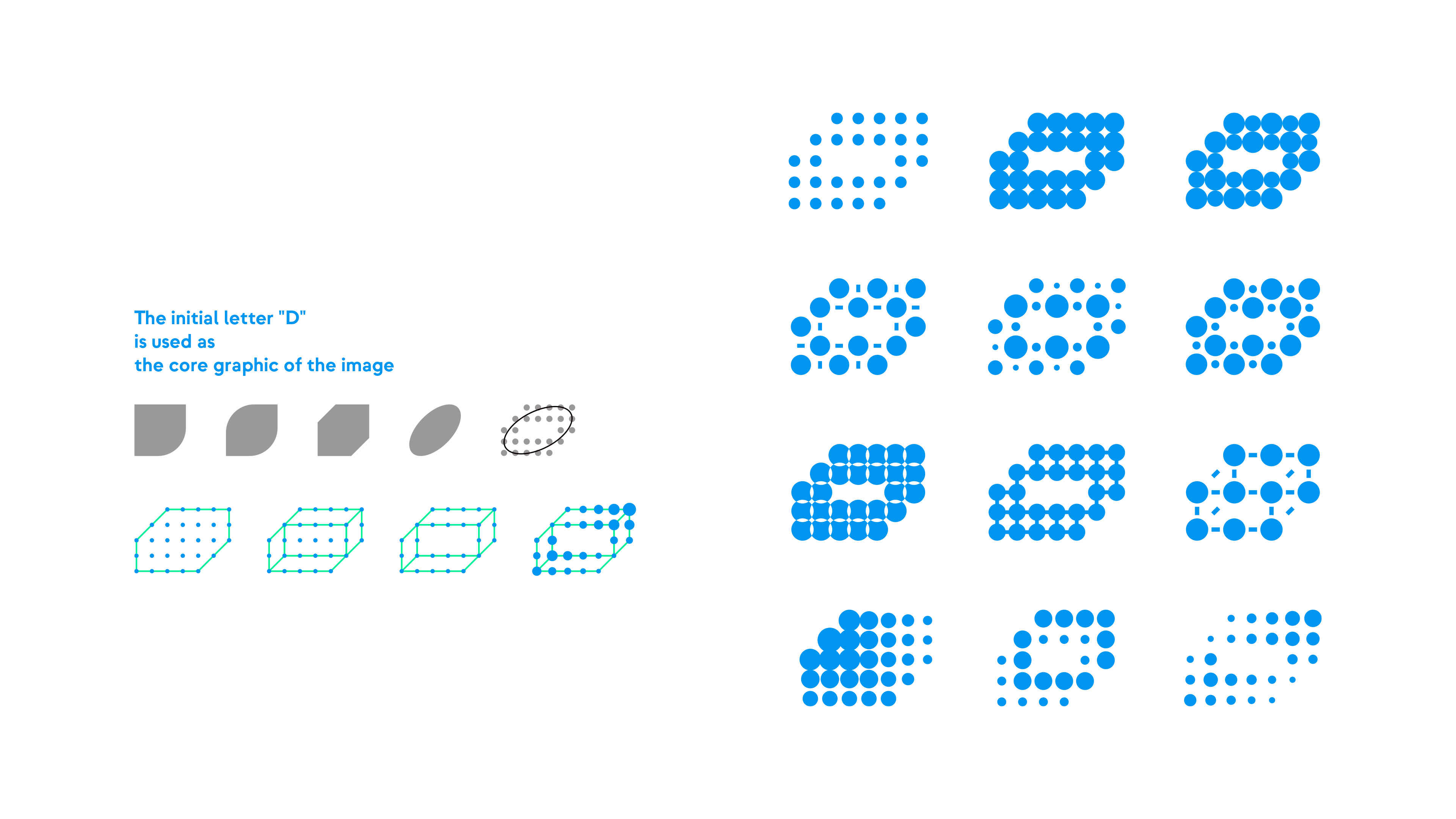
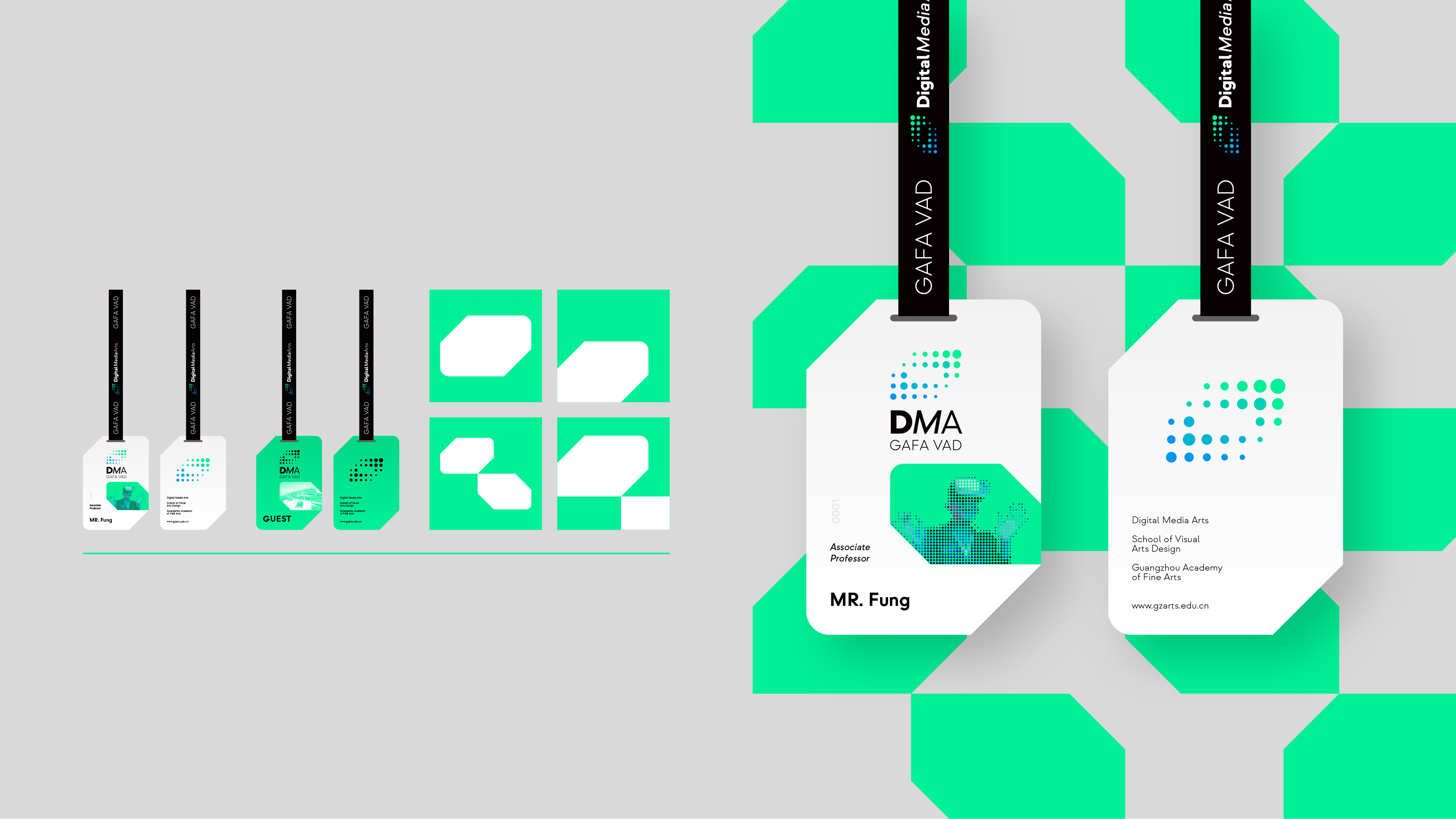
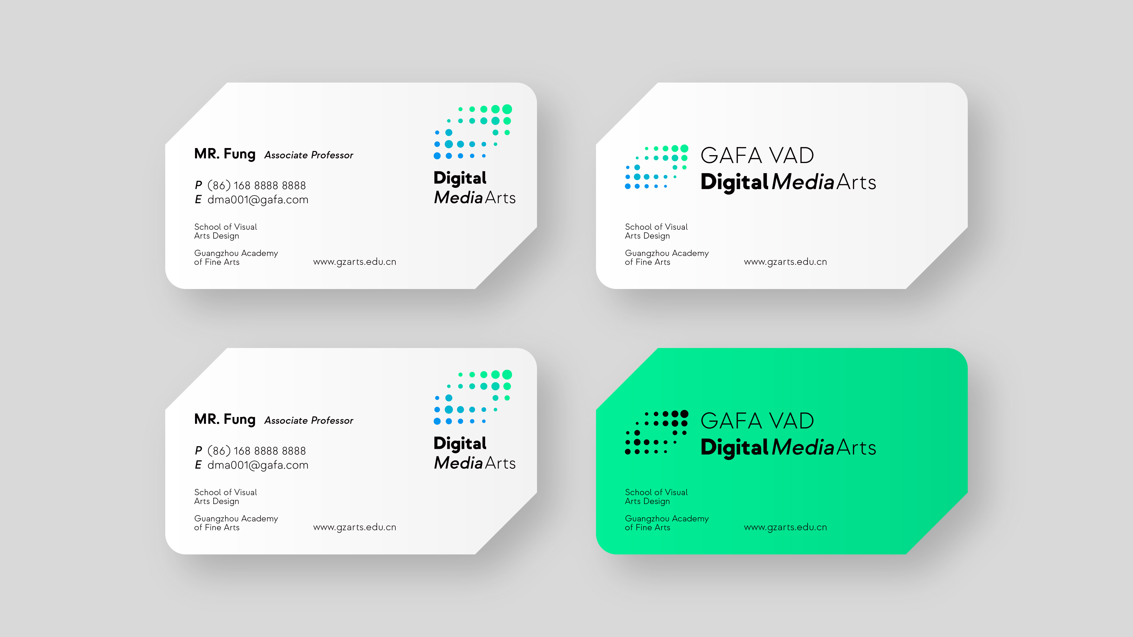
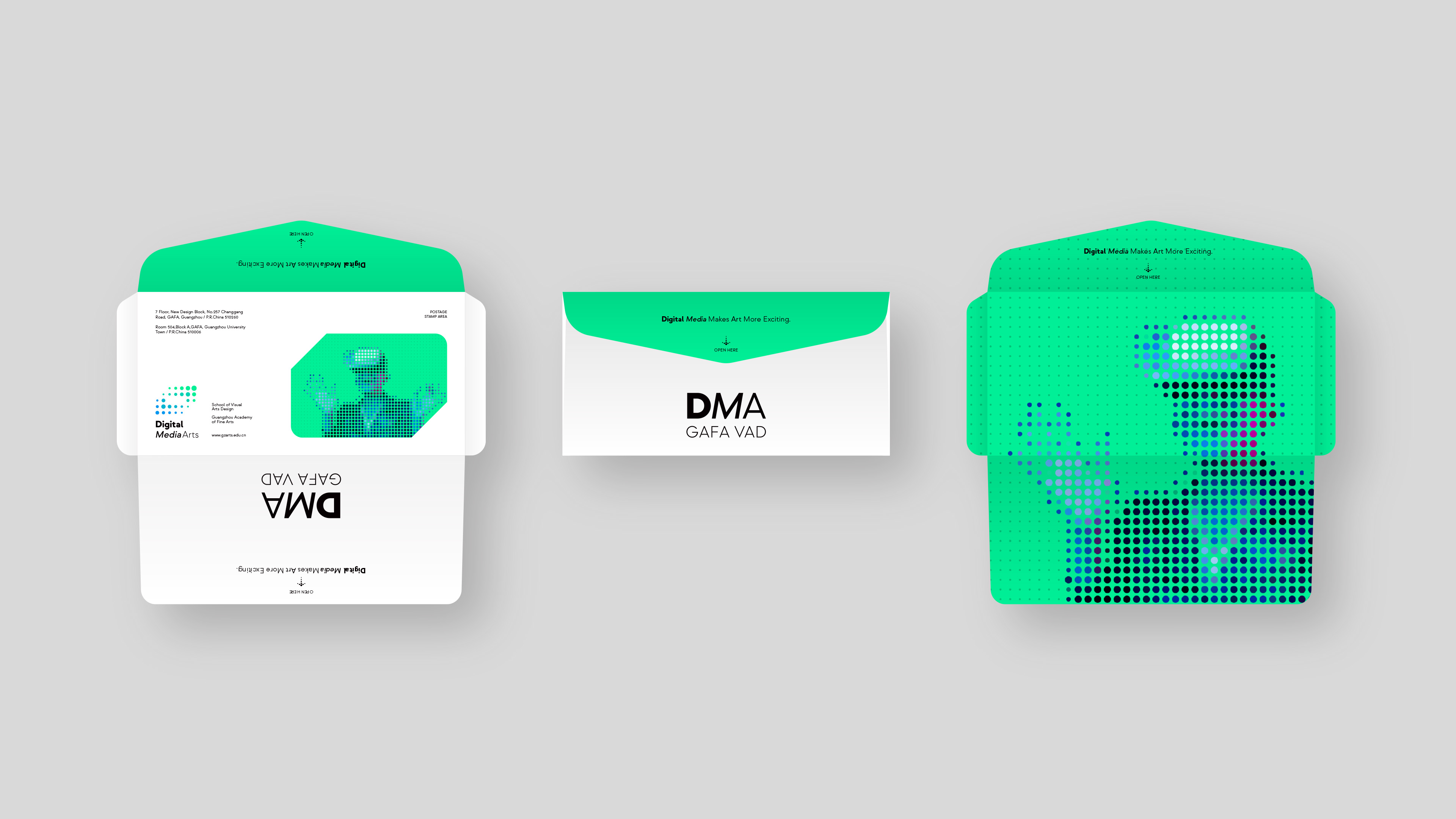
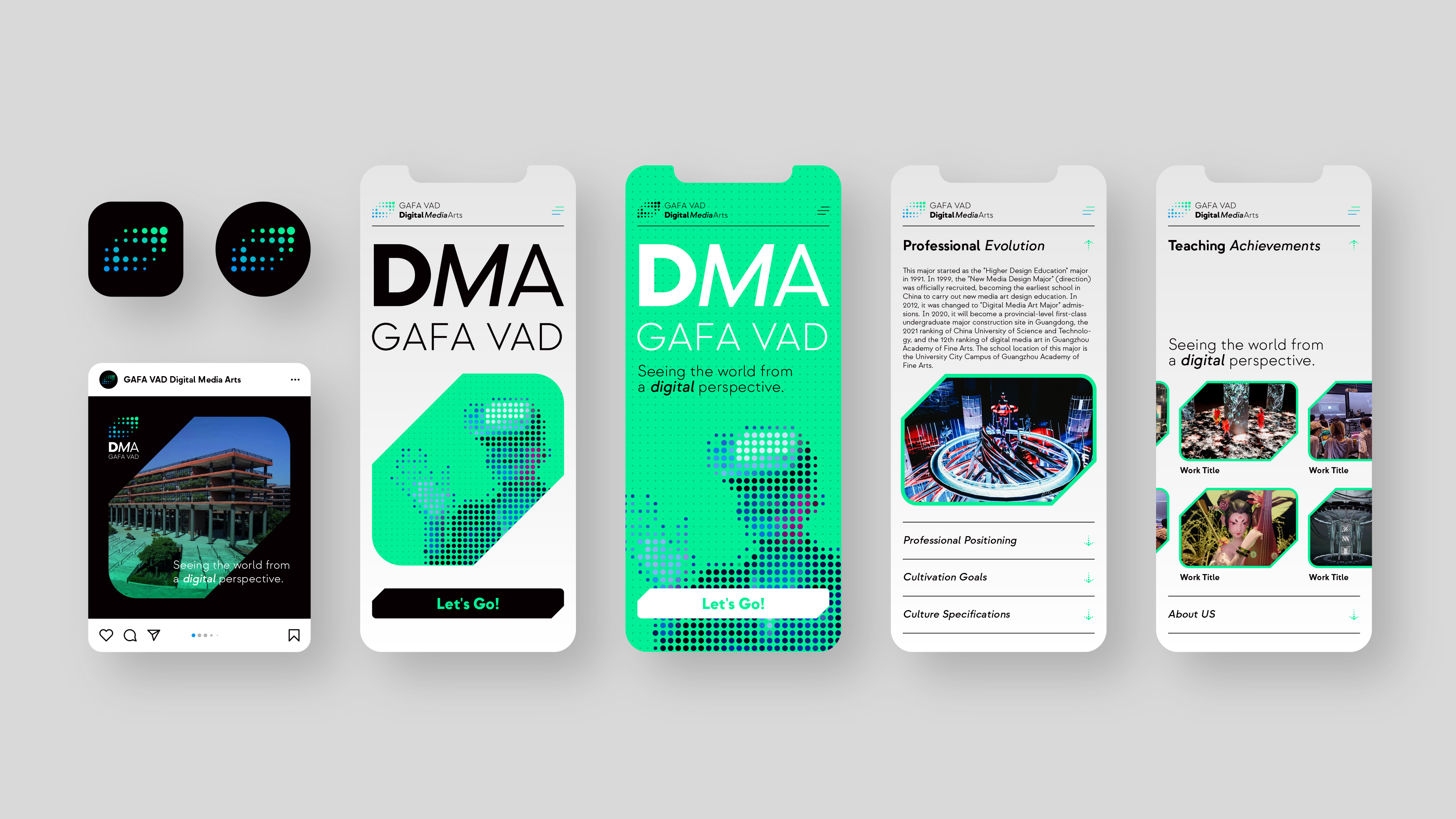
The logo of the Digital Media Art (DMA) of Guangzhou Academy of Fine Arts (GAFA) visualized the concept of "digital media art", and applied a dot-matrix combination according to the characteristics of the information age. The most basic computing unit "01" will be interpreted as the link of all things, which reflects the professional orientation and characteristics of the fusion of virtuality and reality, art and technology. Through the arrangement of icons, the logo embodies the rigorous daily life of DMA, shows a vibrant and imaginative academic culture, and implies the professional vision of cultivating talents with international vision and innovation. The image of this logo is based on the first letter "D" of "Digital Media Art" as the core graphic of the image. The letter "D" is composed of the most basic element "dot". Just as Tao Te Ching says, One begets Two, Two begets Three, Three begets all things. These elements can make a variety of visual effects. And three-dimensional element is also added, showing "a sense of sapce" to a certain extent. The dots that make up the logo are mainly blue, and the overall effect is sedate, profound, and steady, highlighting the academy's meticulous and rigorous concept of value. The overall design adopts a gradient color composition design. The dots in the logo gradually change from dark blue to light blue. The unique arrangement makes the simple colors present an extraordinary design style and creates a rich visual effect. With the continuous advancement of digitization, the combination of virtual and reality is more closely, and the future development of digital media art is also broader. The application of this logo can be extended to the four-dimensional space of the "metaverse", and through the digital form, it can output the front-end platform and content that you want to express. The gradient pattern of the color of the logo pattern also symbolizes the two ways to the metaverse, radicalness and progressiveness, giving full play to the symbolic meaning of the logo.


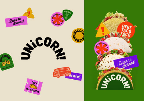
Entrant
Freelance
Category
Experiential & Immersive - Experiential & Immersive / Other___
Country / Region
United States
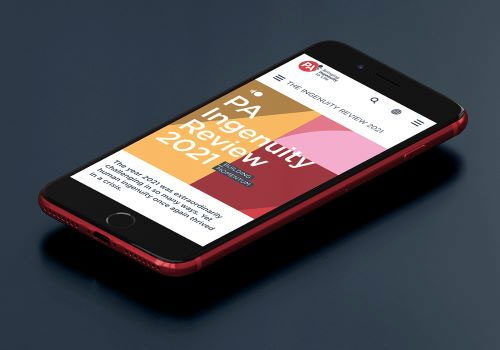
Entrant
PA Consulting
Category
Publication - Annual Report
Country / Region
United States
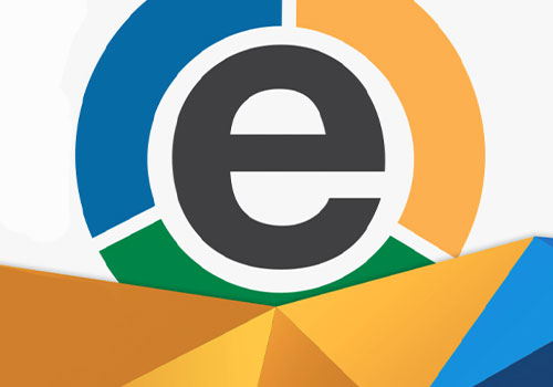
Entrant
Concepts, Inc.
Category
Experiential & Immersive - Community
Country / Region
United States
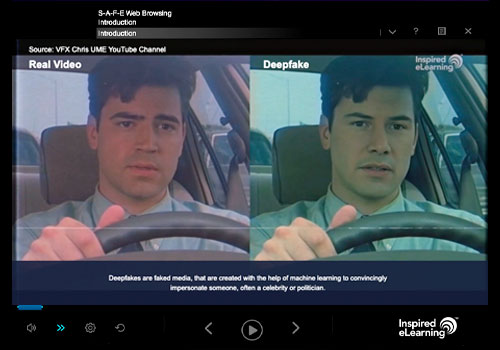
Entrant
Inspired eLearning
Category
Video - Training
Country / Region
United States