2022
nenu-KLAS
Entrant Company
Northeast Normal University
Category
Corporate Identity - Logos
Client's Name
Country / Region
China
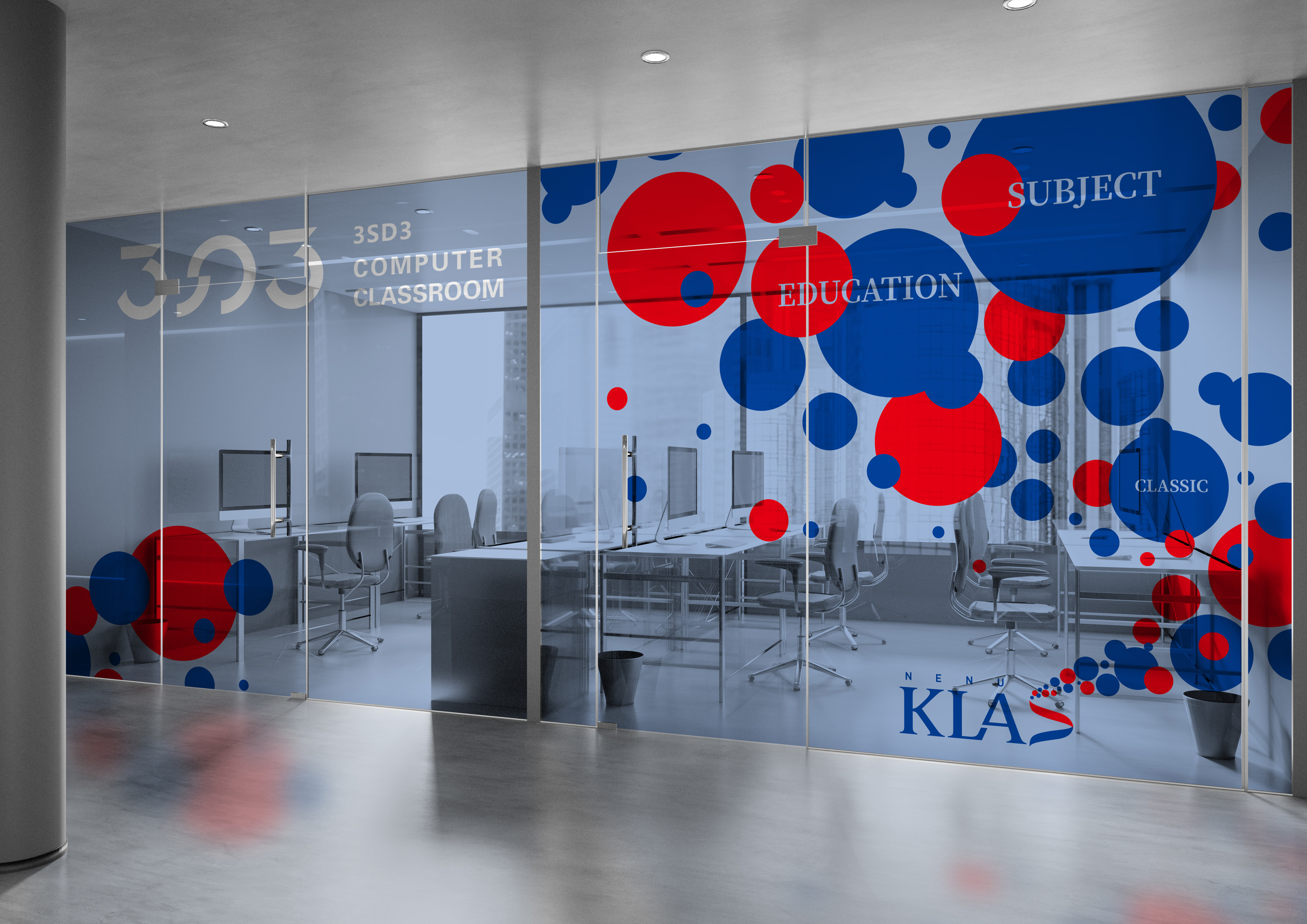
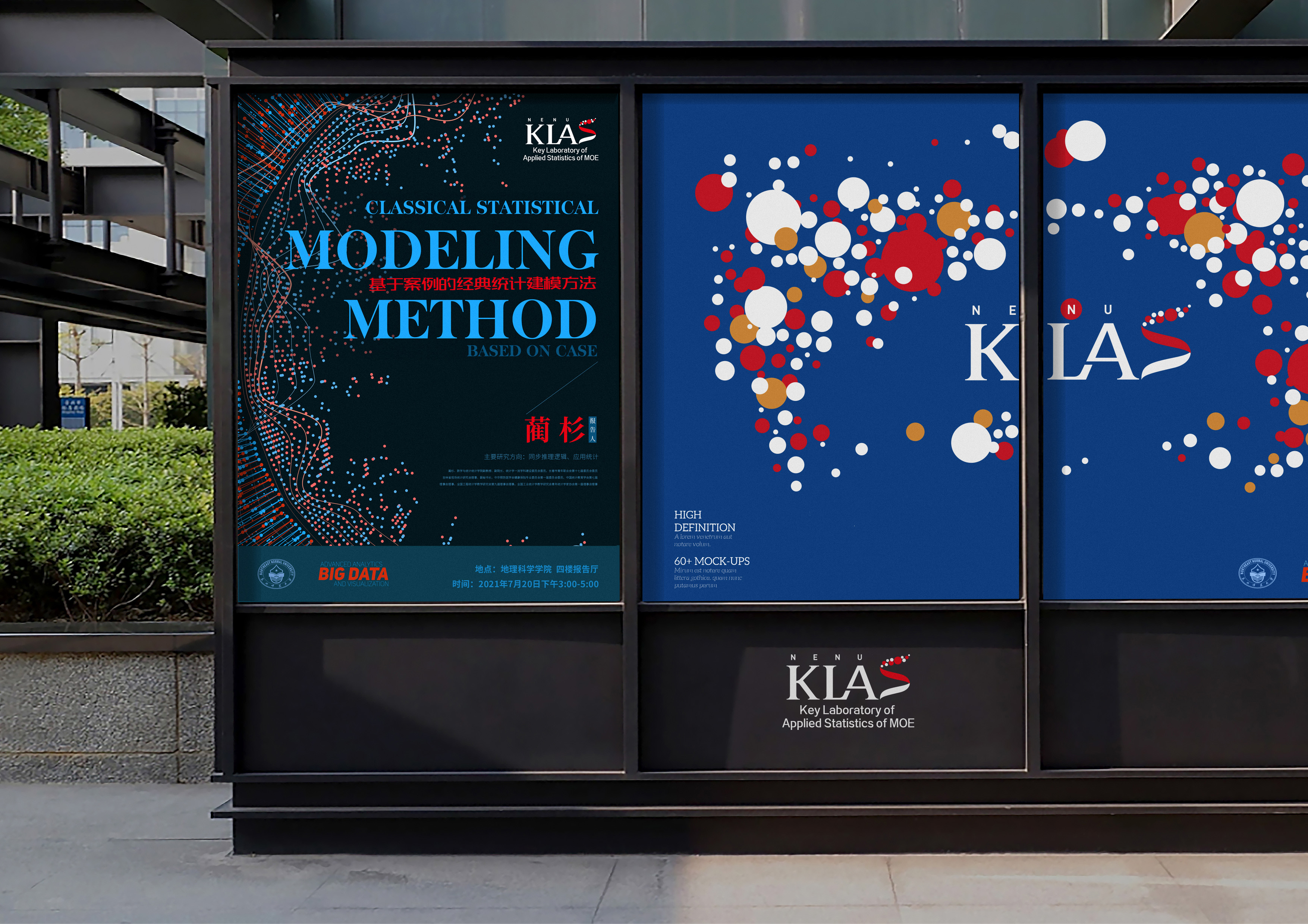
This is a logo designed for "Northeast Normal University - Key Laboratory of Applied Statistics of MOE". The main content is composed of short names "NENU" for the school and "KLAS" for the laboratory. The design incorporates eastern and western cultural elements, statistical elements, etc., and uses the characteristic arrangement to create unique aesthetics, showing a vibrant and imaginative academic culture, and symbolizing the pursuit of excellence and innovation. The design incorporates concepts commonly used in statistics: scatterplot and normal distribution. Scatterplot is a general visual expression of data characteristics, and it is the early reference material for data analysis and statistical modeling. The normal distribution, the most commonly used probability distribution, plays an incomparably important role in probability theory and statistics. Using these two concepts for composition, the designed pattern is more rigorous and scientific, and more in line with the meaning and professional research contained in the laboratory. This logo uses the serif form to express the historical and cultural heritage of the laboratory, and integrates the imagery of the university's iconic pattern. The overall square composition and dot elements of the logo symbolize the traditional Chinese philosophical concept of "Round Sky and Square Earth". This innovative organizational model gives the logo the meaning of time and space and enriches the connotation of the logo. Applied statistics is a subject that has been researched all over the world, and the KLAS laboratory has also been working on it. Just as the scattered points in the pattern have a scattered and upward trend, the laboratory also has a development vision of incorporating all talents around the world, and through the logo design, this concept is also expressed. The logo pattern is mainly blue and red, and the overall effect is sedate, profound, and steady, highlighting the academy's meticulous and rigorous concept of value. The logo design adopts an alternate color composition, and different colors are applied on the "S". Such a unique arrangement makes the simple colors present an extraordinary design style and creates a rich visual effect.


Entrant Company
Magnetic Creative
Category
Strategic Program - Social Media Campaign
Country / Region
South Africa

Entrant Company
Lounge Group
Category
Video - Public Service & Activism
Country / Region
Hungary
Entrant Company
The Leith Agency
Category
Corporate Social Responsibility - Pro Bono (Free)
Country / Region
United Kingdom

Entrant Company
zhang peng、Guodong Yan、Yingying He、Zhexin Feng、Boyang Li、Qi Bao
Category
Student Submission - Student COVID-19-Related Project
Country / Region
China