
2022
Wood River Health Rebrand
Entrant
Imaj Associates
Category
Corporate Identity - Brand Identity
Client's Name
Wood River Health
Country / Region
United States
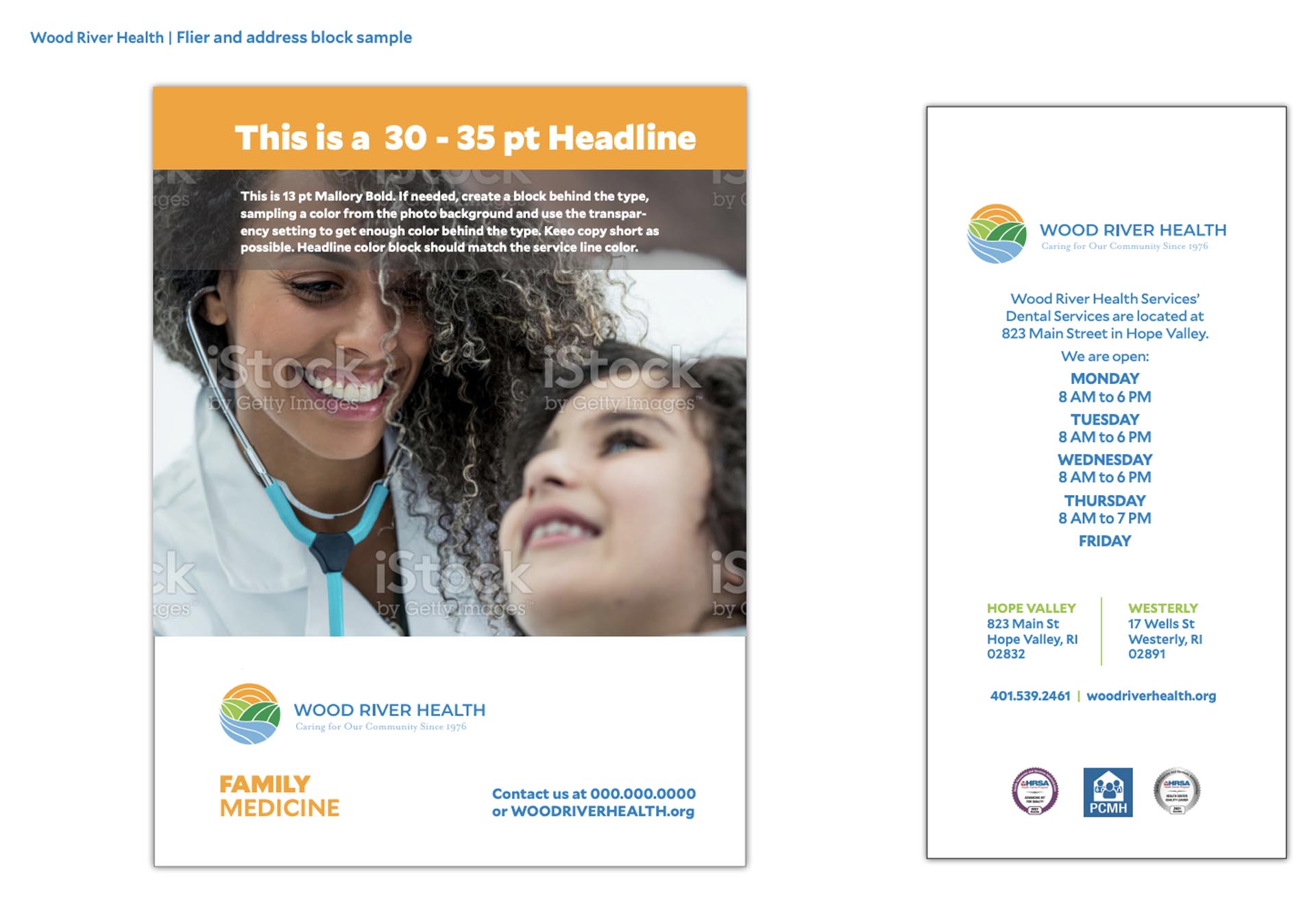
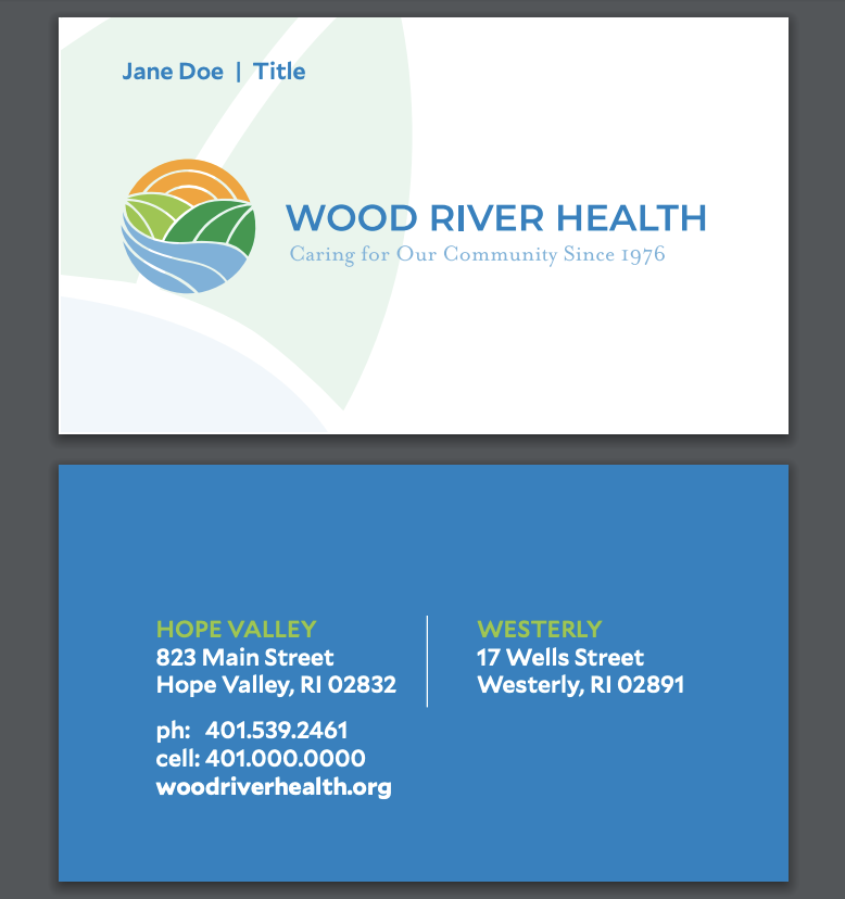
Wood River Health Services needed help rebranding after 35 years with the same logo. The new brand would reflect the natural beauty that surrounds the facilities. We recommended removing the word "Services" based on our discovery and interviews. It would be positive and memorable. The sun in the logo represents hope and health.


Credits

Entrant
Inspired eLearning
Category
Video - Training
Country / Region
United States
Entrant
Cynda Media Lab
Category
Corporate Identity - Brand Identity
Country / Region
United States
Entrant
Skalawag Productions
Category
Video - Motion Graphics
Country / Region
United States

Entrant
GLT International
Category
Video - Animation
Country / Region
United States