
2022
ACT Against COVID-19
Entrant
Audacity Health
Category
Website - COVID-19-Related
Client's Name
Quest Diagnostics
Country / Region
United States
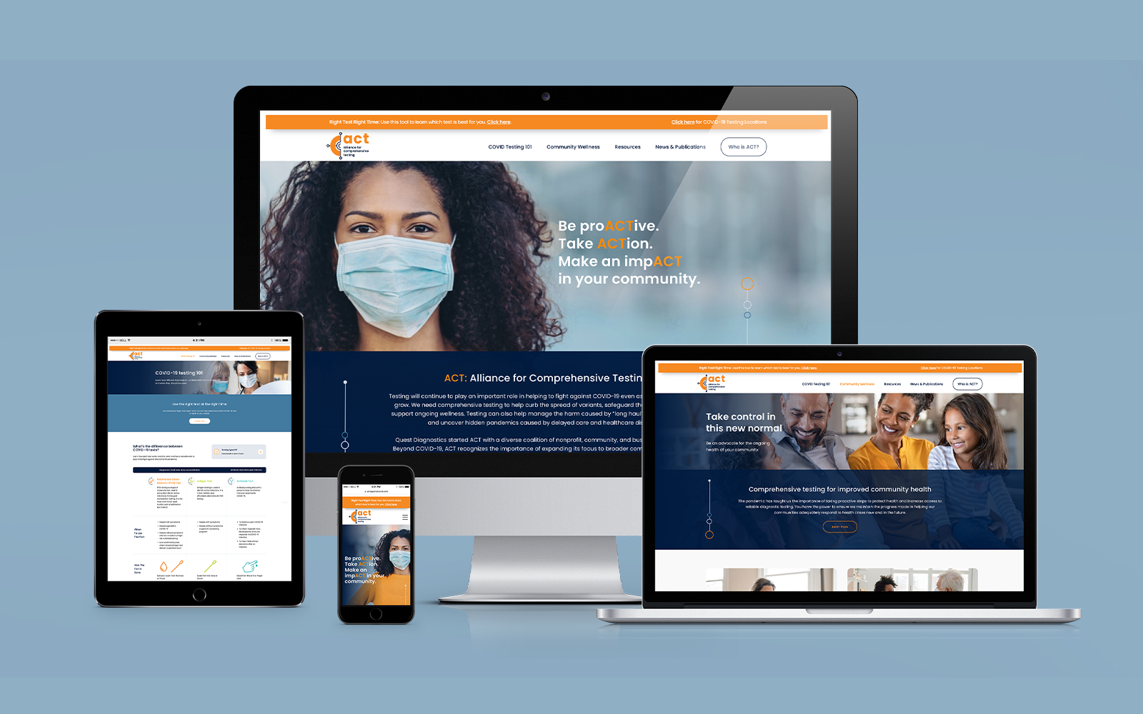
Quest Diagnostics, a lab with the most extensive clinical testing network in the U.S., desired to drive public awareness of the role that comprehensive testing protocols play in mitigating the health and economic impacts in pandemic environments.
When Quest engaged Audacity Health during the early stages of the COVID-19 pandemic, there was a lack of understanding and conflicting views among public health officials and the general public regarding the value of antigen and antibody testing in the fight against COVID-19.
Audacity developed the Alliance for Comprehensive Testing (ACT) against COVID, a new coalition brand built with the purpose of communicating the benefits of COVID testing in the context of the active pandemic. This process included strategic messaging, creative concepting, an educational microsite, a digital media campaign, and numerous supporting collateral.
As a result of this project, Quest gained a strong platform to attract high-caliber alliance partners and to educate key stakeholders about the importance of proactive and comprehensive testing. The microsite takes on a public health tone and includes the “Right Test Right Time” tool—a non-product focused, interactive resource for businesses and individuals to find the best test type for their situation. The use of conservative imagery and colors and objective data aims to build the trust needed for an audience seeking accurate information in a landscape of conflicting messaging.
The homepage features a masked person looking directly into the camera as a means to express confidence in facing pandemic mitigation efforts head on. This is aligned with the overall impartial, non-promotional message of the initiative: every precaution, including comprehensive testing, is important.
The elements from the brand and design marks represent connective data reaching out to form an informational hub and create a subtle nod to a testing swab. The client wanted to include the acronym and full name written out in the brandmark, so the shapes created a strong anchor to hold all this information while still providing a sense of movement and action. Typography choice was Poppins for a bold yet inviting appearance.

Entrant
Agent Image
Category
Website - Real Estate
Country / Region
United States
Entrant
Webconsuls, LLC
Category
Website - Financial Services
Country / Region
United States

Entrant
International Monetary Fund
Category
Video - Show Opening Segment
Country / Region
United States

Entrant
SunnySideUp
Category
Branded Content - Non-Profit
Country / Region
Australia