2023
Hibernia
Entrant Company
The Pudding
Category
Corporate Identity - Brand Identity
Client's Name
Hibernia
Country / Region
Ireland
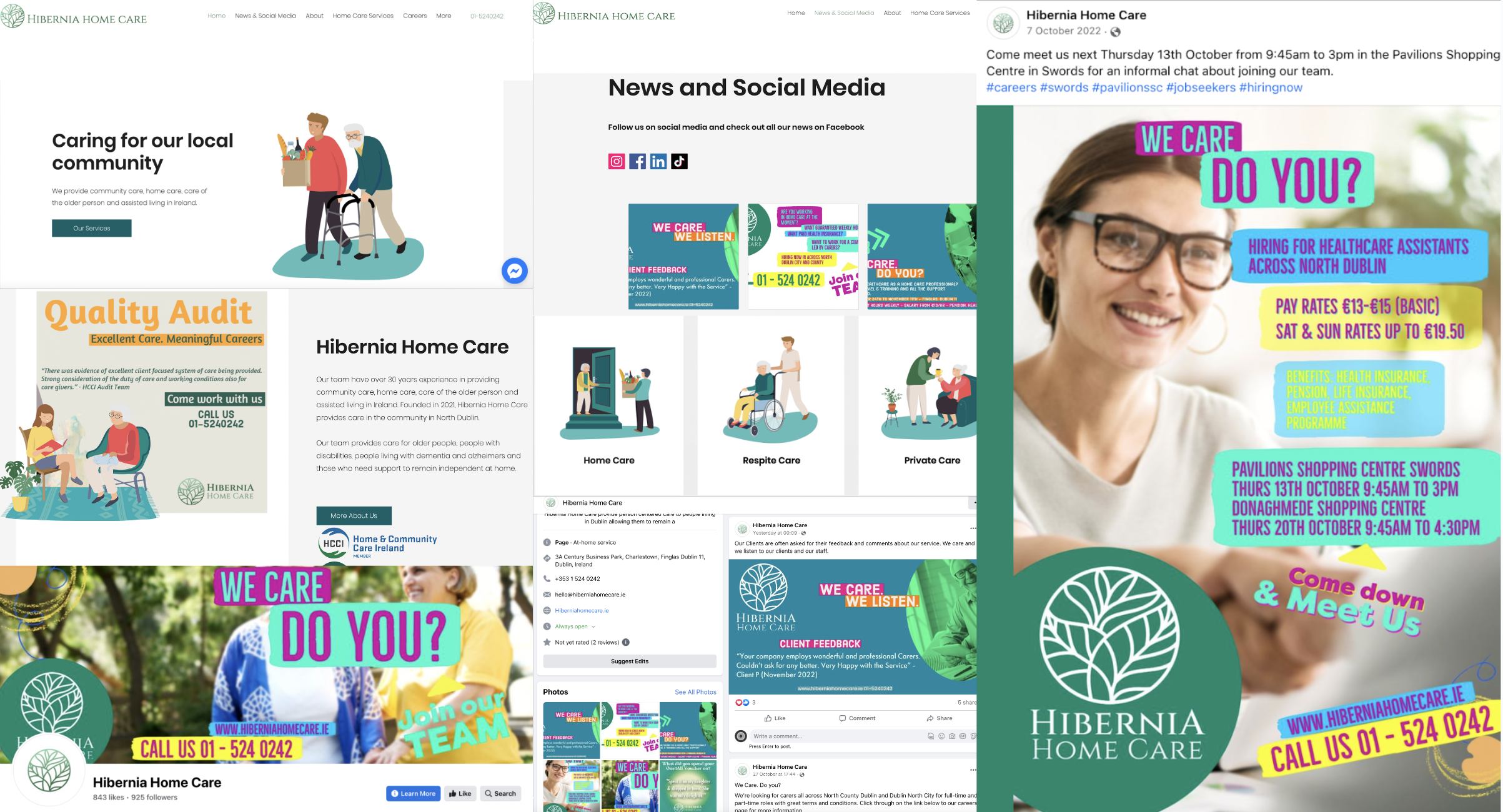
Hibernia Home Care was founded in 2021 by expert healthcare professionals with over 30 years of experience across Ireland's public and private healthcare sectors. Its founders share a deep understanding of the pain points faced when working with homecare providers. Its goal is to change the narrative and transform home care for good. A dynamic brand identity that would set them apart from their competitor set in what is traditionally a staid public service sector would be key. That's where we came in.
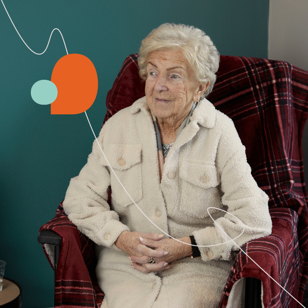
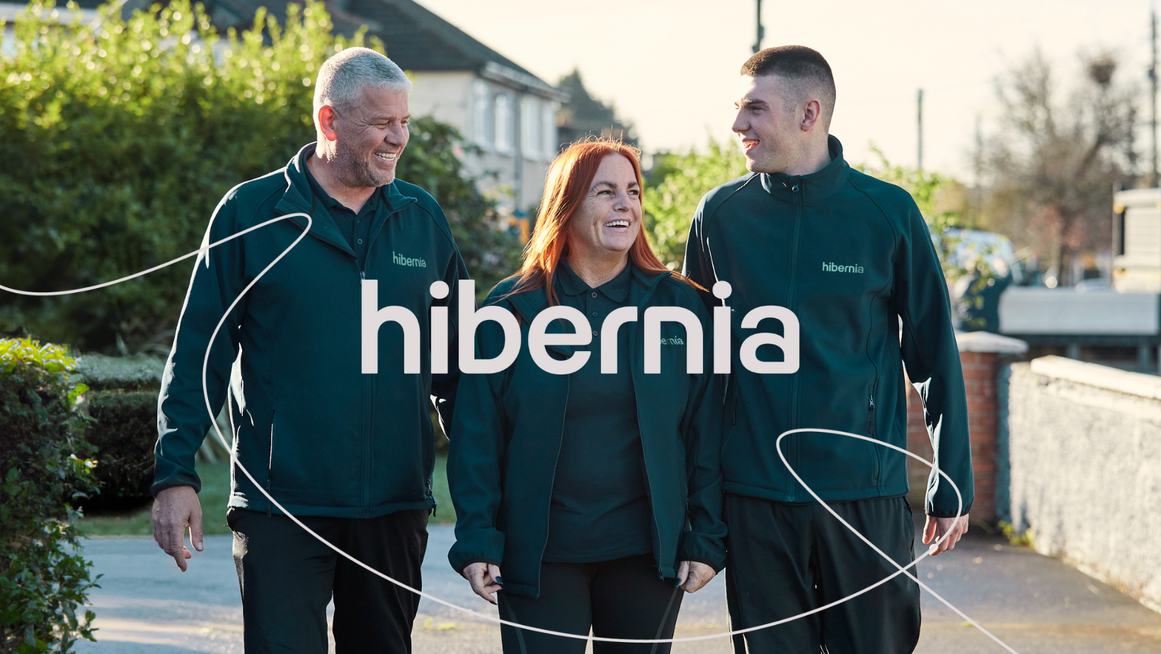
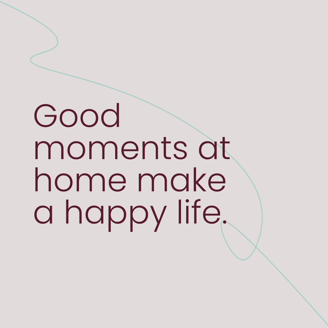
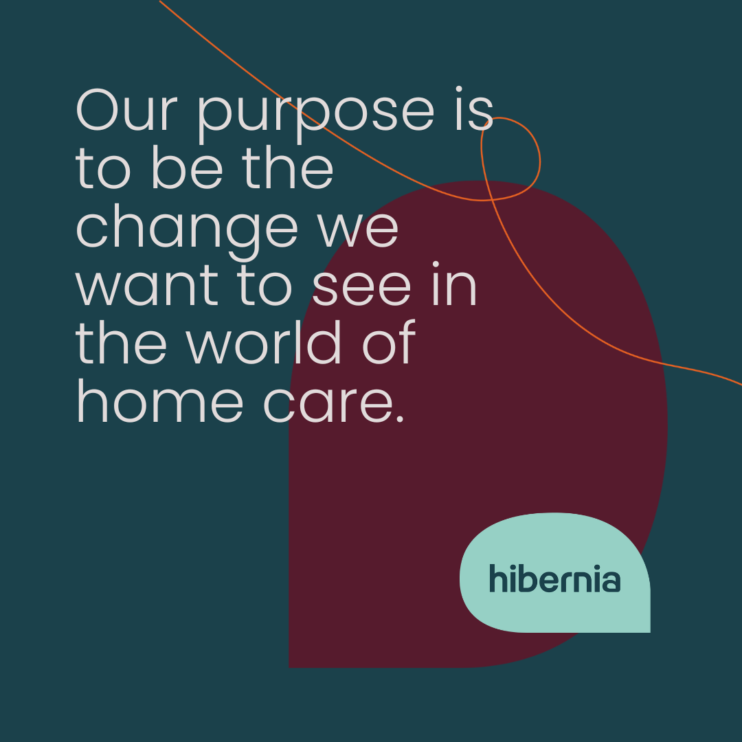
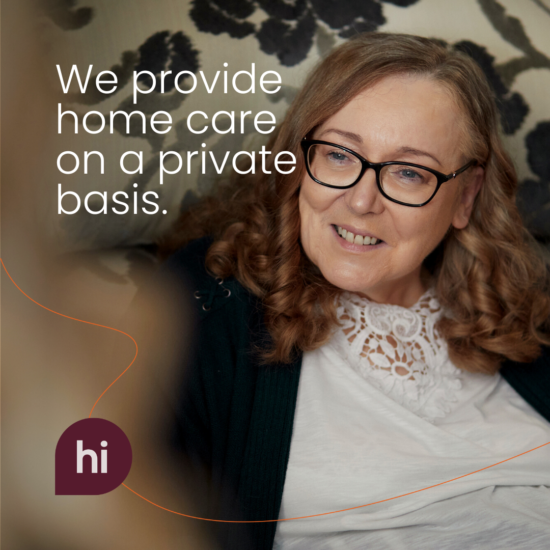
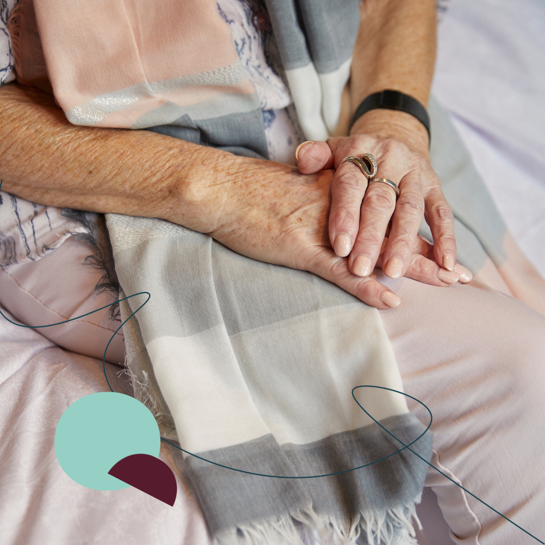
Evolving from Hibernia Home Care to Hibernia, a new identity was born, with its core components inspired by the values, ambitions and everyday behaviours of the people behind the brand. The logo is characterised by curved edges communicating flexibility and safety. It is lowercase – approachable and humble. In the white space of the letters, new shapes – such as speech bubbles – are found and utilised at greater length across the visual identity. The full-scale identifier consists of the logomark enclosed in a speech bubble, expressing the communication inherent to Hibernia's service. The contracted version further cements this notion, communicating just "Hi". The graphic lines that dance across the applications are an interpretation of a hand's lifelines, expressing the connectivity achieved by the client and carer. Consisting of gentle blue and teal, the palette is calm and reassuring with flashes of burgundy, turquoise and orange for flair. Poppins is the primary brand typeface: a sans serif font with rounded shapes that gives a contemporary touch. Our unique series of icons communicate the brand's service offerings and were built with animation in mind. Lastly, photography played a key element when creating this new identity. All imagery is original and shot with real carers and clients. It's sober in some instances and uplifting in others; in all cases is emotive and relatable.
Just like the people behind this change-making brand, the new Hibernia identity is bold and brave yet accessible to all – a fit-for-purpose identity that can help Hibernia stand apart from its competitor set and own white space in the market.


Credits

Entrant Company
Thought Marketing
Category
Integrated Marketing - Brand Transformation / Repositioning (NEW)
Country / Region
United States
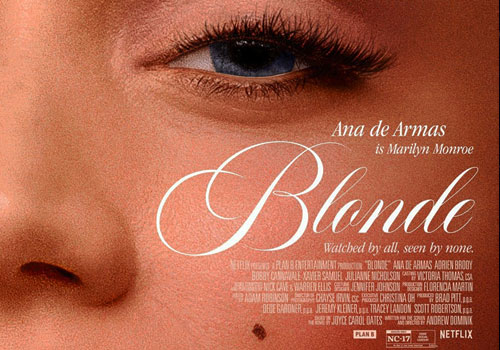
Entrant Company
Leroy & Rose
Category
Marketing & Promotional - Poster (Single)
Country / Region
United States
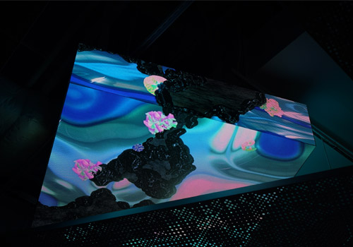
Entrant Company
CT.LAB
Category
Experiential & Immersive - Experiential & Immersive / Other___
Country / Region
China
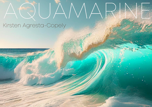
Entrant Company
Valcope Recording Co.
Category
Audio - Original Music (NEW)
Country / Region
United States