2023
Beatrice Collection
Entrant Company
Sharp Type
Category
Typography - Typefaces / Font System
Client's Name
Country / Region
United States
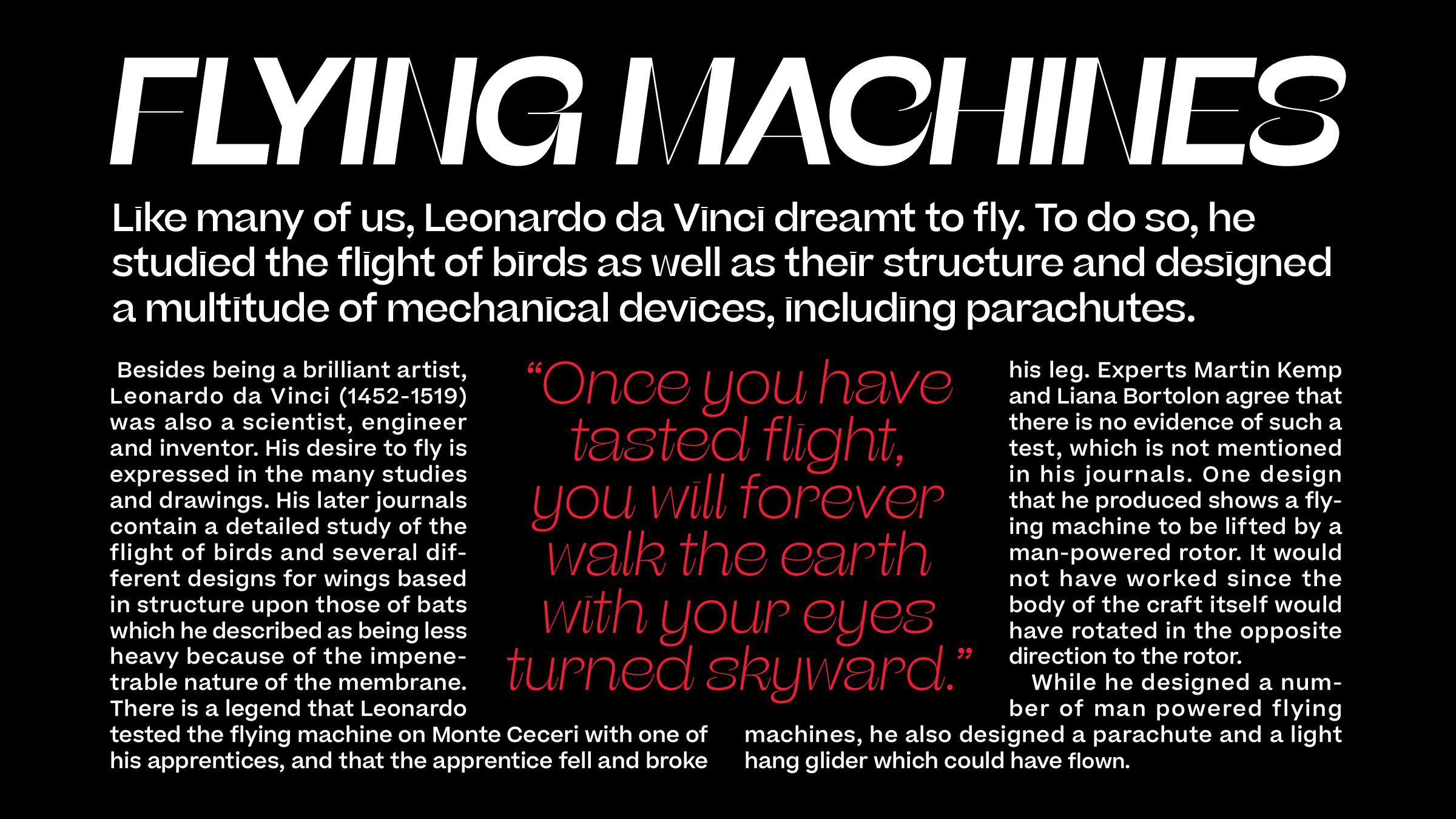
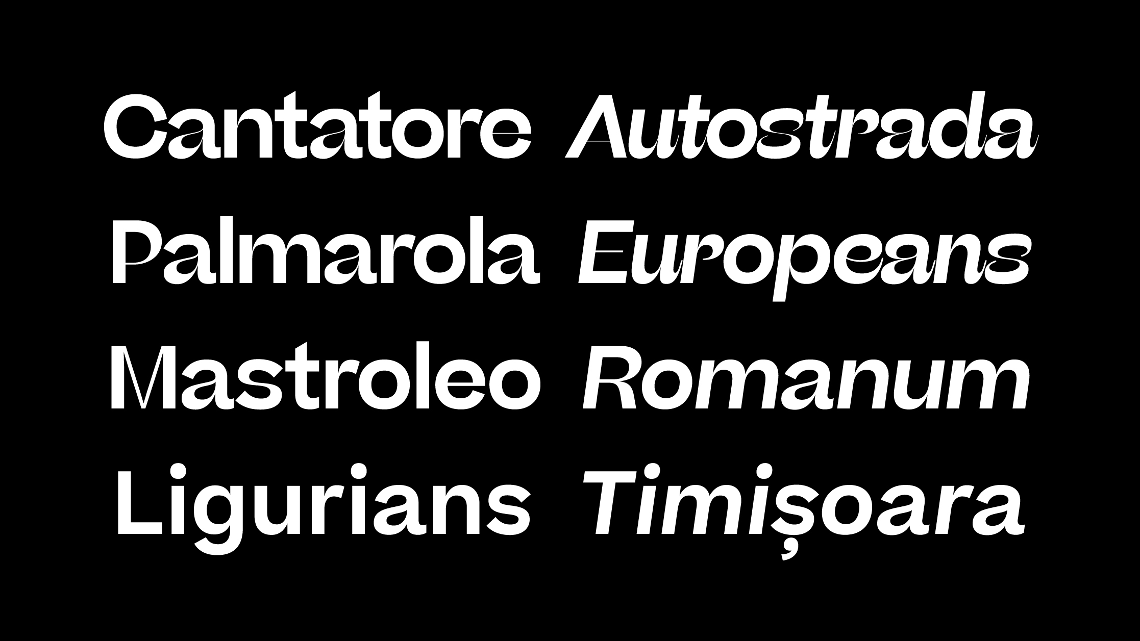
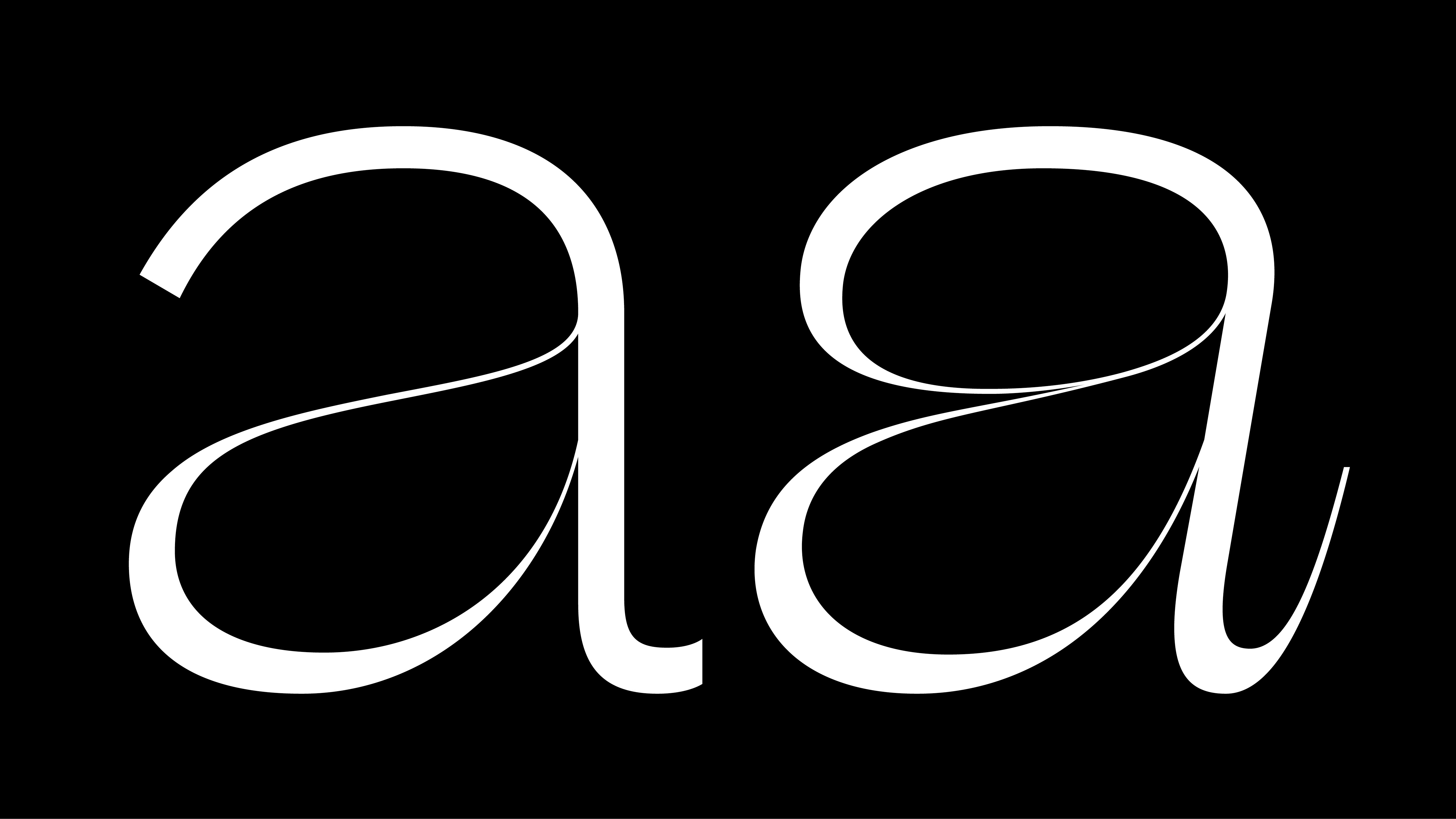
The flagship of the family, Beatrice Display, makes the convincing case that letterforms are drawn to function simultaneously as both effortless text and striking graphics. There is an exuberance that almost lifts it off the page with its dramatically high contrast, extremely tight spacing, and finely wrought apertures. It’s the most salient example of our Internal Contrast methodology, which is the foundation of the Beatrice Collection.
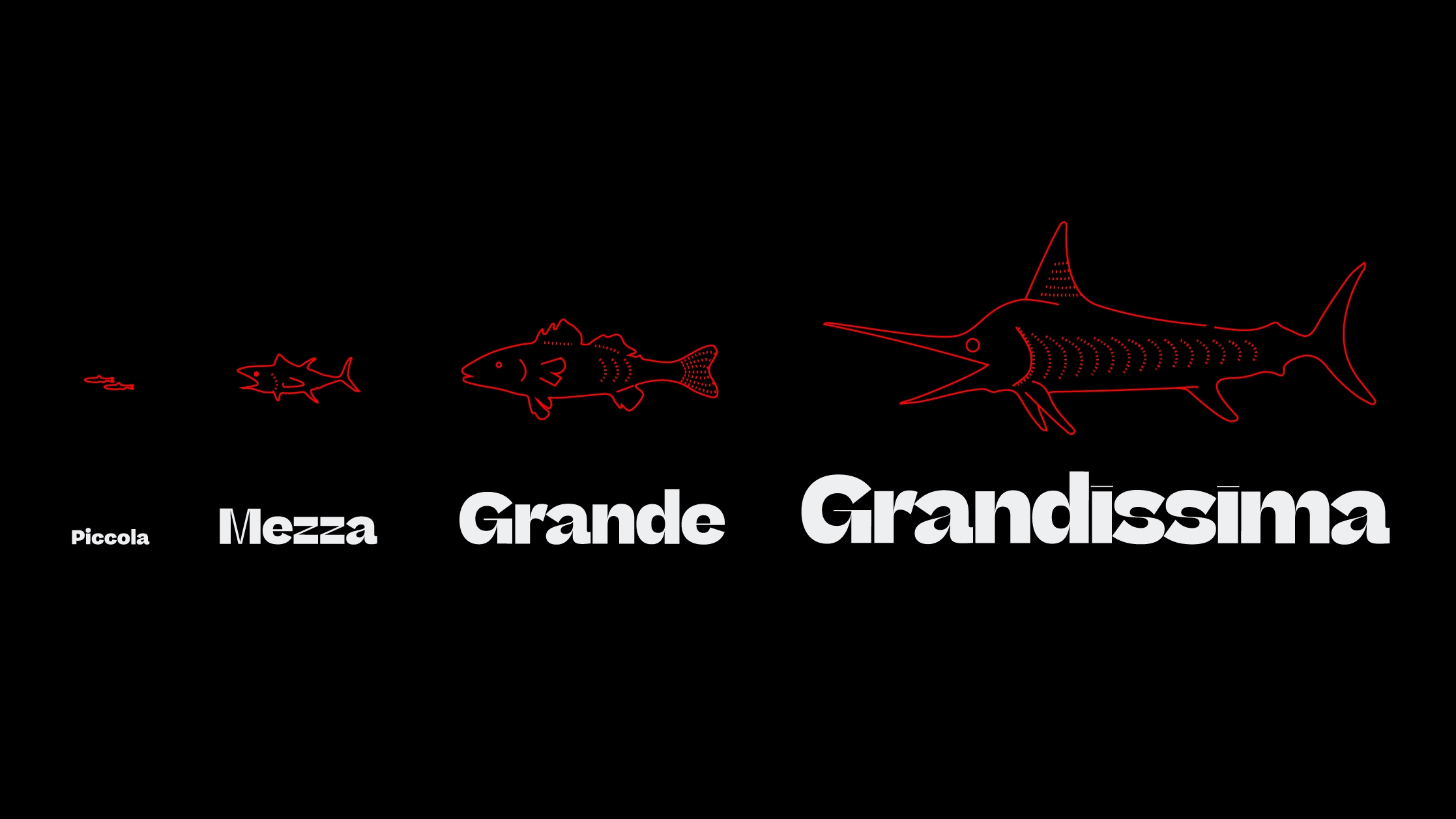
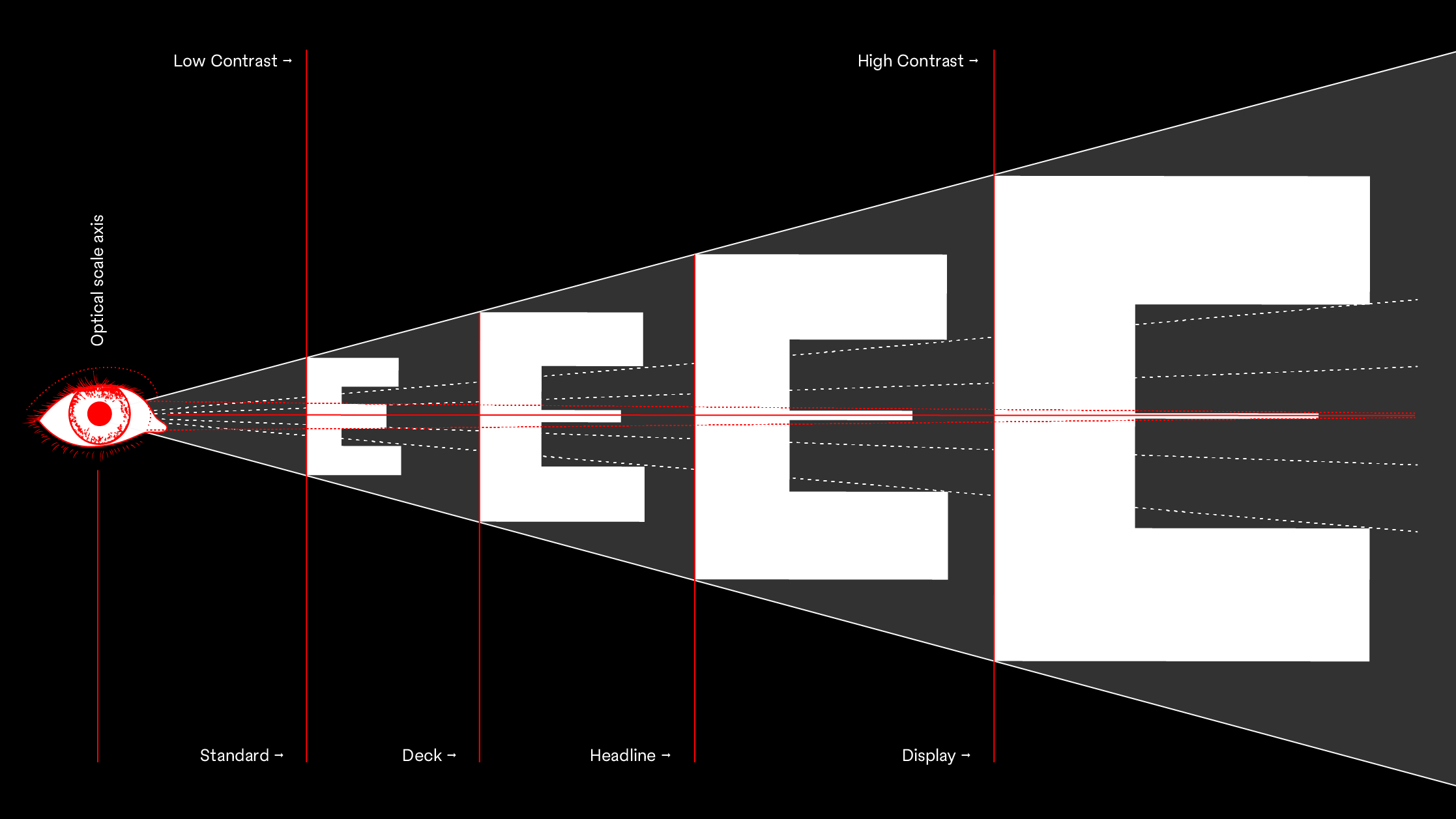
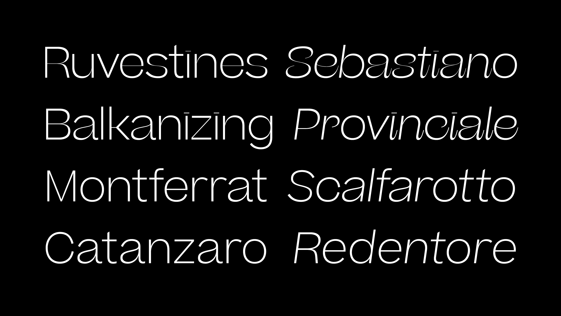
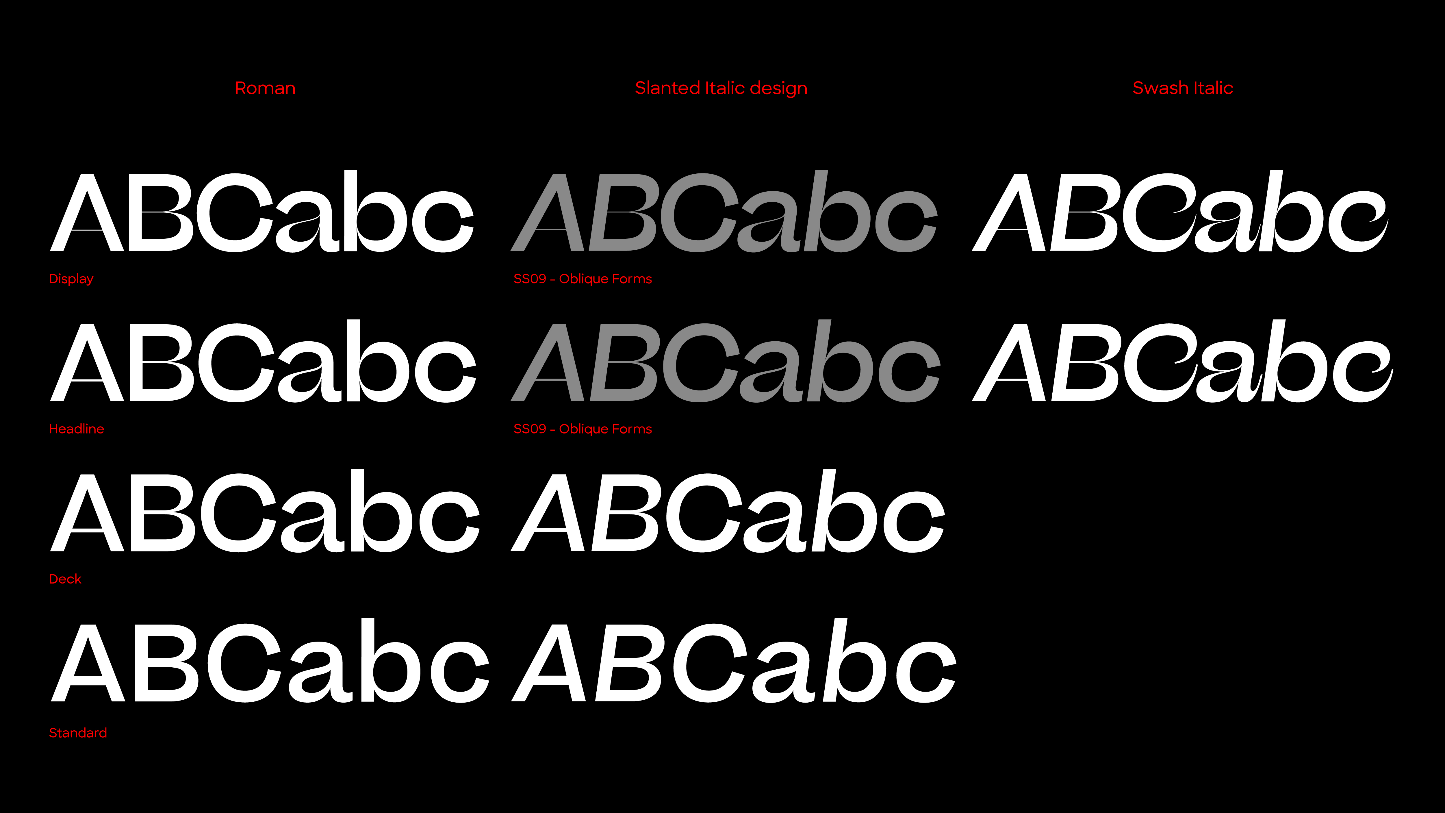
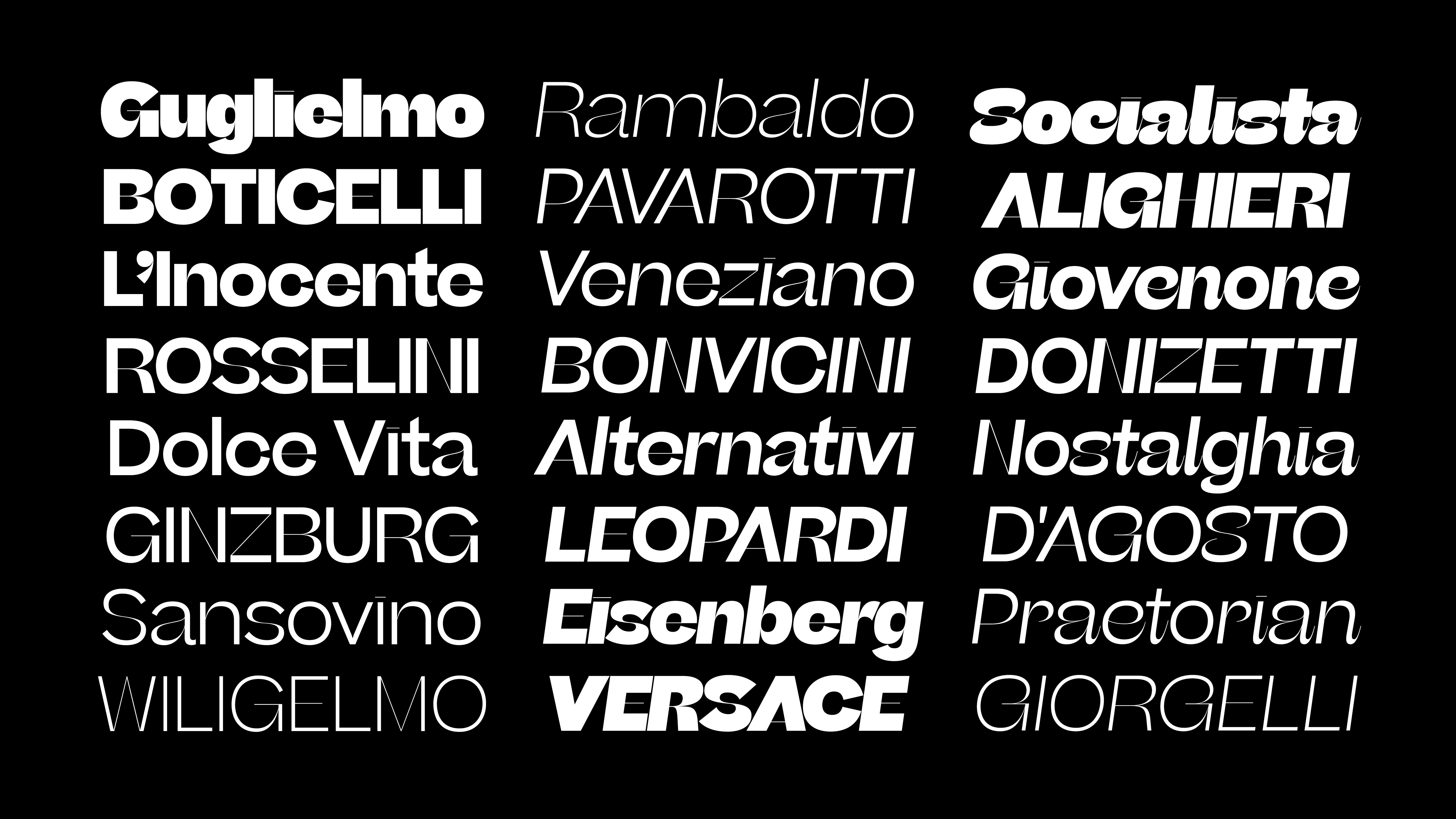
Combining various aspects from the canon expansionist systems, inverted contrast, and the contrast behavior of grotesks, these methodologies were dissected and used as cornerstones in creating our own system. The Beatrice superfamily is built upon the framework of the American Gothic, utilizing tight-not-touching spacing and featuring a robust set of weights across four optical sizes. Our iconic Display cut offers the highest head-turning contrast; use the Standard cut for all high-function-low-contrast needs; our newest additions, Headline and Deck, smoothly click into place between the original two sizes, offering a more complete spectrum of applications.


Credits

Entrant Company
NATIONAL Public Relations
Category
Branded Content - Influencer Marketing
Country / Region
Canada
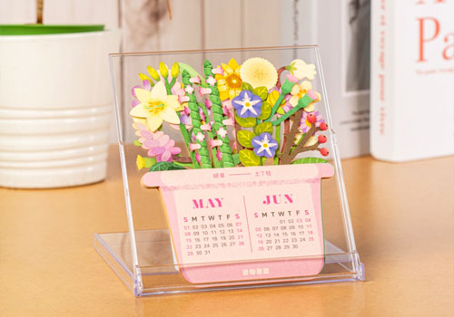
Entrant Company
Silversea Design
Category
Marketing & Promotional - Calendar
Country / Region
Taiwan

Entrant Company
Bad Penny Factory
Category
Website - Website / Other___
Country / Region
United States

Entrant Company
Anthro-Tech
Category
Website - Best User Experience
Country / Region
United States