
2023
Hand Over Hand Identity Redesign
Entrant
Yiwen Zhang, Kimmy
Category
Corporate Identity - Corporate Identity Redesign
Client's Name
Hand Over Hand
Country / Region
United States
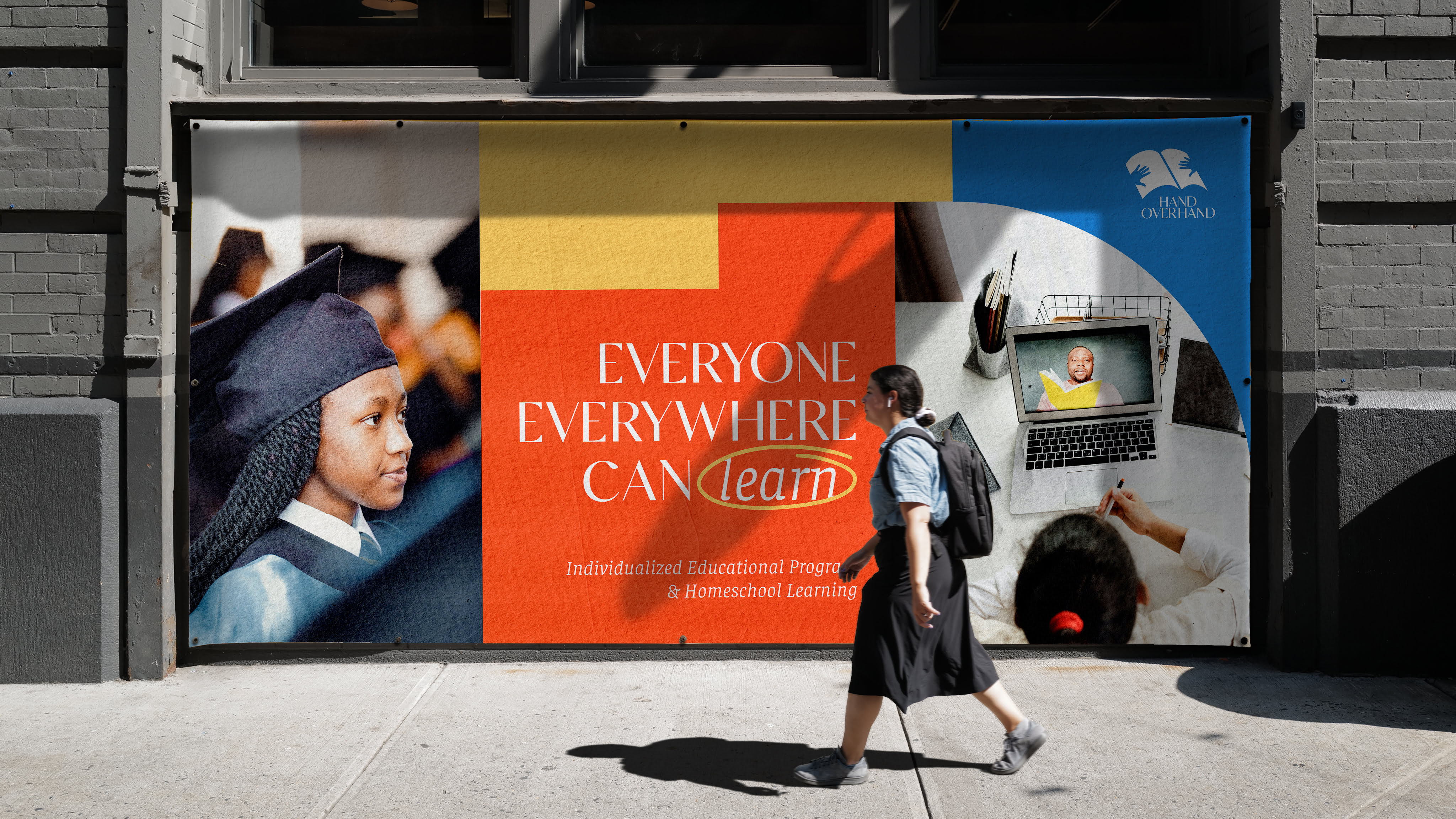
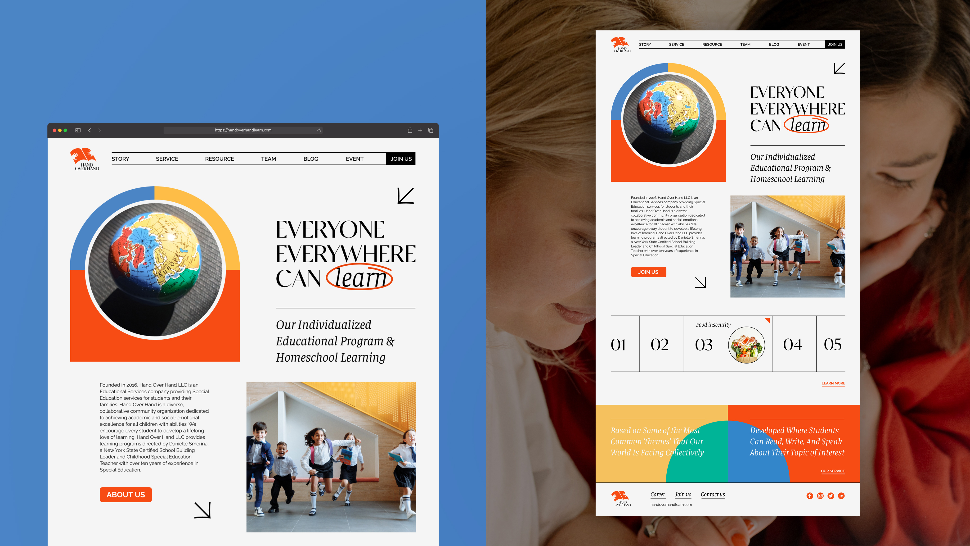
Hand Over Hand is a pioneer in special education services, promoting individualizes students' learning, fosters Inquiry-based learning, STEAM-based learning, and Project-Based Learning. Its tailored education plans cater to students and their families, encompassing reading, math, social studies, science, writing, and finance. As a diverse and collaborative community organization, its mission is to help students excel academically and socially while fostering a commitment to their local and global communities.
We built a brand that continuously inspires and assists people, including children, families, and communities from diverse regions and backgrounds. A critical factor in the brand's marketing evolution is maintaining its appeal to a wide range of demographics and geographies, including individuals with disabilities. The new brand identity embodies Hand Over Hand's core message: "everyone, everywhere can learn."
About the visual groundwork for conceptualizing the brand innovation and future marketing challenges, the main issue is how to ensure consistent marketing and messaging lead to consistent brand identity. To truly differentiate from competitors, the original hand-drawn elements in the logo are preserved to infuse personality, positivity, and a unique advantage. The fundamental elements of a hand and a book are streamlined and merged into a new graphic symbol, a vital representation of the company's global collaborative education philosophy. Analogue, a modern font combining serif and sans-serif styles, seamlessly incorporates the hand-drawn elements with its gentle curves and high-contrast letterforms, mirroring the brand's friendly and approachable personality. Pairing it with Faustina font ensures adaptability in editorial layouts. A strong mix of Reddish Orange and Silk Blue dominates the color palette, giving it an impactful and vibrant look, while the addition of Saffron Mango and Green Blue brings a sense of intimacy and security. The geometric cuts of circular and square elements create a harmonious balance, symbolizing the fusion of regional and demographic diversity.
By reimagining a passionate, vibrant, fun, inclusive, and diverse brand image, we aim to better mirror Hand Over Hand's unwavering support and profound dedication to the future of global education and the challenges faced by 21st-century society.


Credits

Entrant
Gravity Global
Category
Strategic Program - Product Launch
Country / Region
United Kingdom

Entrant
Gravity Global
Category
Branded Content - B2B
Country / Region
United Kingdom

Entrant
City of Sanger
Category
Corporate Identity - Logos
Country / Region
United States

Entrant
Muse Intermedia LLC
Category
Website - Travel
Country / Region
United States