2024
SPARK NS Website Redesign
Entrant
Boldium
Category
Website - Technology / Science
Client's Name
SPARK NS
Country / Region
United States
THE BACKGROUND
Only 14% of discoveries in neuroscience make it to the clinic. SPARK NS, a newly formed nonprofit, has a mission to change that—and they have $2 million grants to give to top researchers to fulfill that mission. While we knew that these grants would generate attention, we also learned that building trust and belief in SPARK NS’s innovative, collaboration-focused methodology is critical to their success. If grantees aren’t on board with their process, it won’t go well.
THE CHALLENGE
When people see $2 million dollars dangled in front of them, they don’t pay much attention to the process, much less take the time to learn about it.
CATCH ATTENTION
Before mentioning the large grant, we caught people’s attention with the methodology. We punctuated the website’s headline with a one-word sentence: Together. It’s an unexpected word for a site like this. It signals that this is a different kind of scientific research organization—one focused on collaboration. We added emphasis to the word “together” by changing the dark blue to orange upon scroll.
INSPIRE VISUALLY
Most scientific research sites use imagery from labs. We created a signature look for the website that positions this organization differently. We highlighted two people actively involved in a conversation with life-sized letters from SPARK NS’s logo in the background. This created a sense that SPARK NS is about bringing people together to drive innovation.
BOLD MESSAGING
Whenever we mentioned the $2 million, we did so in the context of the four pillars that make up the program—the money was only one of the four. The other key to our messaging strategy was to distill each pillar down to its essence, using only four or five words. This allowed us to use bold fonts, making the pillars almost impossible to miss. With an FAQ nearby, it was easy to learn more.
PROVE IT
Finally, we reinforced the credibility of the methodology with a section on “Proven Results.” By highlighting a statistic from a similar process used by their predecessor, we built a strong case.
Credits
Entrant
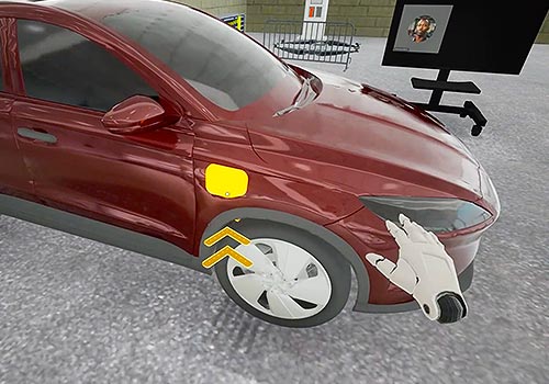
CraneMorley
Category
Experiential & Immersive - Virtual Reality
Country / Region
United States
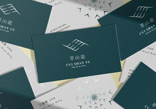
Entrant
Play Design Lab
Category
Corporate Identity - Brand Identity
Country / Region
Taiwan
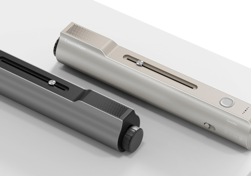
Entrant
Macau University of Science and Technology
Category
Student Submission - Student Product Design
Country / Region
Macau SAR
Entrant
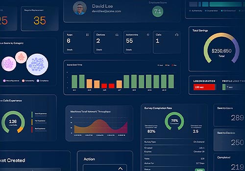
ControlUp
Category
Website - Corporation
Country / Region
United States