
2024
Logo design for east ring shape of railway hub in Chongqing
Entrant Company
Casper Wang
Category
Corporate Identity - Logos
Client's Name
Casper Wang
Country / Region
China
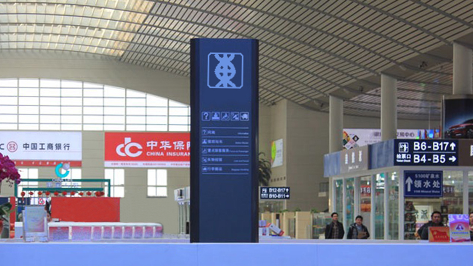
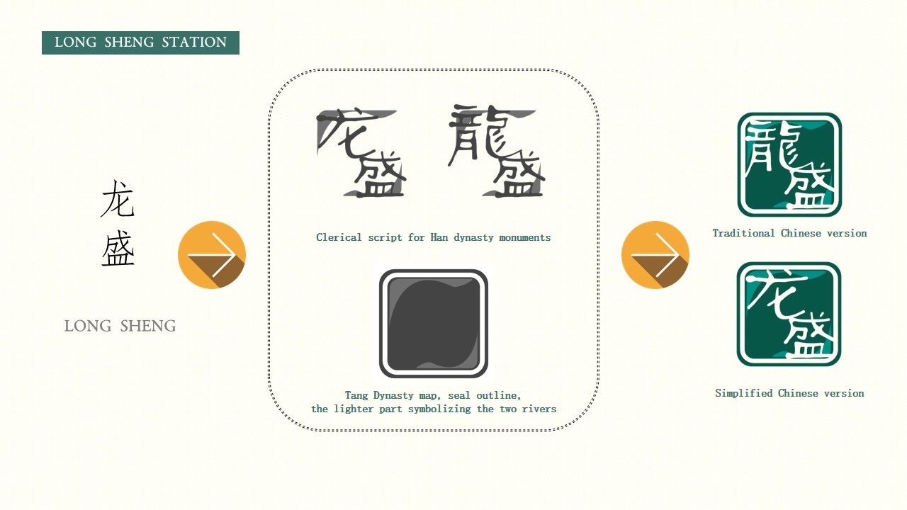
This logo design for east ring shape of railway hub in Chongqing adhered to the principles of "artistic unity, functional identification, and cultural uniqueness," aiming to convey clear directional guidance while reinforcing people’s impressions of Chongqing and fostering a sense of belonging and warmth.
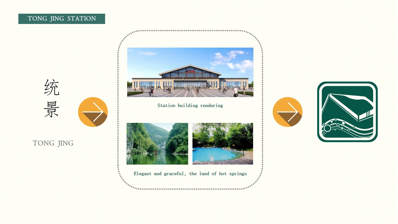
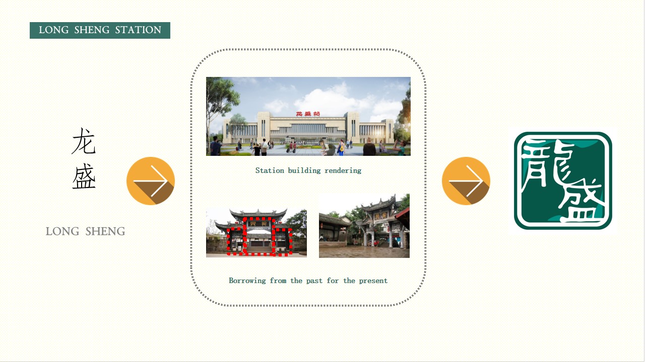
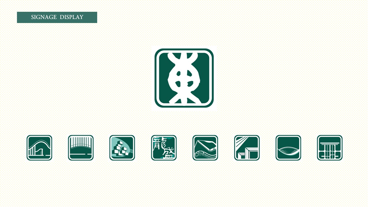
As a key element of the guidance system, the team prioritized a "simple and intuitive" design philosophy, integrating the region's unique cultural, historical, and scenic elements. Each station's icon is designed to reflect the distinctive characteristics of its location, enhancing the unique atmosphere and personality of the area. Whether the station is situated at a railway hub, an ecological reserve, or a natural scenic area, the design team incorporated local architecture, culture, and landscape elements, all unified under a consistent visual expression, to create a cohesive design scheme.
The base color of the signage emphasizes the east ring shape's role as a model of ecological civilization, with a vibrant green as the primary color, harmonized with a deep, steady indigo. For stations featuring text, a custom typeface inspired by ancient seal script was developed, with both simplified and traditional Chinese characters available to reflect regional features. This integration not only enhances the visual distinctiveness and recognition of the signage but also positions it as a cultural emblem of Chongqing, presenting yet another cultural icon of the city to the world.


Credits

Entrant Company
Bad Penny Factory
Category
Website - Manufacturing
Country / Region
United States
Entrant Company
Suzhou Industrial Park Lecheng Advertising Media Co., Ltd./Suzhou Industrial Park Lecheng Space Creation Co., Ltd.
Category
Marketing & Promotional - Guide (NEW)
Country / Region
China

Entrant Company
Write Stuff Enterprises
Category
Publication - Digital Publications
Country / Region
United States
Entrant Company
oOooOooo Studio/University of Macau
Category
Typography - Use of Typography
Country / Region
Macau SAR