
2025
Jo
Entrant Company
A4DH Branding Services
Category
Corporate Identity - Corporate Identity Redesign
Client's Name
Jo café & restaurant
Country / Region
United Arab Emirates
Jo café and restaurant was one of the first brands in Iran that set out to redefine the experience of fine dining, creating a space where food is more than just nourishment; it is a celebration of taste, connection, and shared moments.
The challenge was to craft a new brand identity and spatial experience that resonated with a diverse audience; from children to grandparents, without sacrificing authenticity or sophistication. The core concept revolved around flavor diversity, freshness, and emotional connection, ensuring that every dish and every moment at Jo felt special.
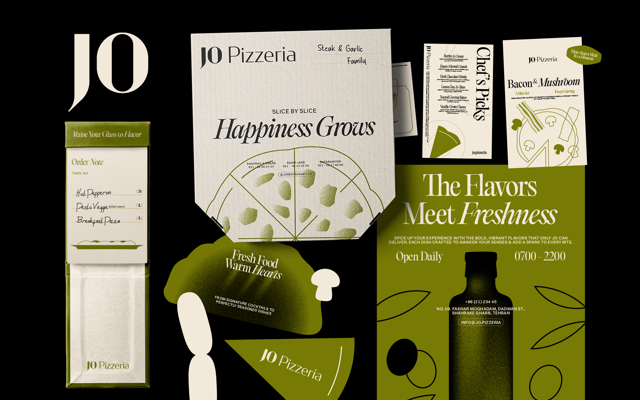
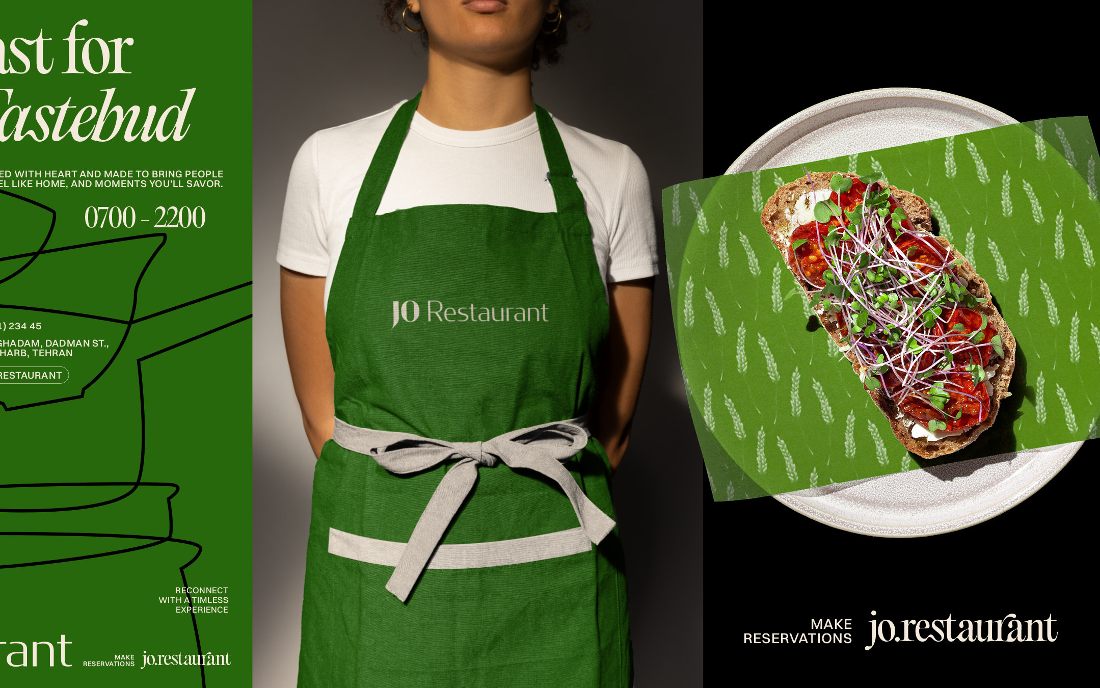
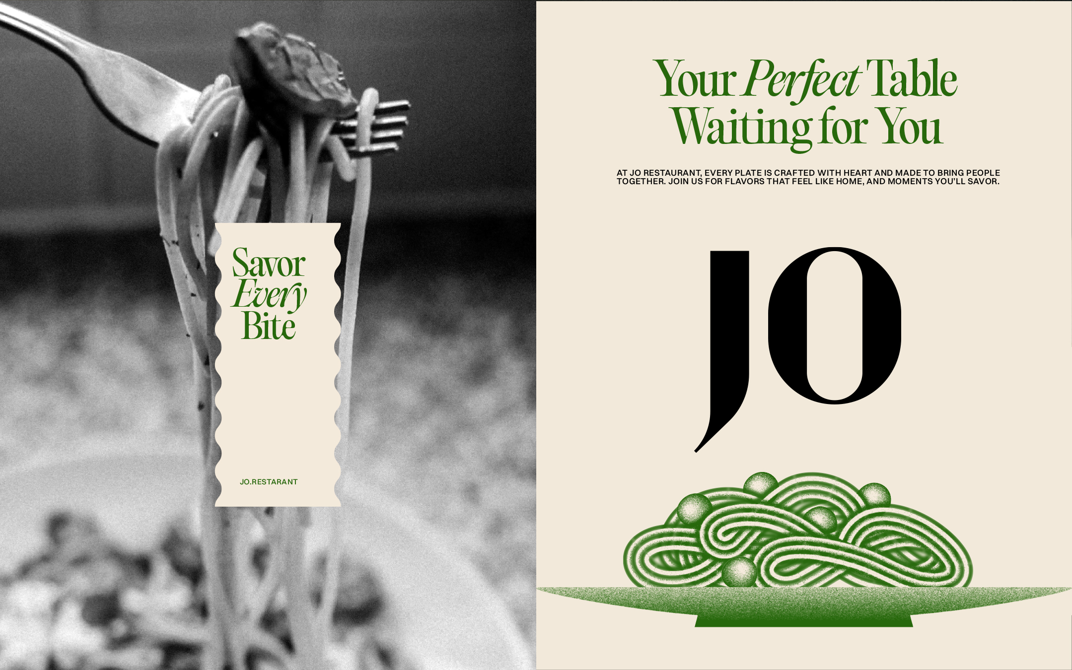
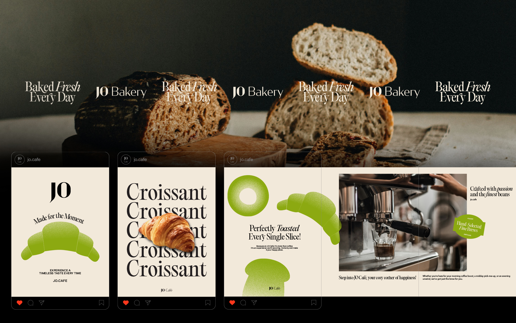
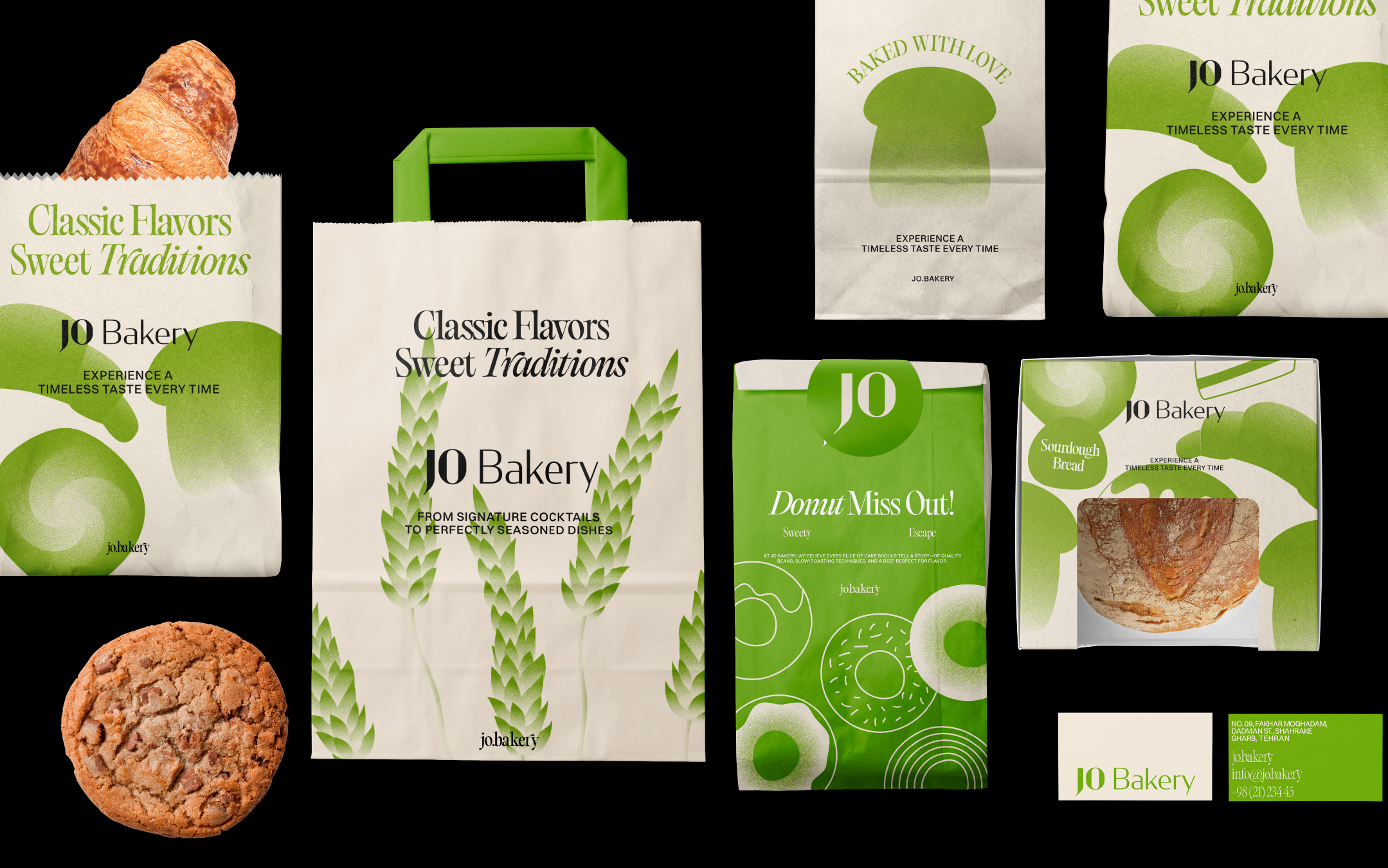
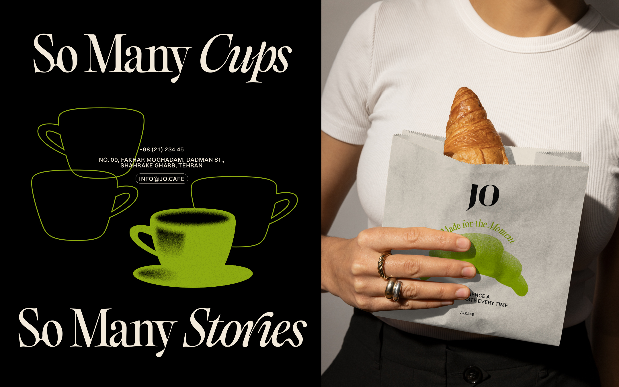
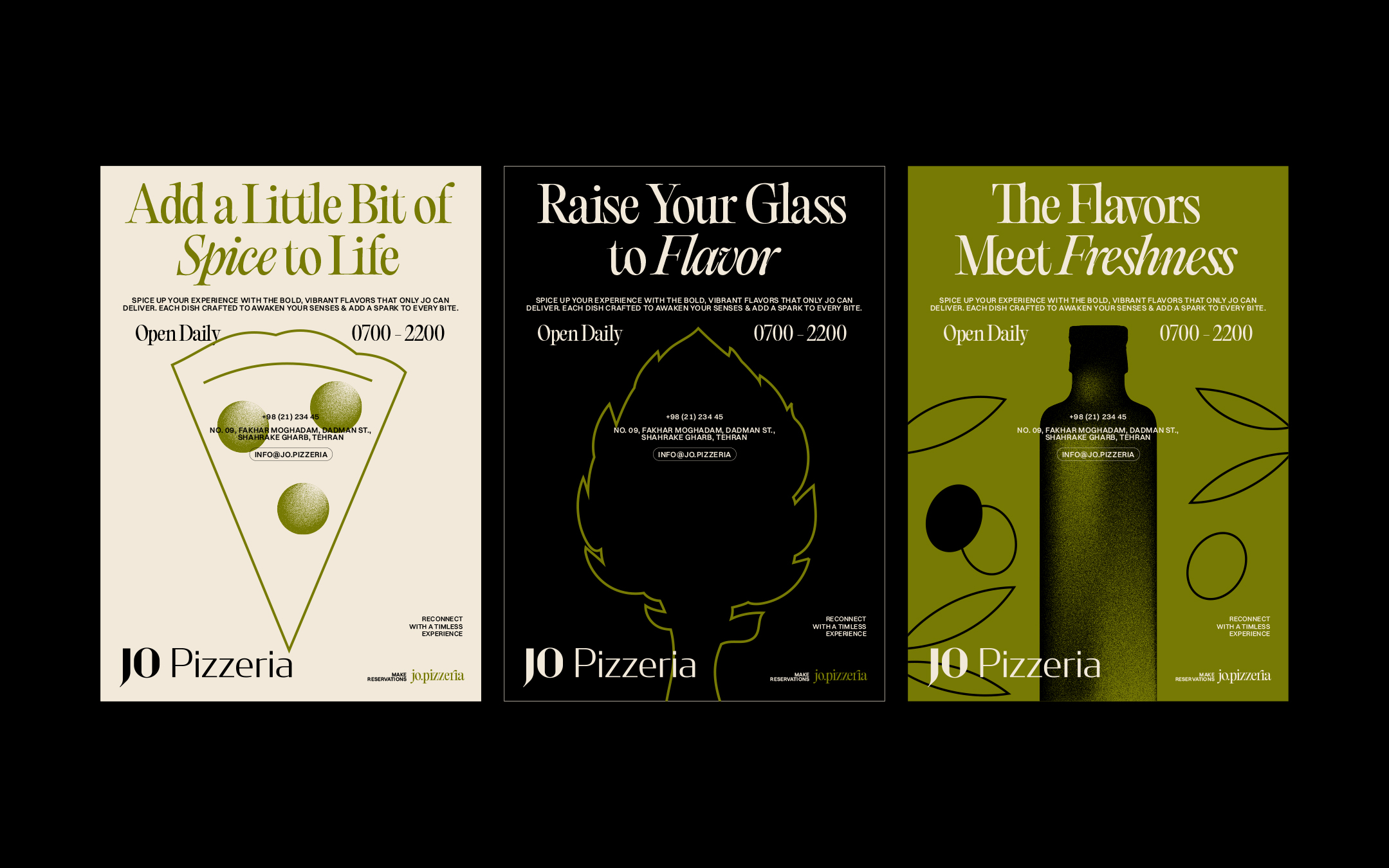
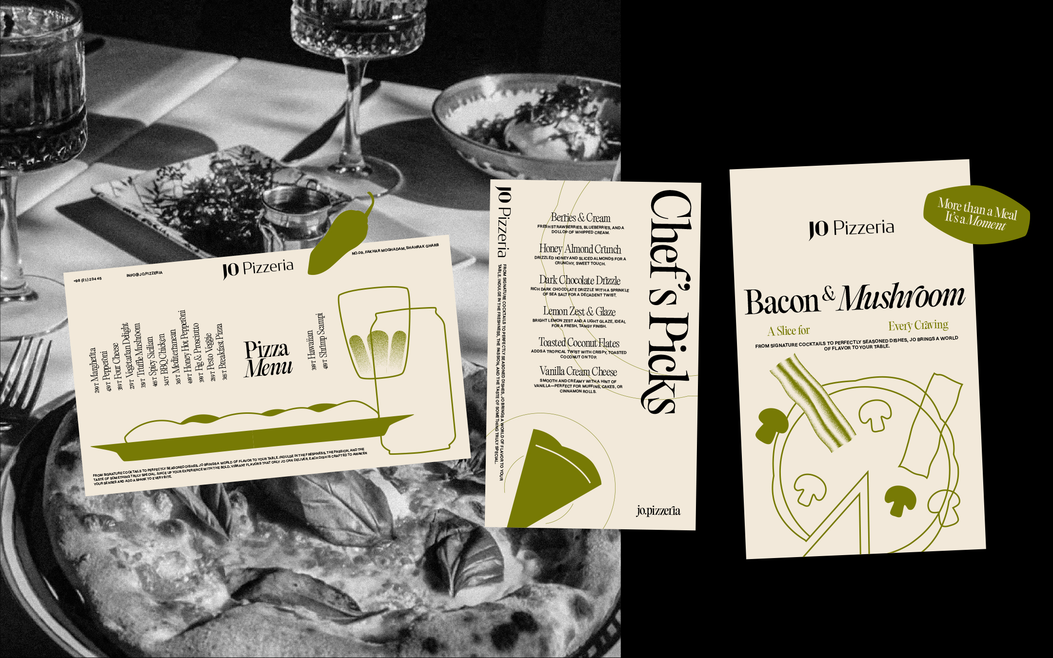
We developed a dynamic visual identity that reflects the vibrant diversity of Jo’s offerings. The logotype, with its clean yet playful form, mirrors the balance between simplicity and adventure. For Jo, we chose green as the primary brand color, symbolizing both the natural essence of the brand and its commitment to growth and progress. Green evokes freshness and sustainability, aligning perfectly with Jo’s brand values and its focus on wholesome, quality food.
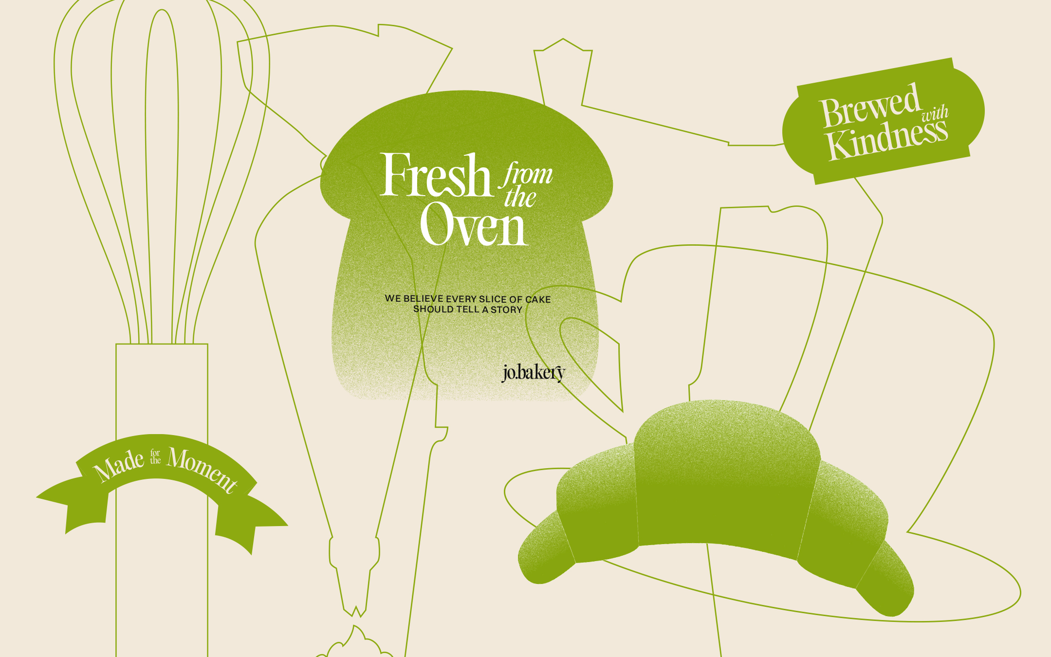
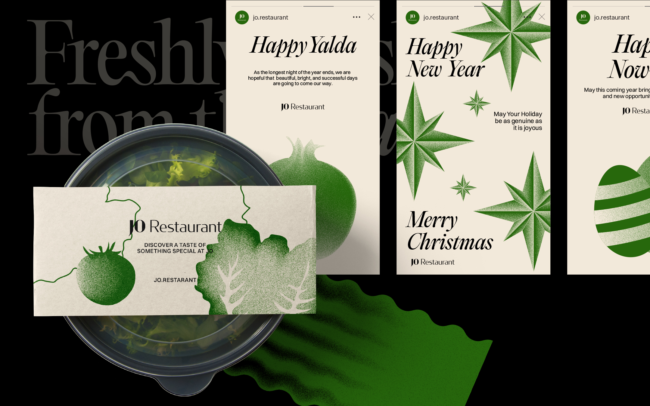
The visual identity of Jo incorporates illustrative graphics inspired by key elements of the dining experience. We drew on forms and shapes from food ingredients, tableware, and restaurant objects to create a visual storytelling approach that enhances brand recognition. These elements contribute to building a cohesive and dynamic brand world, where every graphic element serves a purpose in conveying Jo’s narrative.
A modern aesthetic was a priority throughout the design process. We ensured that all visual forms, from illustrations to graphic motifs, maintained a contemporary feel. This modernity extends into the brand’s typography as well. The type design features clean lines and thoughtful contrasts, adding depth and visual interest to the overall brand presentation.
Our design approach focused on creating contrast within visual forms, combining organic shapes with structured design elements. This interplay of form and function helped us communicate a sense of balance, where natural inspiration meets modern execution.
The result is a fresh and inviting brand identity that not only reflects Jo’s values but also sets the tone for an engaging and memorable customer experience across all brand touchpoints.
Credits

Entrant Company
Casual Films
Category
Video - Financial Services
Country / Region
Hong Kong SAR
Entrant Company
Shanghai LightBrand Cultural Creative Co., Ltd.
Category
Corporate Identity - Brand Identity
Country / Region
China
Entrant Company
A4DH Branding Services
Category
Corporate Identity - Brand Identity
Country / Region
United Arab Emirates

Entrant Company
Shepherd Communications Limited
Category
Corporate Identity - Brand Identity
Country / Region
Hong Kong SAR