2025
TI0
Entrant
Ningbo Mebox Brand Design Co., LTD
Category
Corporate Identity - Brand Identity
Client's Name
Yuyao RUIKE Electrical Appliances Co., Ltd.
Country / Region
China
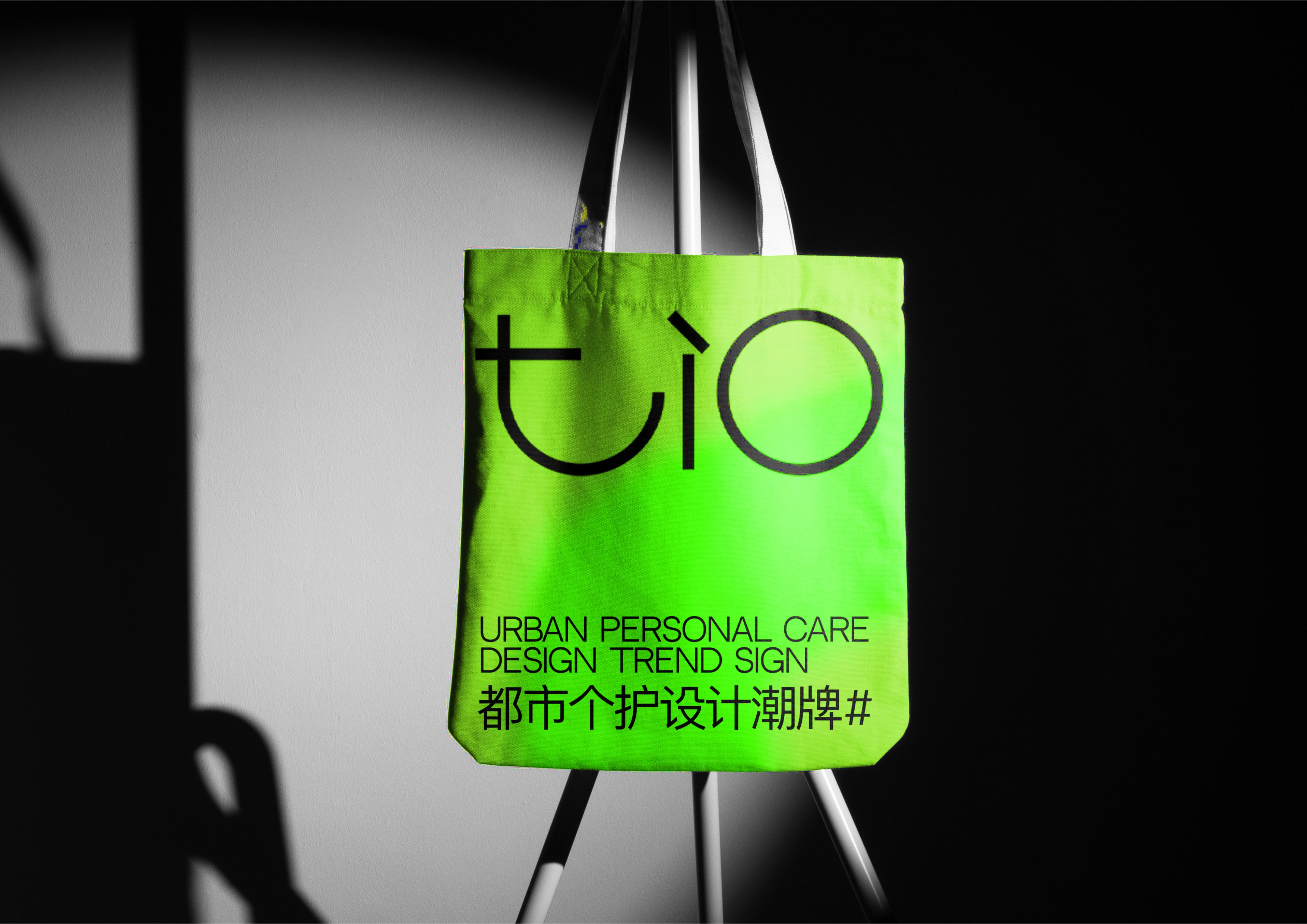
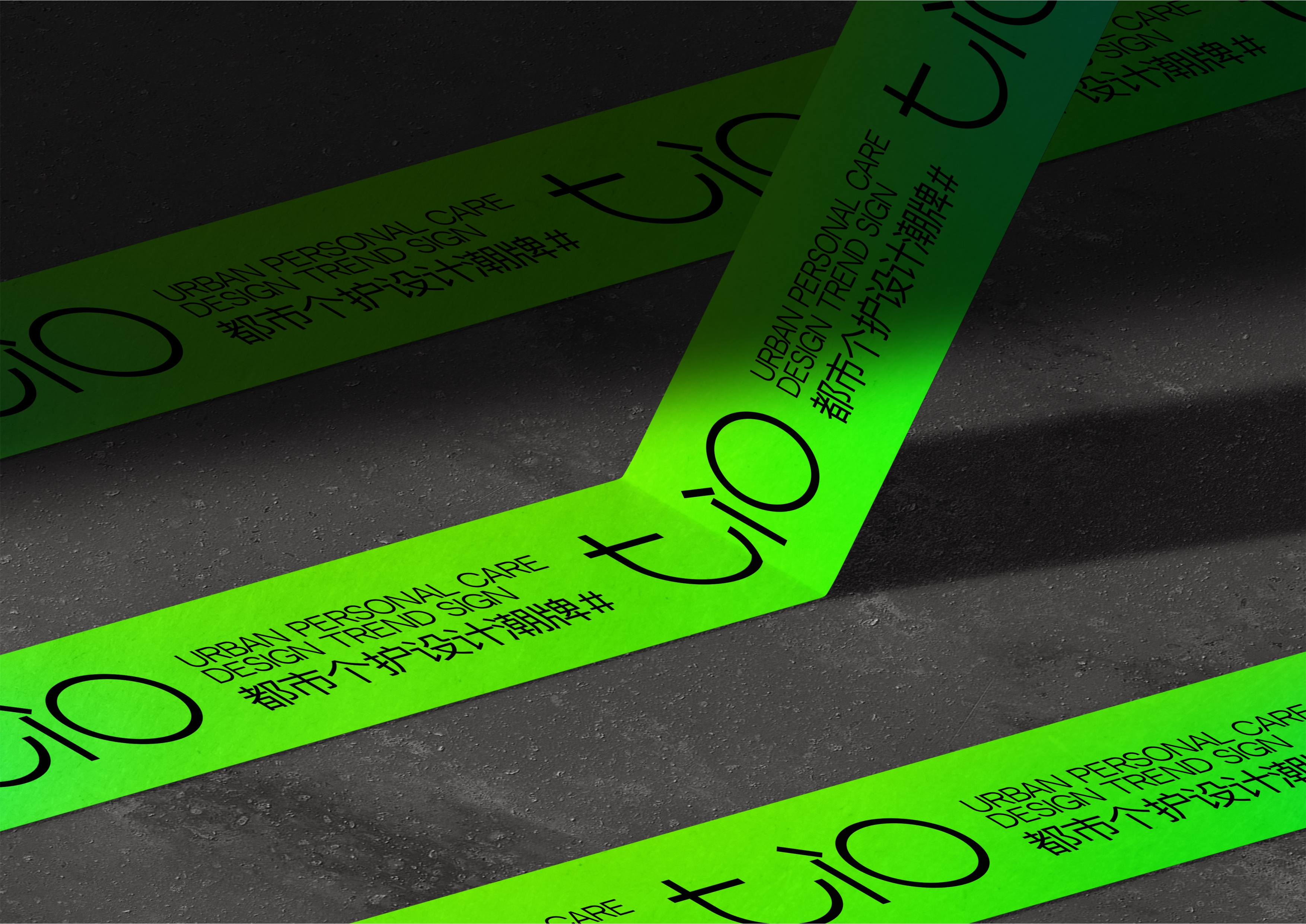
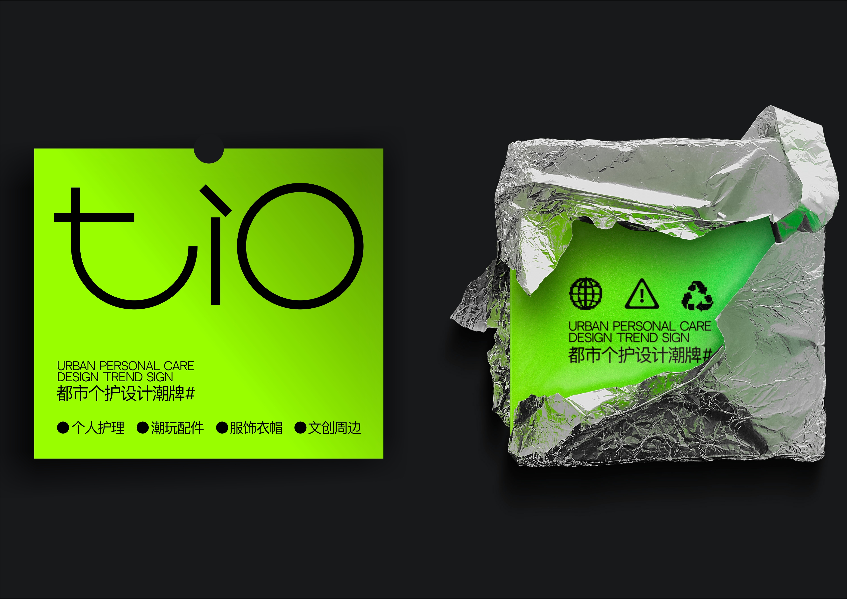
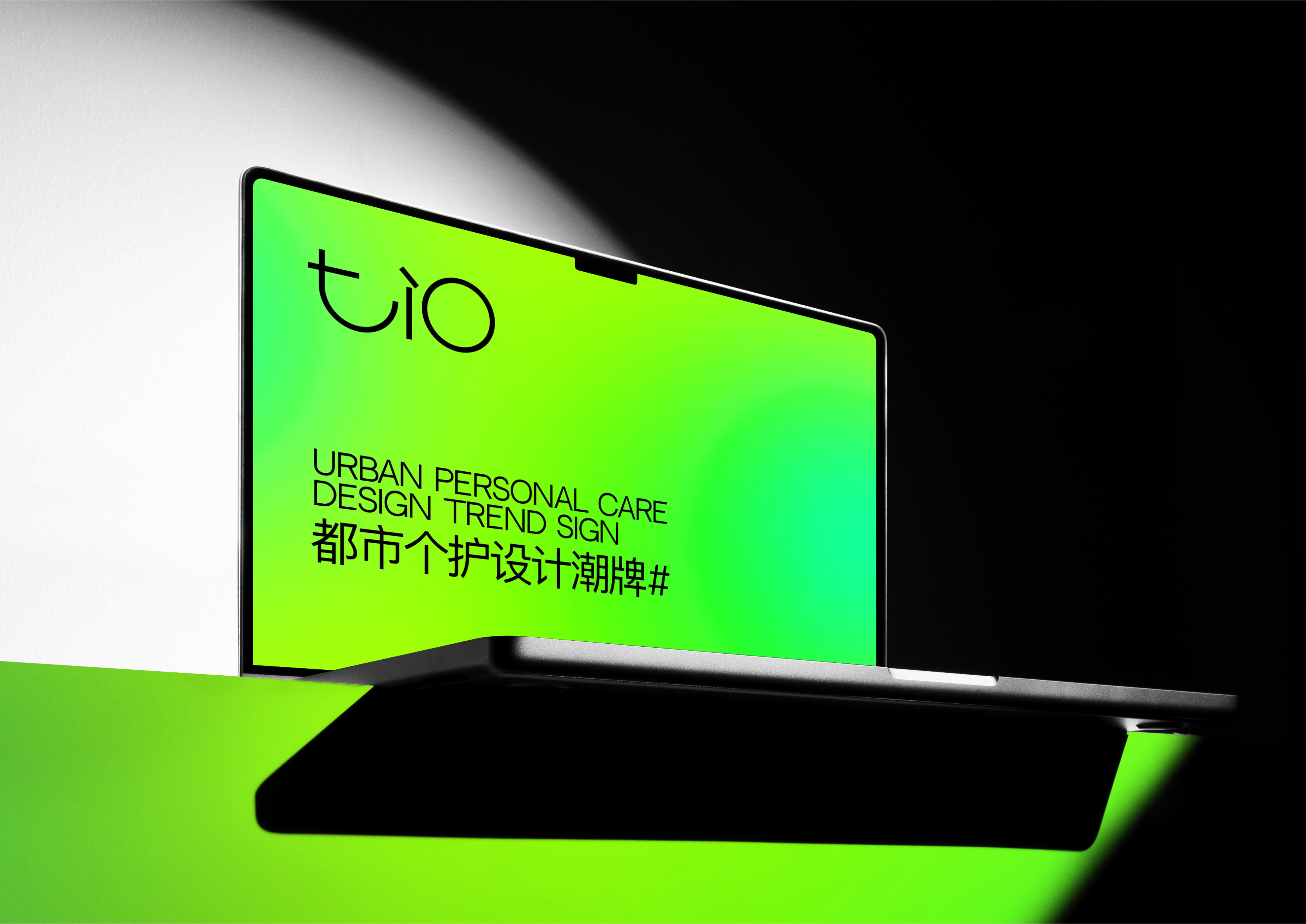
In today’s ever-evolving and diverse personal care market, TI0 Technology stands out as a fresh, trendy brand that captures the spirit of modern self-expression. Beyond simply developing innovative new categories in personal care, Tech 0 is on a mission to become the ultimate symbol of cool, youthful style for the next generation. To bring this vision to life, the brand’s visual identity system blends bold patterns, dynamic lines, and vibrant colors with tech-forward elements, creating a sleek, contemporary aesthetic that radiates energy and highlights the brand’s unique personality.
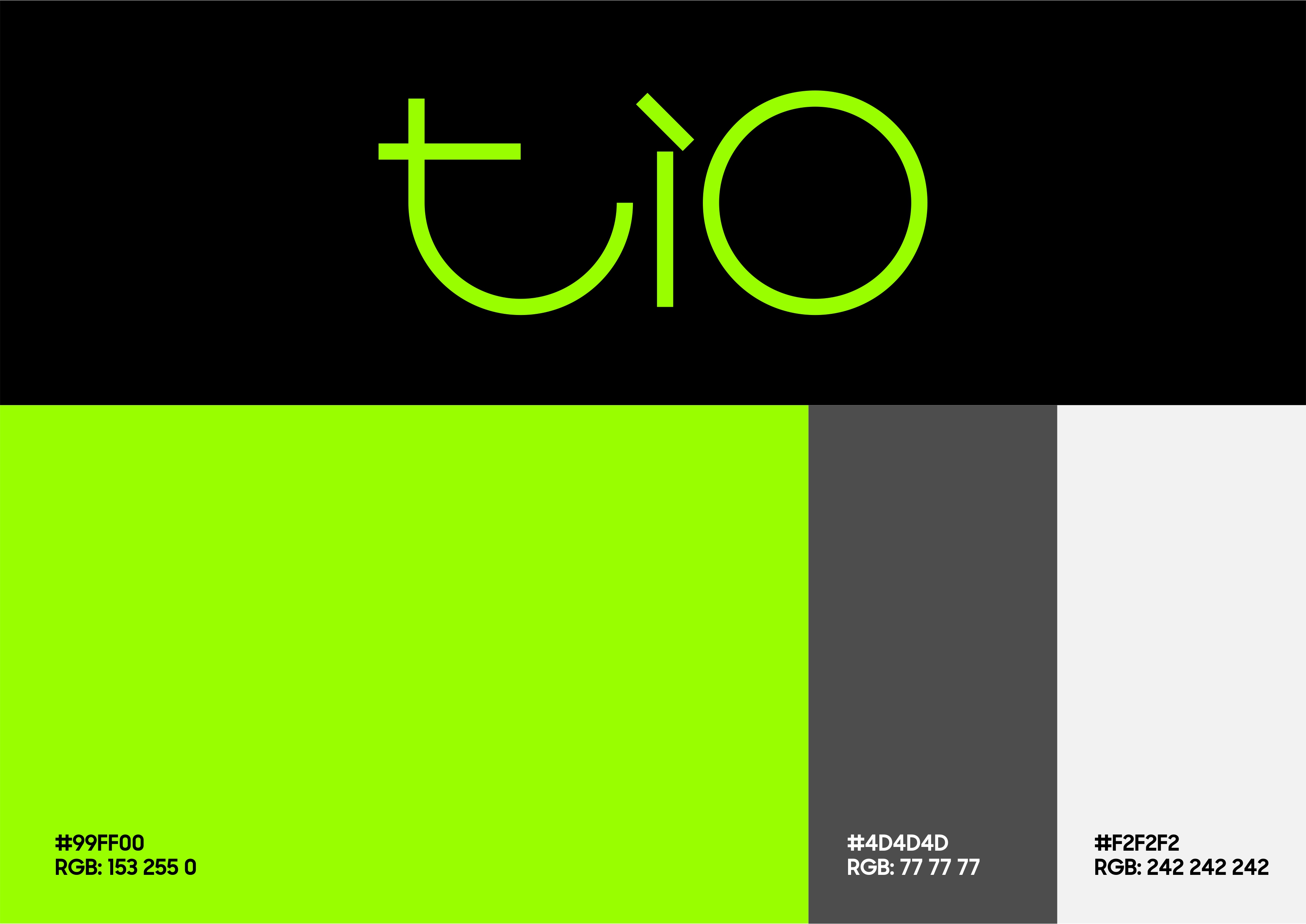
The vibrant, striking color palette is dominated by neon green, set against a profound black backdrop. This daring combination defies convention and exudes individuality, positioning personal care products as more than just functional tools—they’re an essential part of a lifestyle that celebrates self-expression and fashion-forward thinking.
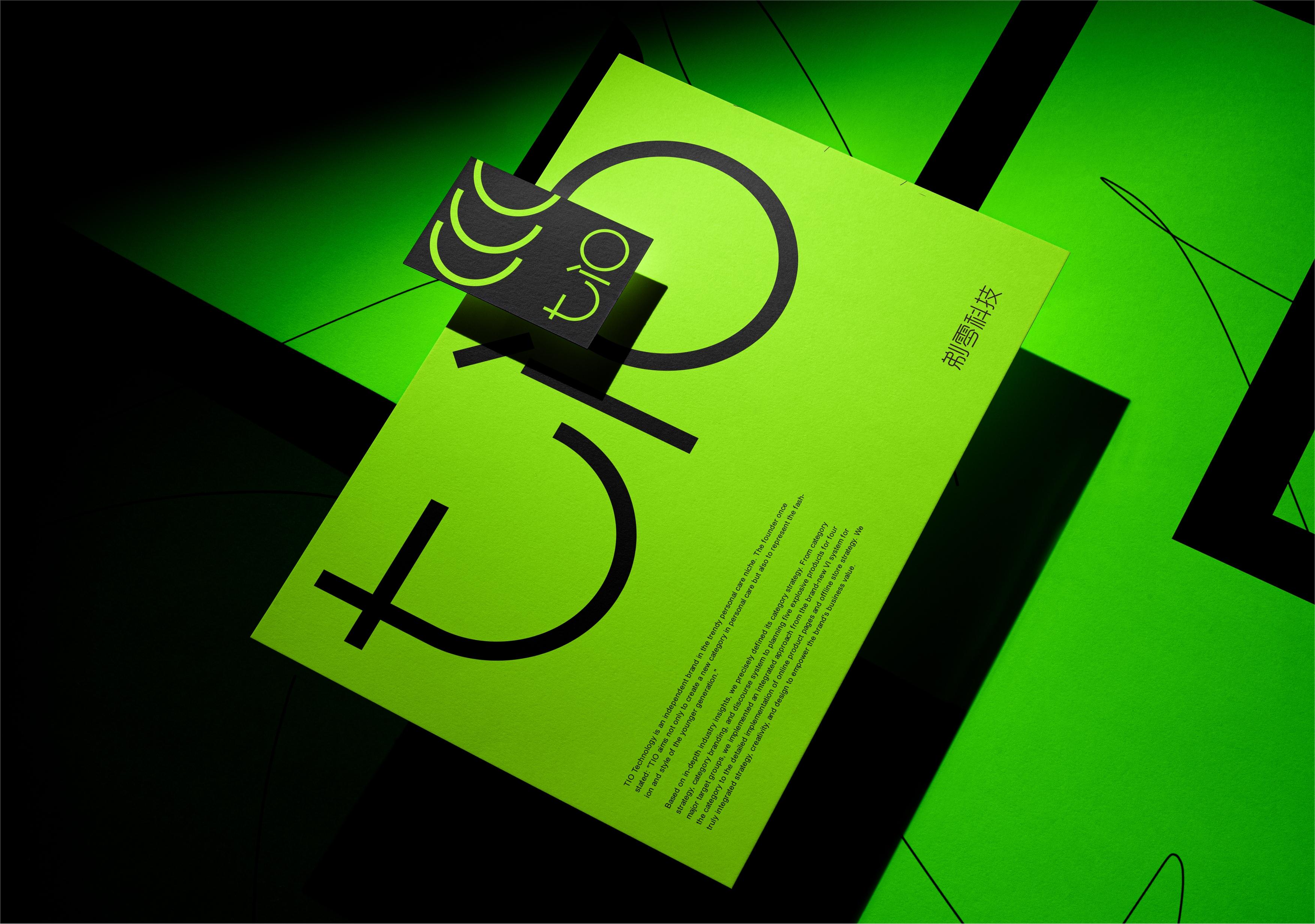
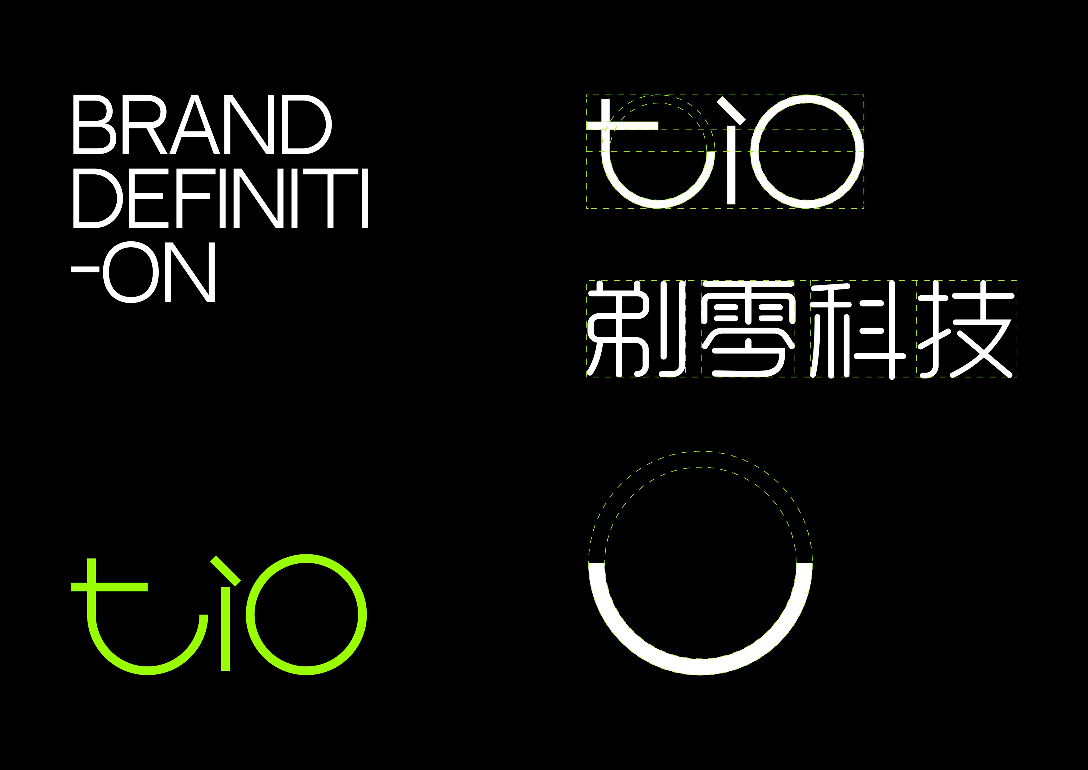
The brand’s logo design reflects its core values and creativity. The Chinese name (“Ti Ling” in Chinese Pinyin) is thoughtfully incorporated: “Ti” (shaving) conveys the brand’s dedication to innovating cutting-edge products like razors and lint trimmers, while “Ling” (zero) embodies the determination and capability to achieve a perfectly clean shave. A subtle curve in the design adds a playful and approachable touch, reinforcing the brand’s fun and relatable vibe. The English logo “TI0,” a streamlined phonetic adaptation of the Chinese name, is both memorable and modern, perfectly resonating with the aesthetic sensibilities of Gen Z. The flexibility to combine the English and Chinese logos ensures seamless integration across various platforms and media.
Adding an emotional layer to the design, half of the “0” in the logo is cleverly transformed into a smile symbol. This simple yet powerful element underscores the brand’s focus on user experience and emotional connection, turning every interaction with TI0 into a moment of joy. From product packaging to advertising campaigns and offline store designs, this iconic symbol will serve as a consistent visual thread, strengthening brand recognition and leaving a lasting impression on consumers.
Credits
Entrant
Lanhua Ma
Category
Video - Film / Movie
Country / Region
China

Entrant
Jennings Social Media and MarTech
Category
Advertising - Advertising Campaign
Country / Region
United States
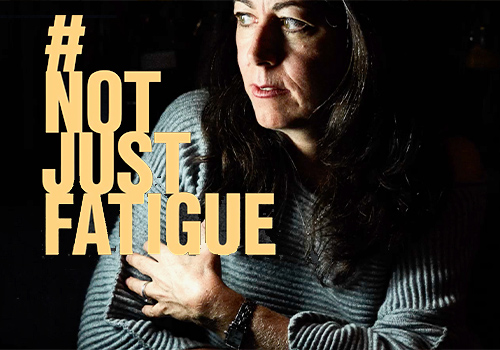
Entrant
#NotJustFatigue
Category
Website - Nonprofit
Country / Region
United States

Entrant
AARP
Category
Integrated Marketing - Nonprofit
Country / Region
United States