2025
SHENZHEN MGM Hotel
Entrant
Signcheck.Limited
Category
Outdoor Advertising - Signage
Client's Name
Diaoyutai MGM Hospitality
Country / Region
China
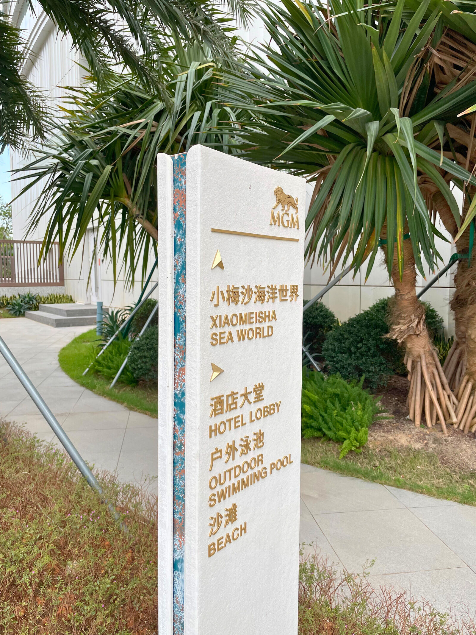
Nestled along the pristine coastline of Xiaomeisha, Shenzhen MGM is more than a luxury resort—it’s a sensory destination where art, design, and hospitality converge. The signage design for the resort redefines traditional wayfinding by transforming each sign into a unique art piece that not only guides but also invites interaction, photography, and memory-making.
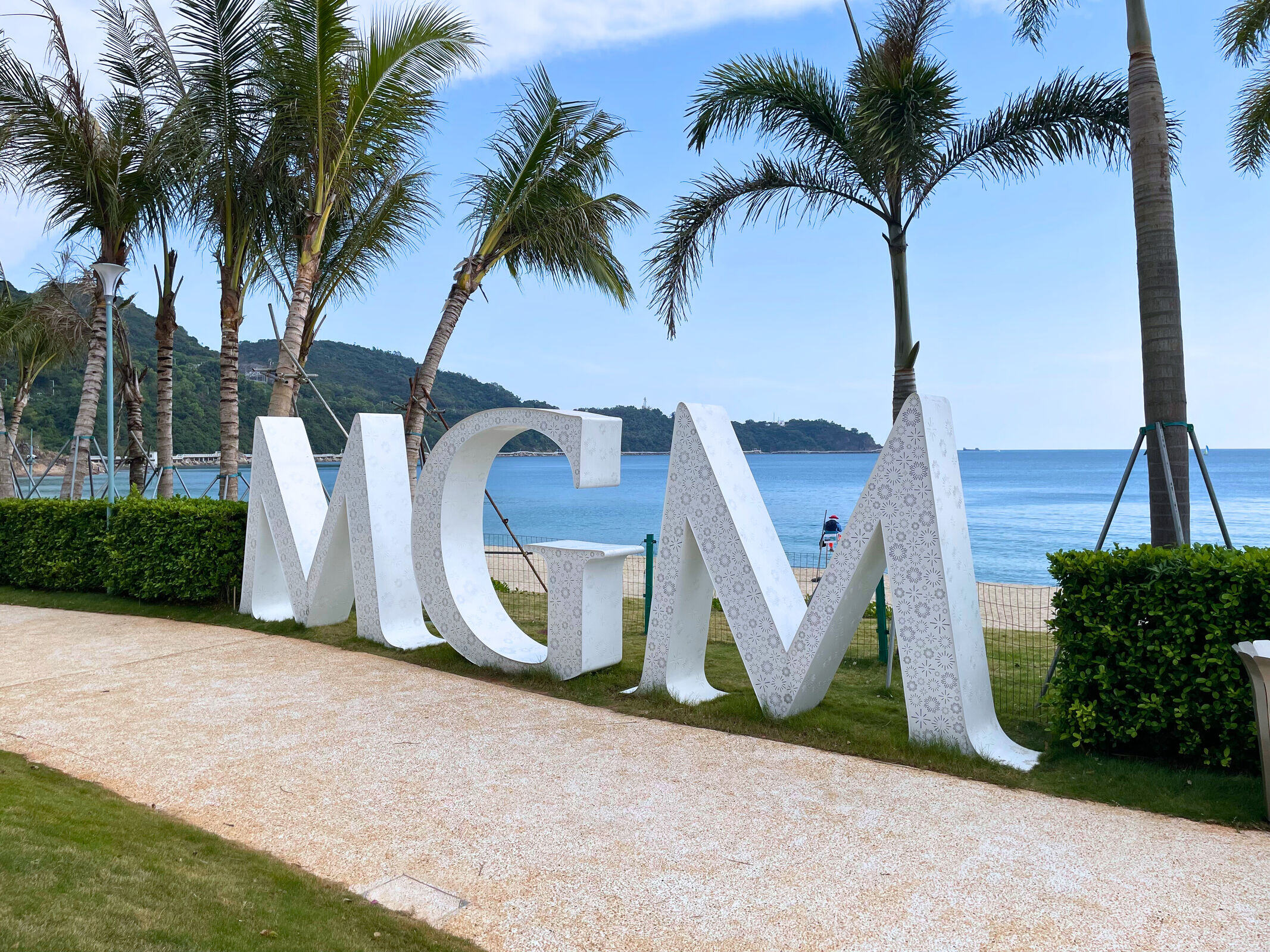
Inspired by the resort’s beachfront location and the vibrant lifestyle of the Greater Bay Area, the exterior signage adopts a sculptural form using white GRC (Glass Fiber Reinforced Concrete) with textured blue accents. This pairing evokes the sunlight, waves, and chill coastal atmosphere. One of the most iconic installations is the 1.5-meter-tall MGM letter sculpture, placed near the beach as a landmark where guests gather to take photos against the stunning seaside backdrop—turning signage into a destination in itself.
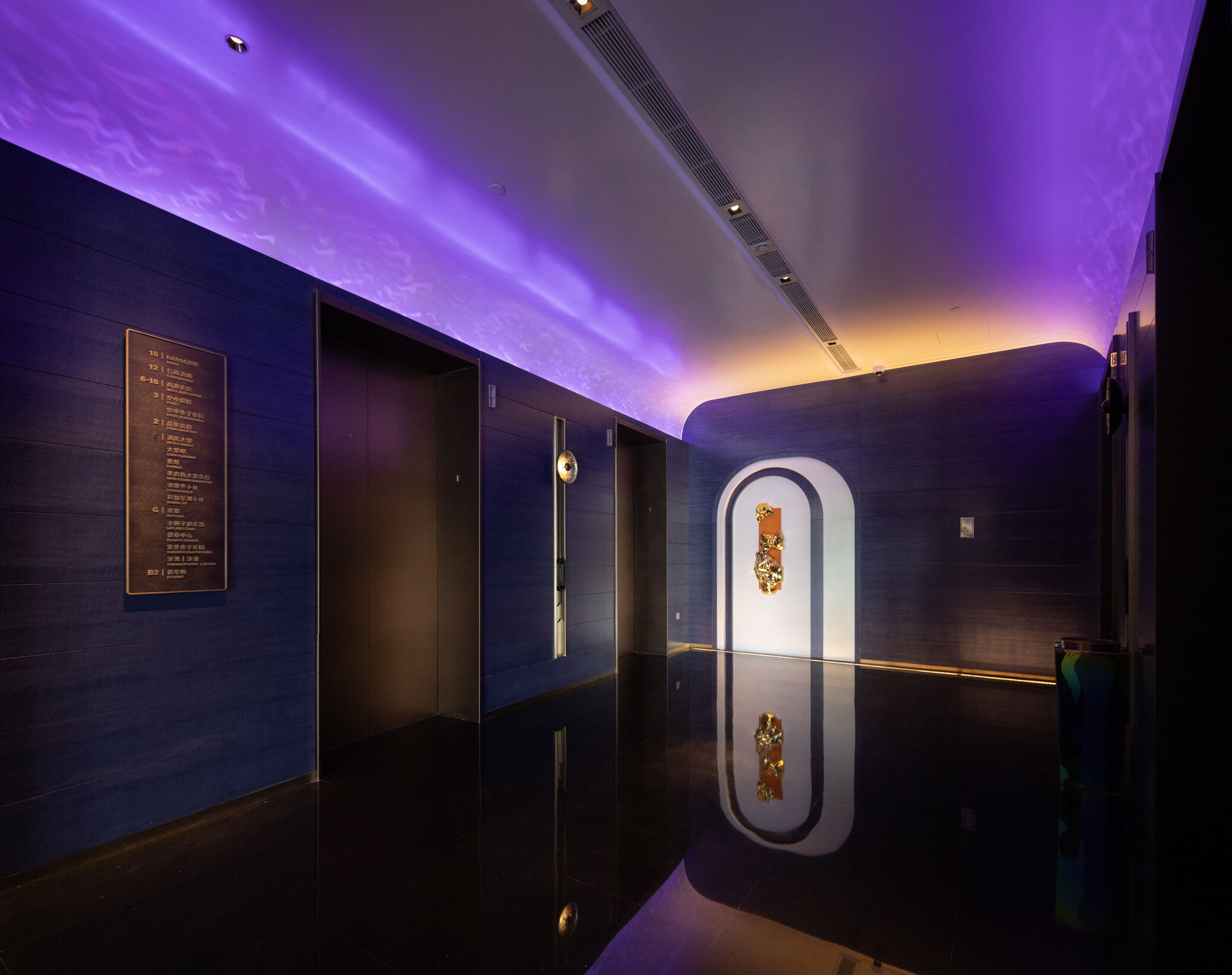
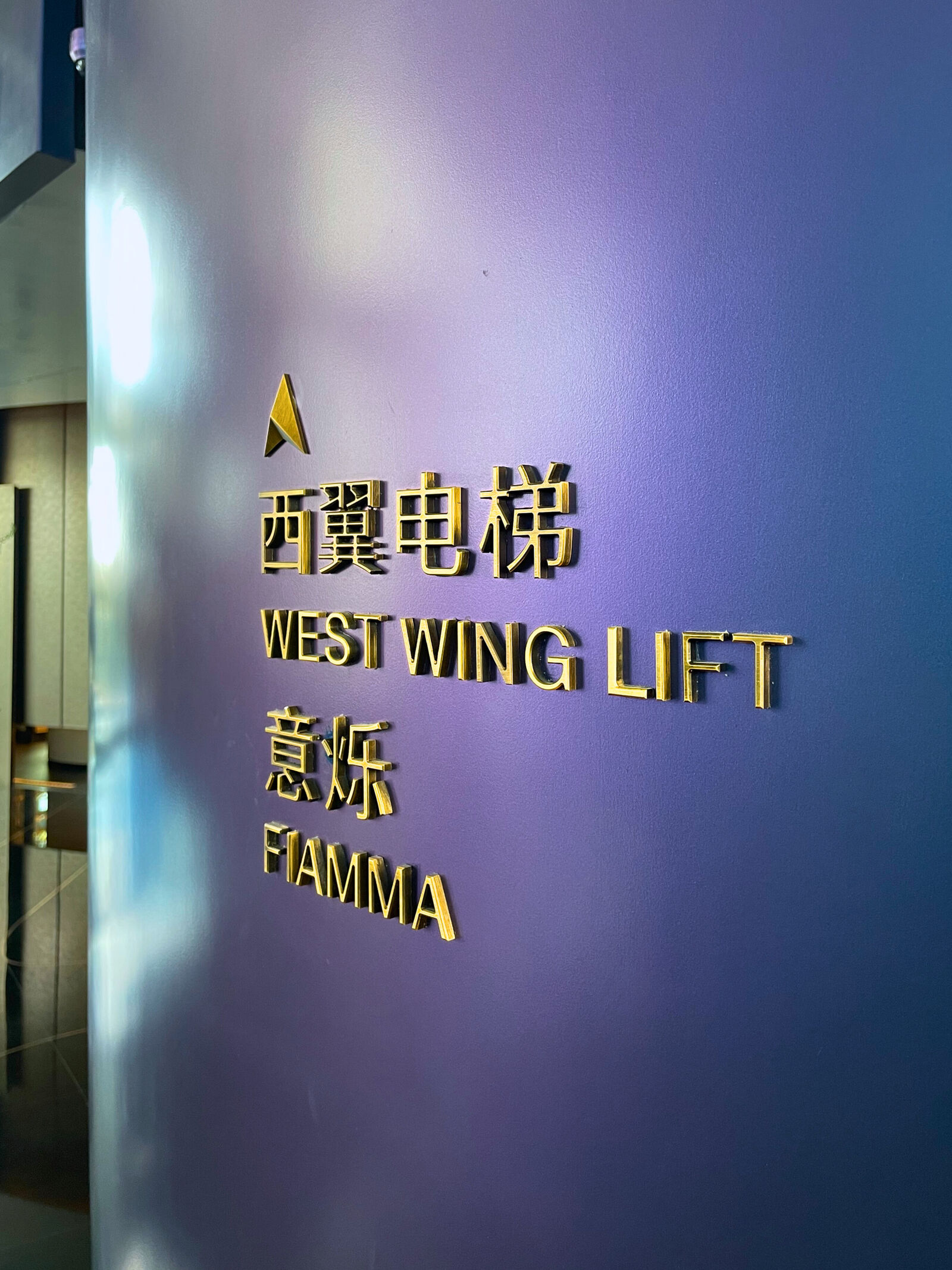
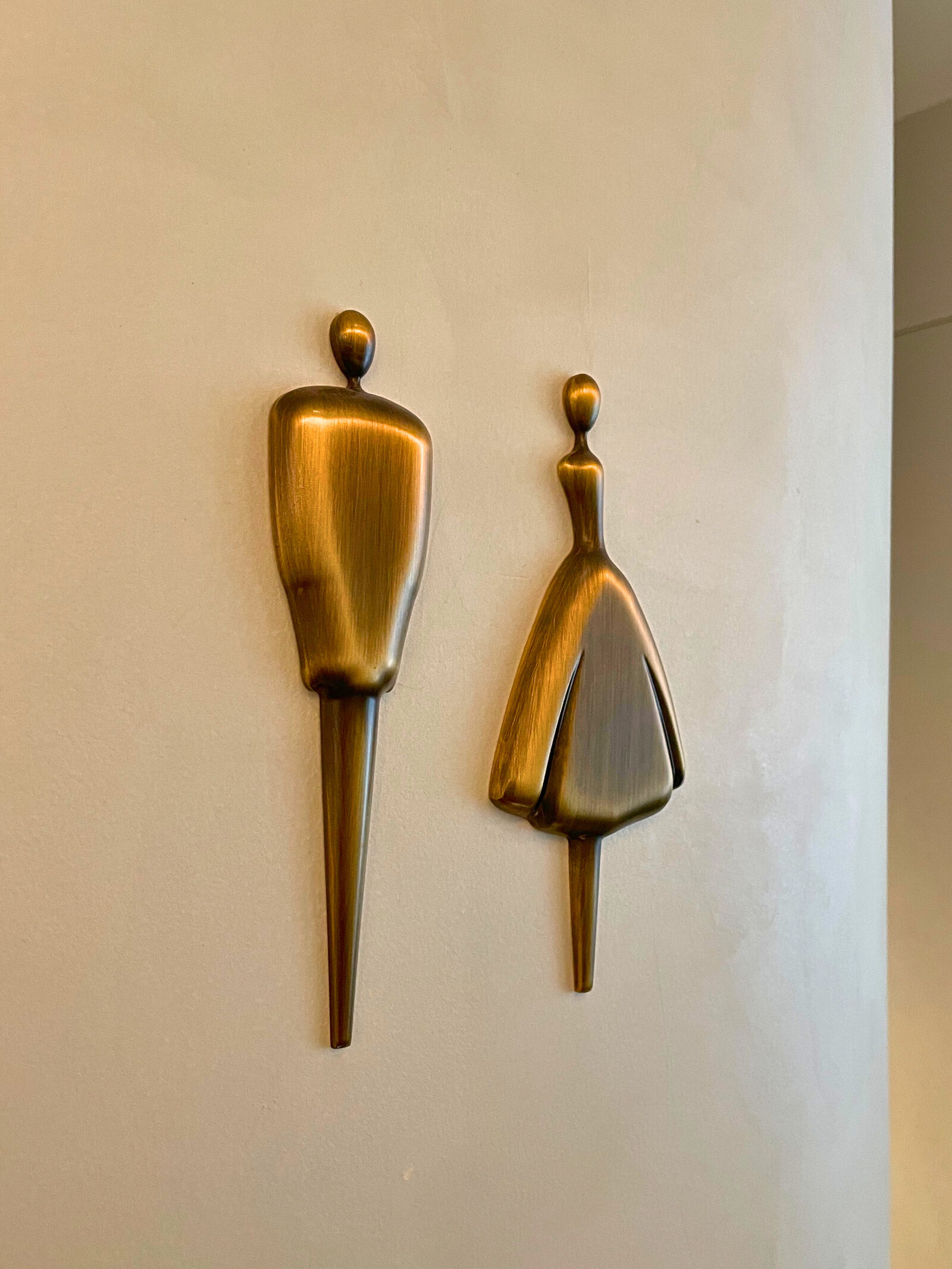
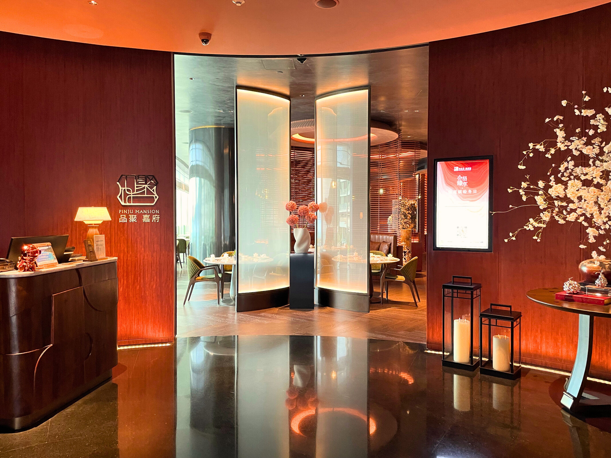
Inside, the signage system shifts to an understated elegance, using bronze stainless steel cutout graphics that harmonize with the resort’s luxurious interiors. Every sign is designed with minimalism and refinement in mind, ensuring seamless integration with the space while remaining legible and distinctive.
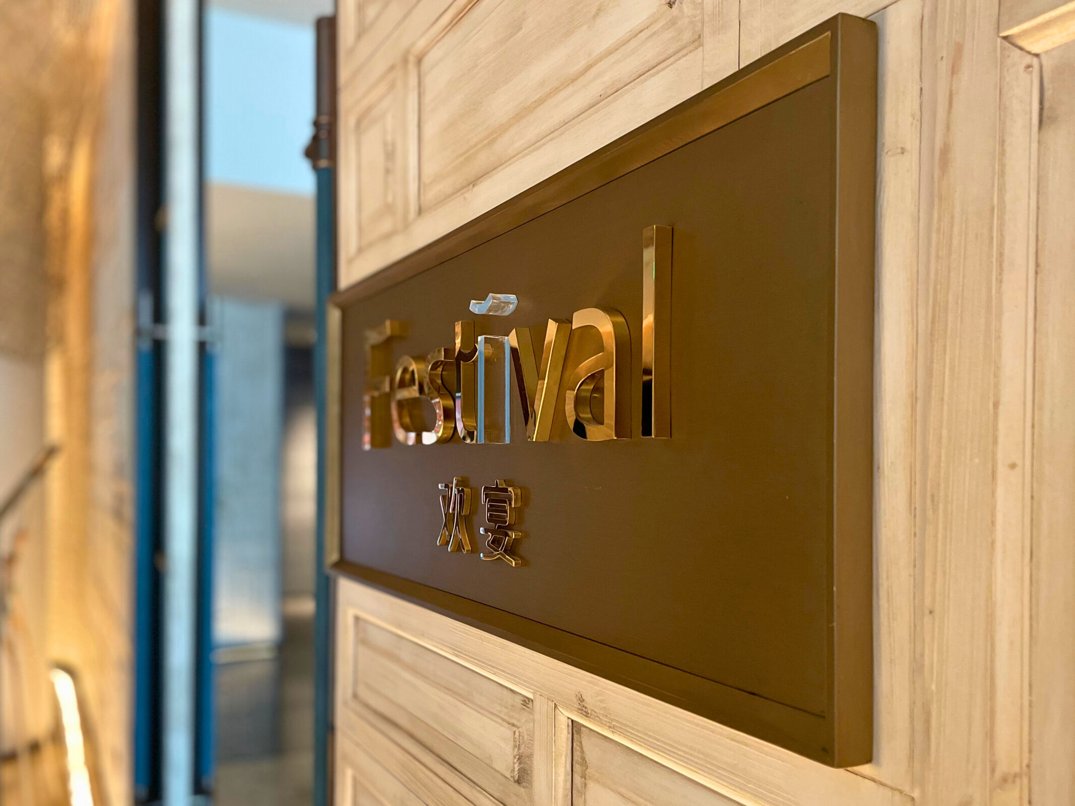
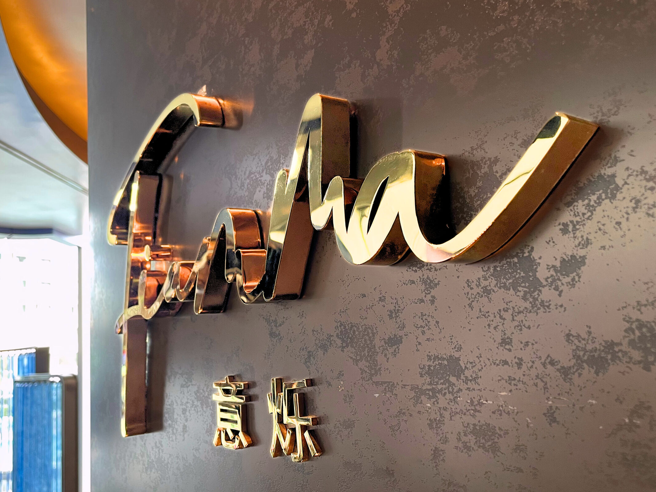
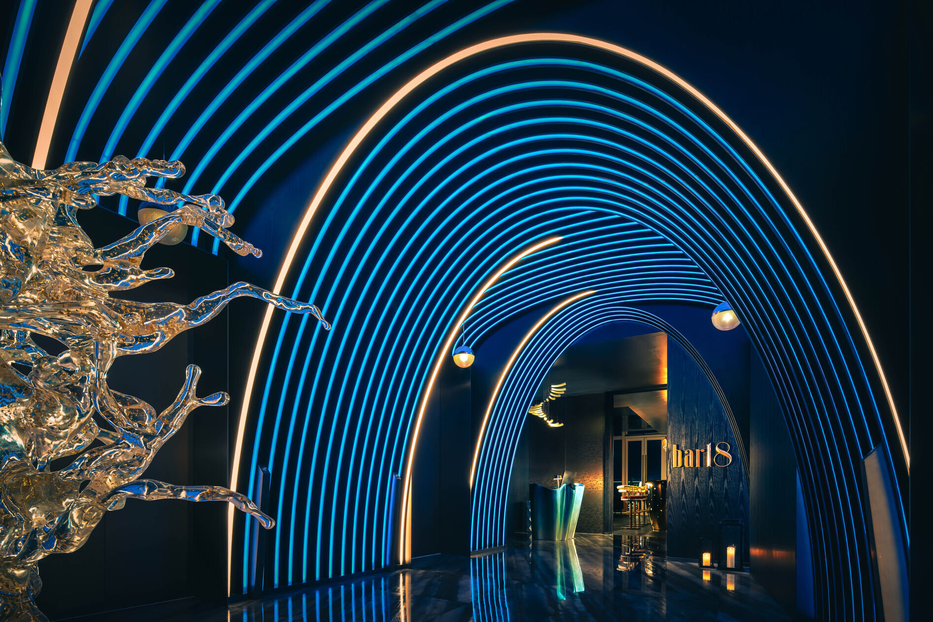
Beyond public area signage, the project includes the logo design for each of the hotel’s restaurants and bars, each tailored to match its specific identity and interior theme. For example, “18 Bar,” located on the 18th floor and exclusive to adults, features a fun and relaxed lowercase logotype that reflects its chill, stylish vibe. The all-day dining area, “Festivals,” highlights individuality by using a crystal glass “i” with blue silkscreen backing—symbolizing that the guest (“I”) is at the center of every tailor-made experience.
The signage design for Shenzhen MGM is not just visual communication—it’s part of the storytelling fabric of the resort. It reflects the brand’s commitment to entertainment, elegance, and immersive experiences, ensuring that each visitor’s journey is both intuitive and inspiring.
Credits

Entrant
Daw Production house
Category
Video - Cinematography
Country / Region
Saudi Arabia

Entrant
Blue Hat
Category
Branded Content - Social
Country / Region
United Arab Emirates

Entrant
New York Life Insurance
Category
Video - Internal Communication
Country / Region
United States

Entrant
Gravity Global
Category
Outstanding Agency Awards - Outstanding Creative / Design Agency
Country / Region
United Kingdom