2025
Shiraz Creative: More Than An Experience
Entrant
Shiraz Creative
Category
Corporate Identity - Corporate Identity Redesign
Client's Name
Country / Region
United States
In 2024, Shiraz Creative embarked on a new chapter. Our work was evolving, our clients were growing, and our team, stronger than ever, was ready to take on new challenges. However, our brand no longer mirrored the vibrant and dynamic team behind it. It felt flat, outdated, and disconnected from the innovative path we were treading.
Our decision to rebrand was not just a change in appearance, but a significant response to a gap we identified. We needed a symbol to express our creativity, culture, and humanity. The answer came in the form of a prism, a symbol that does not create light, but catches and refracts it, revealing unexpected dimensions. This became our guiding metaphor, marking a significant shift in our brand identity.
Our new logo is a geometric form that balances visual clarity with conceptual depth. Every angle was shaped to evoke motion without chaos and strength without rigidity. The prism is embedded within our mark, grounding our creative energy in a clear, intentional identity.
Color was central to the design system. Inspired by the way light moves through glass, Shiraz shines through a wide range of shades. While our default mark is blue, we can shift between solid and gradient tones to complement every partner and project. It also honors our identity as a proudly LGBTQ+-owned agency, and our unwavering commitment to authenticity and inclusion, making everyone feel valued and respected.
Since its launch, the new brand identity has not only unified our voice across continents and channels but also significantly elevated our operations. It has enhanced our pitch decks, live events, and internal culture. The prism now speaks not just to how we create, but to how we think. It reflects our belief that creativity is not manufactured, but refracted. The best ideas do not shout; they illuminate.
This rebrand isn’t a reinvention; it is a more courageous articulation of who we have always been.
Credits

Entrant
So Drama! Entertainment
Category
Corporate Identity - Logos
Country / Region
Singapore
Entrant
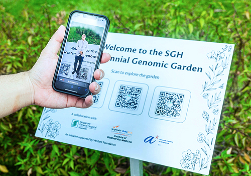
HOL Experiences
Category
Mobile App - Cause / Awareness
Country / Region
Singapore
Entrant
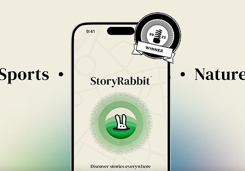
StoryRabbit
Category
Audio - Audio Tour
Country / Region
United States

Entrant
Xinyue Gu
Category
Video - Motion Graphics
Country / Region
United States