
2026
Altivera Medical: Elevating Performance. Advancing Recovery
Entrant
VIVO Agency
Category
Integrated Marketing - Company Branding
Client's Name
Altivera Medical
Country / Region
United States
Gallery


About The Entry
More than 50 million adults in the U.S. live with chronic pain. Electrotherapy was established as an effective non-pharmaceutical treatment in the 1960s, then spent decades confined to niche use. Since 1996, the business now operating as Altivera Medical has worked to change that, making prescription-strength therapy practical at home and expanding into orthopedic bracing, traction, and temperature and compression therapies.
Following its acquisition of Zynex Medical, the company needed an identity equal to what it had become: a MedTech enterprise spanning three therapy categories, serving providers and patients at every stage of recovery.
We built the brand on a clear promise. Who we are: a pain management and recovery MedTech company. What we do: help providers deliver more consistent outcomes and support recovery beyond the clinic. How we do it: clinically supported therapies, dependable device quality, hands-on support. Five pillars anchor it, Trust and Stability, Clinically Differentiated, Excellence and Quality, Patient Centered, and Innovation and Growth, expressed through a persona we named The Impactful Innovator.
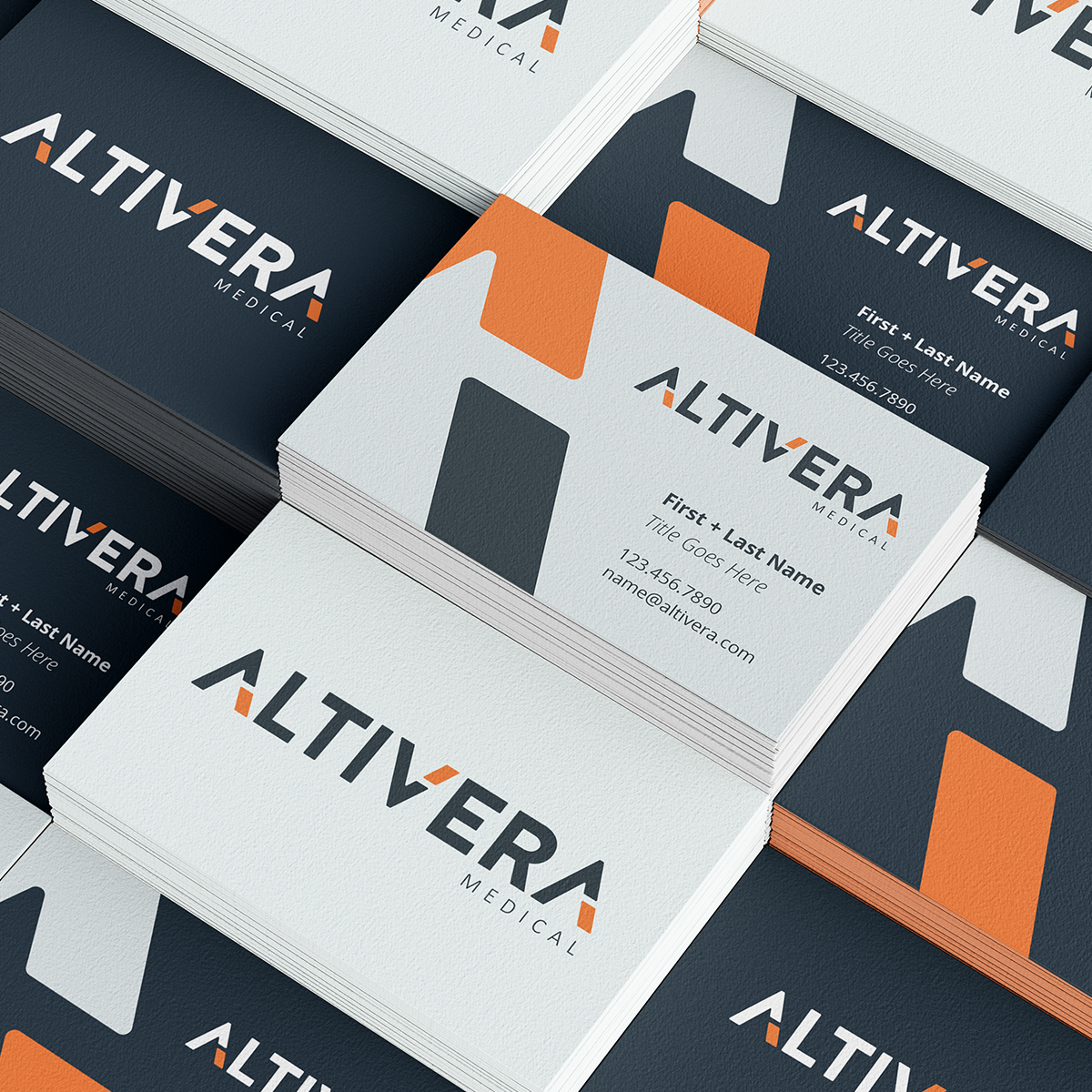
The name signals elevation and integrity, alti for height, and vera for truth. A custom "A" forms a precise architectural peak, its apex angled forward to suggest progress without the visual clichés of MedTech. That apex was extracted from the wordmark and developed into the Elevation accent, a standalone element used as a framing device, directional crop, background texture, and photographic mask.
The system pairs defined colors like Restorative Orange and Foundation Slate with Assurance Blue, Empathy Amber, Precision Mist, and Performance Gold. Open Sans Light and Bold anchor the typographic hierarchy. Custom iconography and line illustrations carry the same disciplined geometry into anatomy and device visualization. Imagery centers a slightly older demographic in unstaged moments of recovery.
A defined voice, clear and disciplined, outcome-focused, clinically credible, progress-driven, leads with reduced pain and restored function rather than product features.
The system launched on a new website organizing the portfolio into three solution paths, with a Patient Portal for ordering, billing, support, and registration. Presentations, sales materials, stationery, and a PowerPoint library complete the rollout.
Elevating Performance. Advancing Recovery.

Entrant
The Frameworks
Category
Corporate Identity - Corporate Identity Redesign
Country / Region
United Kingdom

Entrant
ANDISITES INC>
Category
Website - Government
Country / Region
United States

Entrant
Yang Yi, Yingdi Wang, Bingxue Wu, Rui Zhu
Category
Website - Art & Design
Country / Region
China

Entrant
Stephen Arnold Music (SAM)
Category
Audio - Production
Country / Region
United States