2020
Corporate Identity for a Mystery Shopping Company
Entrant Company
OWDT
Category
Corporate Identity - Corporate Identity / Other
Client's Name
Clear Evaluations
Country / Region
United States
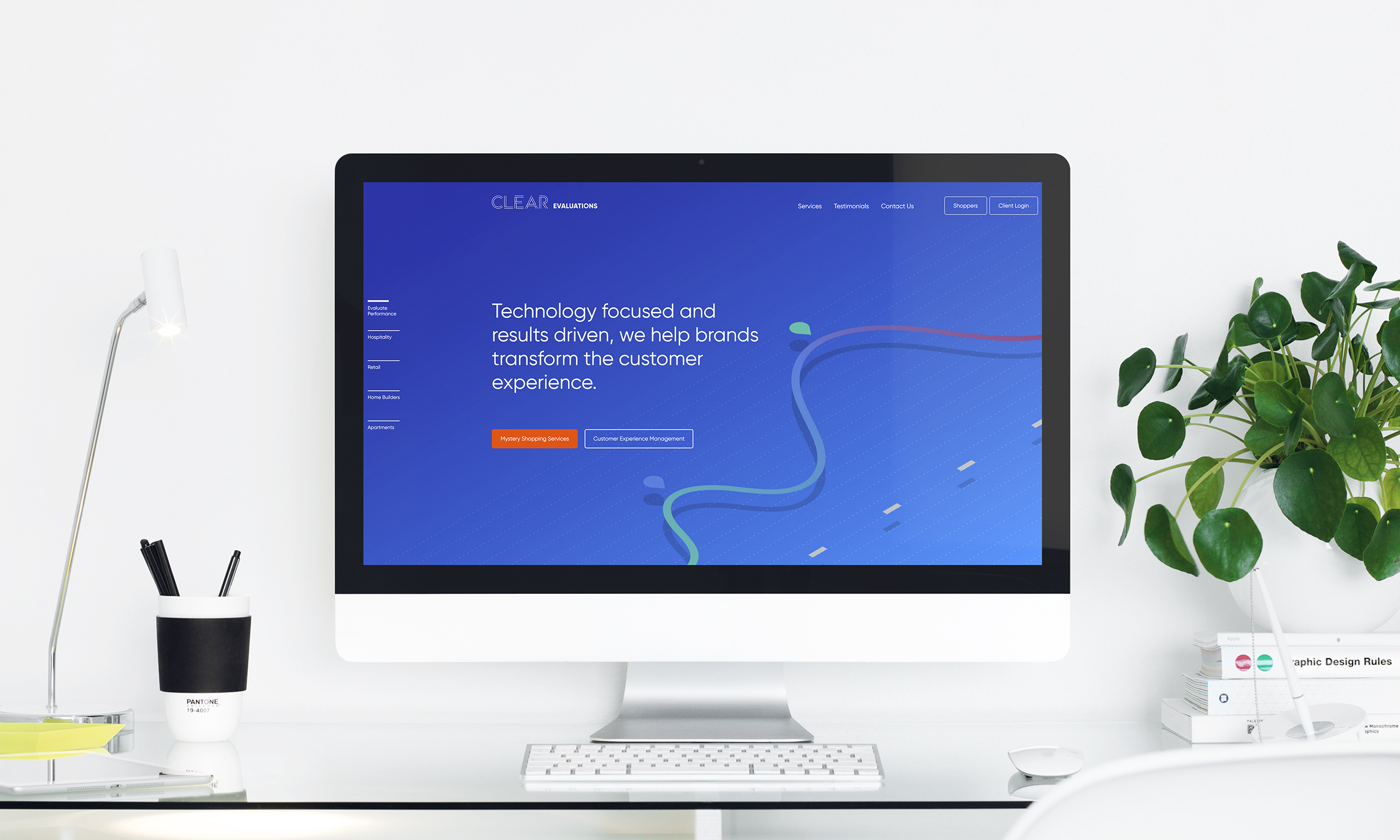
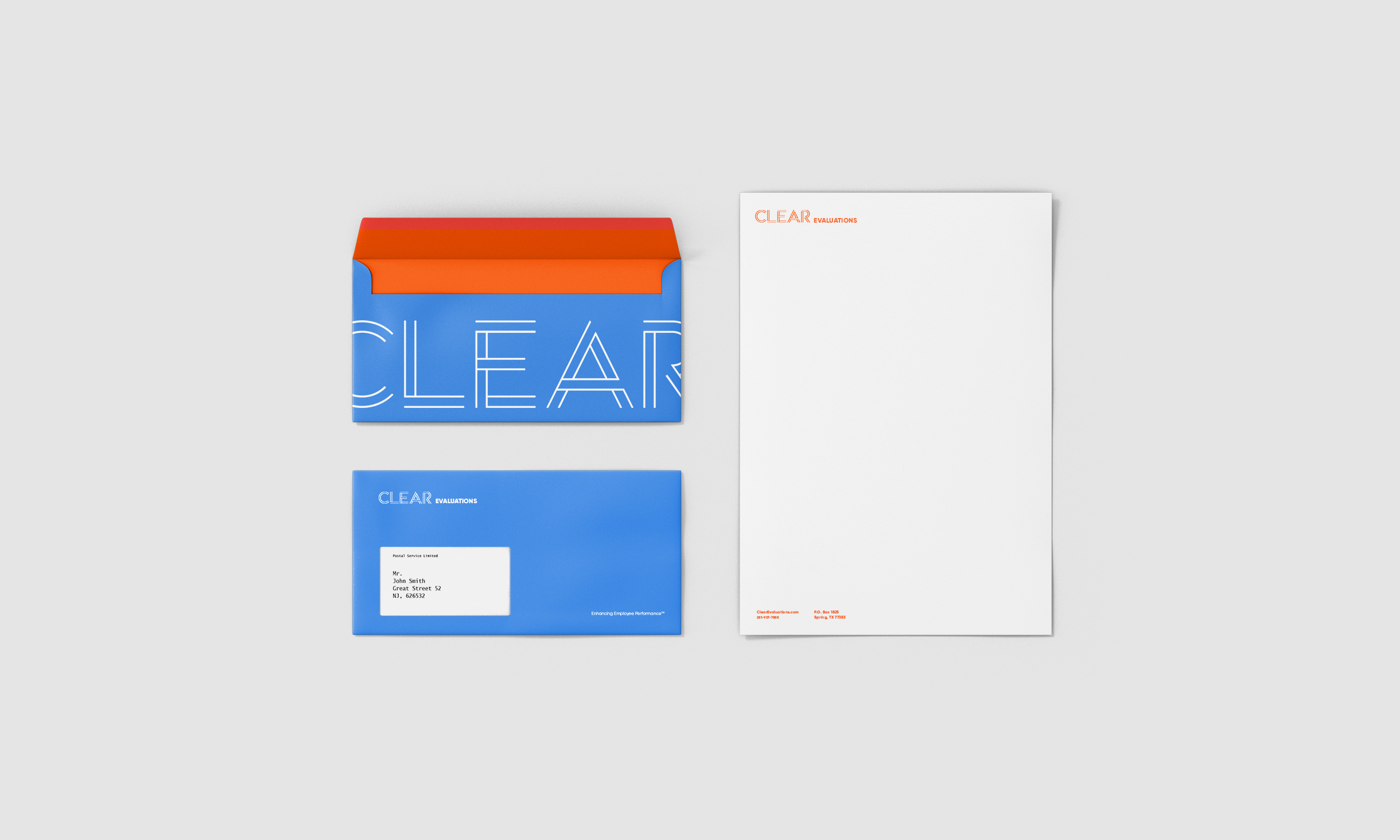
OWDT was retained to reimagine a bold and confident identity in line with CE’s productive approach. OWDT worked closely on the project with leadership at Clear Evaluations and successfully created a typographic system based on the idea of presenting a series of lines and bars, a concept highly connected to the nature of presenting data and evaluations. The primary brand color has been selected as deep blue, accented by a palette of the bright, optimistic secondary color of light blue, bright orange, and minimal green that will be residing in images. We proposed and developed images that capture the visible manifestation of Clear Evaluations’s work as well as the spirit of the less visible, as seen through the people whose lives are impacted by CE’s performance. We also developed illustrations in combination with images to describe the principles of mystery shopping and other service offerings.


Entrant Company
imaginnova
Category
Video - Event
Country / Region
United States

Entrant Company
Promoqube
Category
Integrated Marketing - Social Media
Country / Region
United States

Entrant Company
Player One Trailers
Category
Video - Cinematography
Country / Region
United States
Entrant Company
Lisa Gorham Creative
Category
Corporate Identity - Logos
Country / Region
United States