
2019
Reduced and concise brand design
Entrant
CRENEO
Category
Corporate Identity - Brand Identity
Client's Name
Dominic Quambusch Photography & Film
Country / Region
Germany
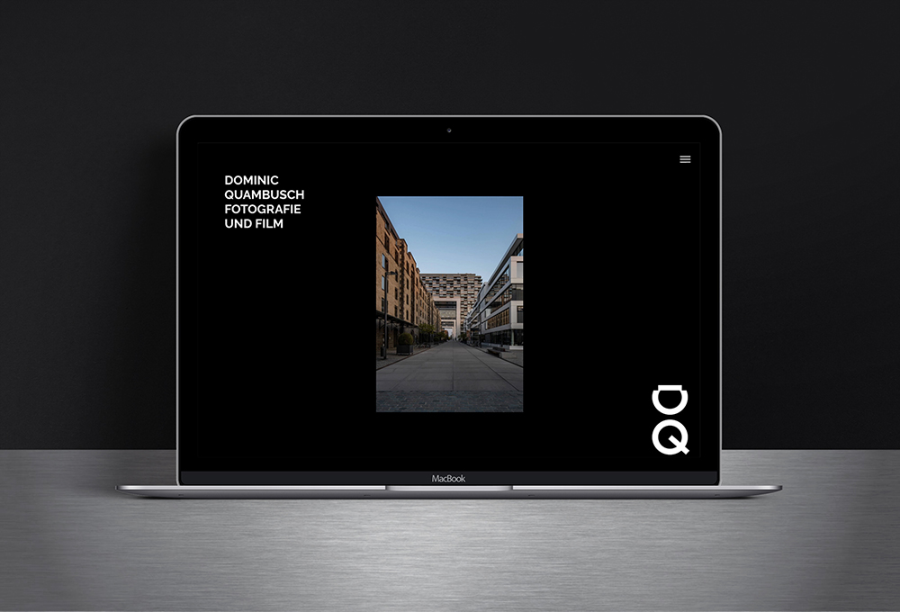
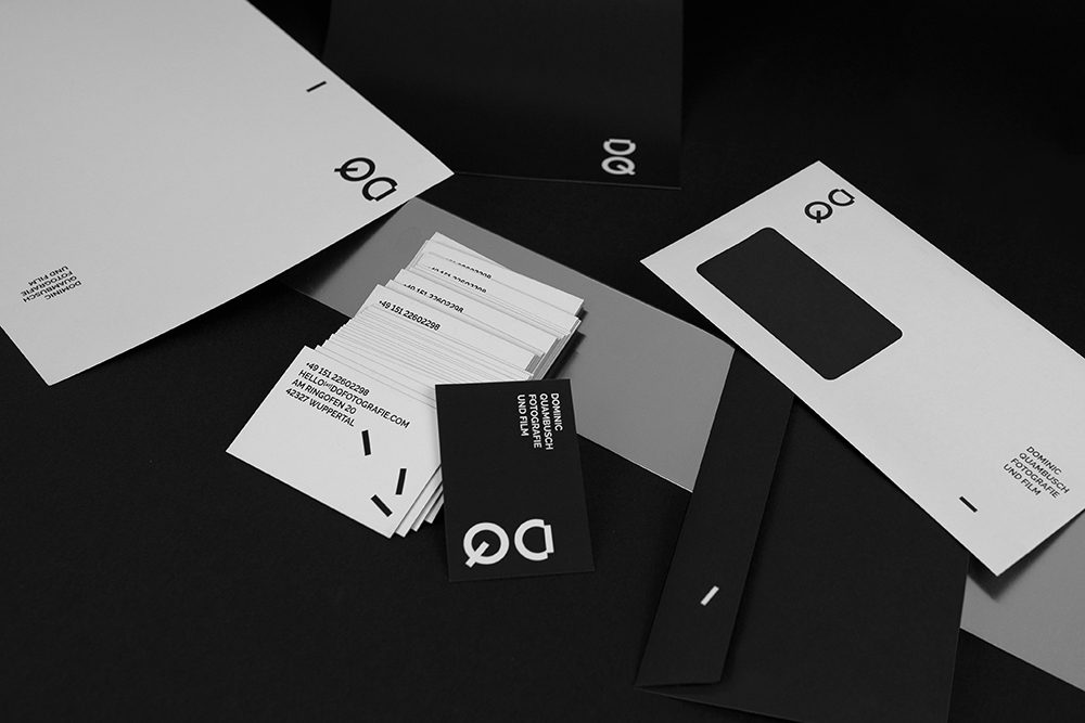
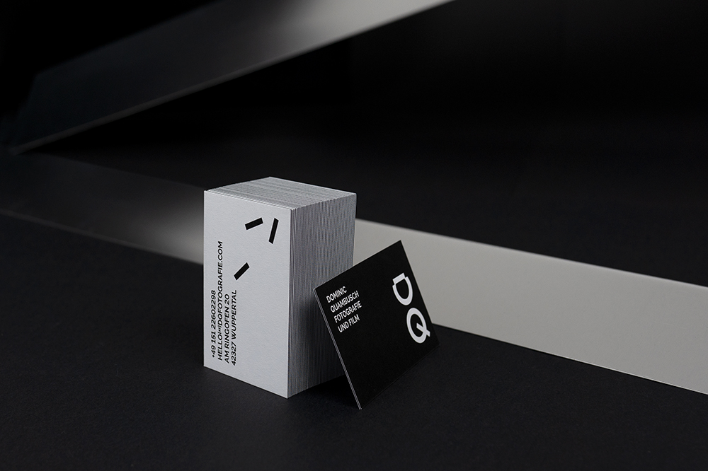
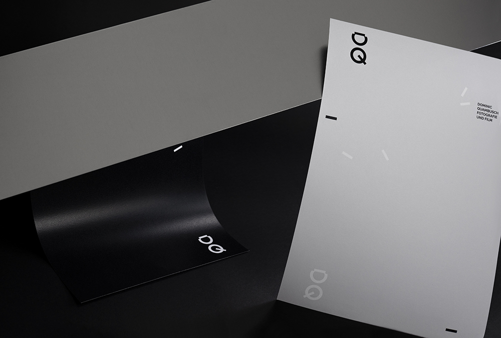
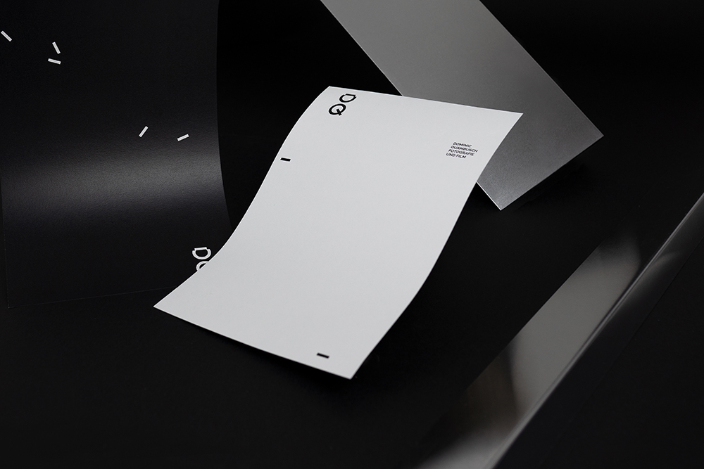
For the photographer and videographer Dominic Quambusch we were commissioned to develop a new brand design. The task was to develop a reduced and concise appearance that would not distract from the customer?s work due to its reduction but would also support its strong characteristics.
As a solution we chose a monogram for the logo from the initial letters of his first and last name ?DQ?. The design of the letters is simplified and constructed and at the same time quotes camera keys. The entire corporate design captivates with a reduced design that directs the clear focus on the photographer?s work. The monogram is flanked by the word mark ?DOMINIC QUAMBUSCH FOTOGRAFIE UND FILM?. Both the monogram and the word mark act flexibly in their arrangement on the respective visible surfaces. Small rectangles symbolising the abstract architecture or quoting the constructivism of the segment break through the grid of the remaining visual communication elements in their arrangement.
This design principle is consistently continued on the website. Here, the client?s photographic works also detach themselves from a rigid display grid and move freely on the visible tableau. Aperture, ISO and exposure time details for individual works flank the photos and at the same time act as a typographically discreet design element.

Entrant
STANDBY CREATIVE GROUP
Category
Integrated Marketing - Integrated Marketing Campaign
Country / Region
Turkey

Entrant
The Creative Bar
Category
Corporate Identity - Brand Identity
Country / Region
United States

Entrant
MOXY
Category
Website - Experimental
Country / Region
Portugal
Entrant
Bad Penny Factory
Category
Website - Professional Services
Country / Region
United States