
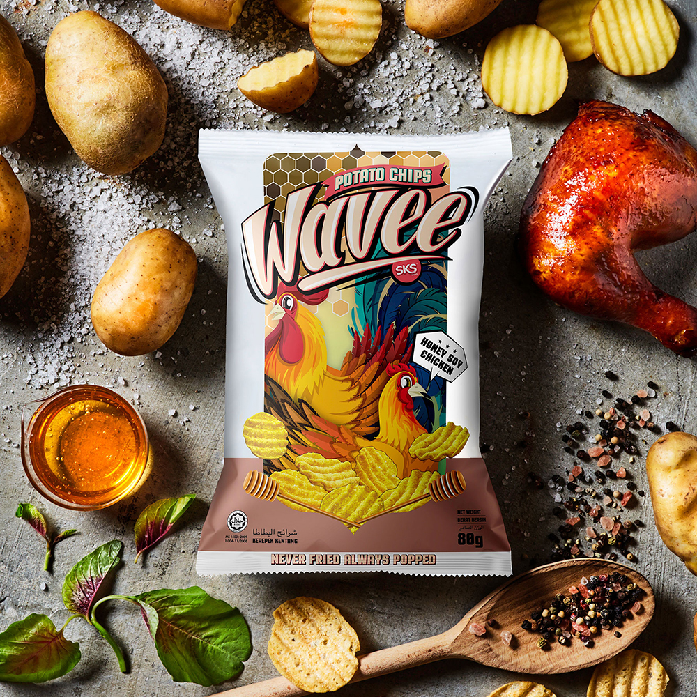
2019
Wavee
Entrant
Shawn Goh Graphic Design Lab.
Category
Corporate Identity - Brand Identity
Client's Name
SKS Food Industries (M) Sdn. Bhd.
Country / Region
Malaysia
Building up a recognizable brand identity and creating attractive product packagings for a new potato chips brand. In order to create a lasting impression and to distinguish our healthier, non-fried potato chips from the rest in the market, we use vibrantly illustrated packaging as a means to bring out the brand?s identity and the product?s features. Various themes and colors are implemented to differentiate between the flavors, while iconic elements and white blank frame on the package help maintaining a unified brand identity.


Credits
Entrant
Explanimate
Category
Video - Animation
Country / Region
Australia

Entrant
VECTOR GEMS TECH PTE. LTD.
Category
Integrated Marketing - Integrated Marketing Materials
Country / Region
China

Entrant
Latcha+Associates
Category
Content Marketing - Branded Content
Country / Region
United States

Entrant
Mengdom Design Lab
Category
Outdoor Advertising - Transit / Airport / Kiosk
Country / Region
Taiwan