2019
Triangler
Entrant
Triangler
Category
Corporate Identity - Corporate Identity, Others
Client's Name
Triangler
Country / Region
Taiwan
Triangler, a talented graphic design studio based in Taiwan, provides great design services in visual graphics and brand identity. The corporation was founded by three designers. The all lowercase logotype is to capture their young spirit and modern design style. The letter ?g? is a transformation of the number ?3?. To express the attitude of enlighting the true color of the clients? brands, a neutral grey is chosen to be the main color, which represents the inclusiveness of Triangler. Interestingly, the Chinese name of the studio read exactly as the sound of ?sandwich? to echo the flavorful works they do; hence, the accent colors: green, red and yellow are the connections of lettuce, tomato and cheese in the tasty sandwich. Wish all the clients can get a chance to take a bite!<br>
Credits
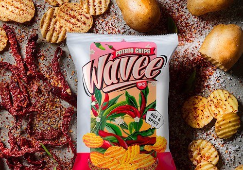

Entrant
Shawn Goh Graphic Design Lab.
Category
Corporate Identity - Brand Identity
Country / Region
Malaysia
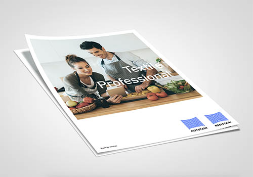

Entrant
Triangler
Category
Corporate Identity - Brand Identity
Country / Region
Taiwan


Entrant
Roars Technologies Pvt. Ltd.
Category
Website - Design / Web Agency
Country / Region
India


Entrant
Simantel
Category
Strategic Program - Digital Marketing Campaign
Country / Region
United States


