
2020
Greenwood Financial logo development
Entrant Company
Ragsdale Design Group
Category
Corporate Identity - Logos
Client's Name
Greenwood Financial
Country / Region
United States
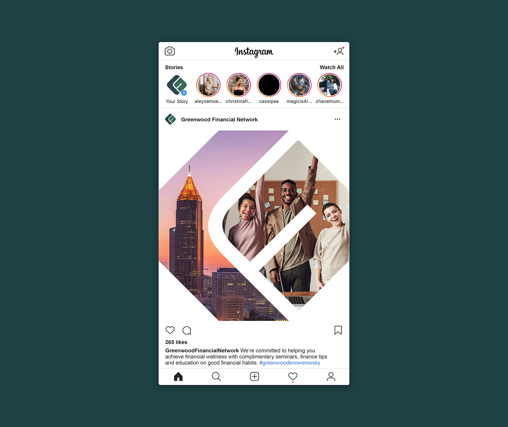
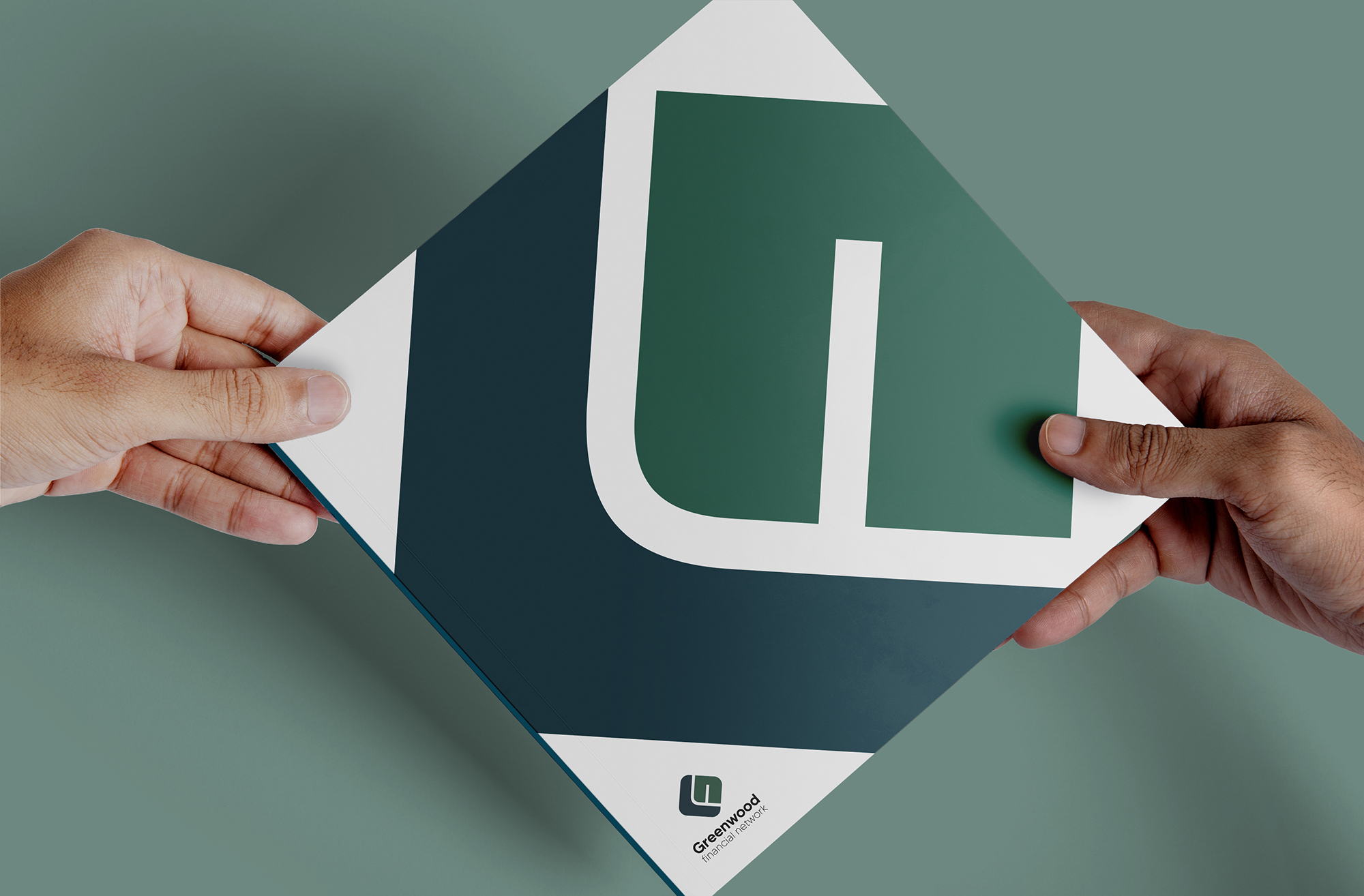
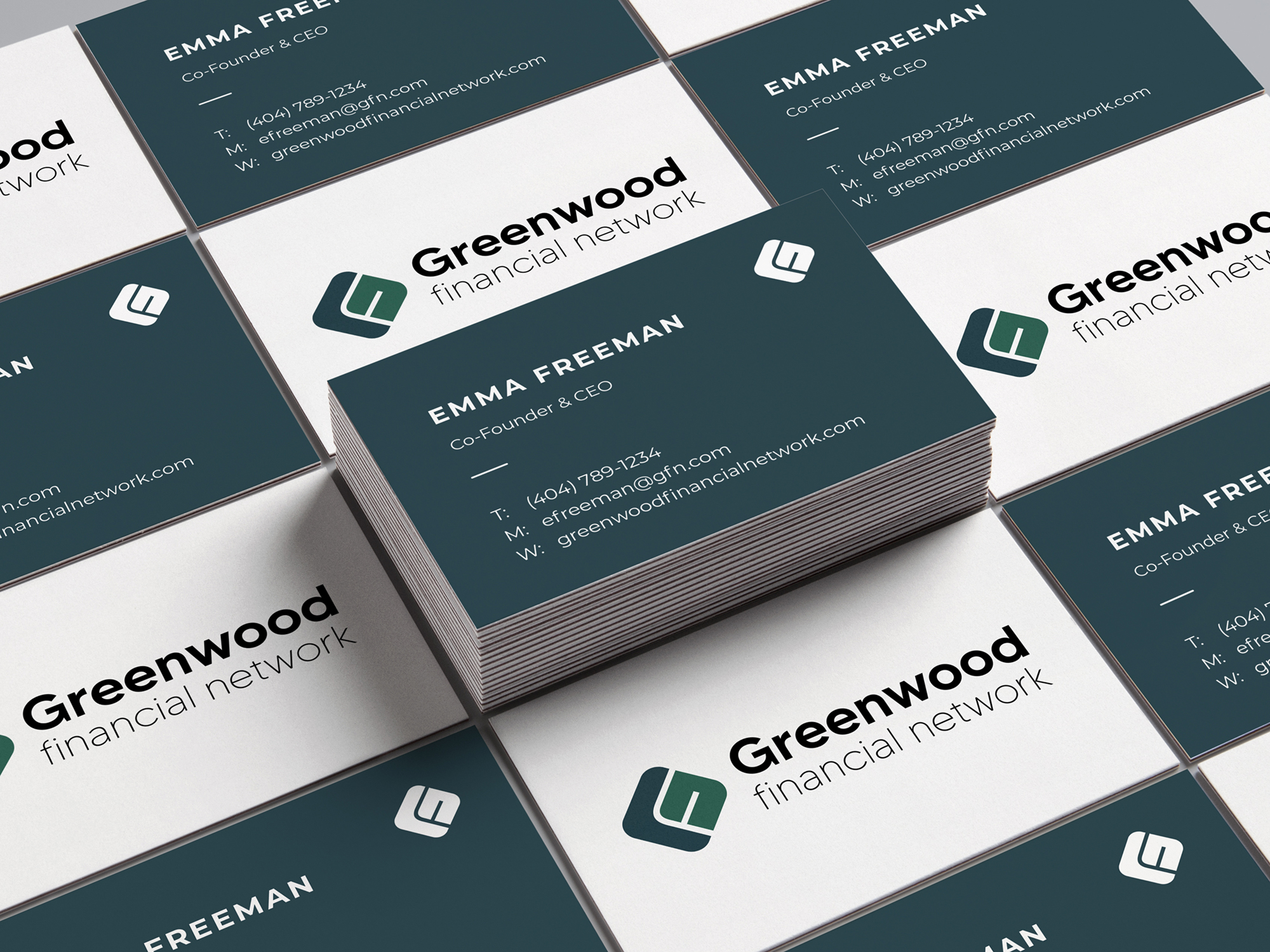
RDG wanted to revitalize Greenwood Financial Network’s brand with a sleek, invigorated look and feel to better reflect the purpose of their services while maintaining the integrity of their original color scheme. To meet these goals, RDG conducted thorough research on the psychology and symbolism of color. The result, a palette of blues and greens, reflects notions of growth, fortune, learning, and empowerment. The color palette is accompanied by a bold and elegant sans-serif typeface. Finally, RDG created a logo that emphasizes the initials of Greenwood Financial Network, interlocking each letter in a harmonious combination.

Credits

Entrant Company
Clarity Partners, LLC
Category
Website - Financial Services
Country / Region
United States
Entrant Company
Decca
Category
Marketing & Promotional - Cover (DVD / CD / Book)
Country / Region
United States
Entrant Company
Dragonfly limited
Category
Corporate Identity - Logos
Country / Region
Kenya

Entrant Company
Freelance
Category
Student Submission - Student AD
Country / Region
India