
2020
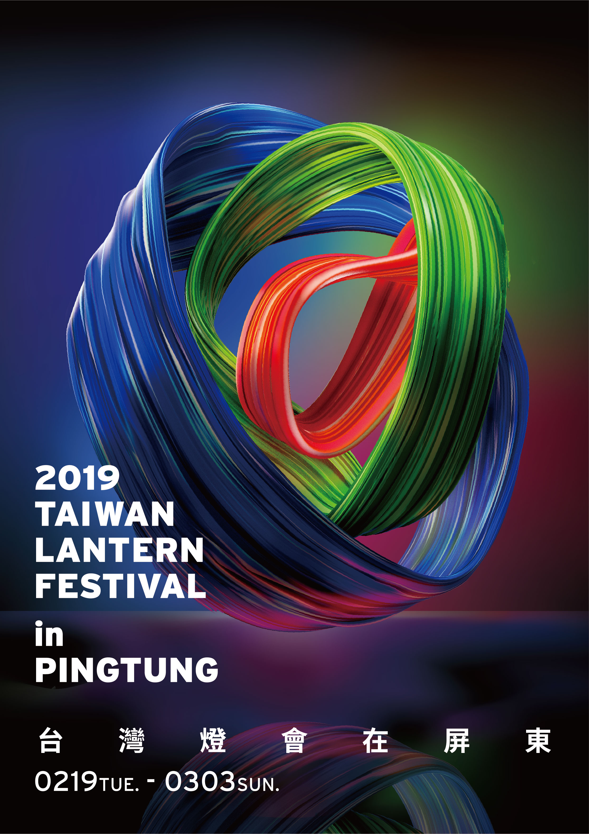
2019 Taiwan Lantern Festival in Pingtung
Entrant Company
Pingtung County Government Taiwan
Category
Marketing & Promotional - Poster (Single)
Client's Name
Country / Region
Taiwan
The Taiwan Lantern Festival in Pingtung was the 30th anniversary of the event, and it was its first time to create a venue at a coastal area. Pingtung is a county with advanced industry in agriculture and fishery. With three ocean adjacent to the county, the lives here is deeply connected with the sea. The society is multi-cultural with different ethnicity including hakka, aboriginal, mainland, and new inhabitants. Thus a unique symbol that represents Pingtung was created using the elements of "the ocean, the land, and the people." With the main design of a nerver-ending möbius strip and the colors of blue, green and red, the symbol illustrates an imagine of the ocean surround the land, and the land surrounding the lives; which demonstrates the picture of the sustainability in life and the possibility for future development. The bright color further on represents the enthusiastic and energetic side of the county. This is the first time the Taiwan Lantern Festival uses the idea of "vitality" as the core of the design, instead of using the Chinese Zodiac as it has been done in the past.
Credits

Entrant Company
Player One Trailers
Category
Video - Art & Design
Country / Region
United States

Entrant Company
Zulu Alpha Kilo
Category
Audio - Audio / Other
Country / Region
Canada

Entrant Company
Kate Dawkins Studio
Category
Video - Art & Design
Country / Region
United Kingdom
Entrant Company
DeVito/Verdi
Category
Marketing & Promotional - Illustration
Country / Region
United States