2020
Creating a New Identity for Mango
Entrant Company
The Office of Experience
Category
Corporate Identity - Brand Identity
Client's Name
Mango Languages
Country / Region
United States
Over several years, Mango Languages had established a well-regarded language learning platform with a consistently growing user base. But as new competitors entered the space, differentiation became a challenge. Mango needed a fresh take on their brand in order to communicate a clear and distinct message and stand apart from the crowd.
Where Mango’s prior brand took a whimsical approach to telling the company’s story, the team wanted its next iteration to reflect a more mature, bold and confident tone establishing instant credibility.
Where most competitors claim ease and speed, Mango acknowledges that language learning takes hard, but rewarding, work. Our newly defined brand position centers on a brand narrative aimed at a key customer target: bold, curious individuals tackling a new language in order to maximize the possibilities of adventure in their lives.
OX designed the identity to reflect the vibrancy and boldness of this community. The logo draws inspiration from maritime flags, a universal mode of communication that symbolizes Mango's commitment to helping people understand each other better. Colors commonly found in national flags around the world make up the logo and the brand’s core palette, bringing a sense of global exploration and togetherness.


Credits
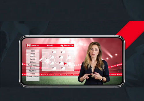
Entrant Company
Promoqube
Category
Strategic Program - Digital Marketing Campaign
Country / Region
United States
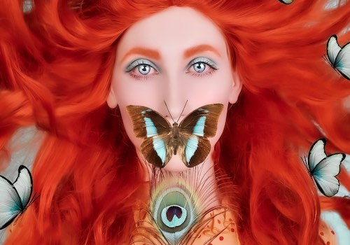
Entrant Company
Priscilla Vezzit Ferreira
Category
Photography - Digital Enhance
Country / Region
France

Entrant Company
Player One Trailers
Category
Video - Trailers
Country / Region
United States

Entrant Company
Ben Purkiss Design
Category
Website - Financial Services
Country / Region
Canada