
2020
t3_arquitectos
Entrant
Eduardo Miguel González Fraile
Category
Corporate Identity - Logos
Client's Name
Country / Region
Spain
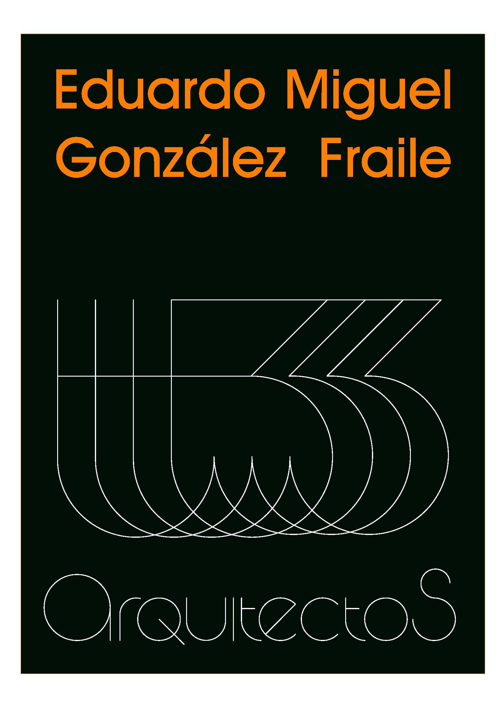
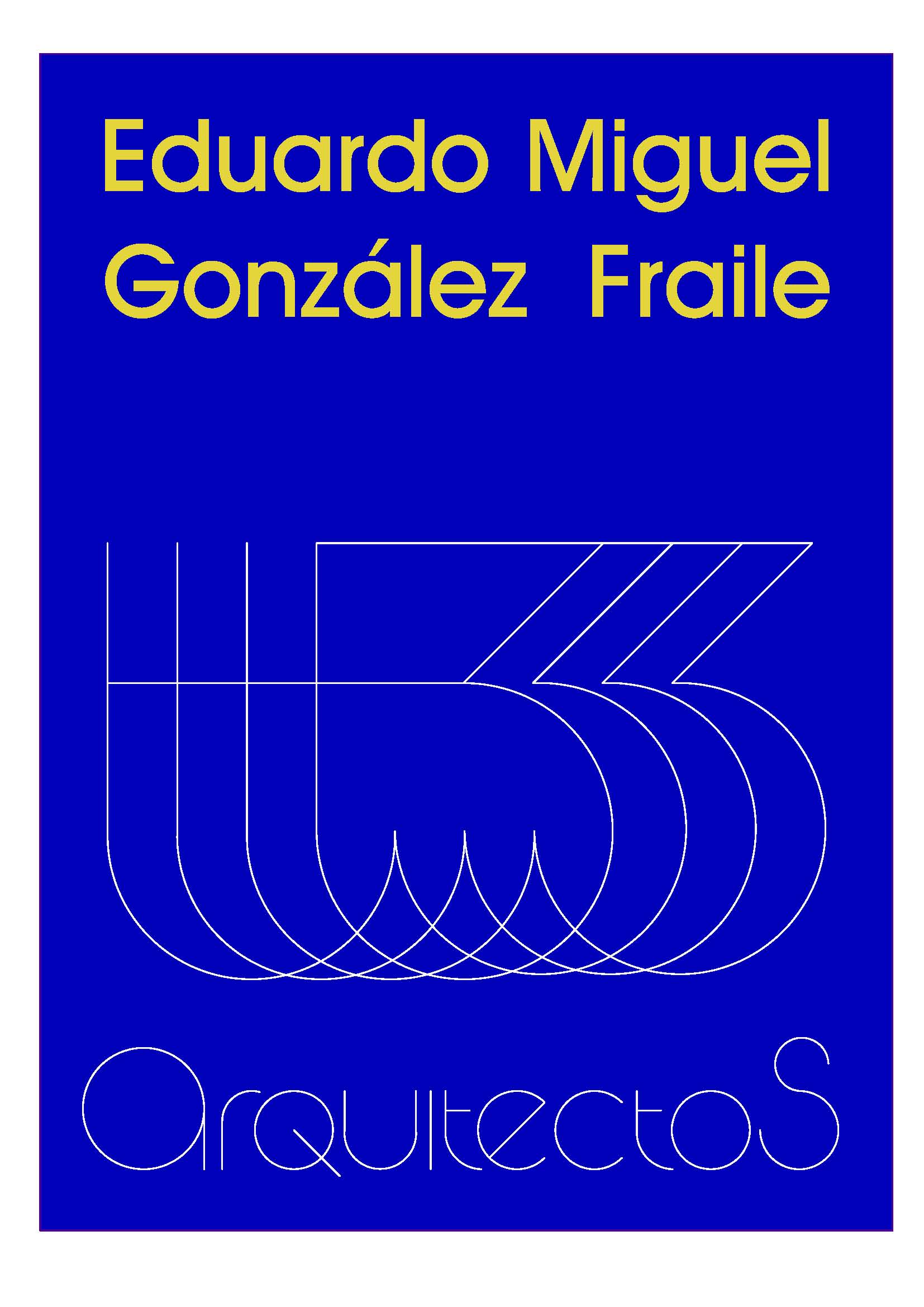
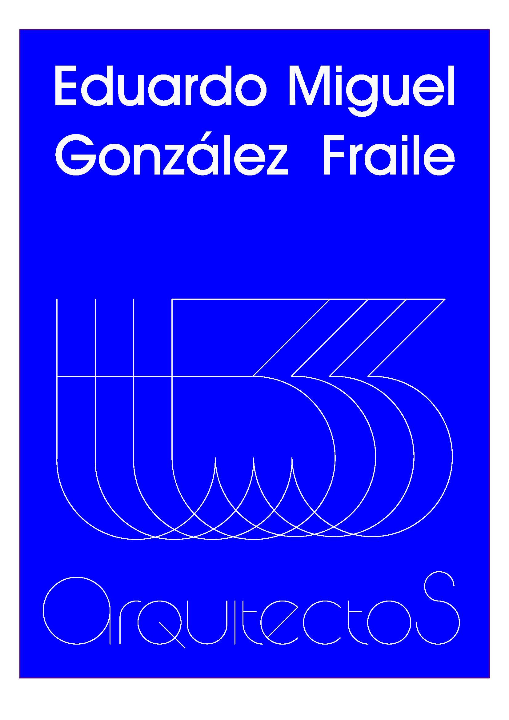
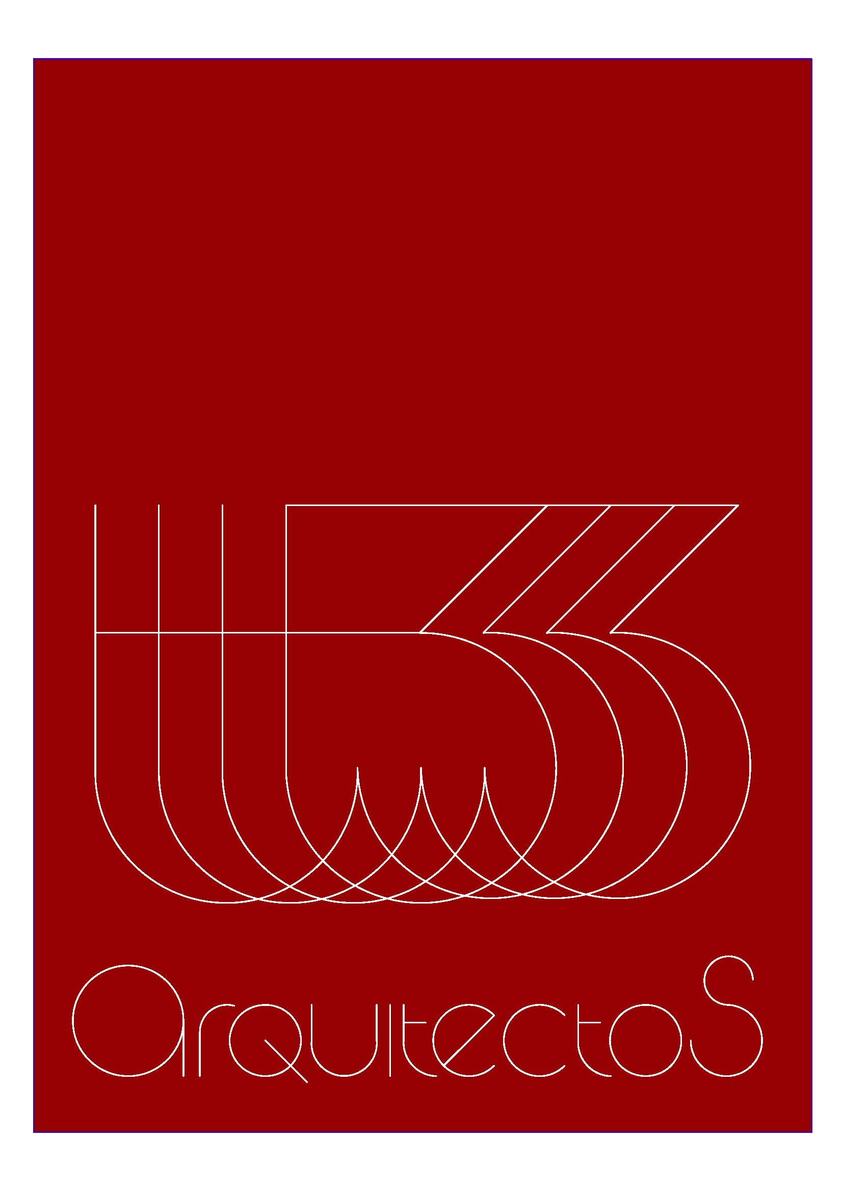
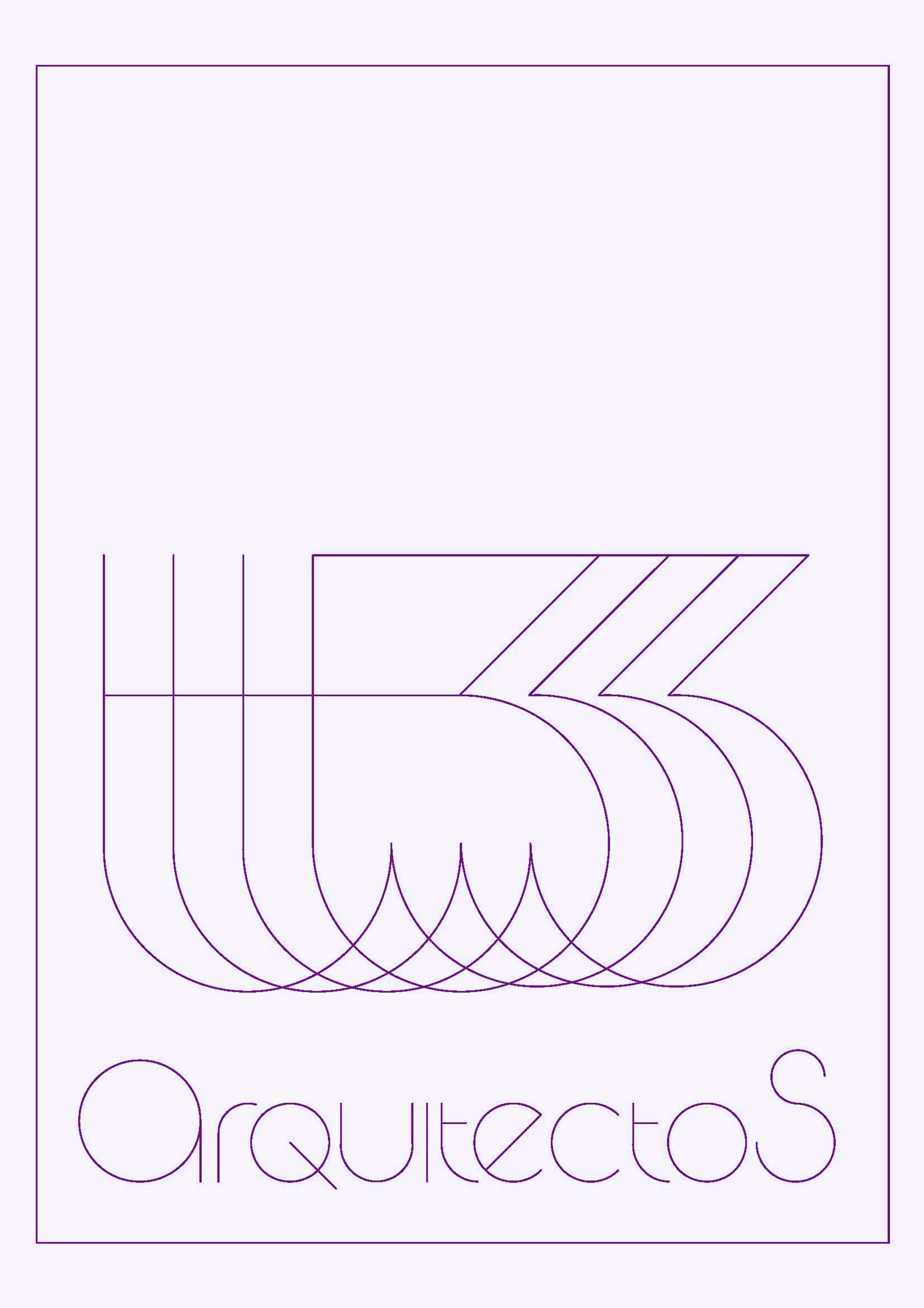
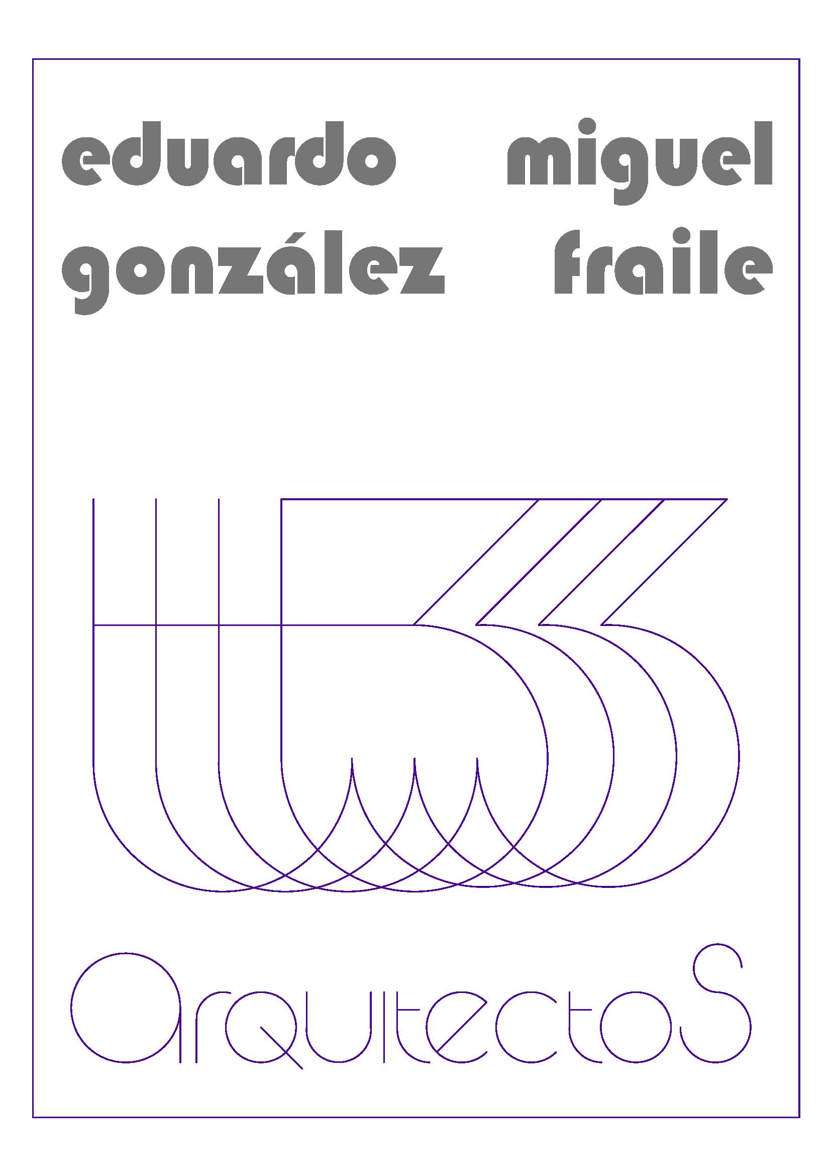
It is the logo of an agency or architectural studio where 3 architects work. The design is intended to be very light and closed contour, forcing the image to be remembered precisely because of its vibration and repetition. This design is transferred to several elements that make up the brand and graphic image of the architecture studio. For example, as a buffer or seal that accompanies the signatures or boxes of the plans and also as an identification plate to place on the door of the workplace or on the street on the facade of the building. Depending on its use it will have different sizes and the materials will be different. On the outside a plastic sheet with the logo caught between two glasses as a sandwich will be sufficient protection. In general it will be made a white background with the color line that best suits the representation of what it identifies: it is very useful for example, for sets of folders or planes, placing the logo in the color of each concept, such as construction plans, installation plans, design plans, details, etc.
However, as understood both the background color and the color of the line can be adapted to convenience as well as materials and textures, always with the conditions of durability, readability and cleanliness. In the white part of the upper area you can put in the appropriate size the name of one or more architects, as indicated in the attached drawing. In this way a simple logo is very versatile and conveys the qualities that graphic design can attribute to an architectural studio: elegance, cleanliness and geometric quality.




Credits
Entrant
WMUL-FM
Category
Social Media - Twitter Page (NEW)
Country / Region
United States
Entrant
AARP
Category
Corporate Identity - Brand Identity
Country / Region
United States

Entrant
Vimax Media
Category
Video - Food & Beverage
Country / Region
United States
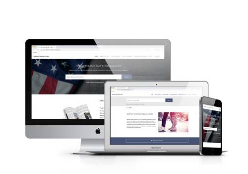
Entrant
Bad Penny Factory
Category
Website - Nonprofit
Country / Region
United States