2021
Placerville Food CO OP Logo
Entrant Company
MiDESign & Marketing Consultancy
Category
Corporate Identity - Logos
Client's Name
Placerville Food CO OP
Country / Region
United States
The Placerville CO OP is located in the heart of the town of Placeville, an early gold mining settlement formerly known as Hangtown and Old Dry Diggins. Once known for its notorious reputation for vigilante justice carried out by hangings. Old Dry Diggins was a gold mining camp on Hangtown Creek established in 1848.
The store rebranding brief was simple, to redesign the 2011 existing corporate identity putting properly portraying core values of local, freshness and accessibility while enticing larger membership and visitor traffic!
The challenge was to design a friendly inviting logo configuration that differentiated itself from the competing big box supermarkets and convey the freshness, farm to fork, local essence of the CO OP as a primary fresh produce outlet within the local community. This in a distinctive, artisanal way, in an inviting, local, almost 'welcome home feeling' for its members and client base.
The integrating of the unglamorous and often overlooked beet, within the heart of the logo was to highlight the importance of freshness and local nature as the core value and very essence of not only the store produce but of the CO OP as a whole. A little like the town of Placerville itself, not necessarily glamorous, but distinctive, unpretentious, good & honest.
The beet also provided a distinctive symbol to allow maximum flexibility, but integrated within the very fabric of the configuration, so as to ensure consistency, with the tag line further reinforcing messaging.
Color selection and typeface usage have been chosen to further champion this philosophy, creating an air of provincial freshness, but with a tinge of individuality accurately reflecting the culture of the store.
The logo was launched but a few months ago and we are currently in the process of rolling out the entire corporate identity, starting with in-store promotional material, following onto digital, signage and store make over.
We all hope you like it.


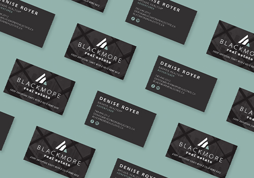
Entrant Company
Paper Lime Creative
Category
Corporate Identity - Brand Identity
Country / Region
Canada
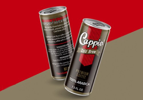
Entrant Company
CBC Creative
Category
Integrated Marketing - Product Branding
Country / Region
United States
Entrant Company
Cognitiv
Category
APP - Entertainment
Country / Region
United States
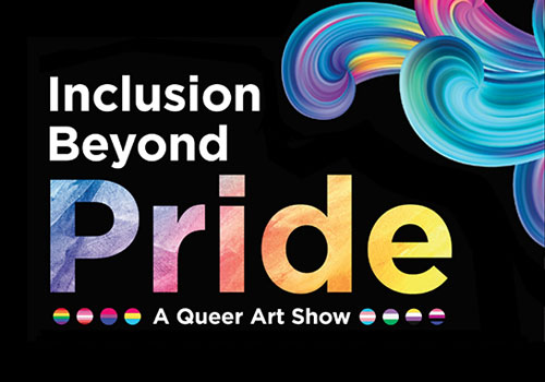
Entrant Company
AltaMed Health Services
Category
Social Media - LGBTQ+ (NEW)
Country / Region
United States