2021
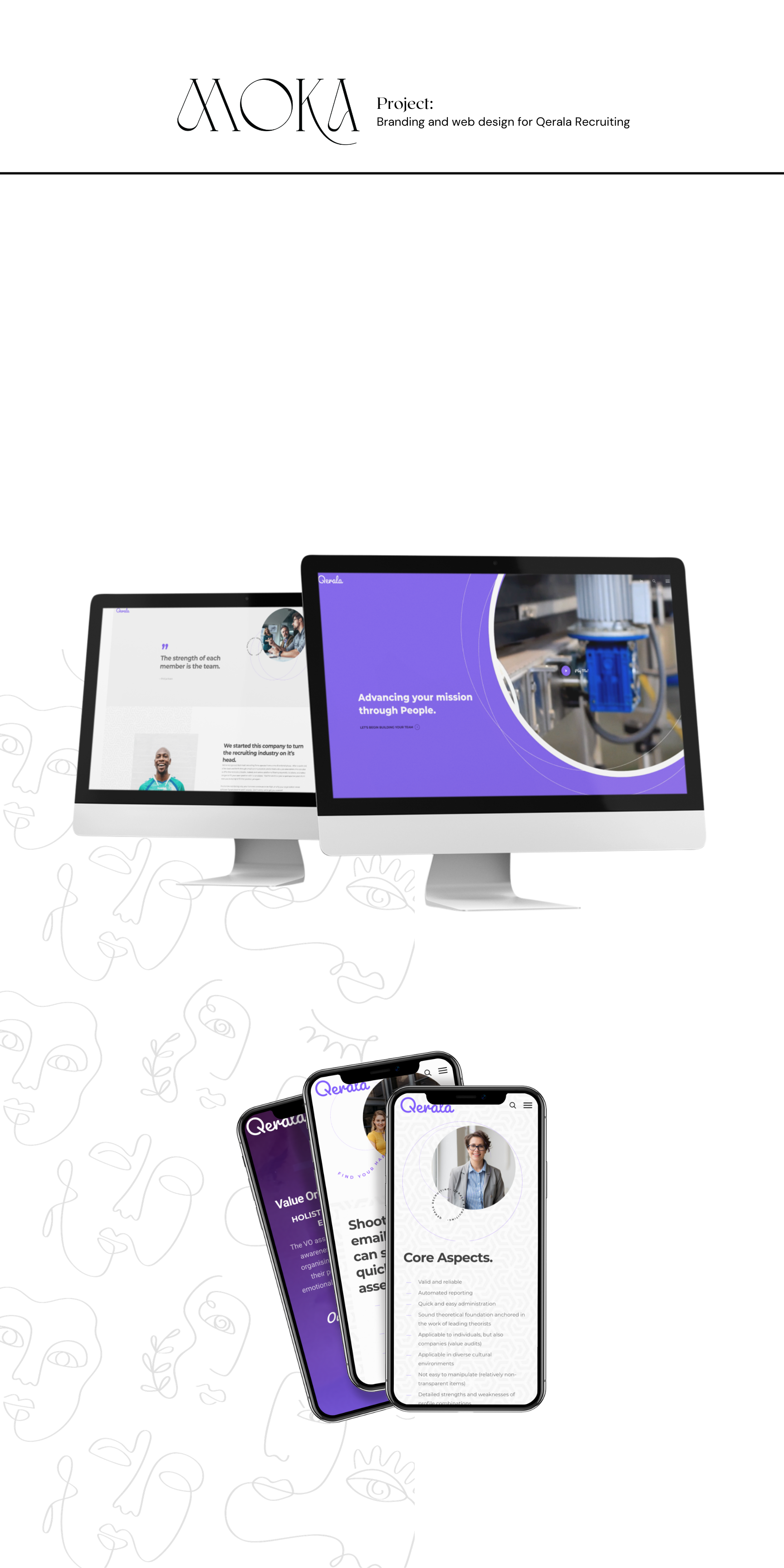
Qerala Brand and Web Design
Entrant
MOKA Creative
Category
Website - Employment
Client's Name
Qerala Recruiting
Country / Region
United States
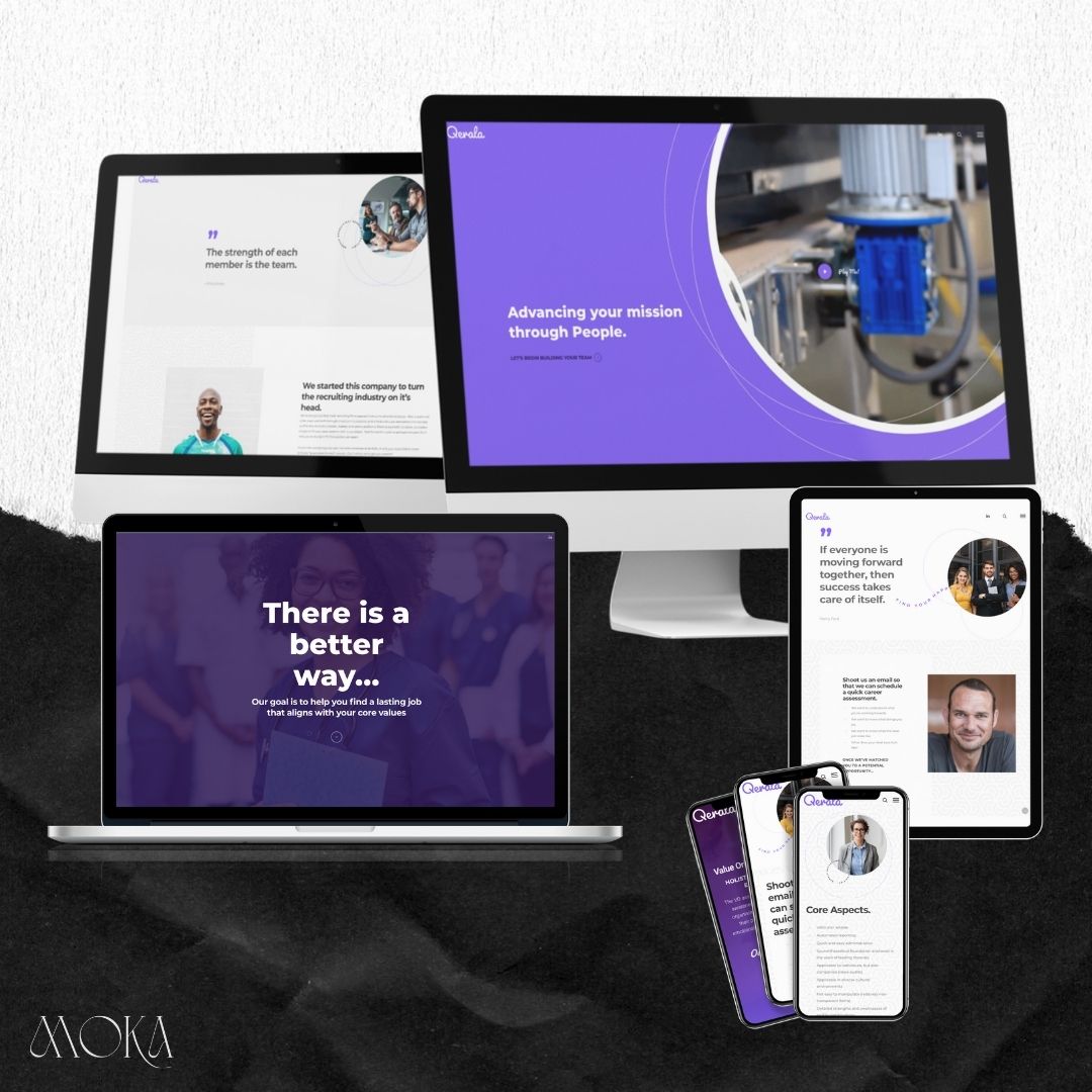
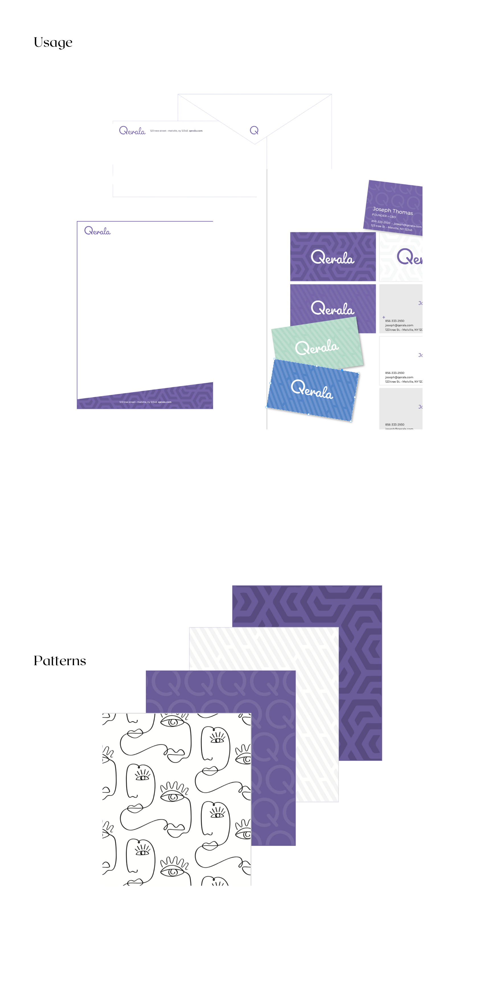
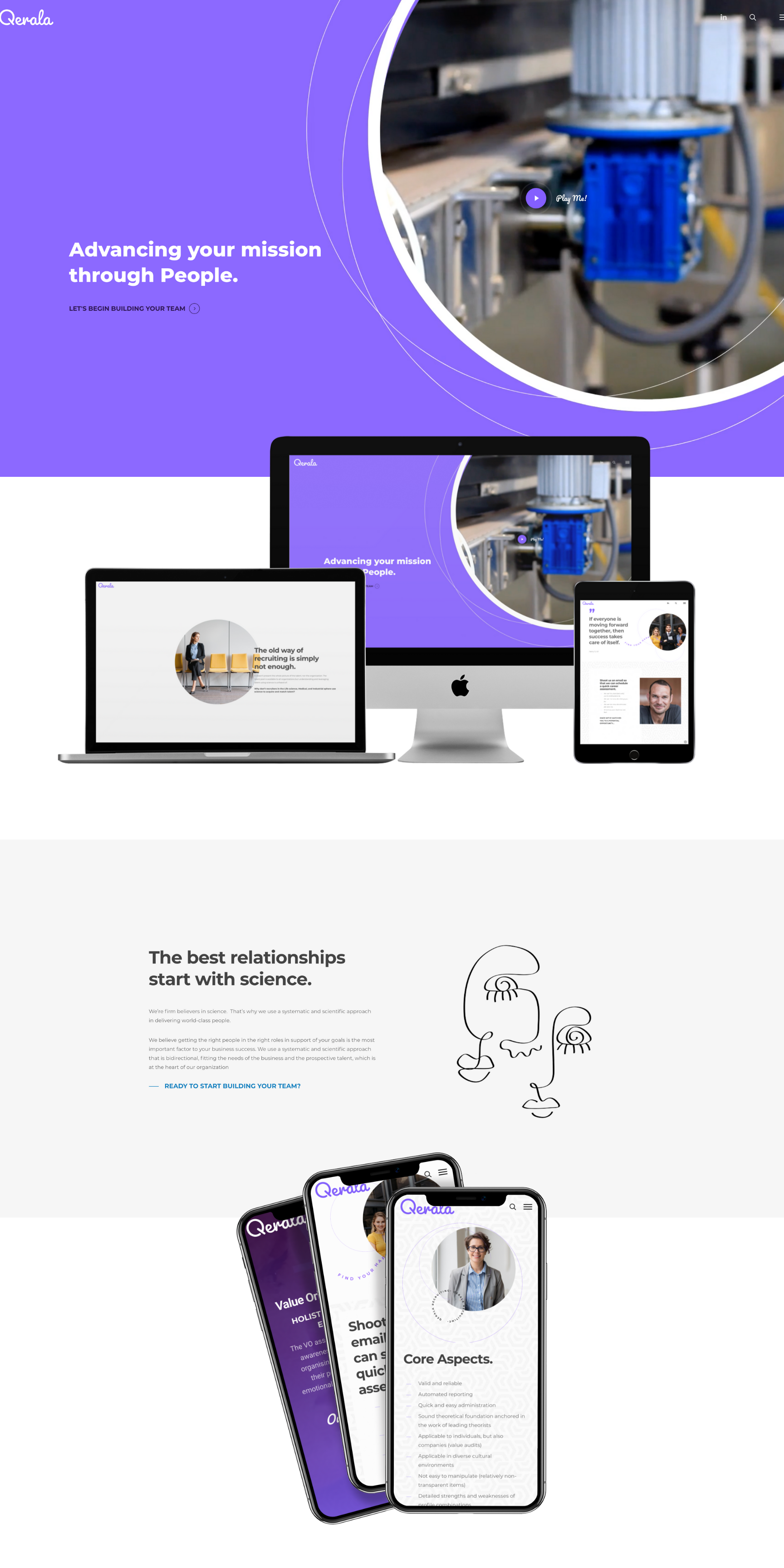
Qerala Recruiting was created to change the face of job placement. It's about a synergistic connection based on a scientific process rather than just qualifications. We created a people- and personality-first brand. We paired vibrant colors and layered in patterns and motion — a nod to the intricate process of employee placement but the energy of finding your purpose. The brand represents possibility, expertise, clarity, and purposeful alignment. The user experience is meant to guide both the company and the job seeker to the right spot. Again, leaning on the promised clarity of the journey they were about to embark on. Once in the correct area, the focus is on inspiration and education with a call to action to sign on and get assessed. The whimsical patterns and text are meant to highlight the exciting journey. The refined design with ample whitespace is meant to give the user a feeling of expertise but with a breath of fresh air. Purple was chosen as the main brand color because it both calms and stimulates our bodies, putting us in the right place for introspection and focused insight. It fosters creativity by awakening our senses while promoting the quiet necessary to make intuitive, insightful observations. Purple creates a harmonious balance of awareness and peace.
.gif)
.gif)


Credits

Entrant
27 Design Co., Ltd.
Category
Video - Motion Graphics
Country / Region
Taiwan
Entrant
The Vilcek Foundation
Category
Video - Nonprofit
Country / Region
United States

Entrant
Flying Lap Media
Category
Video - Sports
Country / Region
United States
Entrant
Holition
Category
Experiential & Immersive - Augmented Reality
Country / Region
United Kingdom