2021
Art Basel in Hong Kong 2019
Entrant Company
Tom Postma Design
Category
Experiential & Immersive - Expos, Conventions & Trade Shows
Client's Name
Art Basel
Country / Region
Netherlands
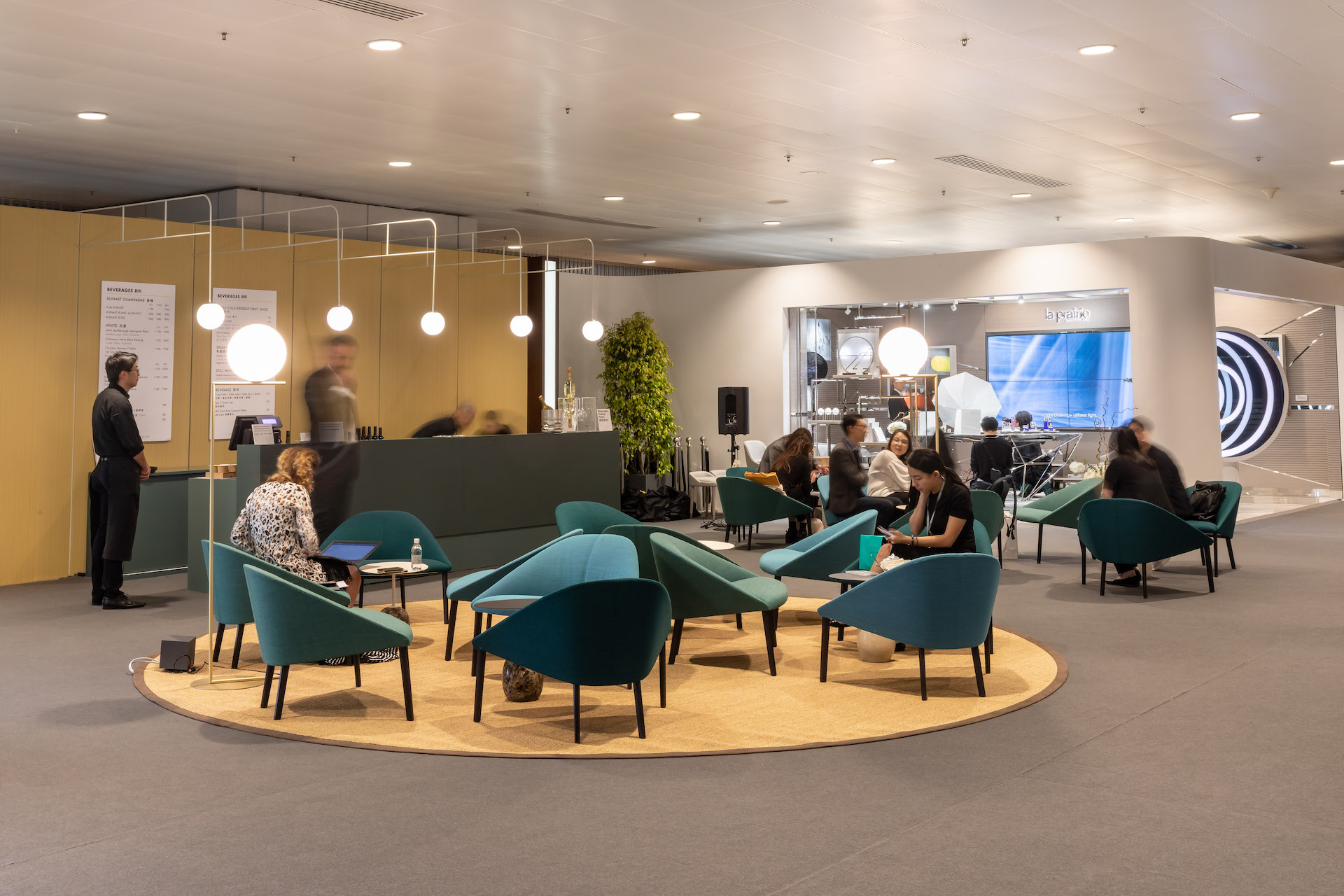
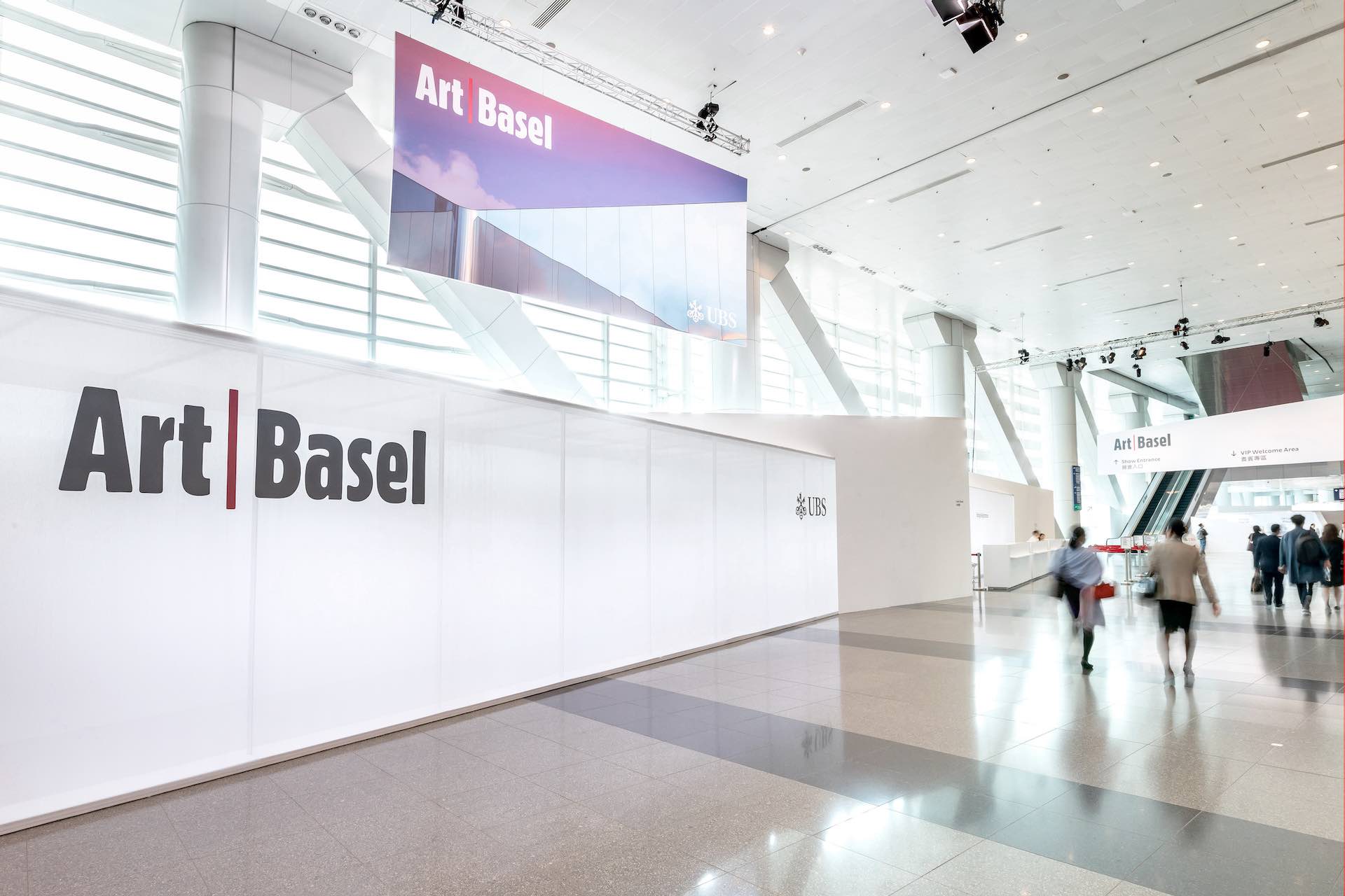
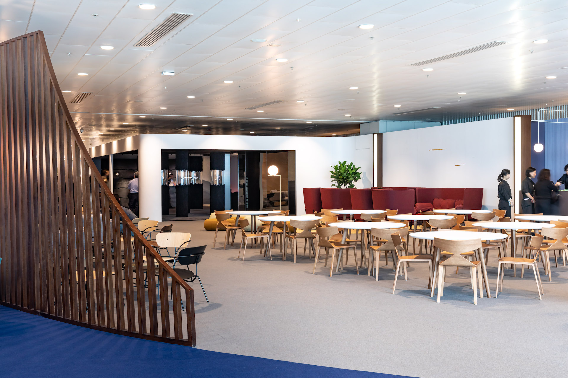
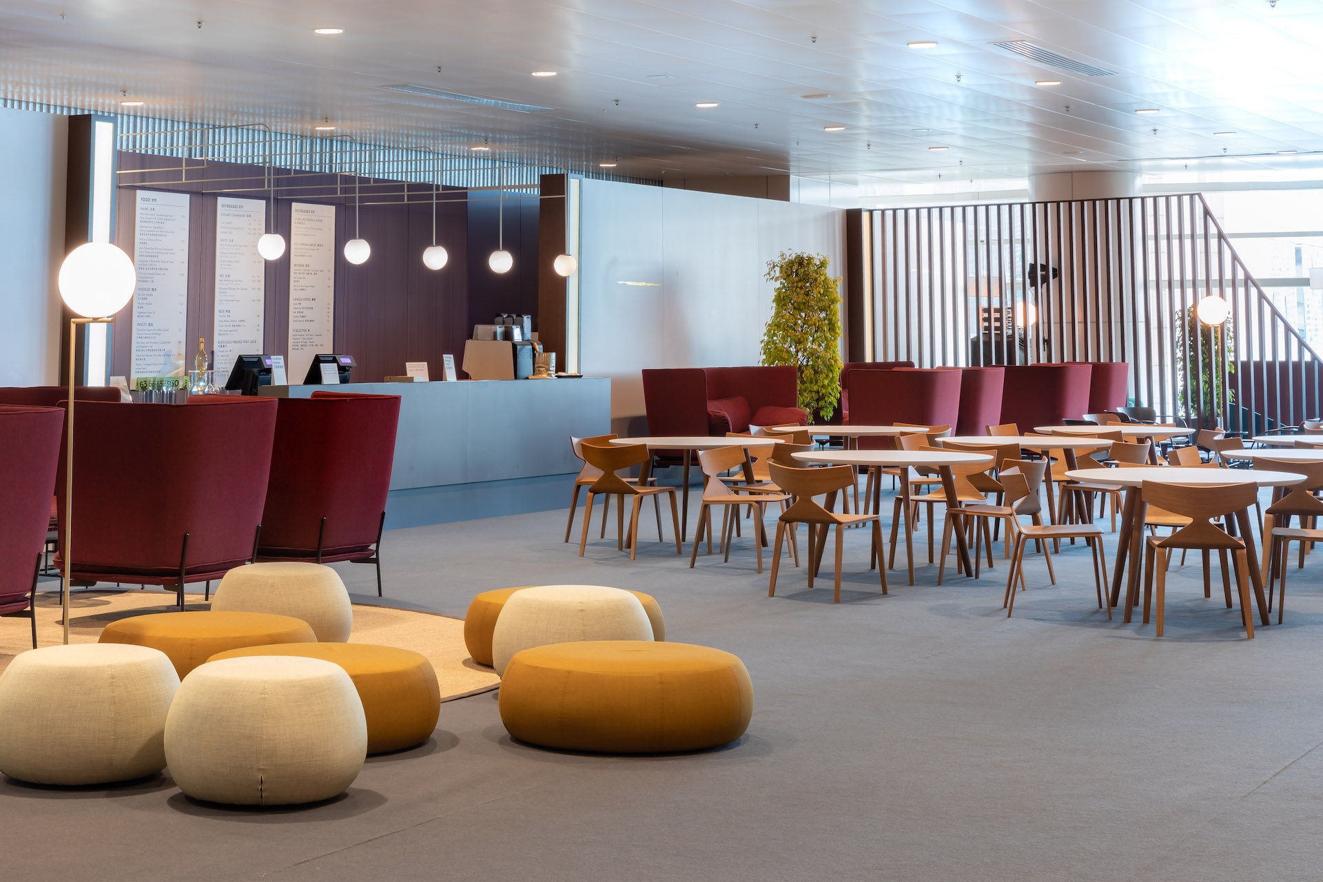
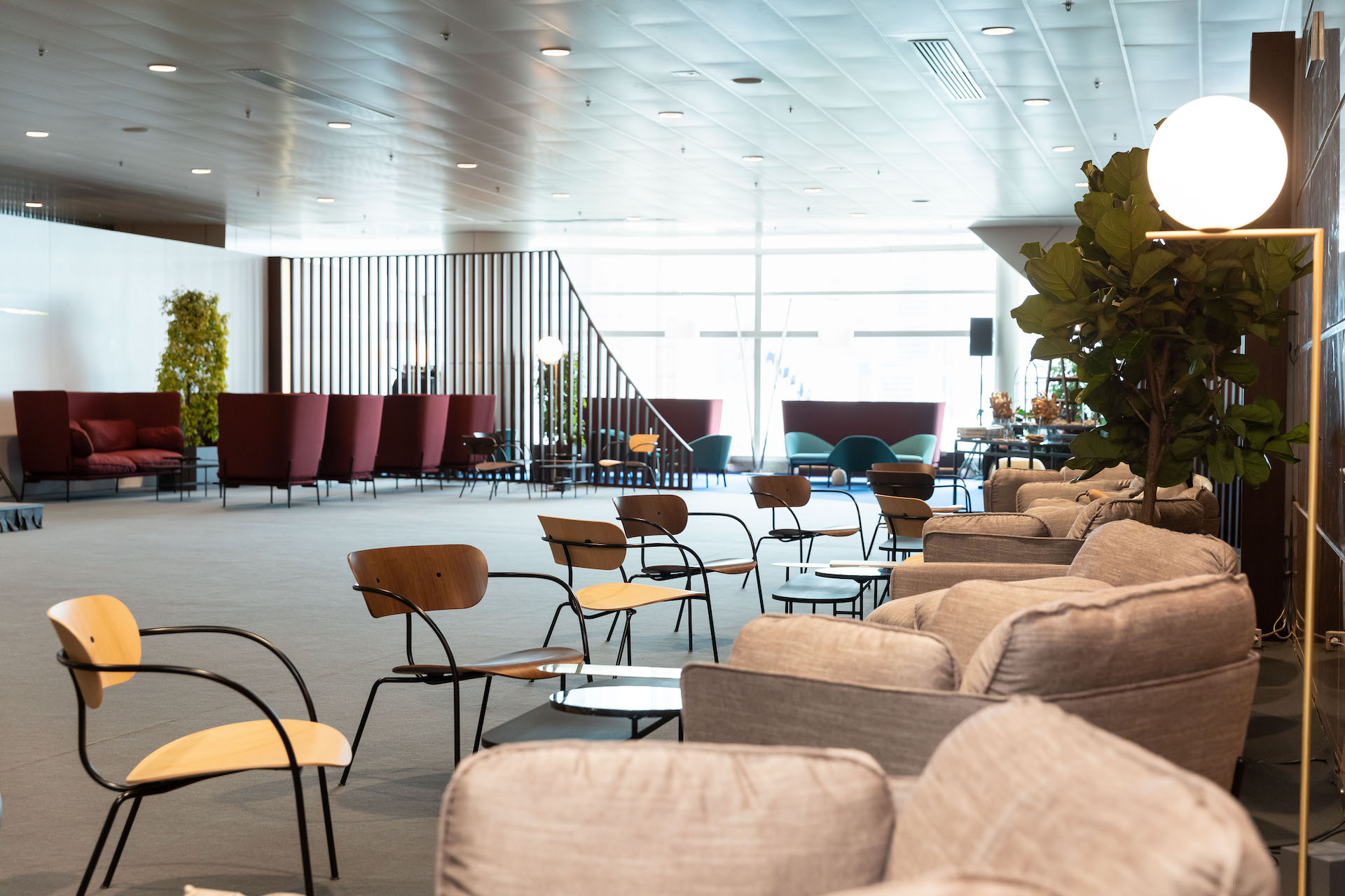
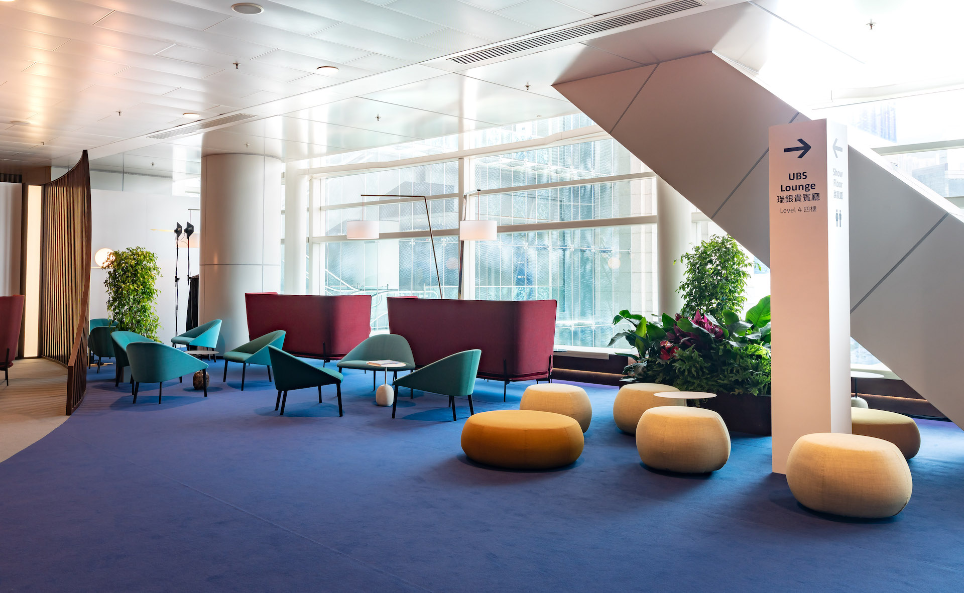
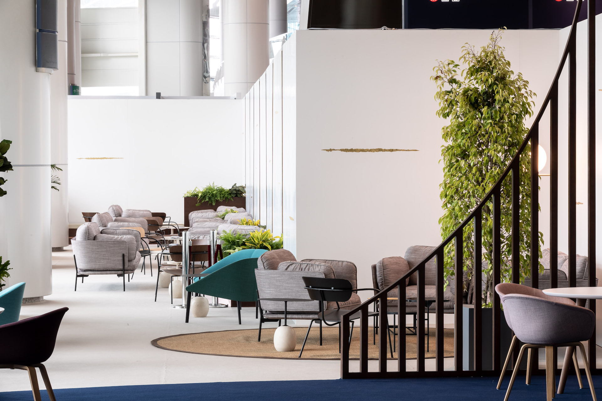
Since its start in 2013, Tom Postma Design (TPD) has been commissioned to design Art Basel in Hong Kong, which showcases pioneering galleries from Asia and beyond. TPD designs all aspects of the fair, from the master plan to booth layouts, and from the coat check to the collector’s lounge. In 2019, the design intent of ABHK shifted, with the objective of creating a more regional identity that speaks to both local residents and global visitors.
Conceptually the design of the art fair was to explore two themes; one was to create a direct dialogue with the city of Hong Kong, the other to heighten visitor experience and engagement with art.
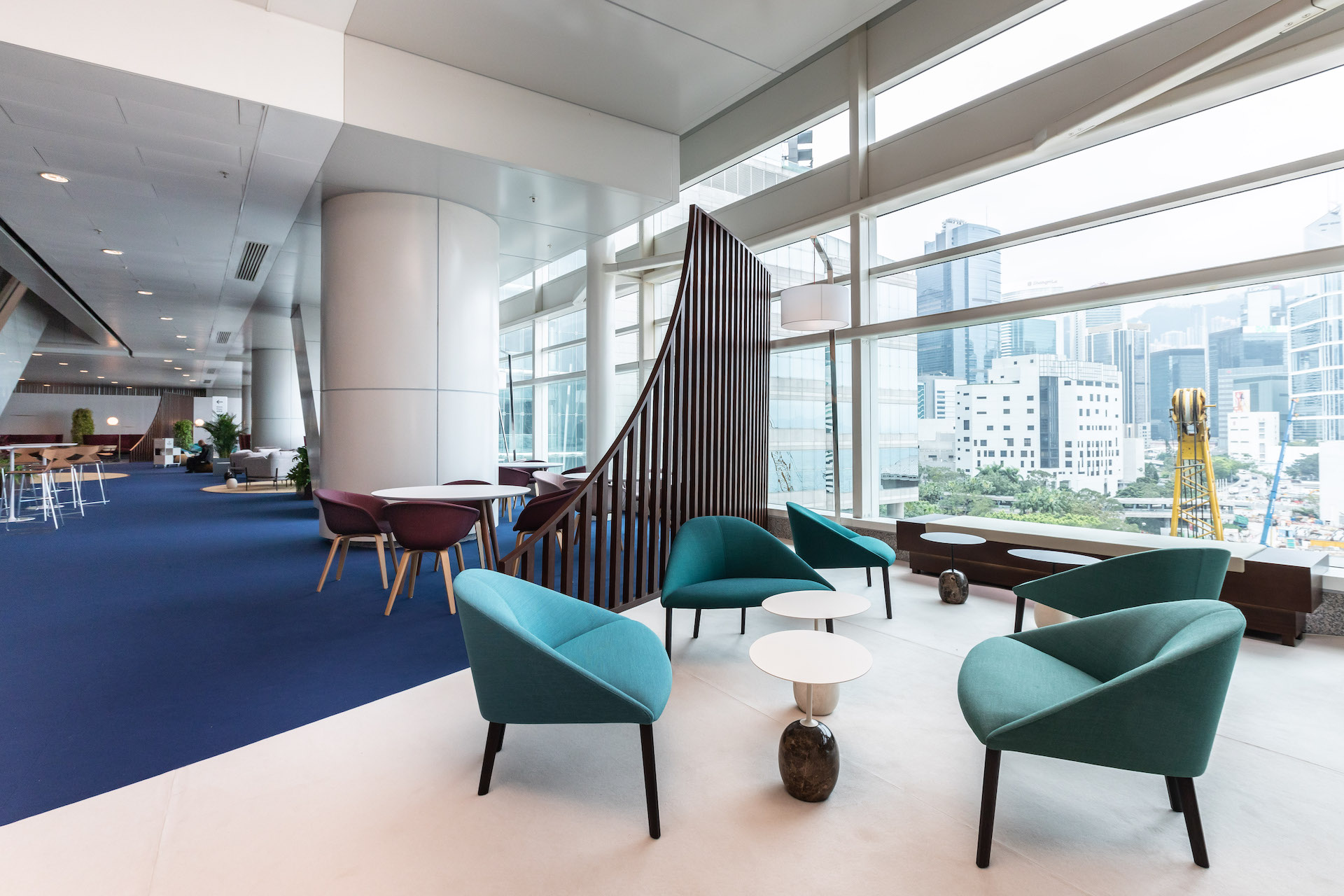
To accomplish this, the ‘external’ areas of the fair, such as the entry and collector’s lounge, use materials and construction techniques that encouraged opacity, local materialisation, and visual contact with the surrounding city. This is demonstrated by the use of semi-circular slatted gates made of local timbers and reoccurring organic patterns that divide space whilst still encourage views out to Hong Kong.
Internally, the exhibition hall inspired by the question, “how can we offer the most complete art experience possible?” The solution was to divide the hall into zones, separated by open ‘breathing’ areas - the ‘Encounters’ sector – a radical idea to give over lettable gallery floor area to large-scale artworks. These areas break up the flow of circulation while providing grounding points of rest and navigation for ABHK visitors. The team at ABHK loved the idea of introducing this additional programmatic activity within the walking lanes of the art fair and ‘Encounters’ has since become one of the signature aspects of ABHK.
A further reduction in the number of aisles allowed visitors to focus on art viewing rather than worry about which turn to make next. In providing a balanced flow for visitors through the showroom floors, this strategy enables audiences to be immersed by art on all sides as they explore the fair. Combined with an optimized floor plan, these elements defined a subtle, yet noticeable visual statement that reflected the initial design philosophy.
Credits
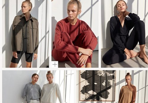

Entrant Company
Reklam5 Digital Agency
Category
Website - Shopping
Country / Region
Turkey

Entrant Company
K11 Group
Category
Integrated Marketing - COVID-19-Related (NEW)
Country / Region
Hong Kong SAR
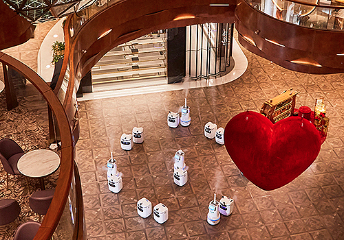
Entrant Company
K11 Concepts Limited
Category
Strategic Program - COVID-19-Related (NEW)
Country / Region
Hong Kong SAR
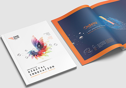

Entrant Company
Alpha Creative (M) Sdn. Bhd.
Category
Publication - Annual Report
Country / Region
Malaysia
