2021
MORE THAN DESIGN
Entrant Company
SURE Design
Category
Corporate Identity - Brand Identity
Client's Name
MORE THAN DESIGN
Country / Region
China
“MORE THAN DESIGN” means that the working scope of design has transcended design itself. Designers should have a broader vision to discover a more colorful world beyond the desk-bound job.
We regard design as a way of solving problems. It comes from a process and leads to a final result. However, due to the intervention of varying factors, our design results are always the products of a certain phase. It is often said in our industry that design is a kind of work that can be kept doing without a deadline. On the other hand, our design work is also promoted according to different phases. The labor of each previous phase is always the foundation of the work in the next phase. That’s why we say design is a combination of process and phase achievements.
From the perspective of a broader background, our creating activities, based on the study, analyses and development of the fruits gained by our ancestors, are some kind of independent processes of study and judgment in light of the actual situation of a project. Each design work has a source. We are basically “standing on the shoulders of giants”, and that is to say all designing activities are proved to be the continuous exploration, research and development of previous achievements. We, as designers, keep running and stopping in cycles. It’s necessary for us to reflect on what we have done after a project ends, so as to form a system of reference resources for future work.
During the specific design process, we extract the Chinese character “不” which means never from our brand name and turn it into an upward pointing arrow since there is a remarkable resemblance in both meaning and form between the character and the sign. The up arrow presents designers’ uncompromising temperament in breaking through the limitation of design effort. In the overall design, we rotate the character “不” clockwise by 90°, extend and repeat it indefinitely, indicating that the design work may has a beginning and an ending , but the life of design moves in circles.


Credits
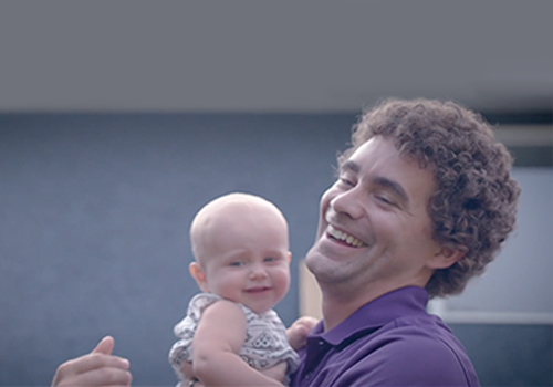
Entrant Company
Key West Video
Category
Branded Content - Recruitment (NEW)
Country / Region
Canada
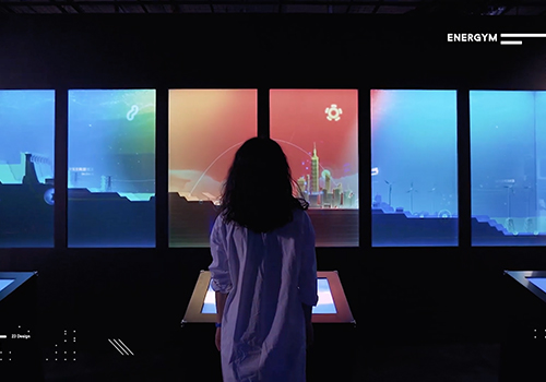
Entrant Company
23Design and Cogitoimage International Co., Ltd.
Category
Experiential & Immersive - Exhibition Experience
Country / Region
Taiwan
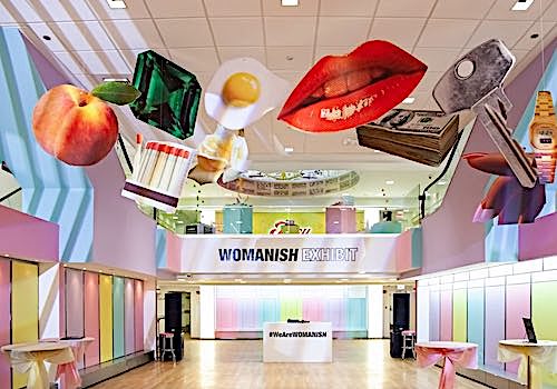
Entrant Company
The Super Producers
Category
Experiential & Immersive - Exhibition Experience
Country / Region
United States
Entrant Company
Wayfarer Entertainment
Category
Branded Content - Public Service & Activism (NEW)
Country / Region
United States