
2021
Camerise - Brand Identity
Entrant Company
adHOME Creative Inc.
Category
Corporate Identity - Brand Identity
Client's Name
York University, Glendon Campus
Country / Region
Canada
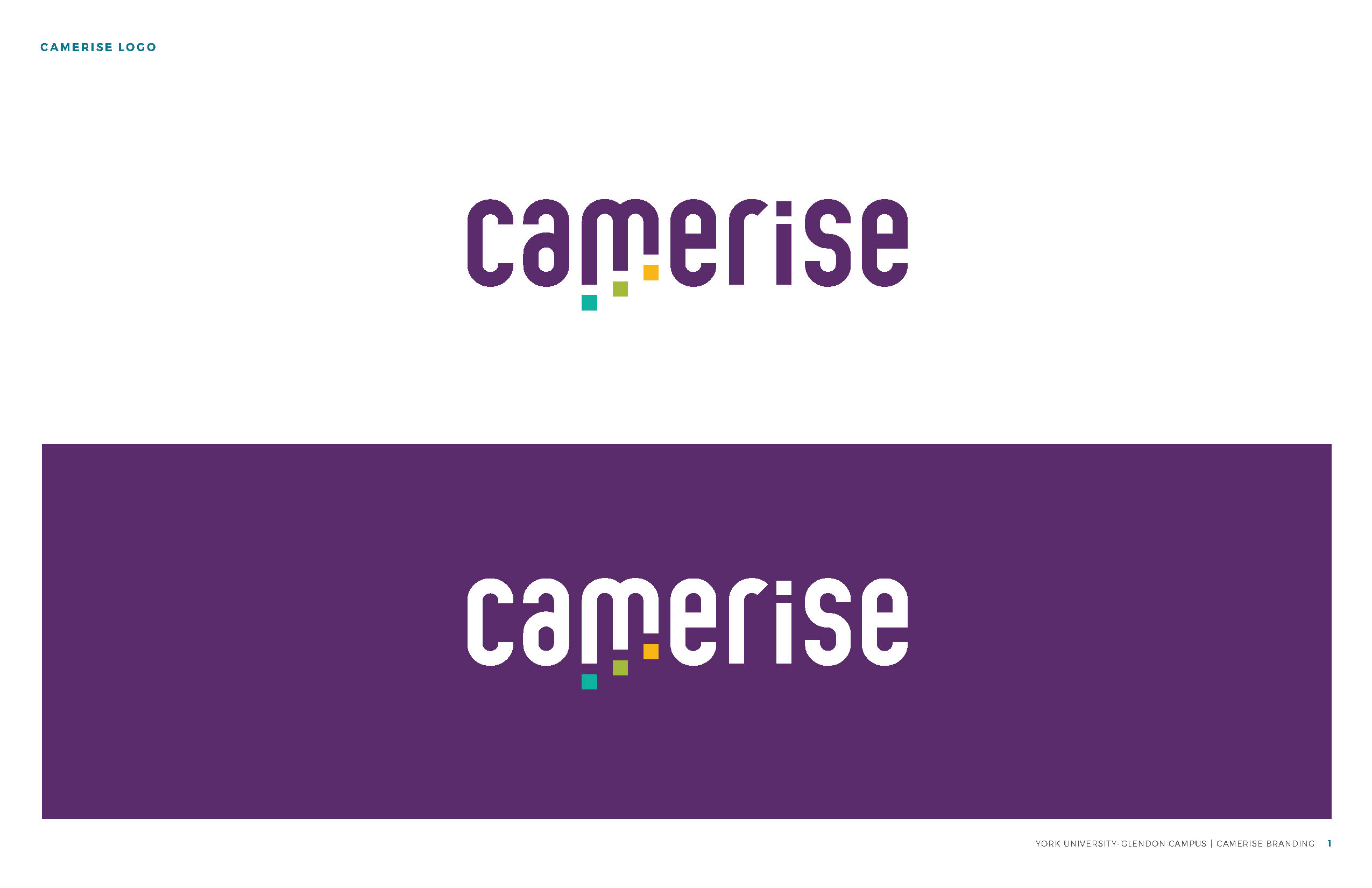
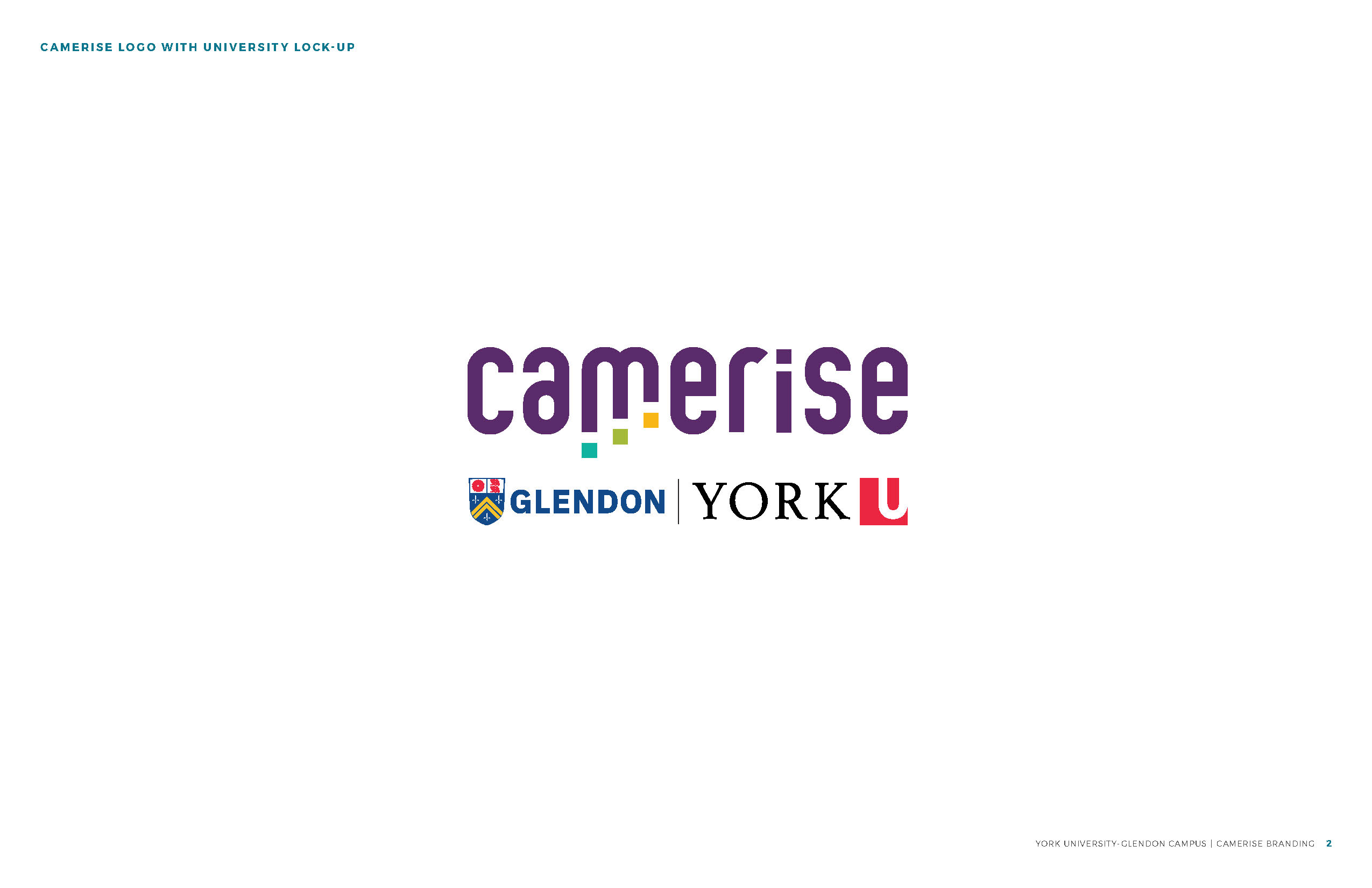
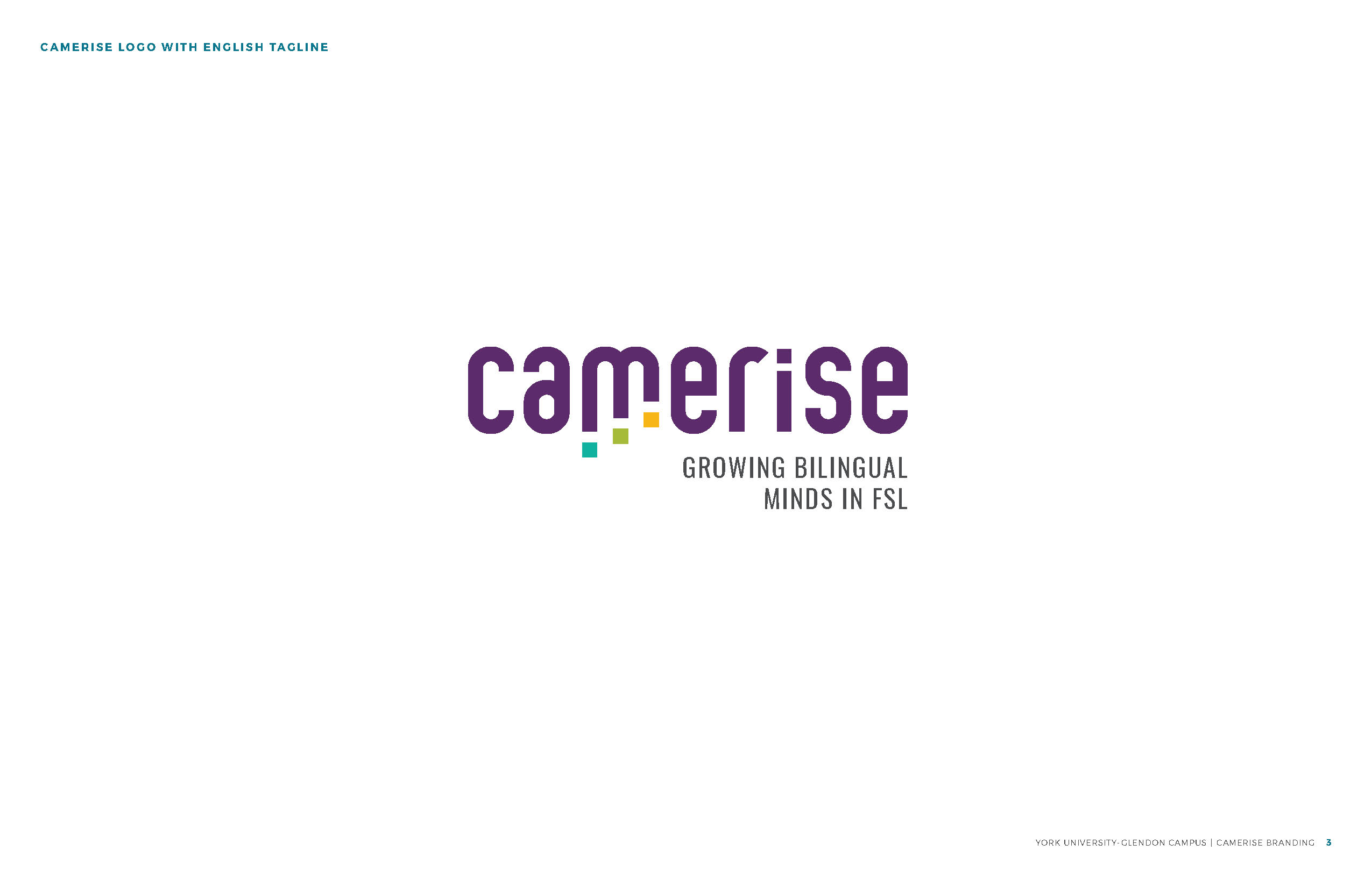
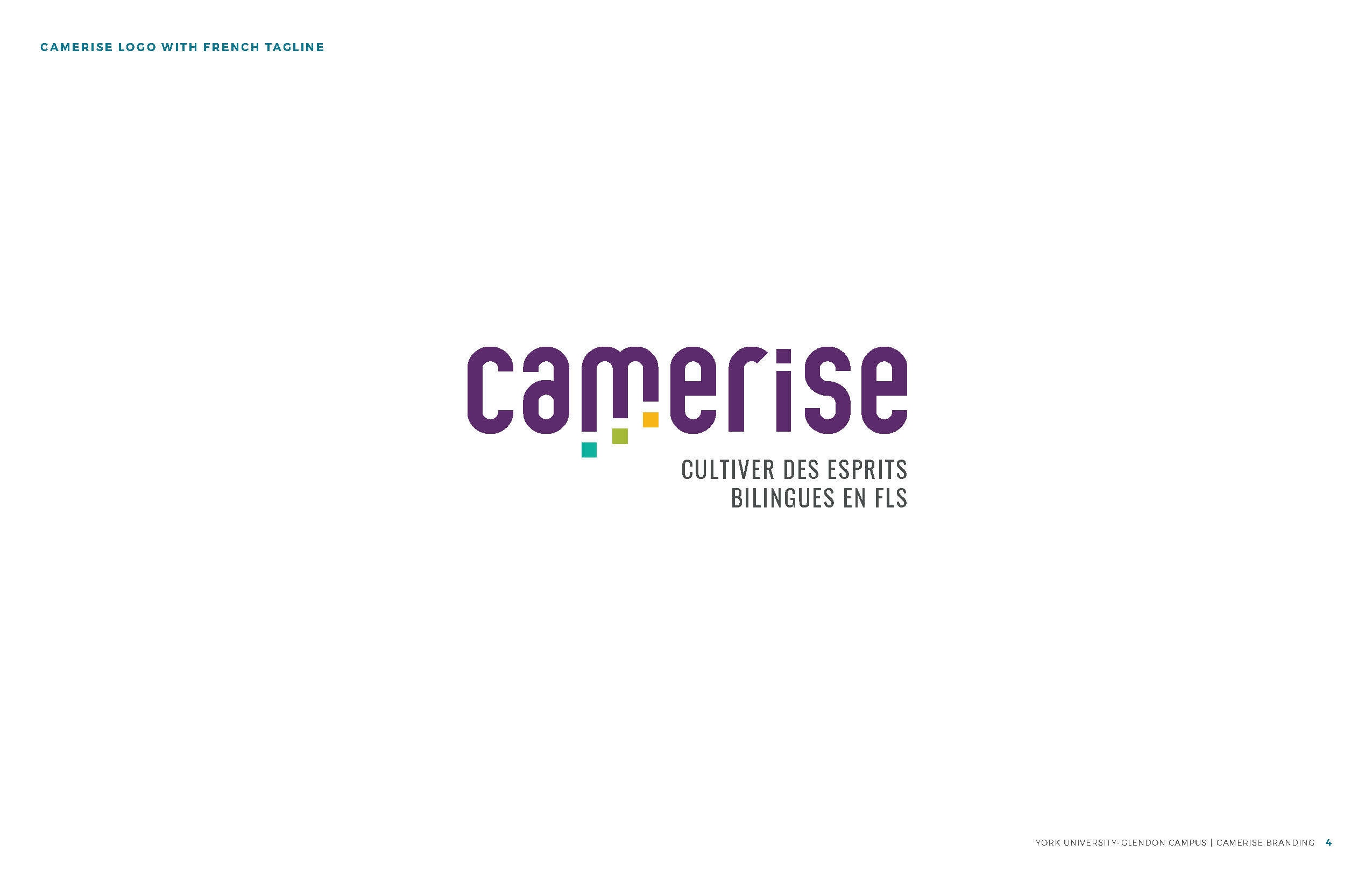
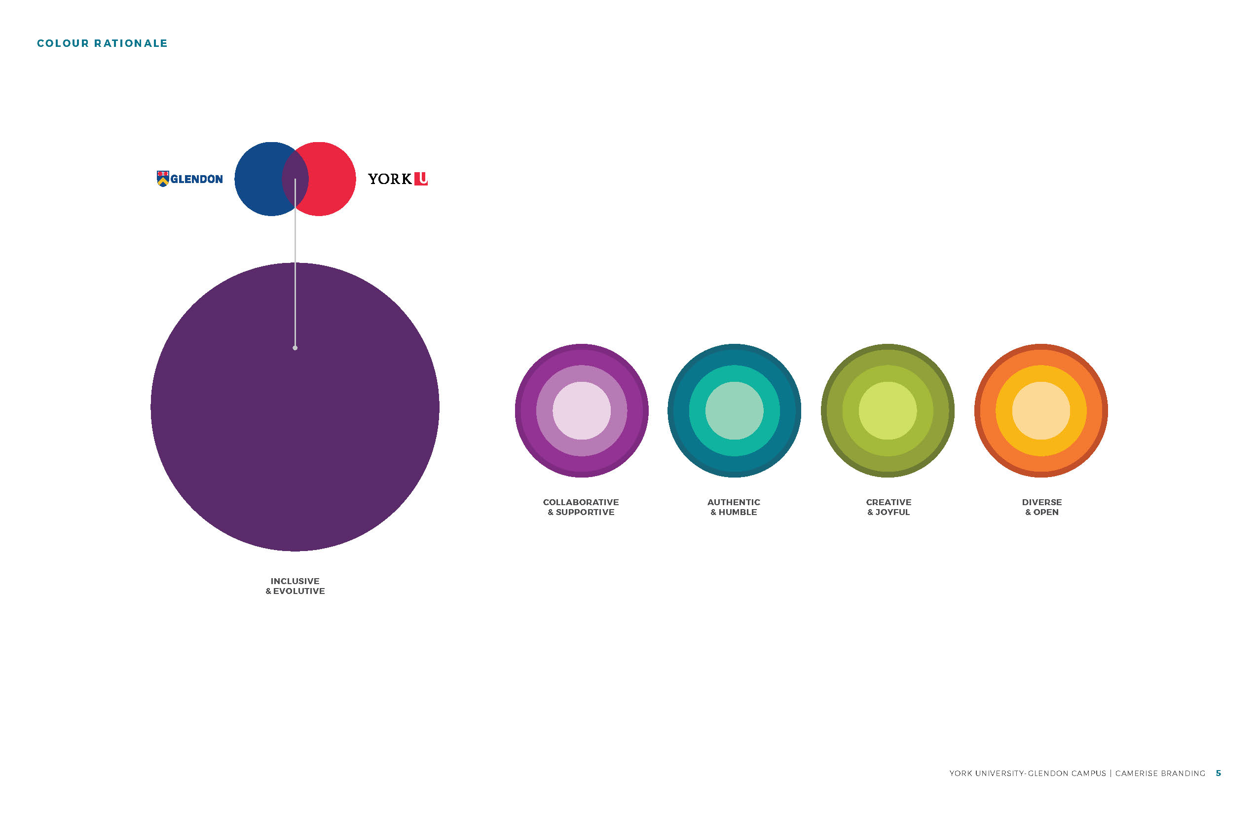
Camerise is a user-friendly digital platform designed to bring together students, educators, administrators and parents to facilitate access to FSL (French as a second language) programs across the country. The goal is to address systemic challenges together and find solutions in order to sustain Canadian bilingualism. The rich purple Camerise berry, flourishing in French Canada, is emblematic of adapting and thriving in new conditions invoking feelings of inclusivity and evolutivity.
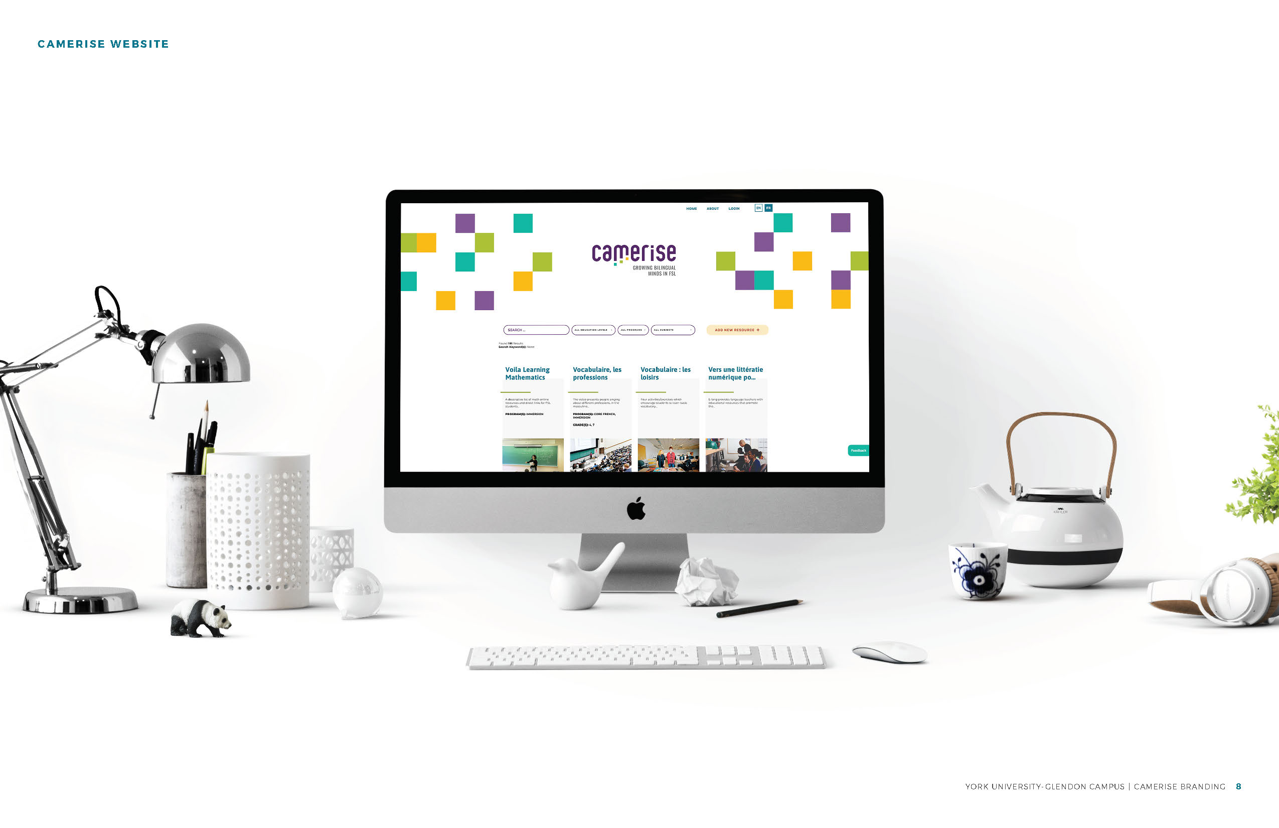
In developing the Camerise brand, we wanted to highlight the professional and progressive nature of the program. The use of a lowercase font as the base for our development of the wordmark helps to lend a youthful appearance, while the bold nature of its sans serif structure adds a component of strength, authority, and credibility necessary for an academic organization. The customized letterforms are rounded, giving the wordmark a welcoming and approachable tone while allowing Camerise to have strong ownership over their brand.
Our primary purple colour was influenced both by the Camerise berry, for which the program is named, but also the mixing of the primary colours in the York University and Glendon brands. The red and blue mix to create a rich purple. Our secondary colour palette makes use of vibrant, but natural complementary colours that represent other traits important to the brand. Light purple represents collaboration and support, while teal reflects an authentic and humble nature. Green showcases creativity and joy, while orange represents diversity and openness.
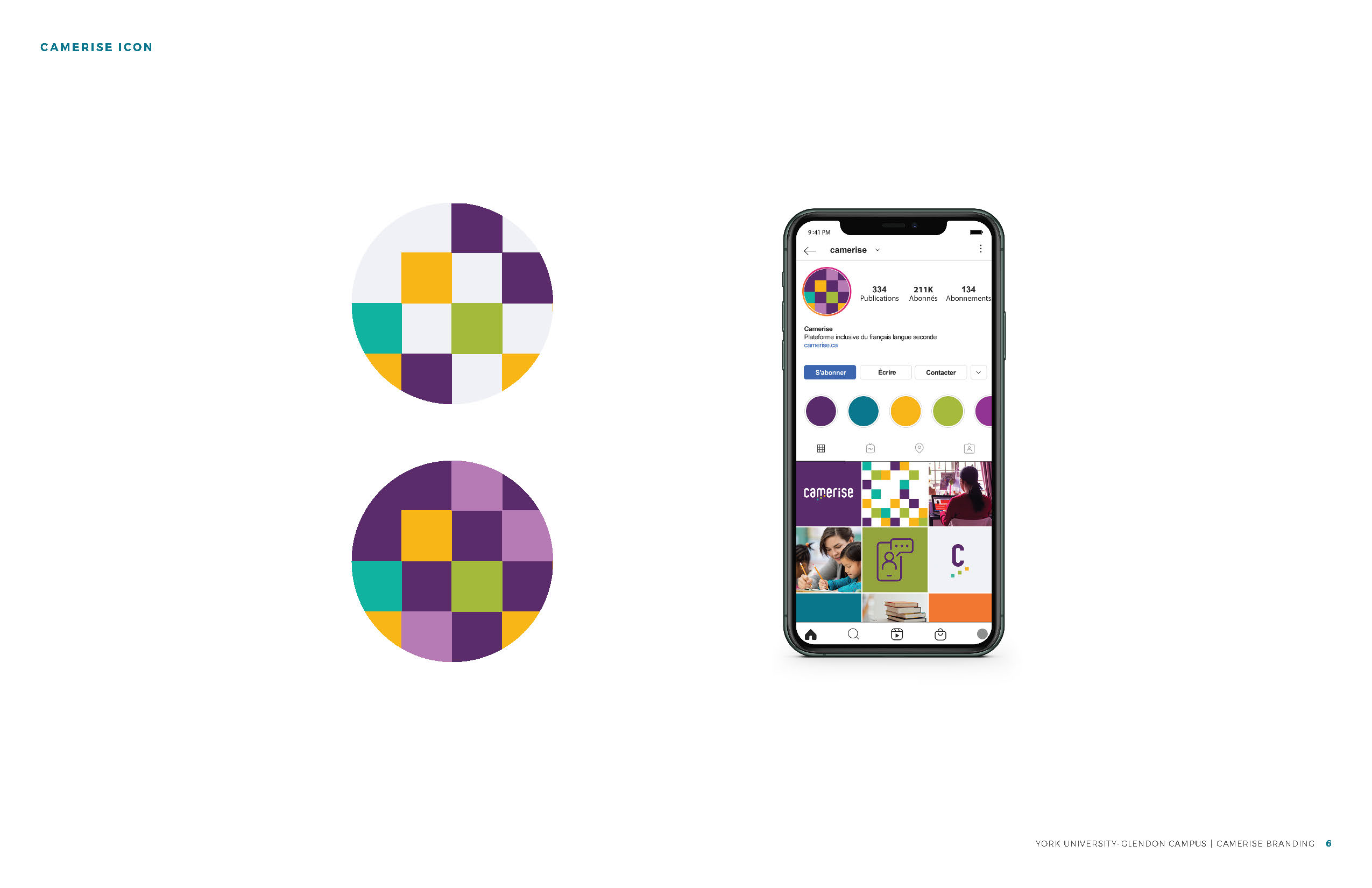
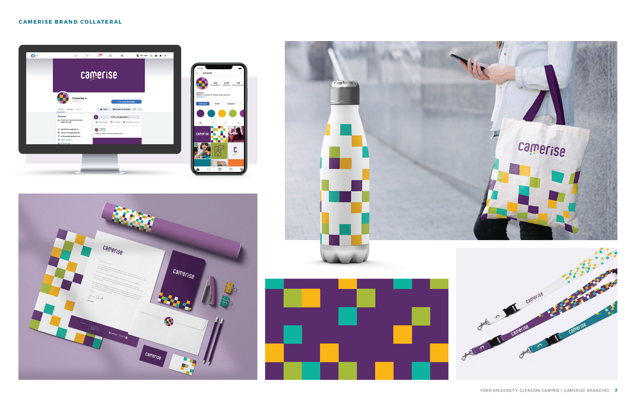
The square iconography used in the logo depicts steps moving upward, representing forward momentum and the journey through elevating one’s knowledge as they grow and evolve. This progression gives an uplifting feeling, showing broadly what education provides in someone's life. More specifically what Camerise strives to do – uplift people through the sharing of educational resources. The pattern blocks are randomized in other branded materials to tell the story that learning is not a linear process, but a journey that can be different for each individual. This pattern tells their story across all of Camerise’s branded collateral, bringing continuity and cohesiveness to every element.

Entrant Company
Multipleoutlet Productions & Charity Bids
Category
Video - Nonprofit
Country / Region
United States
Entrant Company
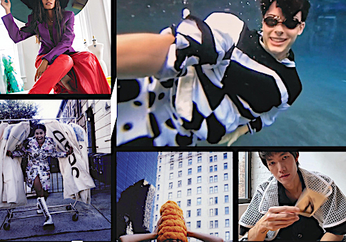
Savannah College of Art and Design
Category
Video - Fashion
Country / Region
United States

Entrant Company
Concepts, Inc.
Category
Experiential & Immersive - Community (NEW)
Country / Region
United States
Entrant Company
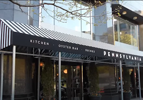
A. Hoffman Awning Co
Category
Website - Multi-level Marketing
Country / Region
United States