2021
Reclaiming Brand Identity Through Design in the 21st Century
Entrant Company
Color More Lines
Category
Corporate Identity - Brand Identity
Client's Name
Daiwa Health Development
Country / Region
United States
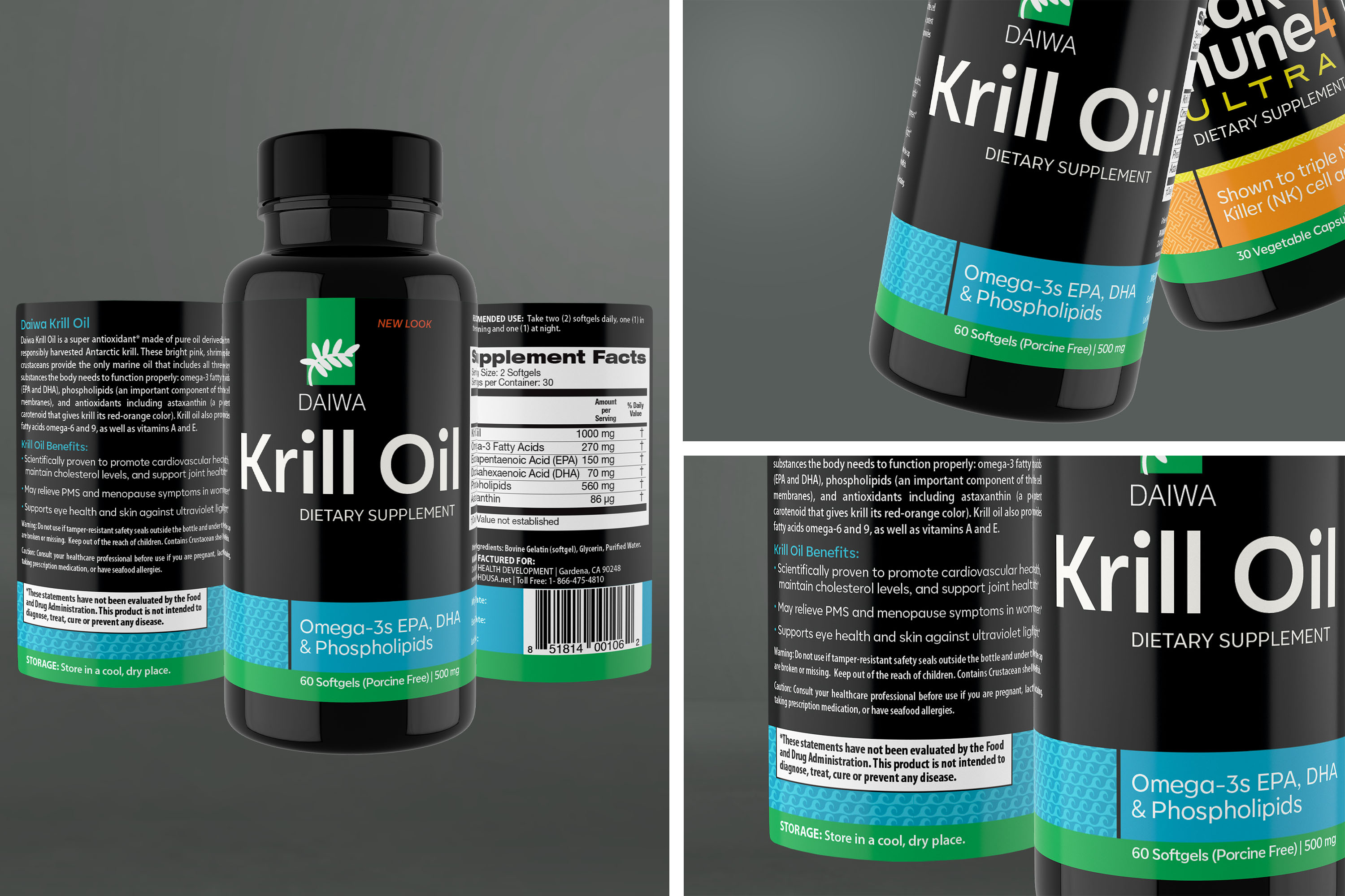
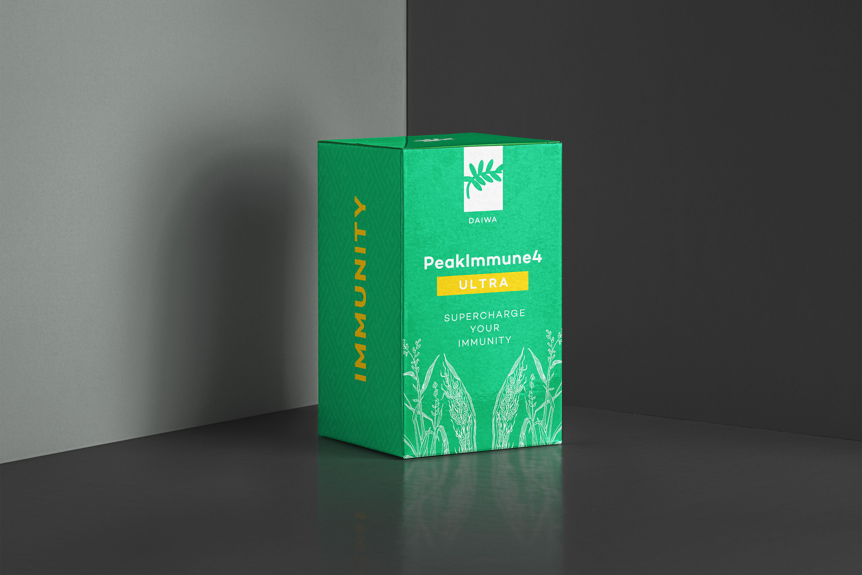
Daiwa Health Development is a brand with over 30 years experience in providing high quality health supplements. Yet moving forward into the 21st century, their imagery and design was in danger of being lost in a sea of competitors. Color More Lines’ task was to redefine their brand identity while still maintaining their historic integrity. We achieved this by focusing on both their cultural heritage and the increasing consumer preference for minimalist yet innovative design.
When redeveloping the Daiwa brand identity, we needed to develop an entirely new fusion that merged Daiwa’s existing reputation with today’s customer needs.
Japanese patterns: At the heart of Daiwa is its cultural heritage. When redesigning the new bottle look, we needed to ensure that all aspects of the packaging emphasized its history and identity.
New bottle look: With the new bottle look, customers could easily discern that the Daiwa brand and products stood for clarity, freshness and reliability.
Cohesiveness of brand: The Daiwa facelift now looks and feels like a single cohesive brand providing multiple health supplement products. Carrying the cohesiveness of the brand’s new look is integral to customer relatability and trust.
Stability and strength of the brand: Daiwa is a company with over 30 years’ experience backed by scientific research. At the same time, consumer trust demands an entirely new attitude towards reliability and credibility.
Trust in nature: The care and precision in Daiwa’s ingredients was taken into account, being reflected in their motto: “Trust in Nature.” Subsequently, we incorporated botanical and scientific drawings which helped highlight Daiwa’s key ingredients.
When redeveloping the Daiwa brand identity, we needed to develop an entirely new fusion that merged Daiwa’s existing reputation with today’s customer needs.


Credits
Entrant Company
ByDzyne
Category
Video - Multi-level Marketing
Country / Region
United States
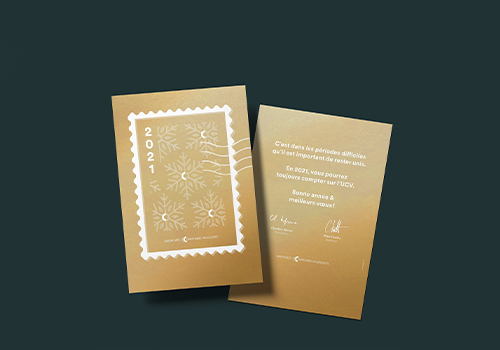
Entrant Company
Mashka
Category
Marketing & Promotional - Invitation / Greeting Card
Country / Region
Switzerland

Entrant Company
The Fource Group
Category
Video - TV Ad Campaign
Country / Region
United States
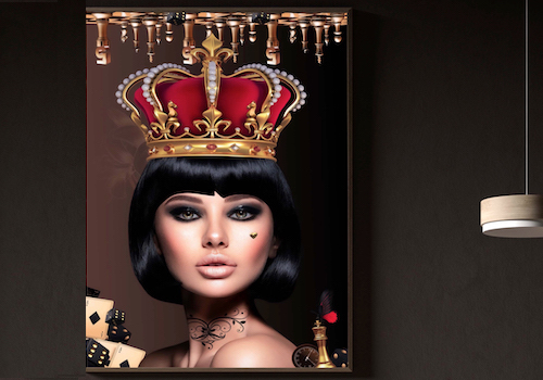
Entrant Company
Priscilla Vezzit Ferreira
Category
Advertising - Advertising / Other___
Country / Region
France