2021
TATA Art World
Entrant
Play Design Lab
Category
Corporate Identity - Logos
Client's Name
TATA Art Kingdom
Country / Region
Taiwan
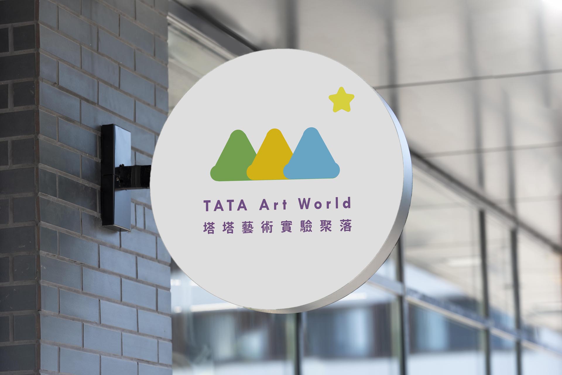
TATA Art Kingdom is a small, privately owned art school teaching children’s art within neighborhoods in Tamshui township. This year, the school expands an open-air space in a rural farm land nearby, and designs its new curriculum by incorporating nature explorations such as agricultural art, ecological art, or plant art.
In response to the school’s new positioning, we proposed to create another brand for the open-air branch - TATA Art World to distinguish from TATA Art Kingdom which provides traditional in-room children’s art class.
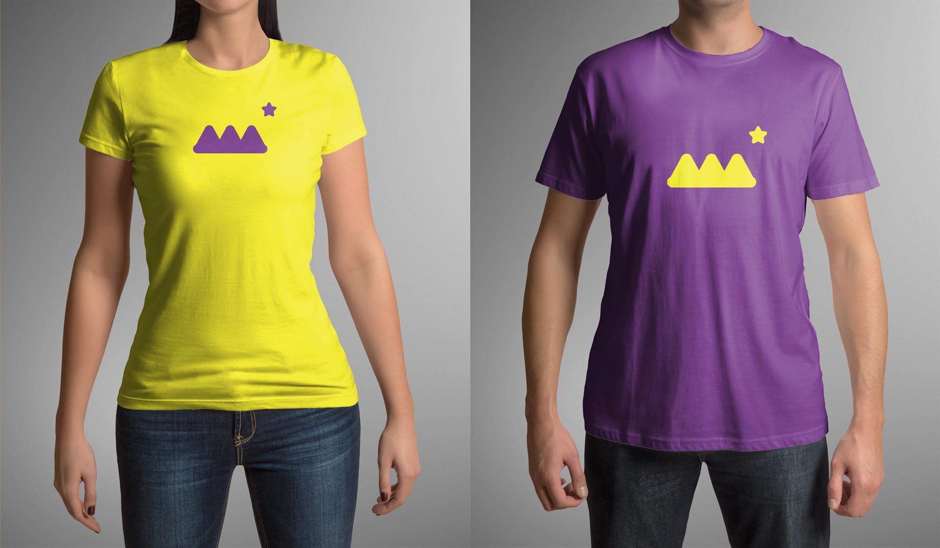
The new logo design starts from exploiting the letter ‘T’ and ‘A’ from the previous logo of TATA Art Kingdom. The letter ‘T’ and ‘A’ symbolize two kinds of artists that the school wants to cultivate the children to become. ‘A’-shaped means that the person has a focused expertise that has a deep impact on different domains. And the ‘T’-shaped means that a person has a broad spectrum of knowledge while having an in-depth professionalism in a single field.
The primary logo merges the letter ‘T’ and ‘A’ to create triangular icons which resemble the image of mountains and the roof of the farmhouses later transformed into classrooms in the rural farmland, echoing the educational concept of learning art from nature. The pentacle (star sign) around the upper right corner of the logo represents 5 artistic elements that the school is aiming at cultivating in students: creativity, aesthetics, sympathy, truthfulness, and perseverance.
The logo can be used as monochrome or with multi-color based on application flexibility, manifesting the diversity and inclusiveness of art form, and the varied, colorful emotions that art could evoke.
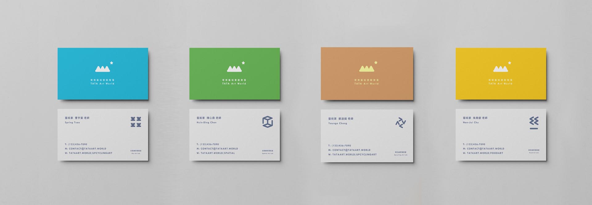
The signage system and extended icons that employ the graphical combinations of ‘T’ and ‘A’ are also developed for various application scenarios.


Credits

Entrant
DeVito/Verdi
Category
Advertising - Newspaper AD (Campaign)
Country / Region
United States
Entrant
tungsten branding
Category
Corporate Identity - Logos
Country / Region
United States

Entrant
DeVito/Verdi
Category
Video - School / Universities
Country / Region
United States

Entrant
Northeastern's Films | Northeastern University
Category
Video - School / Universities
Country / Region
United States