2022
Givenchy Website
Entrant Company
Work & Co
Category
Website - Retail
Client's Name
Givenchy
Country / Region
United States
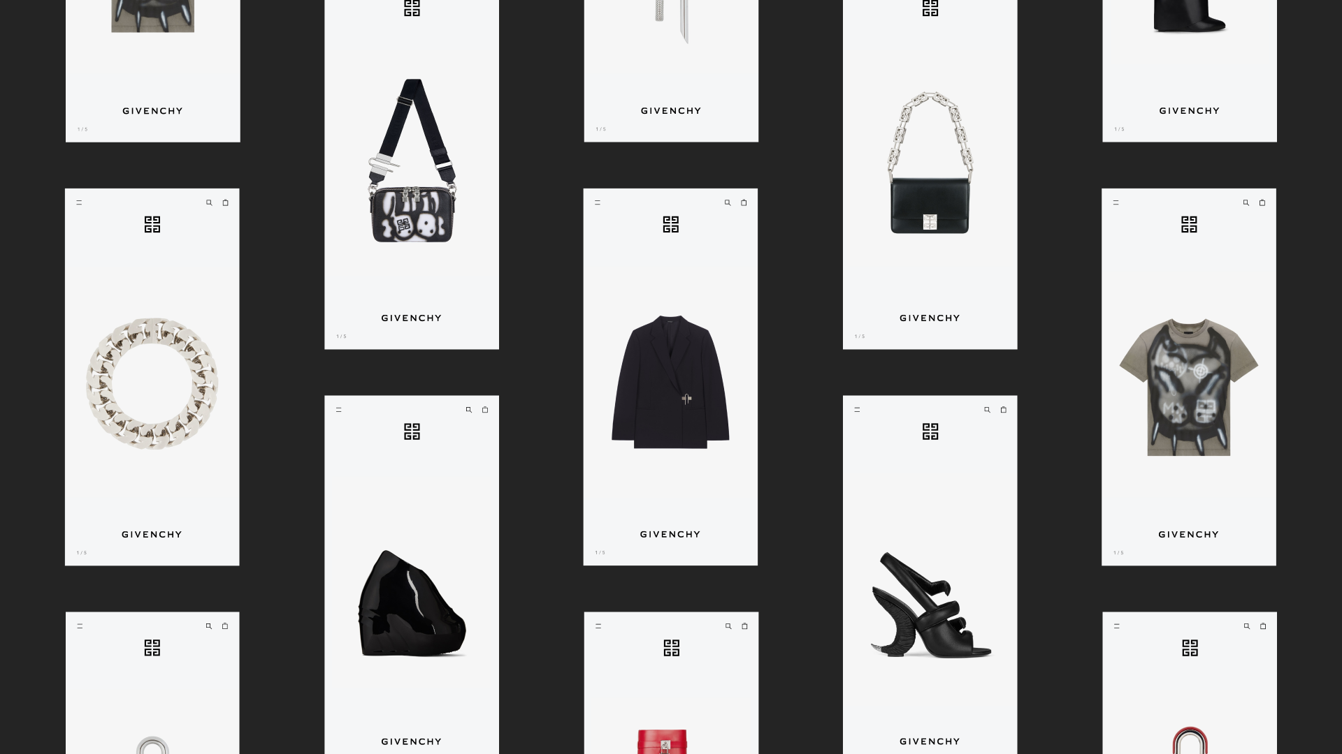
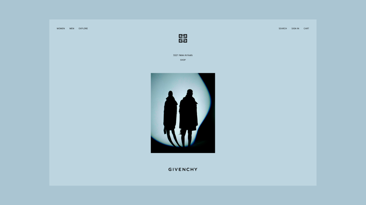
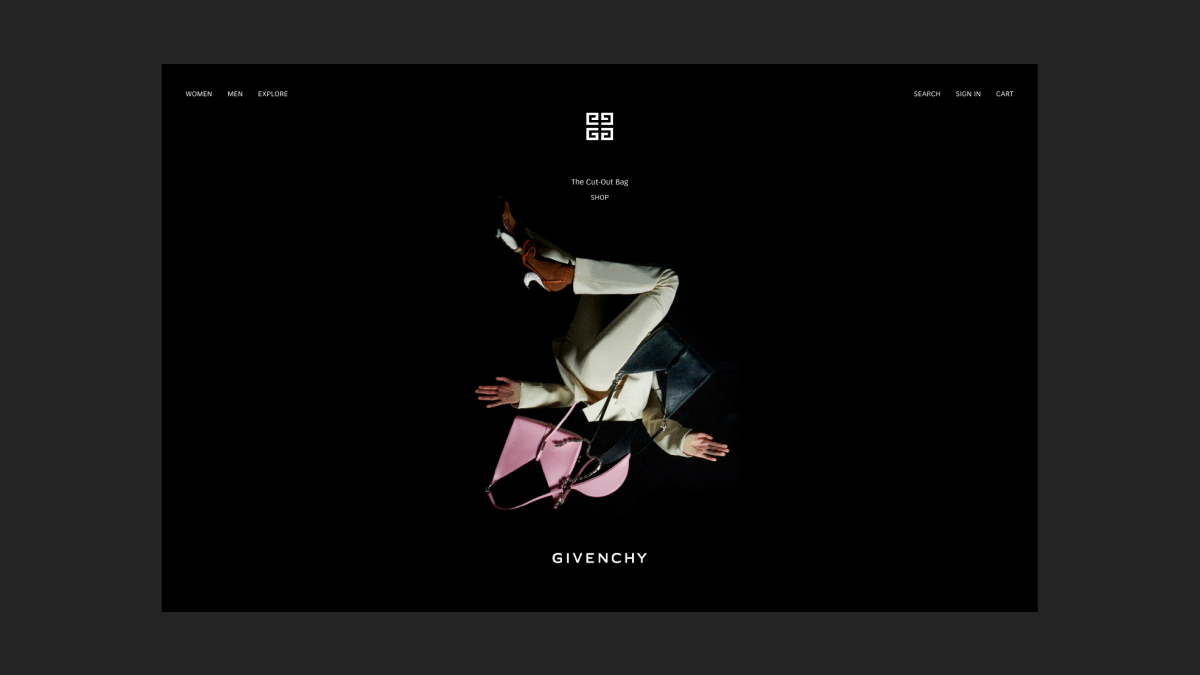
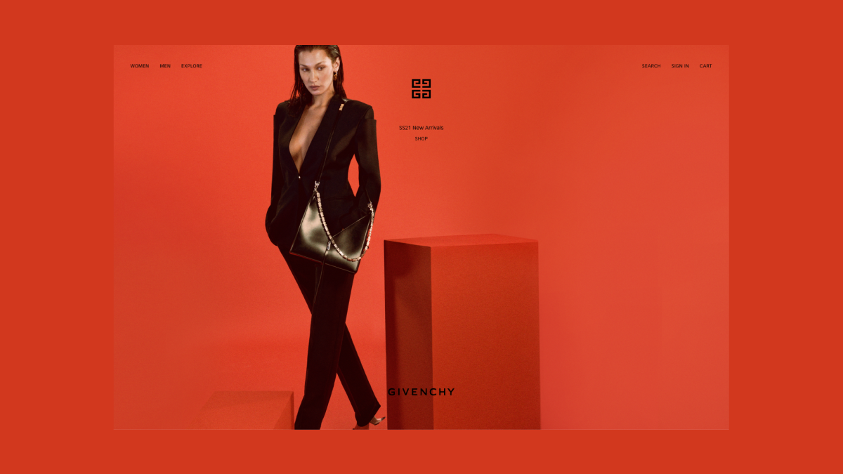
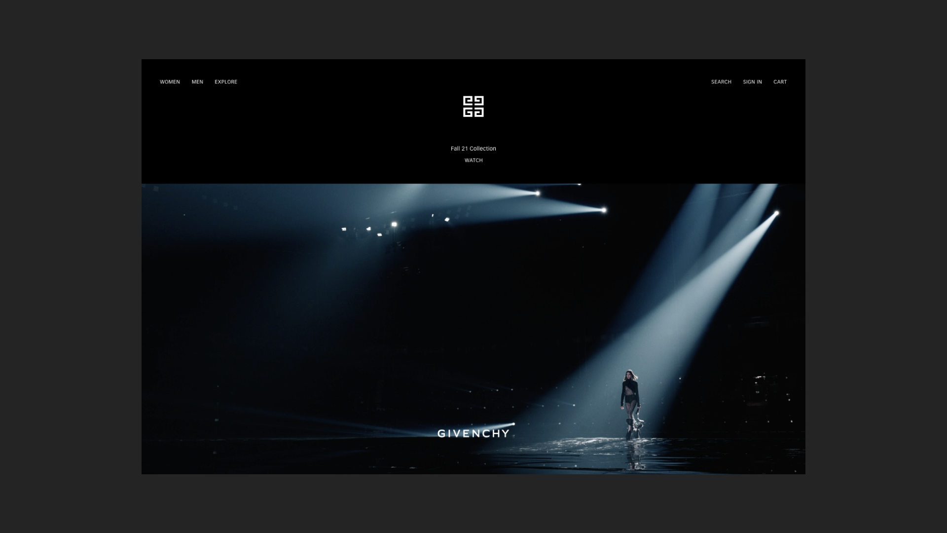
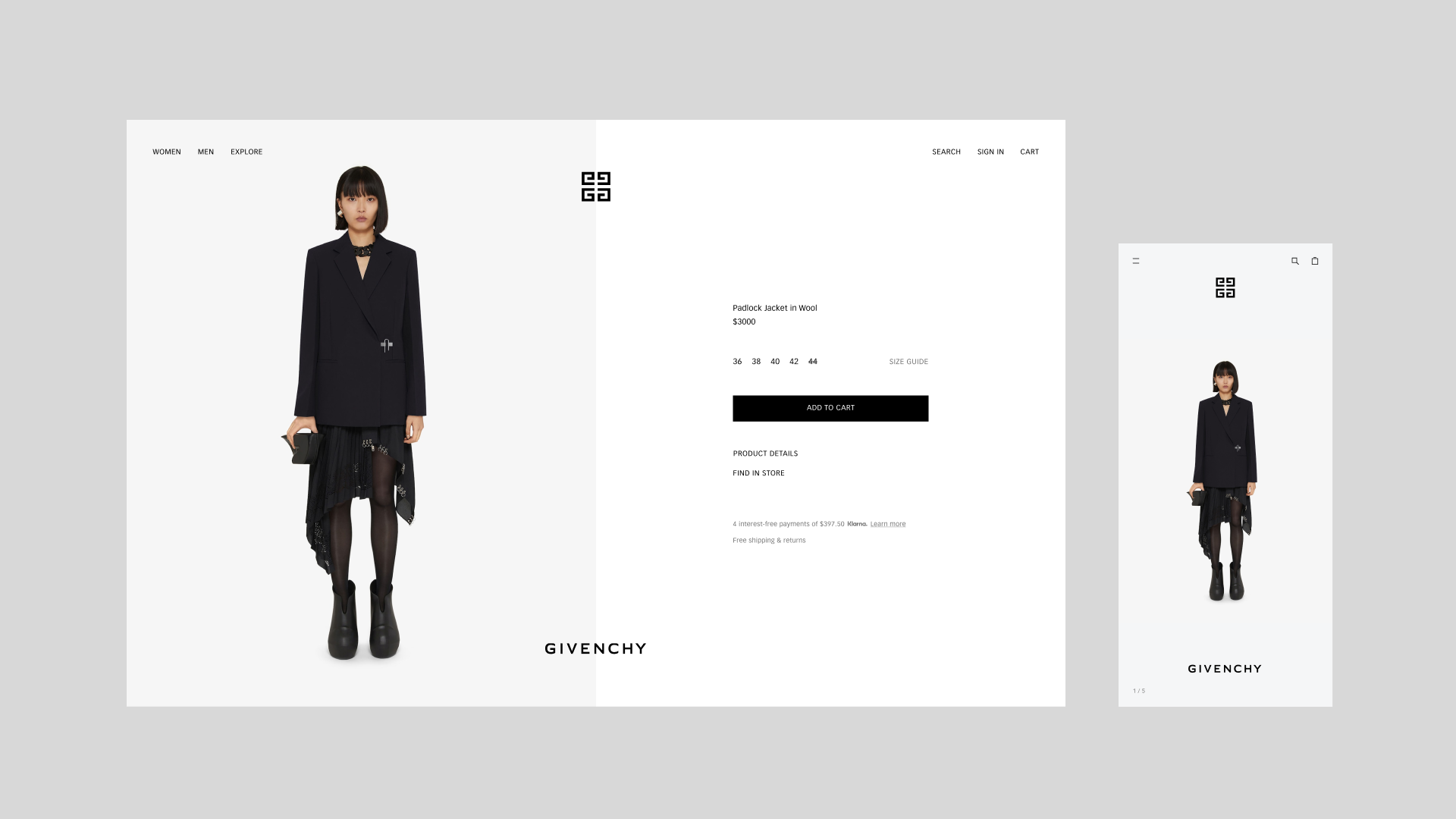
Givenchy’s newly launched e-commerce site and experience gives fans and shoppers a new way of exploring collections through an interactive blend of runway videos and lookbook photography. The key goal was to simplify navigation and elevate the product and shopping experience. The new site leverages the monogram and logotype to frame all content, layering in branding with the streamlined, minimal presentation of products and imagery.
Features include:
--A renewed focus on elegance and simplicity, with a single type size and 2 colors across the whole site
--Closer alignment with the brand’s other customer-facing channels and seasonal campaigns
--A streamlined check-out experience with a focus on omni-channel fulfillment
--Enhanced product photography and sizing to let shoppers be immersed in the products
--A modular framework that supports seasonal updates and artist collaboration collection drops
The new Givenchy.com is a reflection of the vision of designer and Givenchy Creative Director Matthew M. Williams. Work & Co collaborated with Williams and other senior leaders to bring the new site to life through digital strategy, design concepting, detailed design, and design QA.
Entrant Company
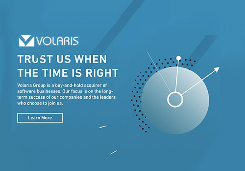
Volaris Group
Category
Website - Multilingual Site
Country / Region
Canada


Entrant Company
Work & Co
Category
Website - Best User Experience
Country / Region
United States

Entrant Company
Dell Technologies Education Services
Category
Video - Budget below $3000
Country / Region
United States


Entrant Company
CRATER Inc.
Category
Corporate Identity - Logos
Country / Region
Japan
