2022
DL Adventure
Entrant
Leona Kuo Design
Category
Corporate Identity - Brand Identity
Client's Name
DL Adventure
Country / Region
Australia
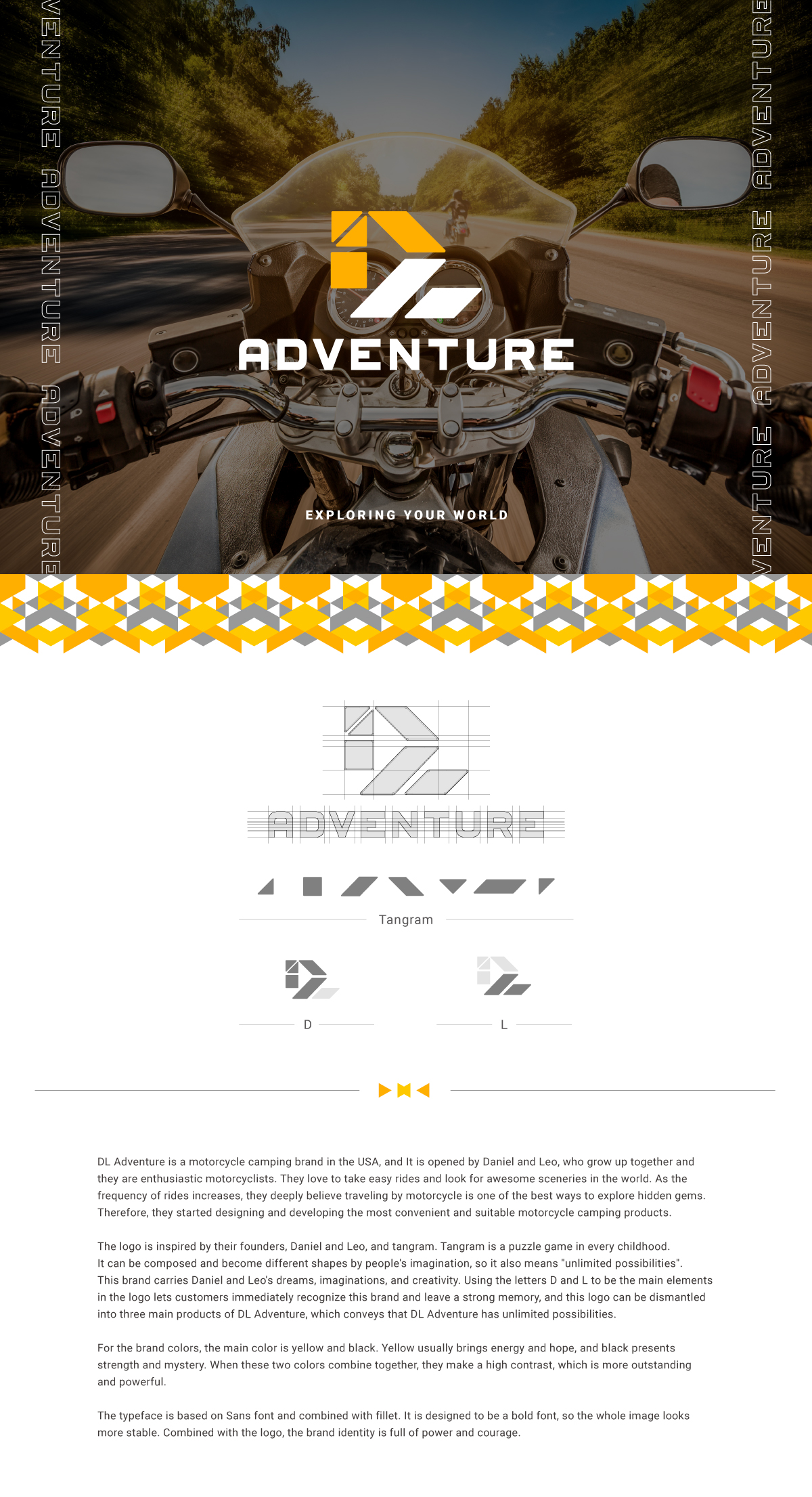
DL Adventure is a motorcycle camping brand in the USA, and It is opened by Daniel and Leo, who grow up together and they are enthusiastic motorcyclists. They love to take easy rides and look for awesome sceneries in the world. As the frequency of rides increases, they deeply believe traveling by motorcycle is one of the best ways to explore hidden gems. Therefore, they started designing and developing the most convenient and suitable motorcycle camping products.
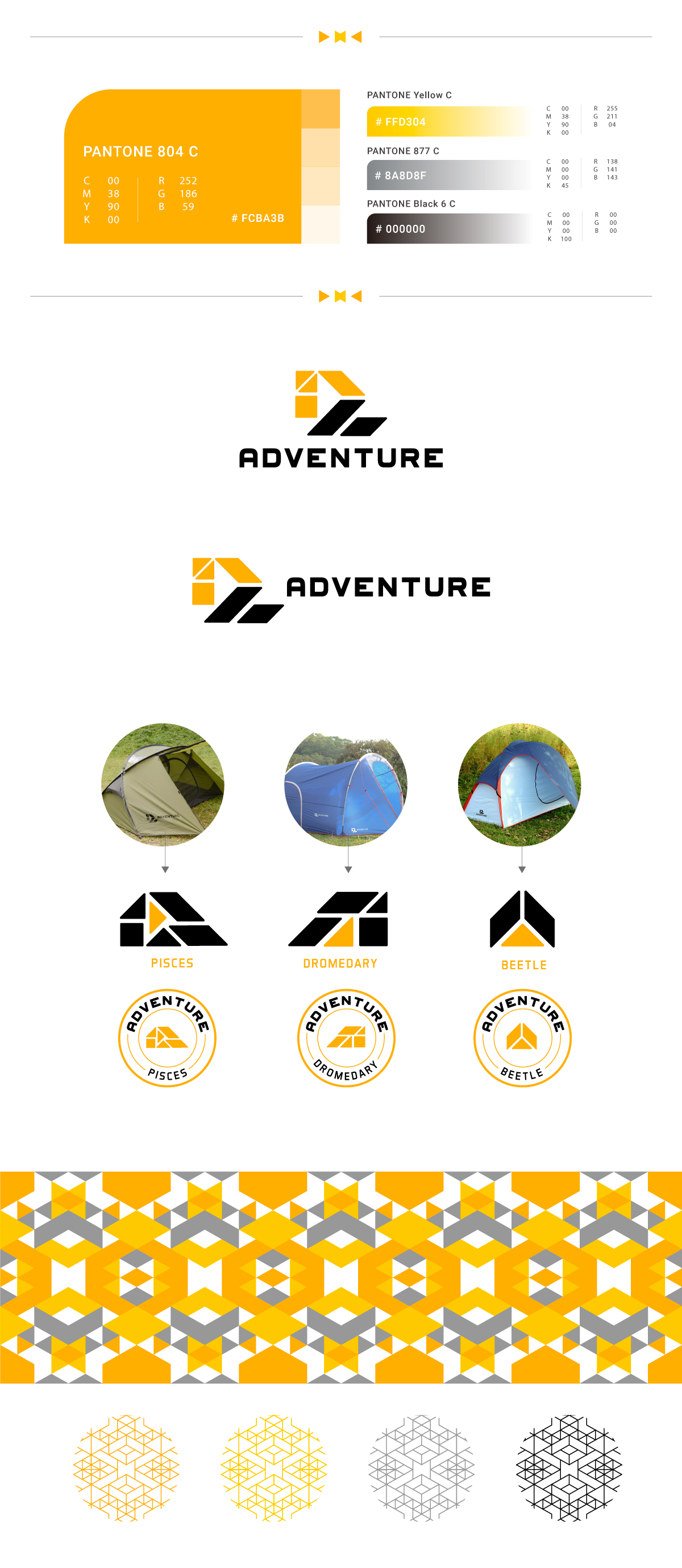
The logo is inspired by their founders, Daniel and Leo, and tangram. Tangram is a puzzle game in every childhood. It can be composed and become different shapes by people's imagination, so it also means ''unlimited possibilities''. This brand carries Daniel and Leo's dreams, imaginations, and creativity. Using the letters D and L to be the main elements in the logo lets customers immediately recognize this brand and leave a strong memory, and this logo can be dismantled into three main products of DL Adventure, which conveys that DL Adventure has unlimited possibilities.
For the brand colors, the main color is yellow and black. Yellow usually brings energy and hope, and black presents strength and mystery. When these two colors combine together, they make a high contrast, which is more outstanding and powerful.
The typeface is based on Sans font and combined with fillet. It is designed to be a bold font, so the whole image looks more stable. Combined with the logo, the brand identity is full of power and courage.

Credits

Entrant
Moving Bits pte ltd
Category
Video - Transportation
Country / Region
Singapore
Entrant
Savannah College of Art and Design
Category
Experiential & Immersive - Live Experiences
Country / Region
United States
Entrant
Kin
Category
Website - Website / Other___
Country / Region
United States
Entrant
Resolute Forest Products
Category
Strategic Program - CSR Program
Country / Region
Canada