2022
Kellogg's Special K Brand Refresh
Entrant Company
Oddinary
Category
Typography - Packaging / Product
Client's Name
Kellogg's
Country / Region
India
Project Introduction:
Bring to life Special K as an ally for women in their journey to get or stay fit
Challenge:
Special K, a brand of breakfast cereal manufactured by Kellogg’s is a low-fat, weight loss meal replacement. In its long due packaging refresh the brand wanted to communicate through design that it was an ally in the fitness journey of the TG – primarily women. Their current packaging used a lot of blue and looked Unisex. The new packaging needed to clearly imply that it is meant for women who are looking to get fit and lose weight – however they did not have any direct claims to support this. Also, in doing this it was important to not alienate the TG by coming across as a brand just for “gym goers”, or a nutritional supplement or a sports nutrition brand. In addition to this, as a global alignment exercise, the brand had to move to a uniform Masterbrand approach
Solution:
Given the multiple guardrails, the design had to work hard with minimal resources effectively. Using the brand’s design heritage to our advantage, we decided to retain familiar blue colour so that the shopper who relies on visual cues can easily orient herself and identify her familiar brand Special K. However, given the task for the packaging was to also cue it’s for women, a combination of blue and pink was used. The pack used the imagery of an active women in the visuals to cue the aspirational lifestyle of the consumers - This aided the co-relation between the product and benefit without the need of a direct claim on weight loss. It visually told the narrative that Special K provides nutrition in a jiffy and unlocks time that women can invest in themselves to become their fitter and more confident self.
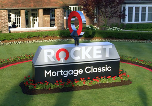

Entrant Company
Rocket Central
Category
Video - Nonprofit
Country / Region
United States

Entrant Company
Imaj Associates
Category
Corporate Identity - Brand Identity
Country / Region
United States
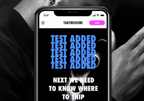

Entrant Company
Mangold Design
Category
Corporate Social Responsibility - Pro Bono (Free)
Country / Region
United States


Entrant Company
Audacity Health
Category
Advertising - COVID-19-Related
Country / Region
United States


