2022
UST’s Simplified, Dynamic Logo
Entrant Company
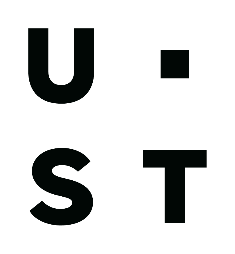
UST
Category
Corporate Identity - Logos
Client's Name
Country / Region
United States
Since its founding in 1999, UST has evolved from a small start-up to a full-service digital transformation firm with a powerful mission: transforming lives. Born digital, UST guides the world’s best companies through their toughest business challenges, walks side by side with clients to earn trust, and charts the smartest, fastest path toward a more sustainable tomorrow.
Today, UST is a mission-driven group of 30,000+ practical problem solvers and creative thinkers in 30+ countries. After 20 years in business, we set out to create a bold UST brand that authentically tells the world who we are and the impact we make. We created a new strategic brand platform, visual identity and digital experience for UST that reflects our modern vision and positions the company in the market as a premier digital transformation partner—beginning with its logo.
UST’s previous logo struggled to communicate who we are and had readability issues. It also utilized our previous name. So, “UST Global” evolved into “UST.” Now UST no longer stands for three words. Instead, the letters combined with a new logo represent what makes us unique. Our new logo stands for innovation. It's dynamic, adapting, ready to solve any problem - just like UST.
A single square serves as an anchor point, representing the building blocks and tools UST uses to construct unique solutions. The square is the primary inspiration for the overall visual identity.
There are four distinct iterations of our logo. Each variation combines the letters U, S and T with the anchor point to allow for flexibility in design. In each instance, the logo is placed in one of the four corners of an asset, always using the version that positions the anchor point in the innermost corner so that the content of the layout gives the impression of growing from the logo.
UST’s proprietary icon library builds upon our logo. Built from scratch to represent general concepts, each icon borrows the logo’s anchoring square, evoking the building blocks we use to construct unique solutions.
Bold and dynamic, UST’s logo—much like the company itself—expresses stability, strength and agility.

Credits

Entrant Company
Moya Design Partners
Category
Video - Self-Promotion
Country / Region
United States

Entrant Company
HAVAS
Category
Experiential & Immersive - Community
Country / Region
France
Entrant Company
McKinsey Global Publishing
Category
Video - Consulting
Country / Region
United States
Entrant Company
Graphic Dpt
Category
Marketing & Promotional - Invitation / Greeting Card
Country / Region
Taiwan