
2022
Wooman Power
Entrant Company
Triangler Co., Ltd.
Category
Corporate Identity - Brand Identity
Client's Name
WooManPower Corp.
Country / Region
Taiwan
Wooman Power is a female community gathering women from all walks of life to learn together, and create more possibilities for being a better self.
Inspired by the community's unique hand gesture, the logomark is designed as a pair of confident spreading wings symbolizing strong mutual support for every member to fly freely in their colorful life.
The rose gold color palette gives the gentle but tenacious woman power an elegant and comfortable interpretation. The new rebrand unites not only how the public sees the brand, but the belongingness to Wooman Power.


Credits
Entrant Company
Savannah College of Art and Design
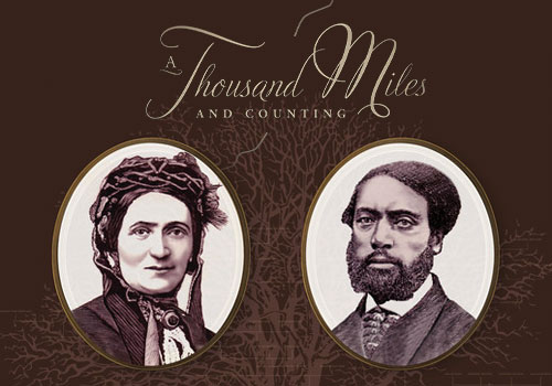
Category
Video - Documentary
Country / Region
United States

Entrant Company
Austin Kelley Productions LLC
Category
Branded Content - Lifestyle
Country / Region
United States

Entrant Company
Mnemonic Agency
Category
Video - Video / Others___
Country / Region
United States
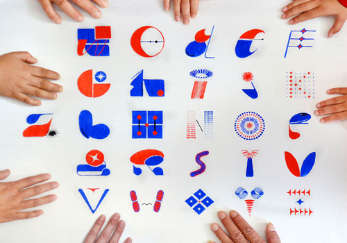
Entrant Company
Yu Chen
Category
Typography - Typefaces / Font System
Country / Region
China