2022
Holy Stone 40th founding anniversary
Entrant Company
Triangler Co., Ltd.
Category
Event - Celebration Event
Client's Name
Holy Stone Enterprise Co., Ltd.
Country / Region
Taiwan
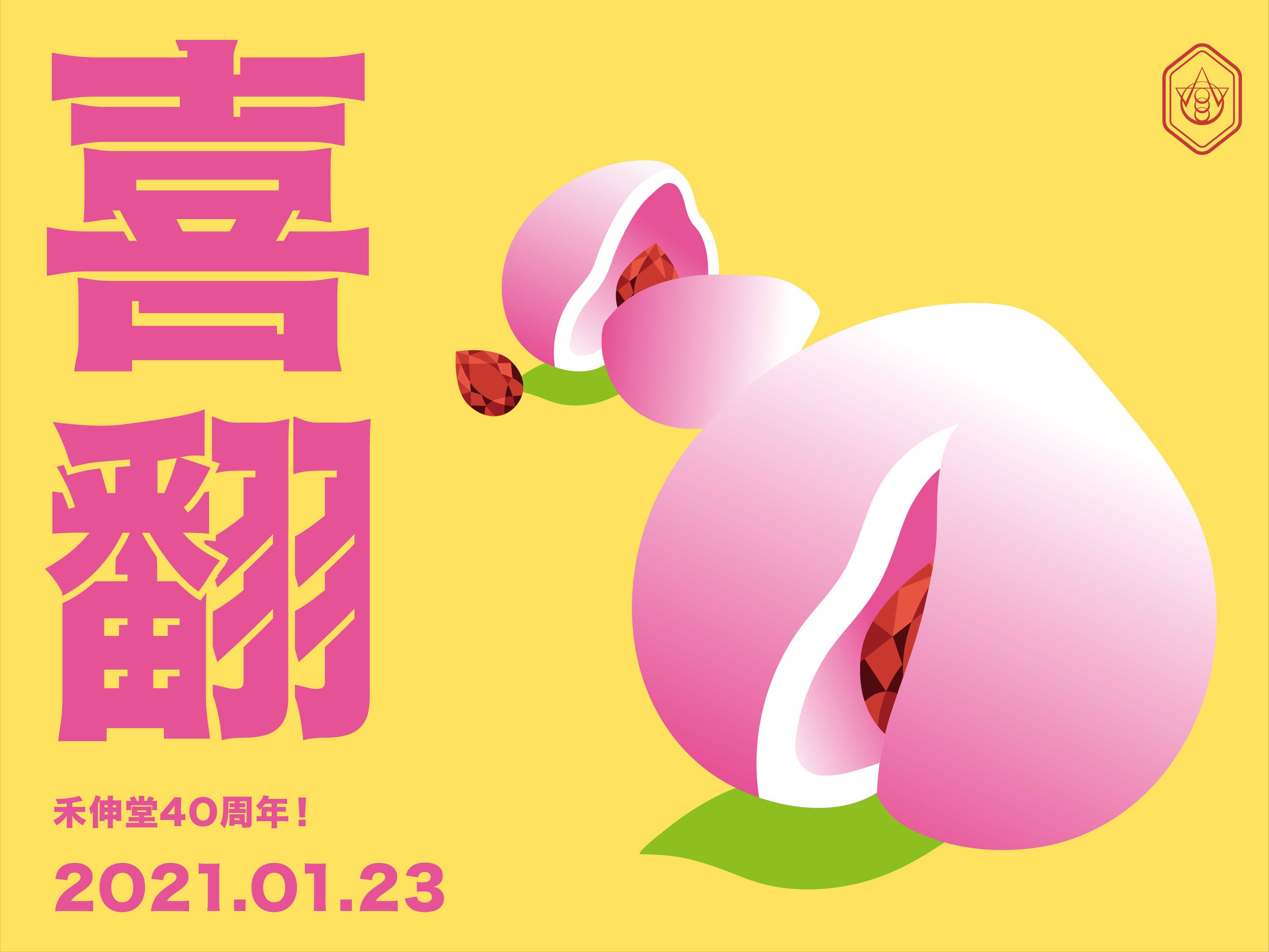
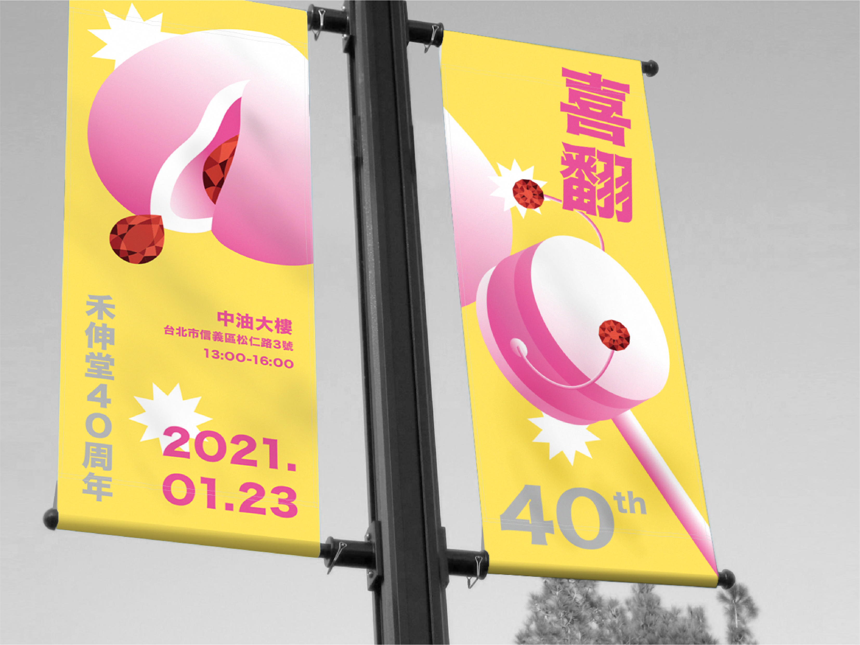
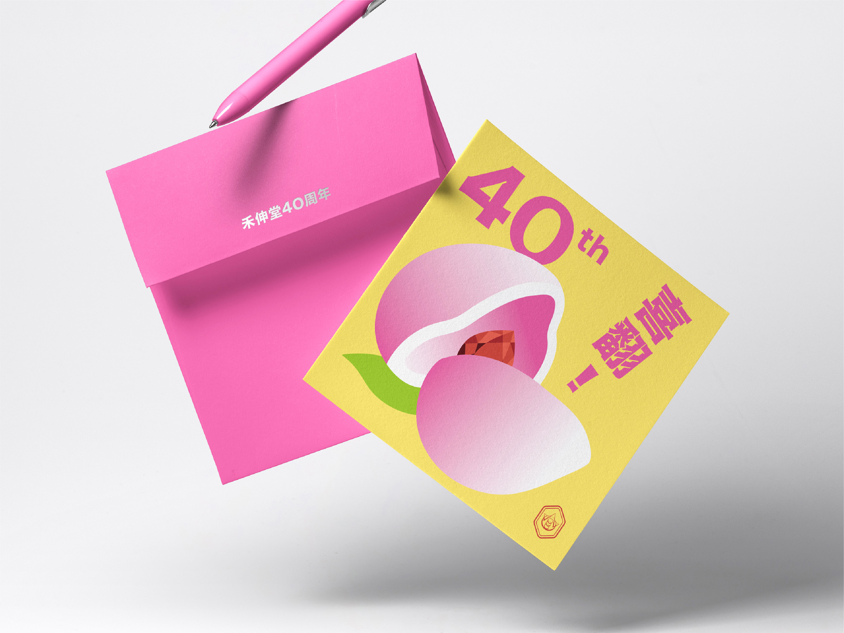
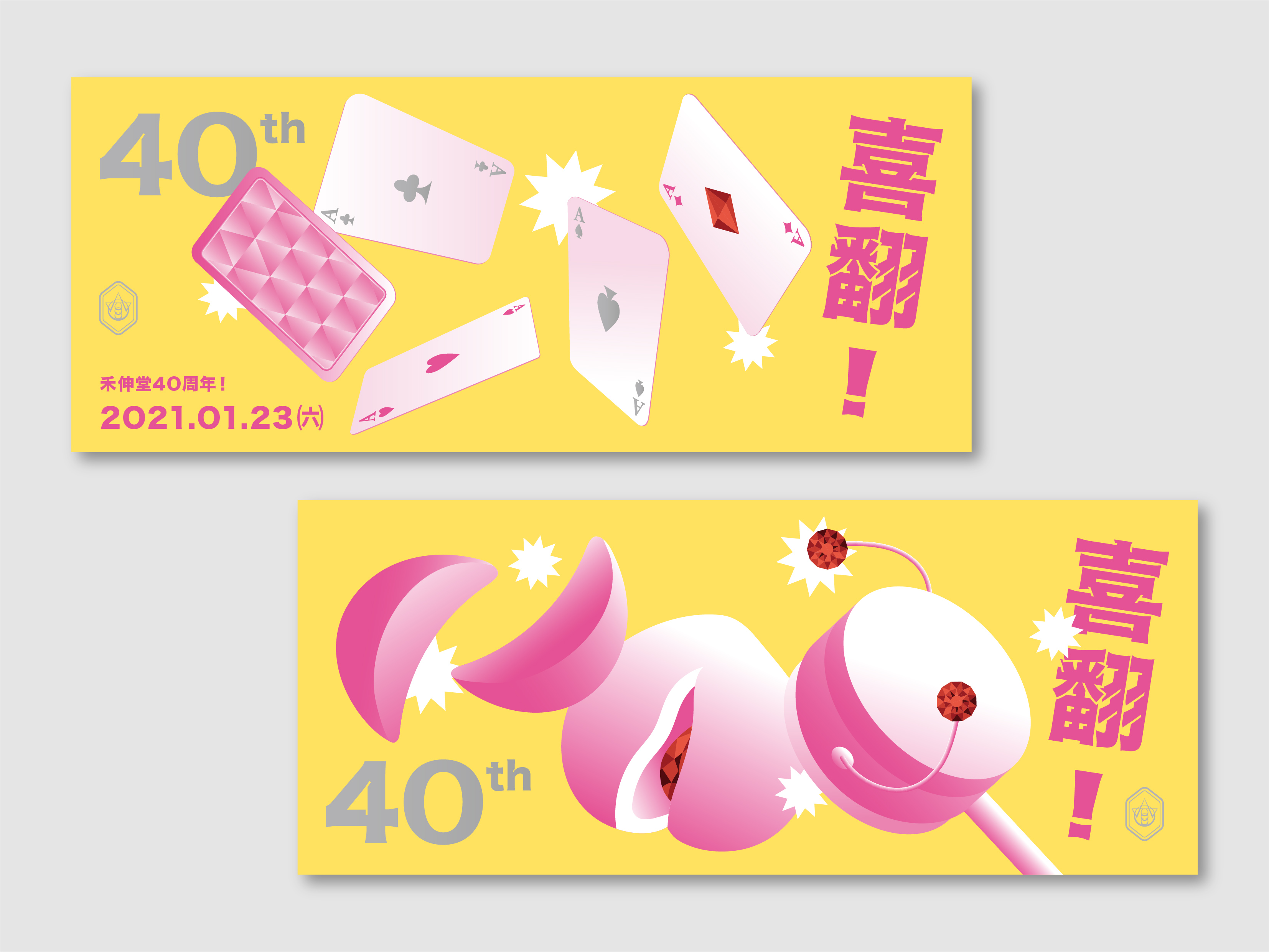
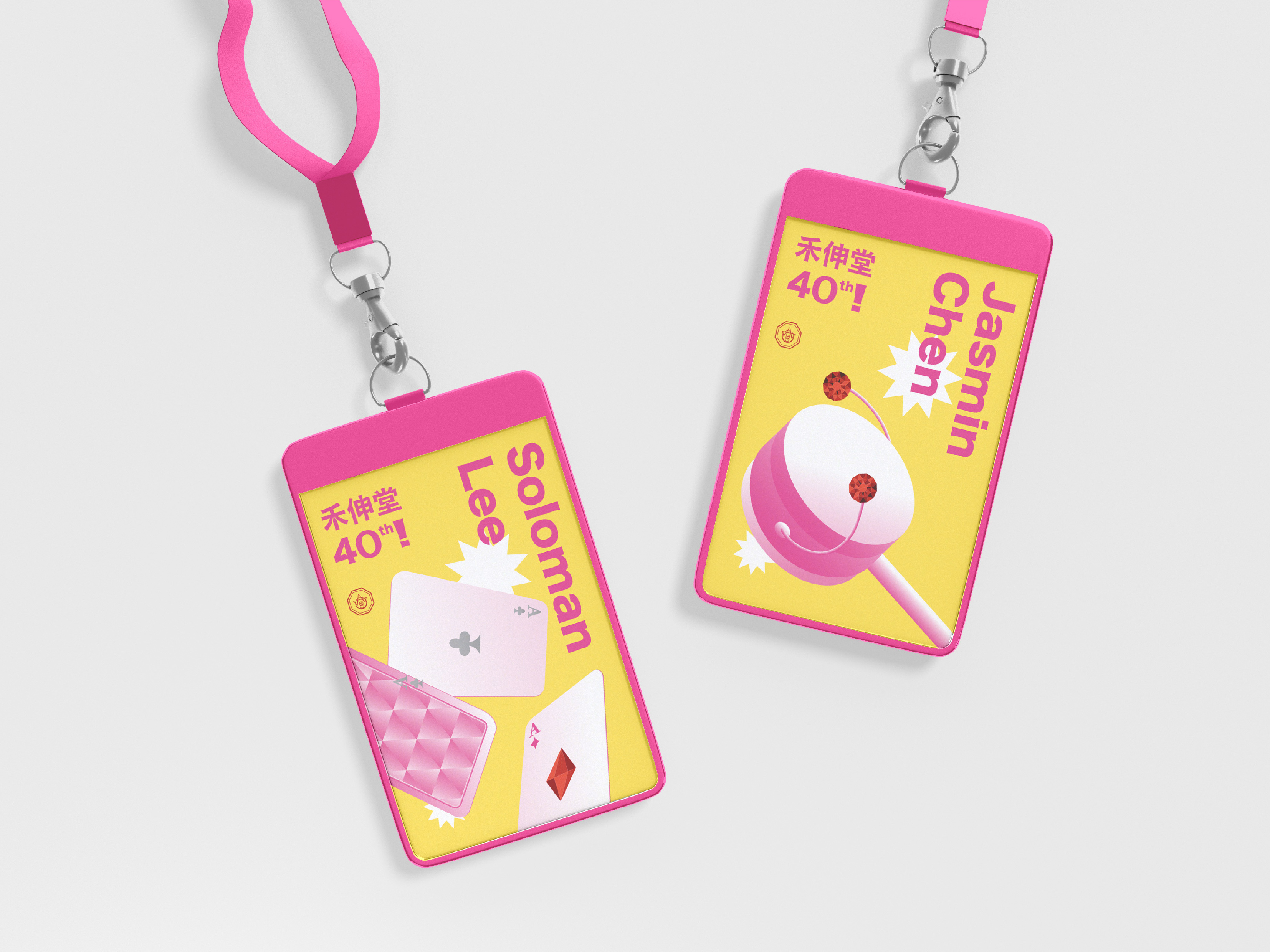
Celebrating the 40th founding anniversary, Holy Stone planned a series of year-round activities to share the joy with employees.
The key visual combines the Chinese birthday peach bun and the ruby symbolizing the 40th anniversary. The Chinese logotype means "Loving and Turning" in Taiwan, so its visual is designed like turning pages to an even exciting, promising future.
In coloring, the energetic yellow and vivid purple pink not only create an eye-catching year-round celebration, but picture a younger corporate culture ready for more challenges ahead.


Credits
Entrant Company
Shenzhen REHOEGD Signage Co., Ltd.
Category
Corporate Identity - Logos
Country / Region
China
Entrant Company
W2 Design Xiamen, China
Category
Outdoor Advertising - Signage
Country / Region
China

Entrant Company
Casa Batlló
Category
Video - COVID-19-Related
Country / Region
Spain

Entrant Company
The Gate NY
Category
Video - Corporate
Country / Region
United States