2022
Corporate and Brand Identity in Business Travel Technology
Entrant Company
Deem
Category
Corporate Identity - Brand Identity
Client's Name
Country / Region
United States
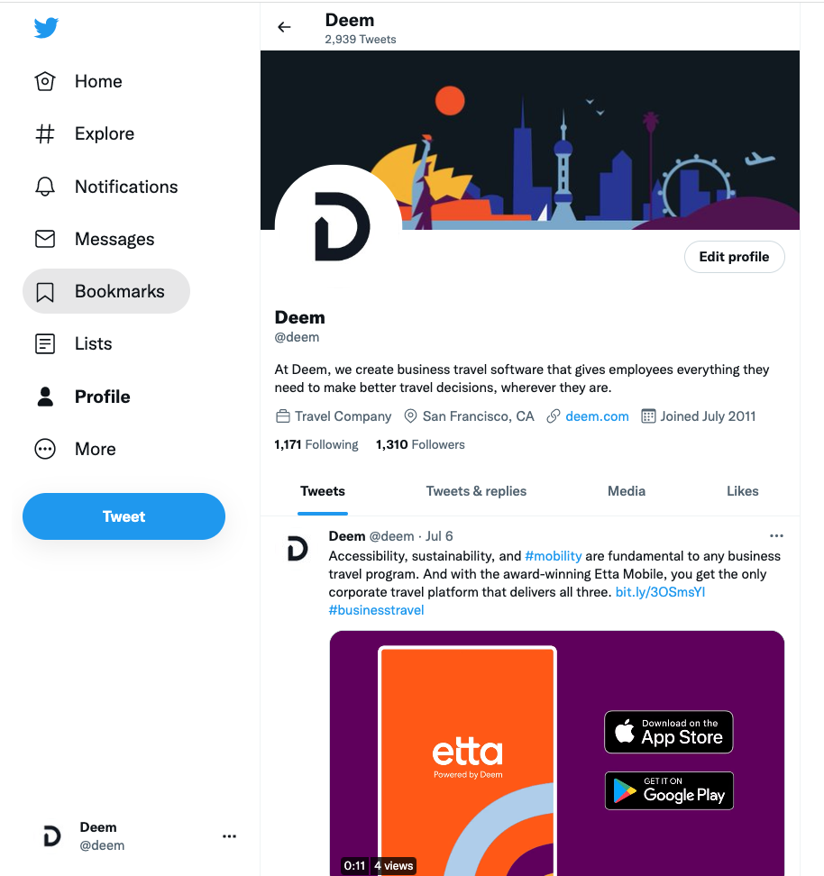
Corporate travel is very, well, corporate. So we knew our new identity for Deem and our Etta software would immediately show that we’re different.
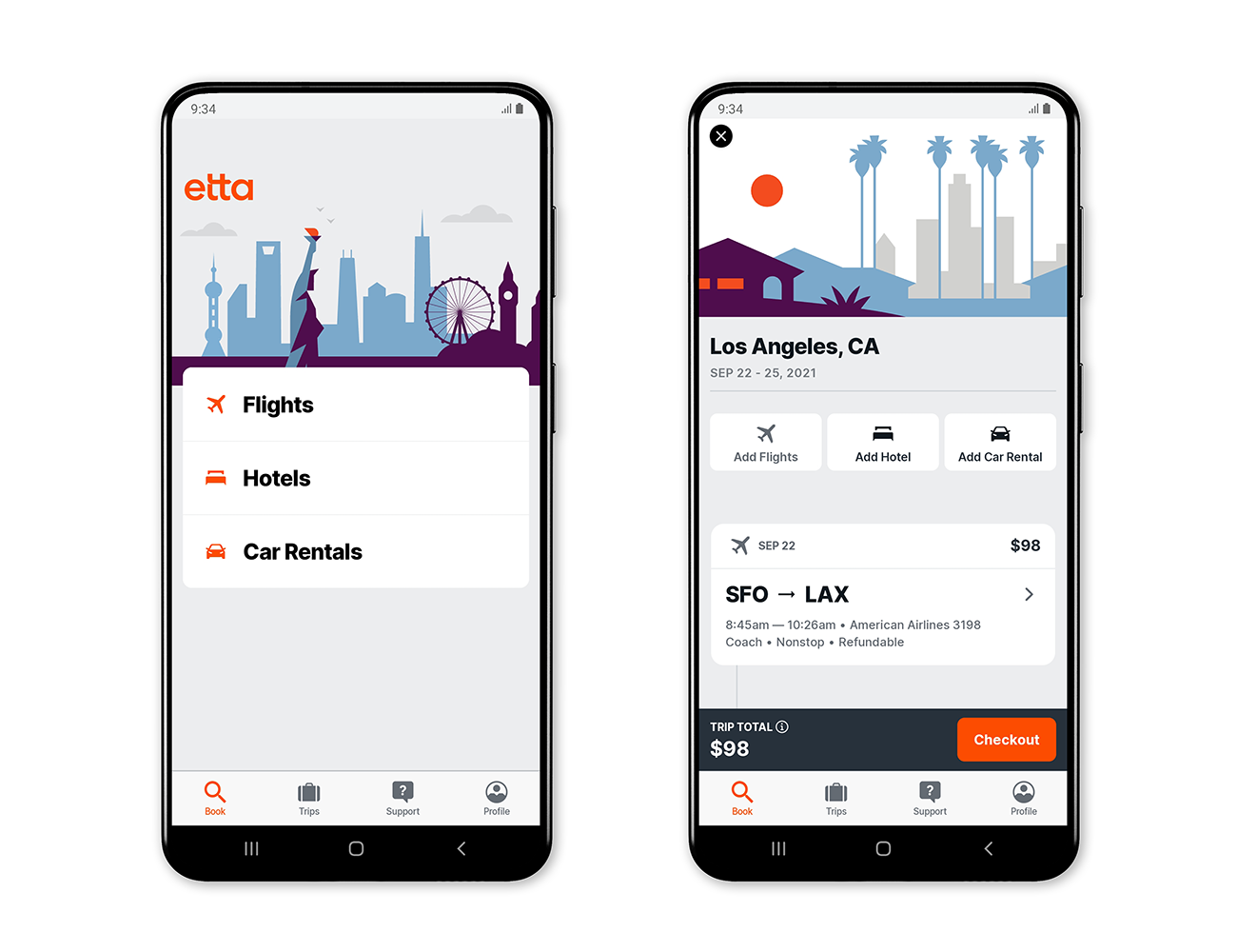
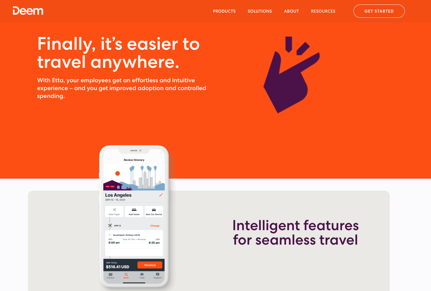
Our goal is to increase Etta traveler adoption by offering a trustworthy and engaging brand, and an elegant, intuitive platform with important features that no one else offers. We started with a human-centered design approach, and Etta was born from our conversations with travelers and travel managers. We found out what they want, need, and how they use technology.
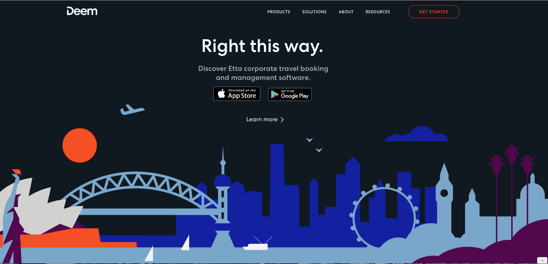
Then, incorporating that feedback, we made sure we don’t look like anyone else. The Deem.com website relies on Deem’s primary black color and incorporates Etta’s bold orange and purple, with strategic use of the rest of the brand palette throughout. But you won’t find a distracting carnival of color everywhere.
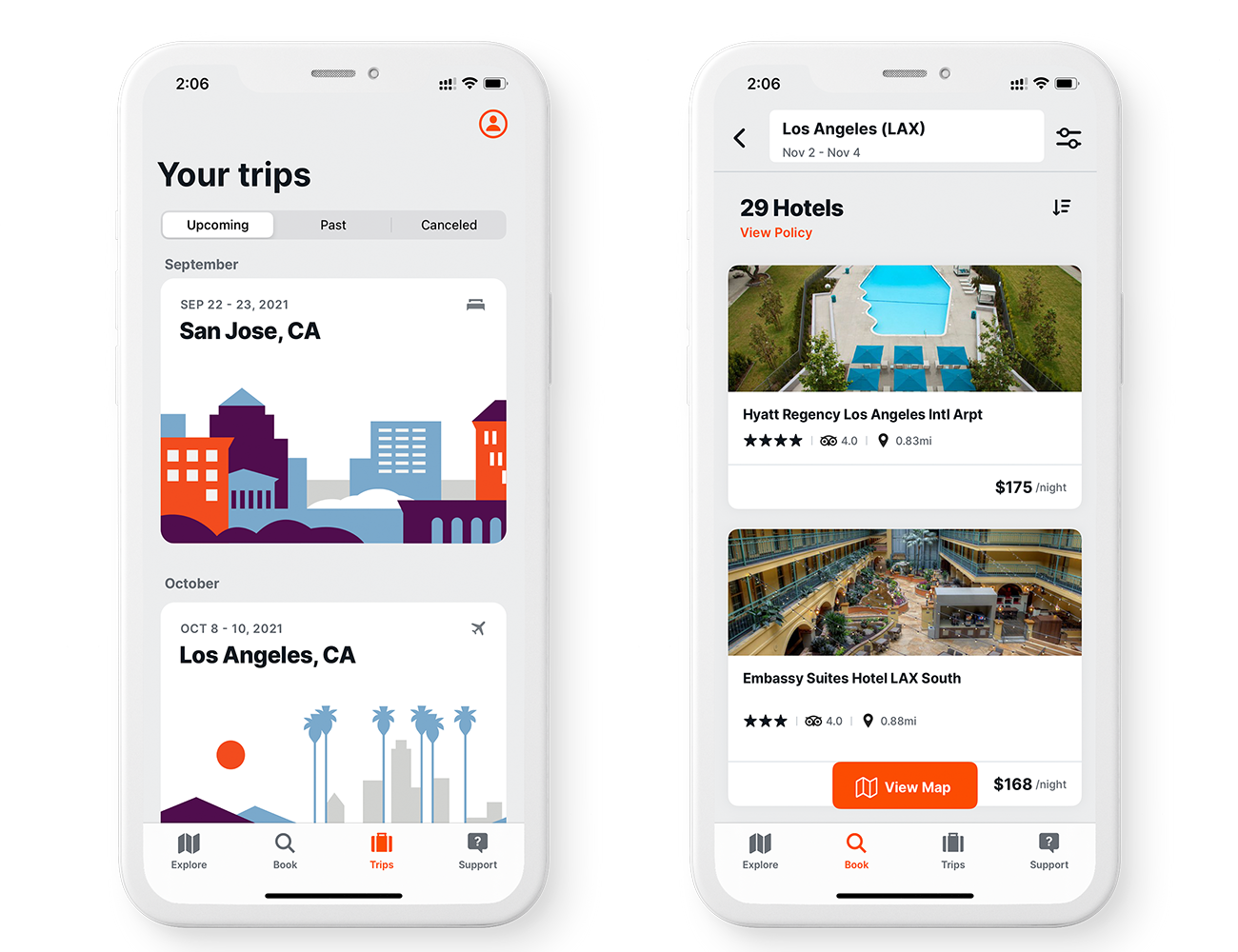
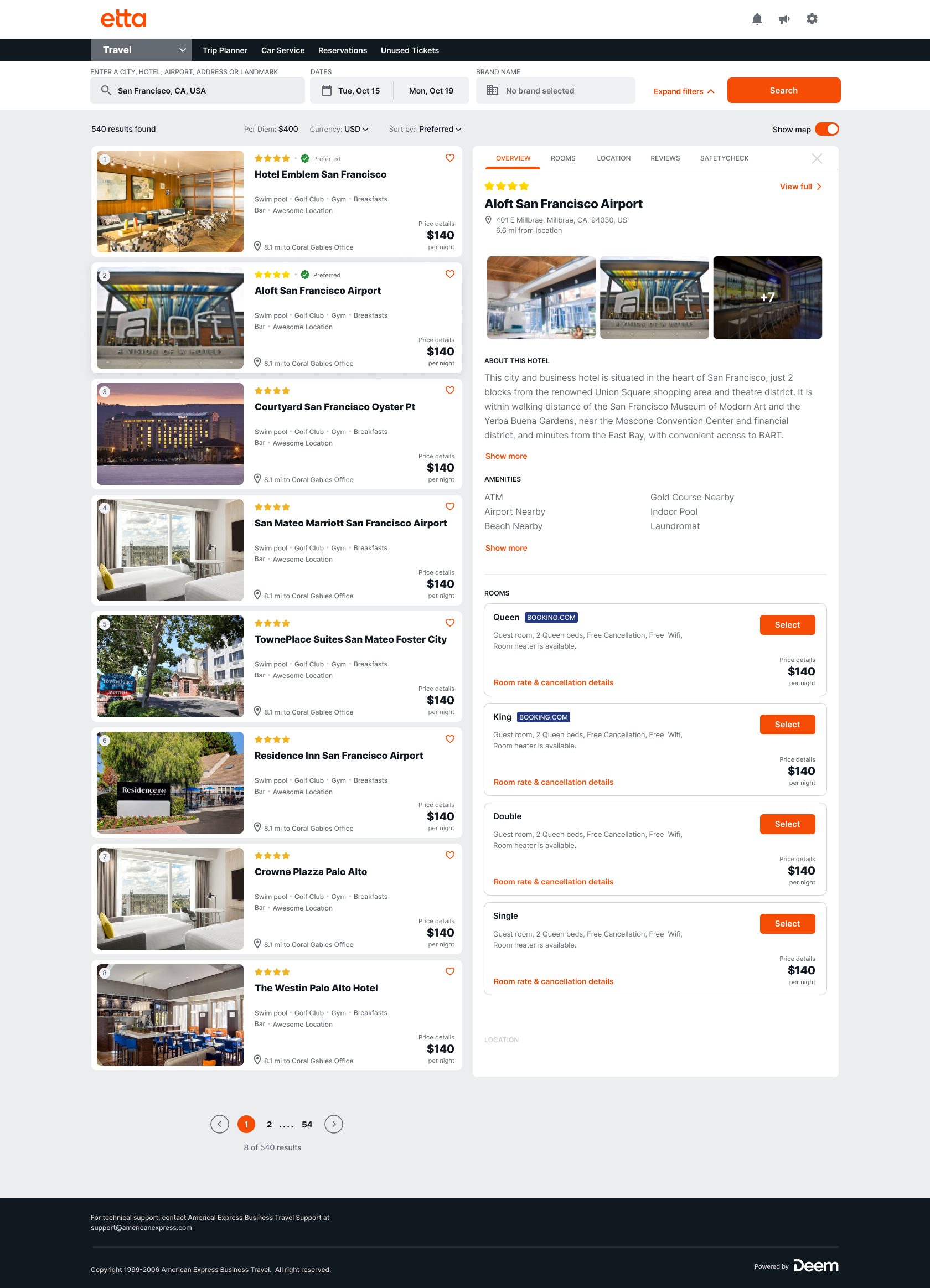
You will find in Etta aesthetic, original landscape illustrations commissioned from a Barcelona-based artist, space for the eye to rest on each screen, and a refreshing, conversational brand voice that doesn’t exist in any other corporate travel booking software. Outside of the Etta app, our identity includes bold arrow motifs and pictograms that we use in animations and on owned properties.
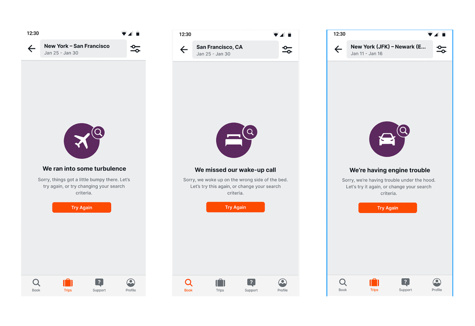
It was important that Etta’s “voice” sound very human and relatable. We make sure Etta isn’t clever for clever’s sake—she’s still got to be clear and informative, especially in the app when people are trying to schedule or fix their trips. But she’s got some style, too.
Etta’s design considers the guardrails we established for usability for all travelers. Etta is still the only business travel booking technology that meets the AA level guidelines set by the Worldwide Web Consortium. To accomplish this, our design is clean, elegant, respects devices’ sensitivity settings for animations, and limits the number of decisions on one screen, among other details.
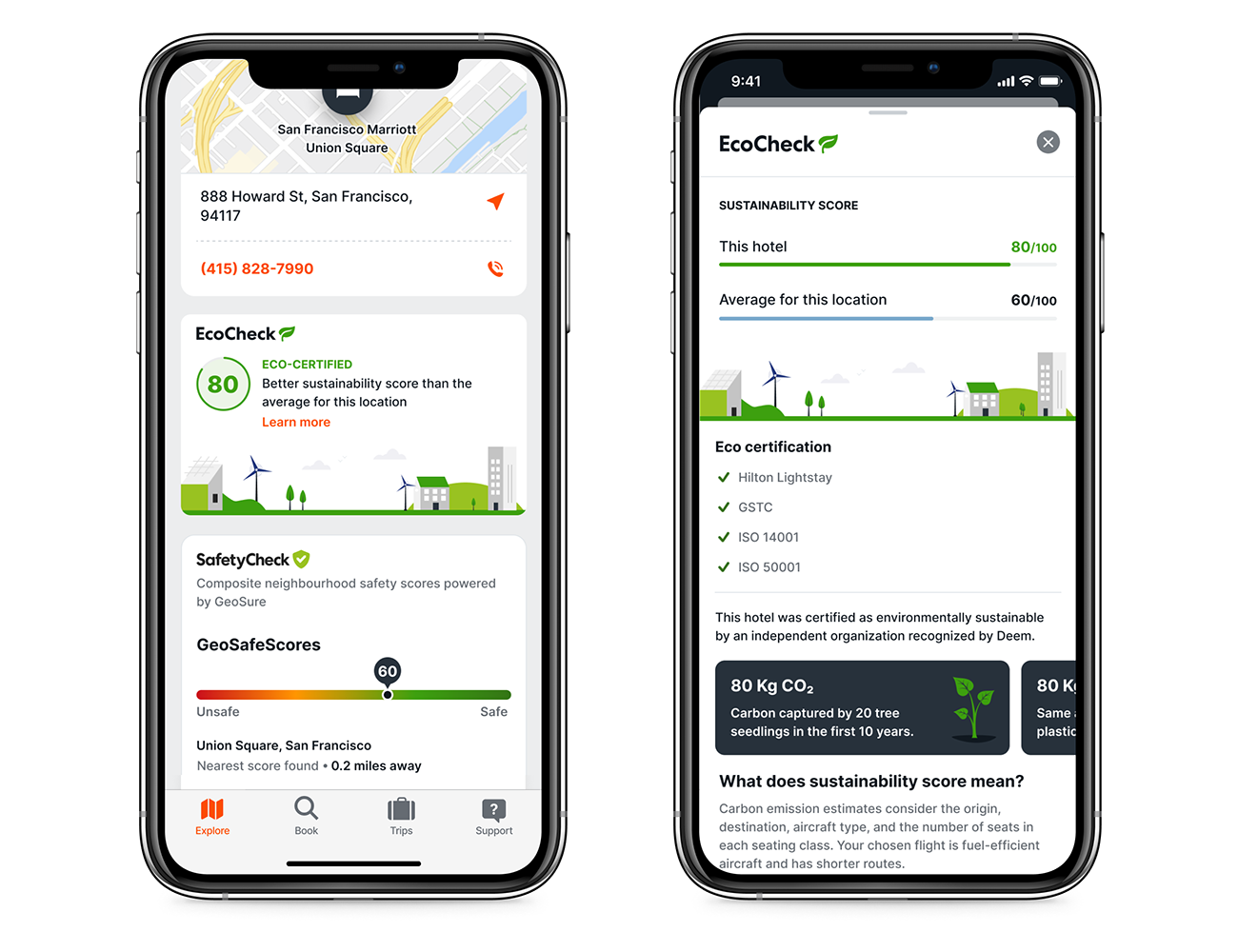
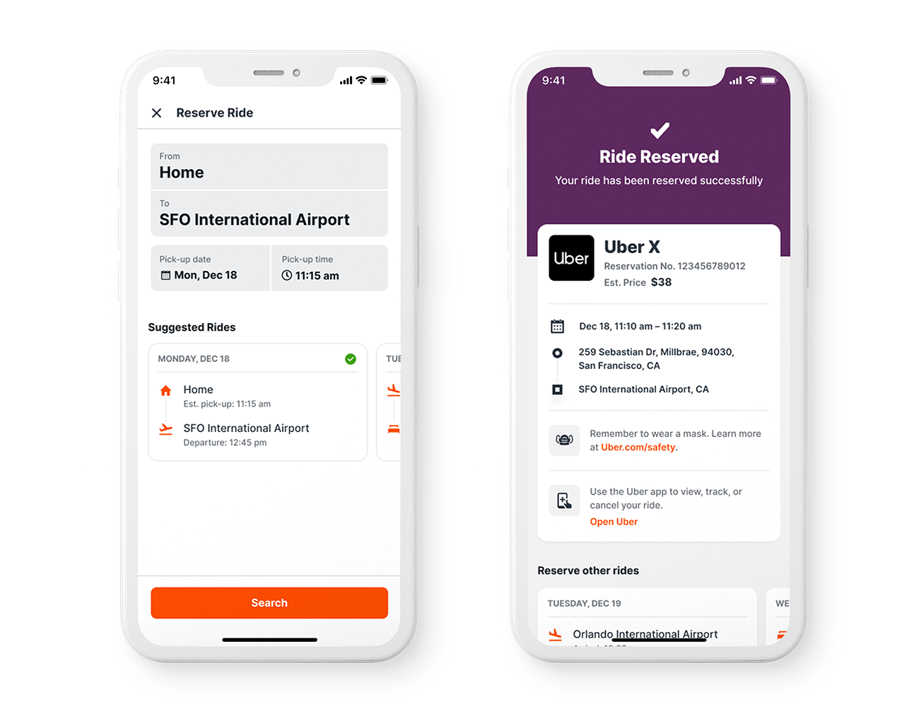
Our design is also flexible enough to easily incorporate first-of-their-kind integrations within Etta’s design protocols: in-platform Uber ride booking; contextual information and scores in our EcoCheck feature; and Travel SafetyCheck, which shows health and safety information.
Entrant Company
Americaneagle.com
Category
Website - E-Commerce
Country / Region
United States

Entrant Company
Evergreen Podcasts
Category
Audio - Podcast
Country / Region
United States

Entrant Company
Bad Penny Factory
Category
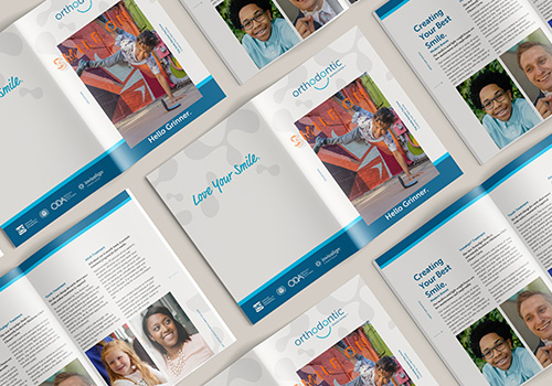
Marketing & Promotional - Brochure
Country / Region
United States

Entrant Company
Kateryna Lebedynska
Category
Social Media - Fashion Beauty & Luxury
Country / Region
United States
