
2023
Da Kine By Da C
Entrant Company
Octavo Designs
Category
Corporate Identity - Logos
Client's Name
Tony Checchia
Country / Region
United States
Time to put some toes in the sand! Tony Checchia came to us wanting a logo for his beachside property that symbolized peace, love and happiness like the timeless and natural harmony of waves crashing on the beach. This beachy logo and branding for Da Kine By Da C features a “C” as the focal point with waves intertwined in a symmetrical way to resemble natural harmony. Palm leaves rise out of the top of the C and create the illusion of a sun to give the mark a Hawaiian flare. The top most circle and arrows emerging from the sides unify the logo and form an anchor when paired with the waves to highlight the sea ambience.


Credits
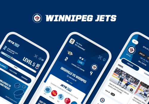
Entrant Company
Mirego
Category
App - Sports & Recreation
Country / Region
Canada

Entrant Company
Mindsailing
Category
Branded Content - E-Book
Country / Region
United States

Entrant Company
Fresno First Bank
Category
Video - Banking
Country / Region
United States

Entrant Company
DesignHammer
Category
Website - Health
Country / Region
United States