2023
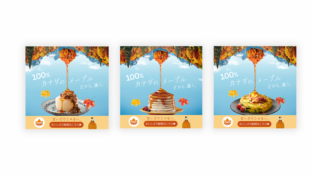
“It’s different, because it’s a 100% Canadian maple”
Entrant
relativ*
Category
Strategic Program - Digital Marketing Campaign
Client's Name
Quebec Maple Syrup Producers
Country / Region
Japan
We set off to change a long held misconception about maple syrup being an expensive topping for pancakes by drawing the consumer attention to maple’s strongest advantage over competition – nature. And simply connected the dots, so that people could do the same. We leveraged the strong association Japanese have of Canada with nature and created an overt visual line between the consumption occasion – pancakes (and others), the product – maple syrup, and its origin – Canadian forests. Under the motto – “It’s different, because it’s 100% Canadian” we built a digital campaign that targeted people browsing for recipes, intercepting their search with the bright visual leading to maplefromcanda.jp where we welcomed them with inspiring new recipes and surprising facts about maple.
Credits


Entrant
Atrium Health
Category
Branded Content - Healthcare & Pharma
Country / Region
United States


Entrant
MarketCrest
Category
Strategic Program - Search Enging Marketing (NEW)
Country / Region
United States


Entrant
Muse Intermedia LLC
Category
Website - Travel
Country / Region
United States

Entrant
Random42 Scientific Communication
Category
Experiential & Immersive - Virtual Reality
Country / Region
United Kingdom


