2023
Ciao Bella
Entrant Company
Creative Co, LLC
Category
Corporate Identity - Logos
Client's Name
Ciao Bella
Country / Region
United Arab Emirates
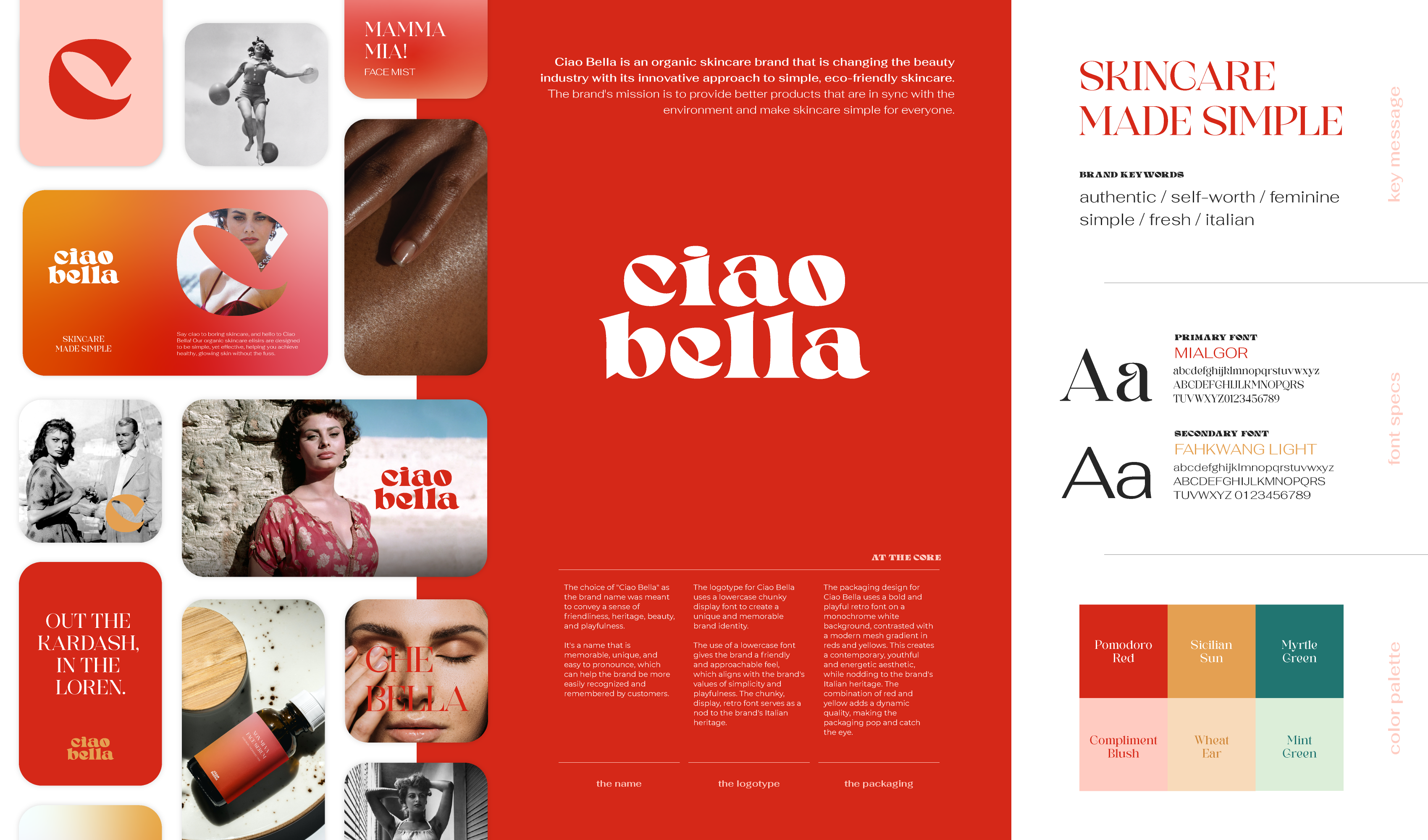
Ciao Bella is an organic skincare brand that is changing the beauty industry with its innovative approach to simple, eco-friendly skincare. The brand's mission is to provide better products that are in sync with the environment and make skincare simple for everyone. The choice of "Ciao Bella" as the brand name was meant to convey a sense of friendliness, heritage, beauty, and playfulness.
It's a name that is memorable, unique, and easy to pronounce, which can help the brand be more easily recognized and remembered by customers. The logotype for Ciao Bella uses a lowercase chunky display font to create a unique and memorable brand identity.
The use of a lowercase font gives the brand a friendly and approachable feel, which aligns with the brand's values of simplicity and playfulness. The chunky, display, retro font serves as a nod to the brand's Italian heritage. The packaging design for Ciao Bella uses a bold and playful retro font on a monochrome white background, contrasted with a modern mesh gradient in reds and yellows. This creates a contemporary, youthful and energetic aesthetic, while nodding to the brand's Italian heritage. The combination of red and yellow adds a dynamic quality, making the packaging pop and catch the eye.
Credits

Entrant Company
Moya Design Partners
Category
Integrated Marketing - Integrated Marketing Materials
Country / Region
United States


Entrant Company
Dragonfly Africa
Category
Corporate Social Responsibility - Pro Bono (Free)
Country / Region
Kenya


Entrant Company
LevLane
Category
Video - Insurance
Country / Region
United States

Entrant Company
BESLER
Category
Website - Financial Services
Country / Region
United States
