2023
Baoman VI Design
Entrant Company
Shanghai Baoman Communications Co., Ltd
Category
Corporate Identity - Brand Identity
Client's Name
Shanghai Baoman Communications Co., Ltd
Country / Region
China
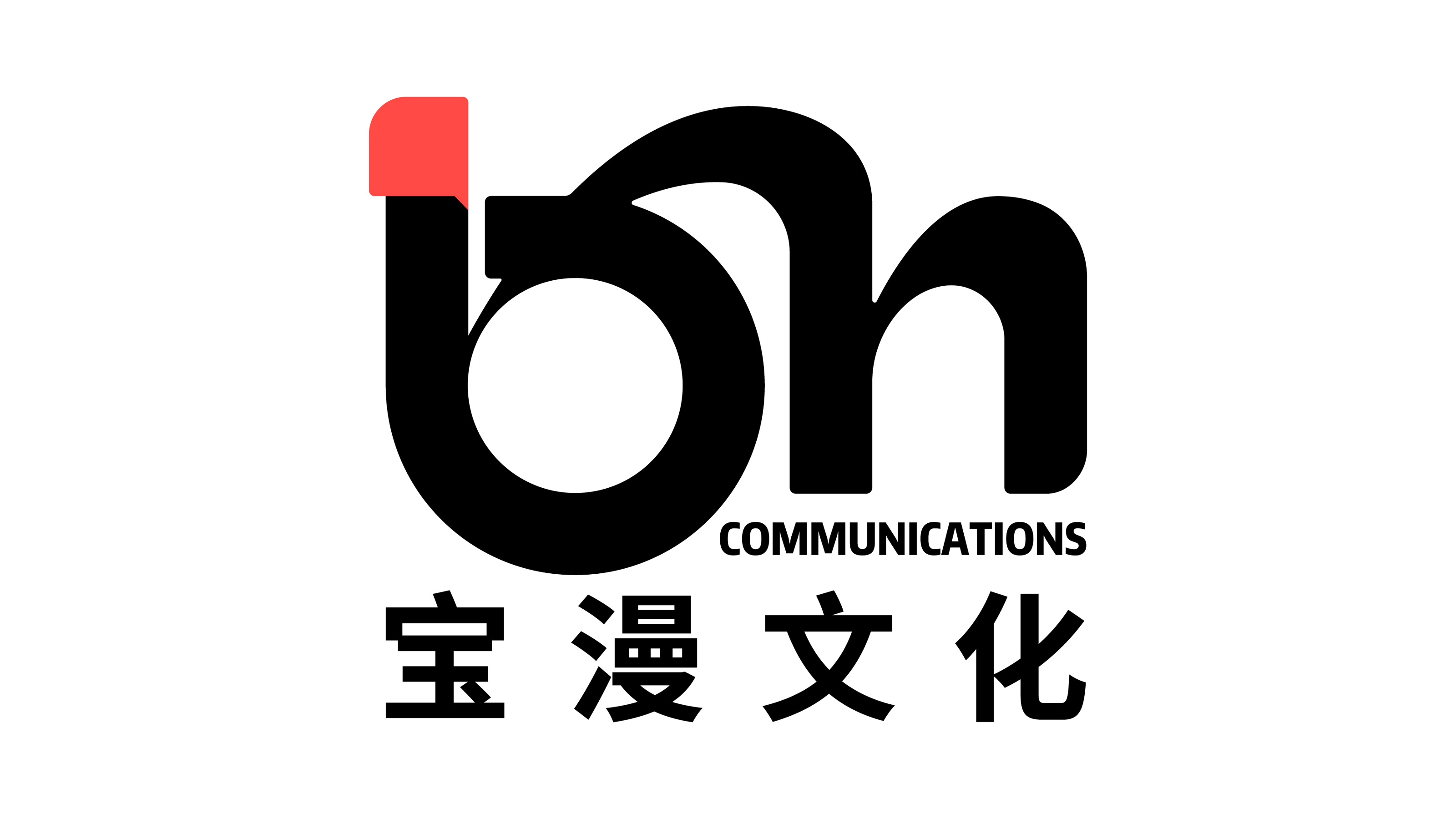
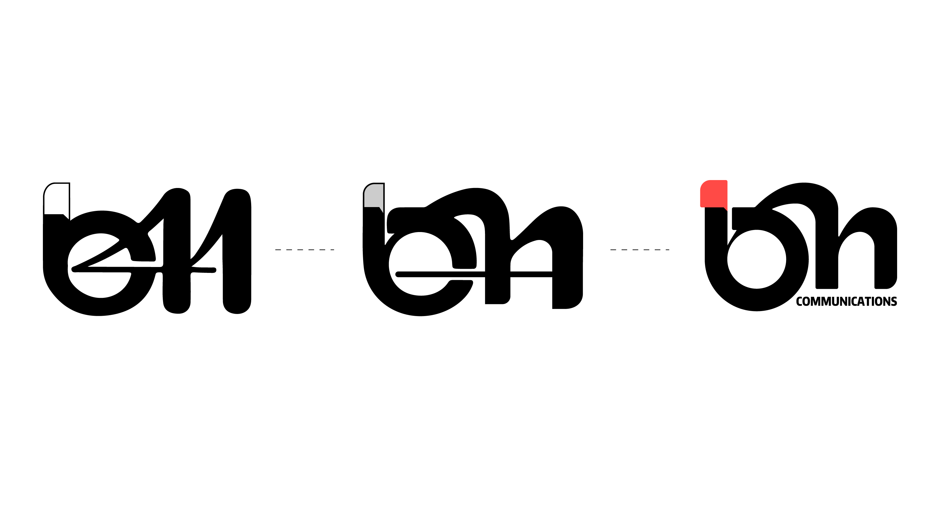
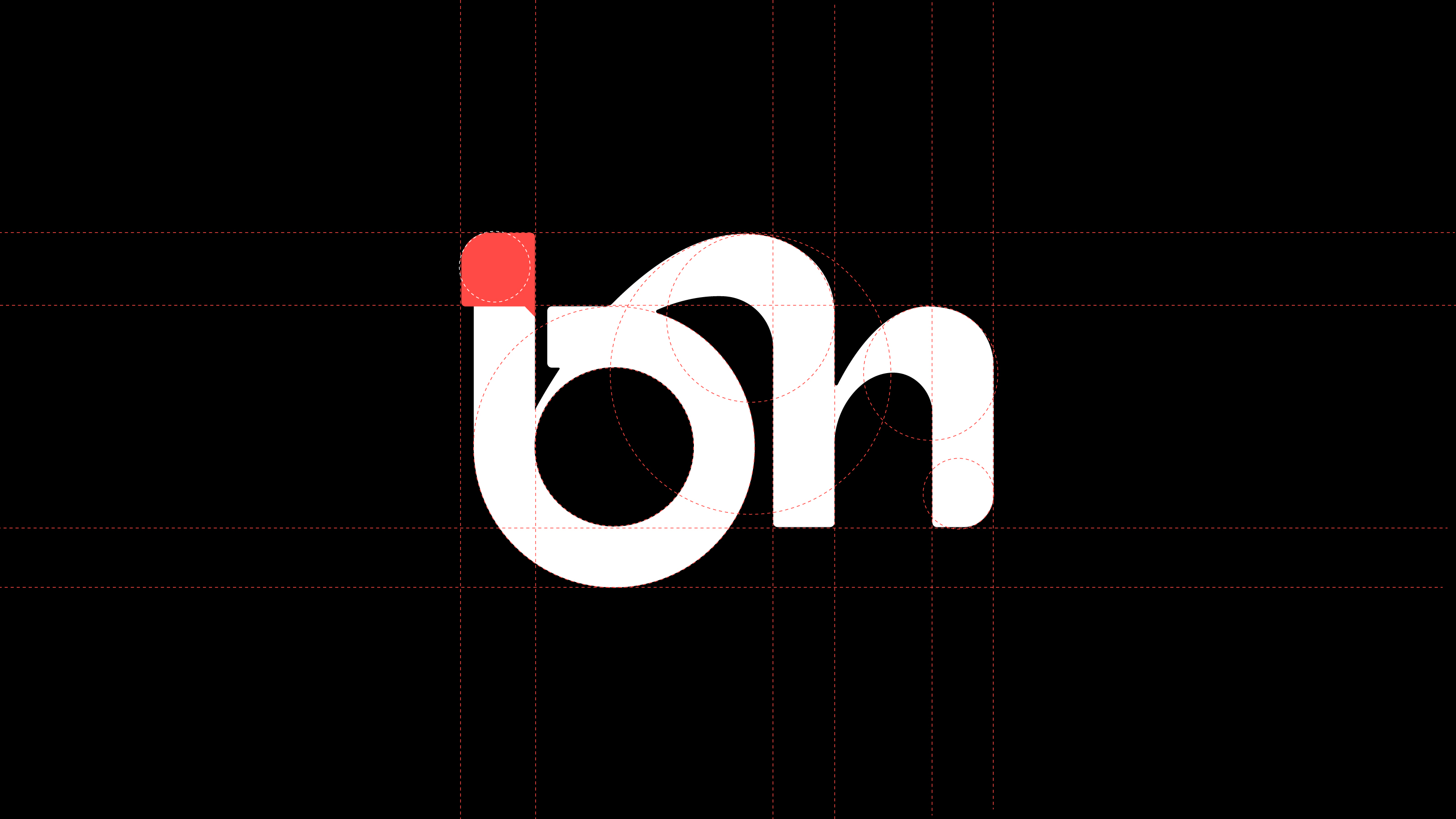
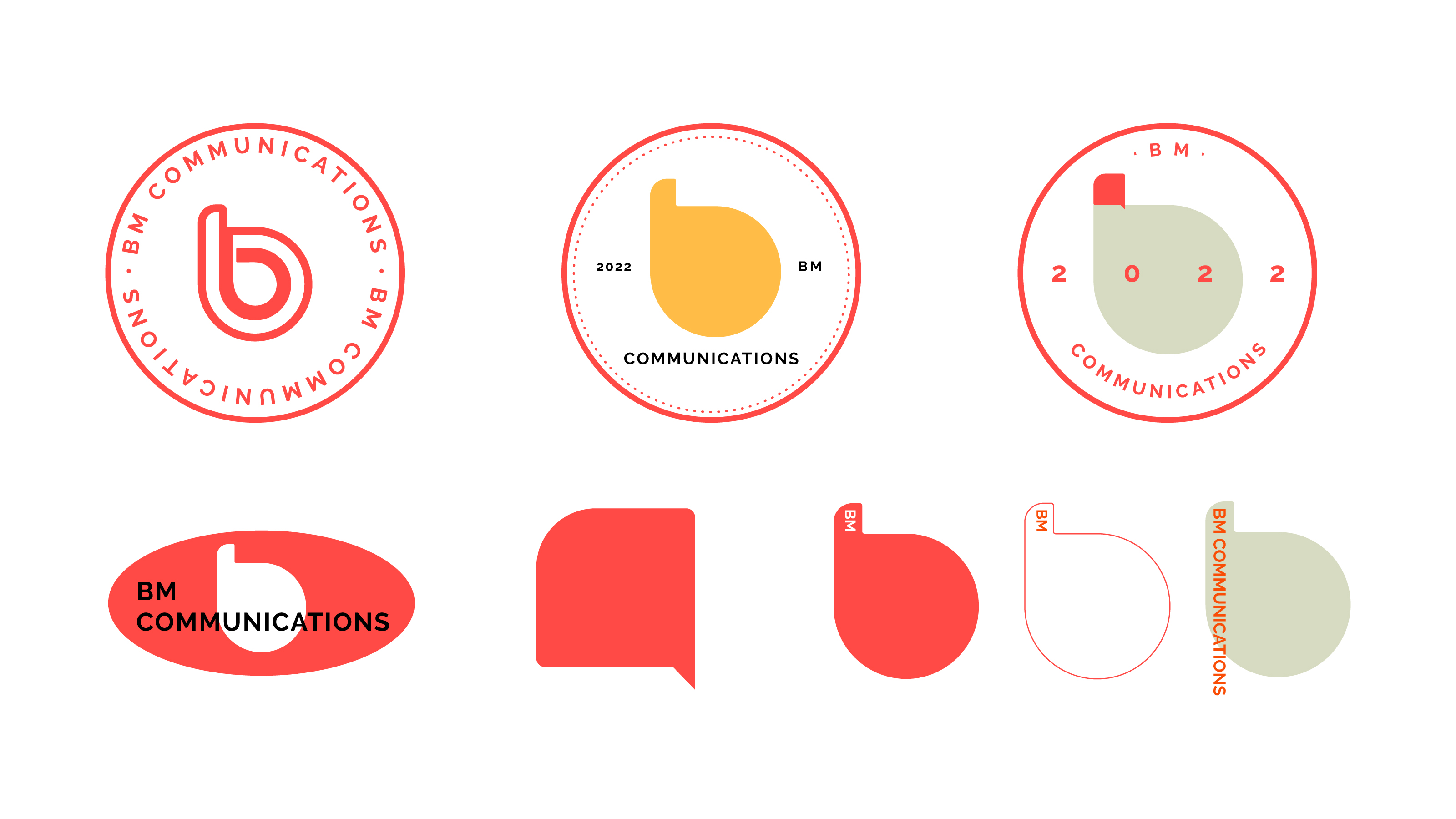
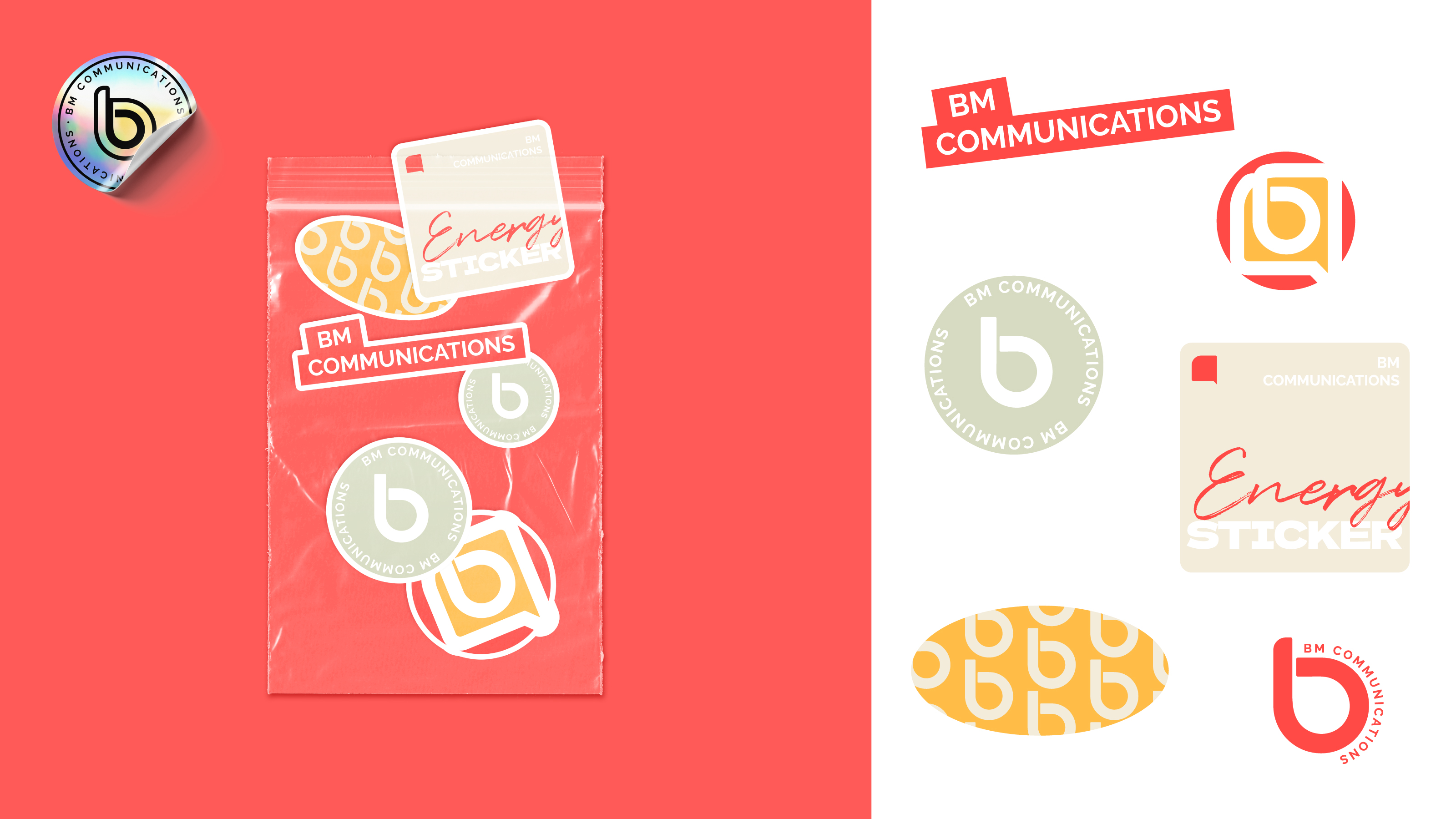
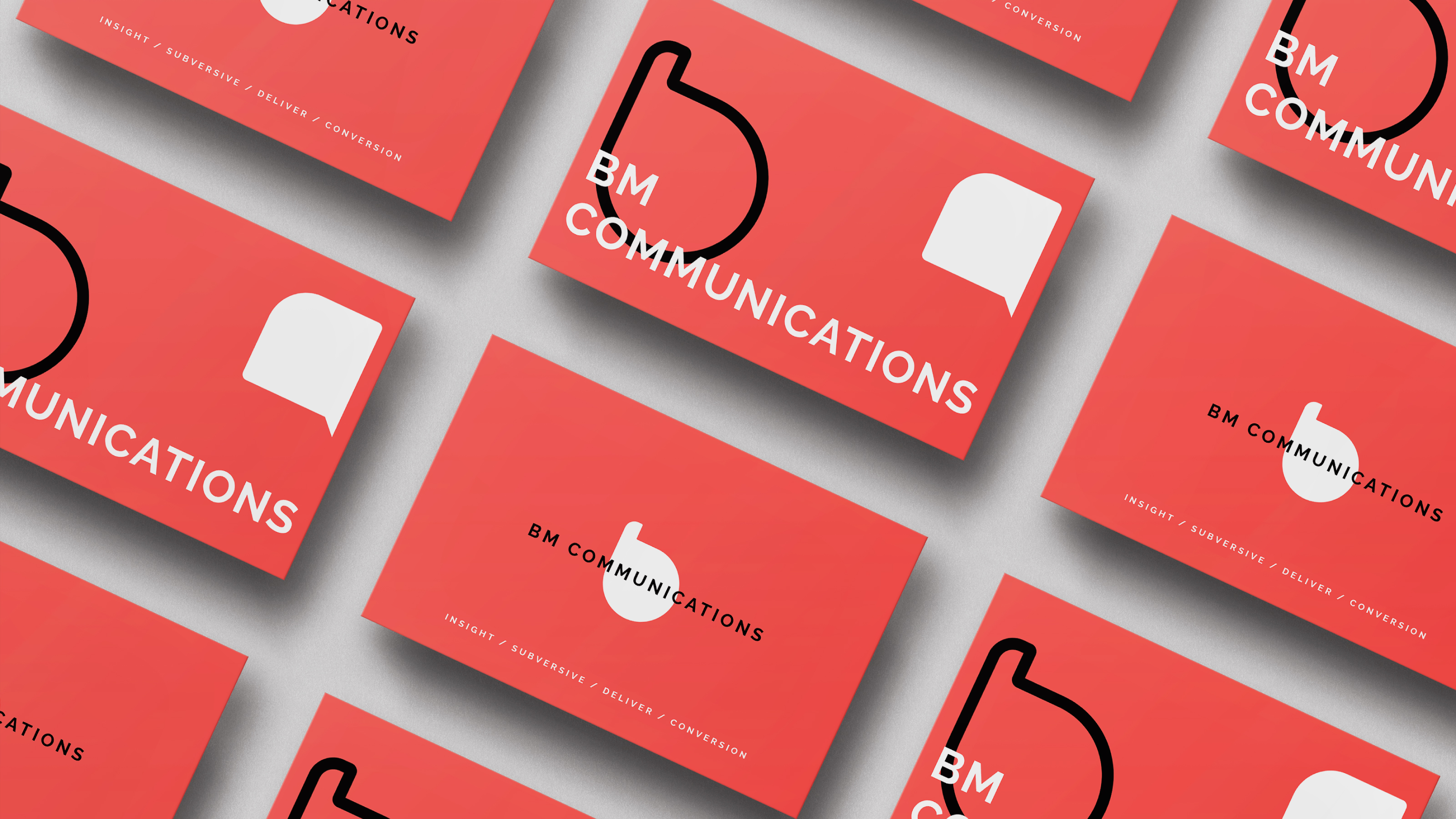
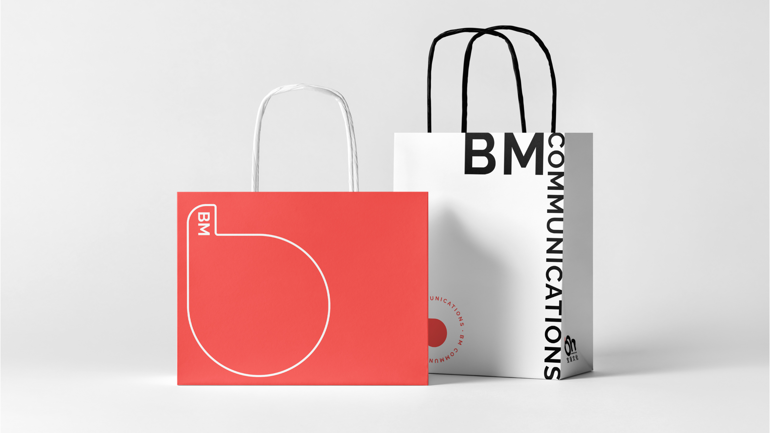
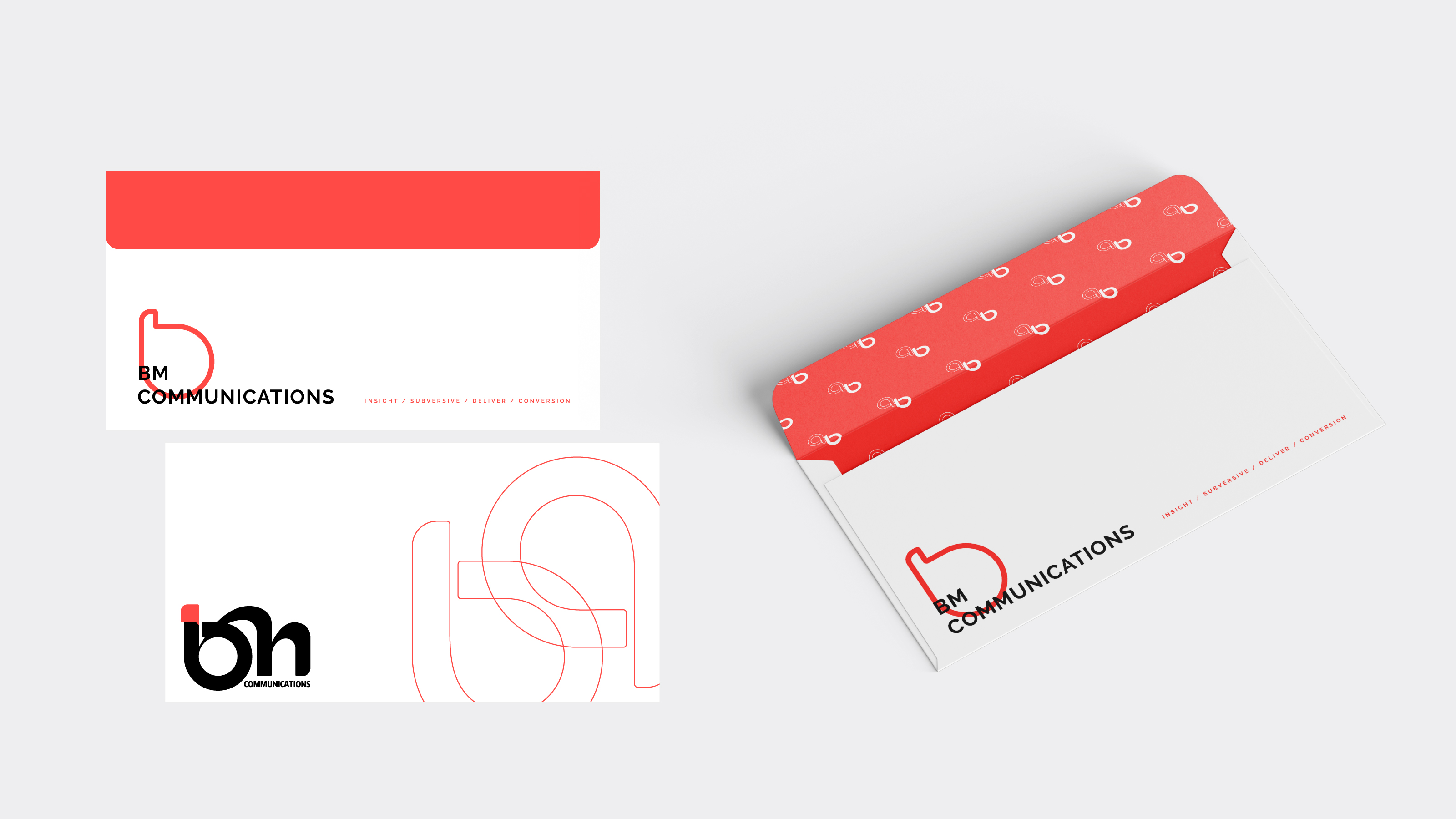
Baoman is dedicated to establishing seamless connections with its customers to provide comprehensive business services. When designing its brand visual logo, the designer extracted the initials B and M from the brand name Baoman (宝漫), and integrated the concepts of bridges and dialogue. While preserving the fundamental shape, the strokes and lines were artistically processed to make the logo concise and easily recognizable. Additionally, the letters were superimposed and connected to avoid a fragmented and weak association among the elements. This integration makes the logo whole and leaves a deep impression on customers. Moreover, the speech bubble and bridge structure add interest and visual depth to the overall simple logo, and convey the brand's concept of “building solid communication and links” to customers.
Thanks to the geometric and graphic design, the elements in the logo can be split and combined to form new visual symbols, which can be flexibly applied to different environments and media for brand promotion. Additionally, with black as the primary tone and red elements in the details, the logo is both calm and energetic, highlighting the brand’s youthful and energetic characteristics and temperament.

Credits
Entrant Company
RBK Advertising + Design
Category
Publication - Annual Report
Country / Region
United States

Entrant Company
Tianyun Jiang, Zhen Hou
Category
Publication - Book
Country / Region
United States
Entrant Company
PRISM DESIGN STUDIO
Category
Outdoor Advertising - Signage
Country / Region
China
Entrant Company
Decision Counsel
Category
Event - Virtual Event
Country / Region
United States