2023
WOLONG ANCIENT FISHING VILLAGE BRANDING SYSTEM
Entrant Company
TTD DESIGN
Category
Branded Content - Branded Content / Other___
Client's Name
OCT Yunnan Group
Country / Region
China
Design strategy:
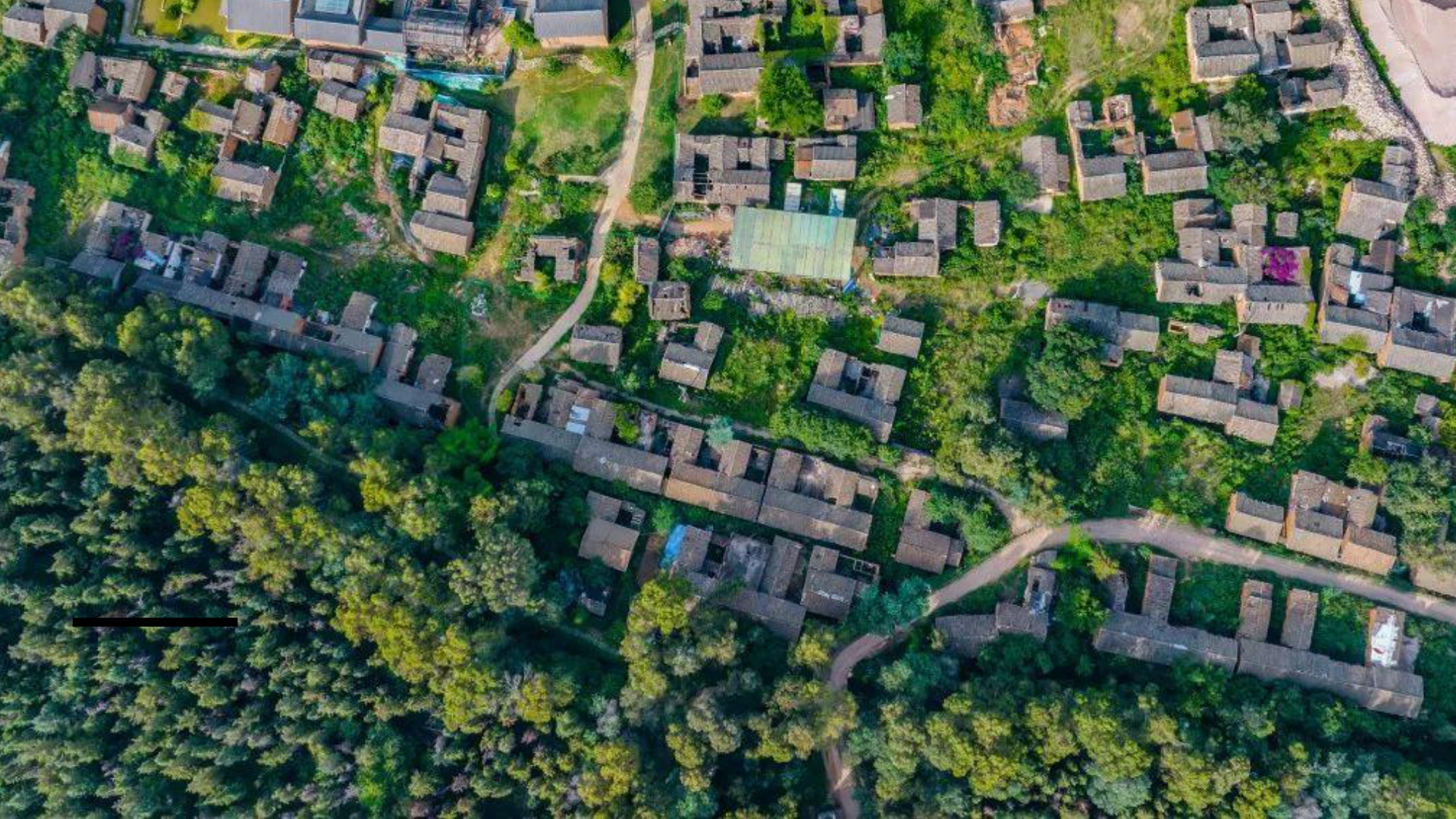
Plant fishing and farming life on the earth, and restore the Yupu star lights to the original buildings
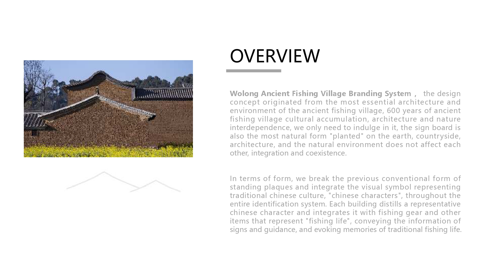
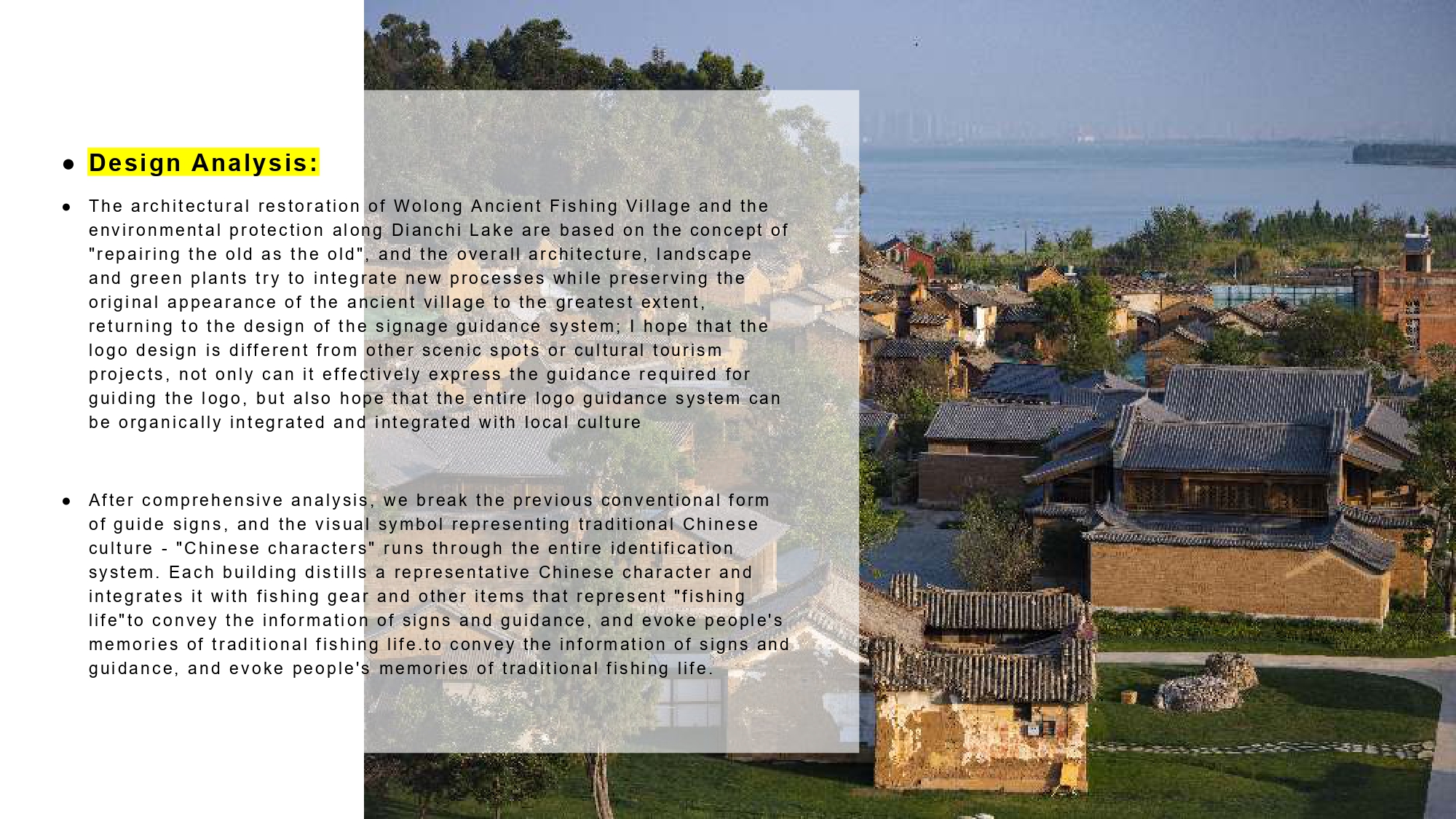
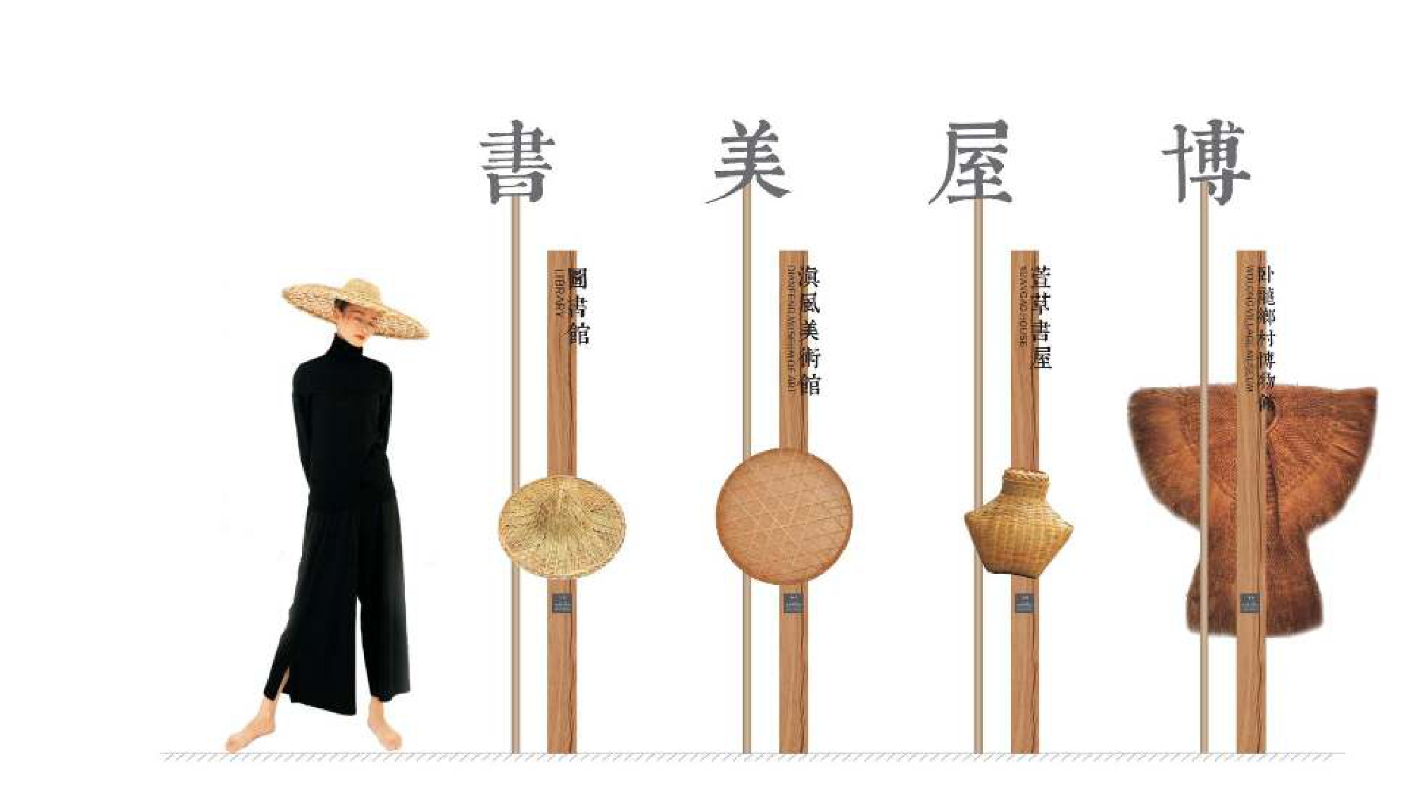
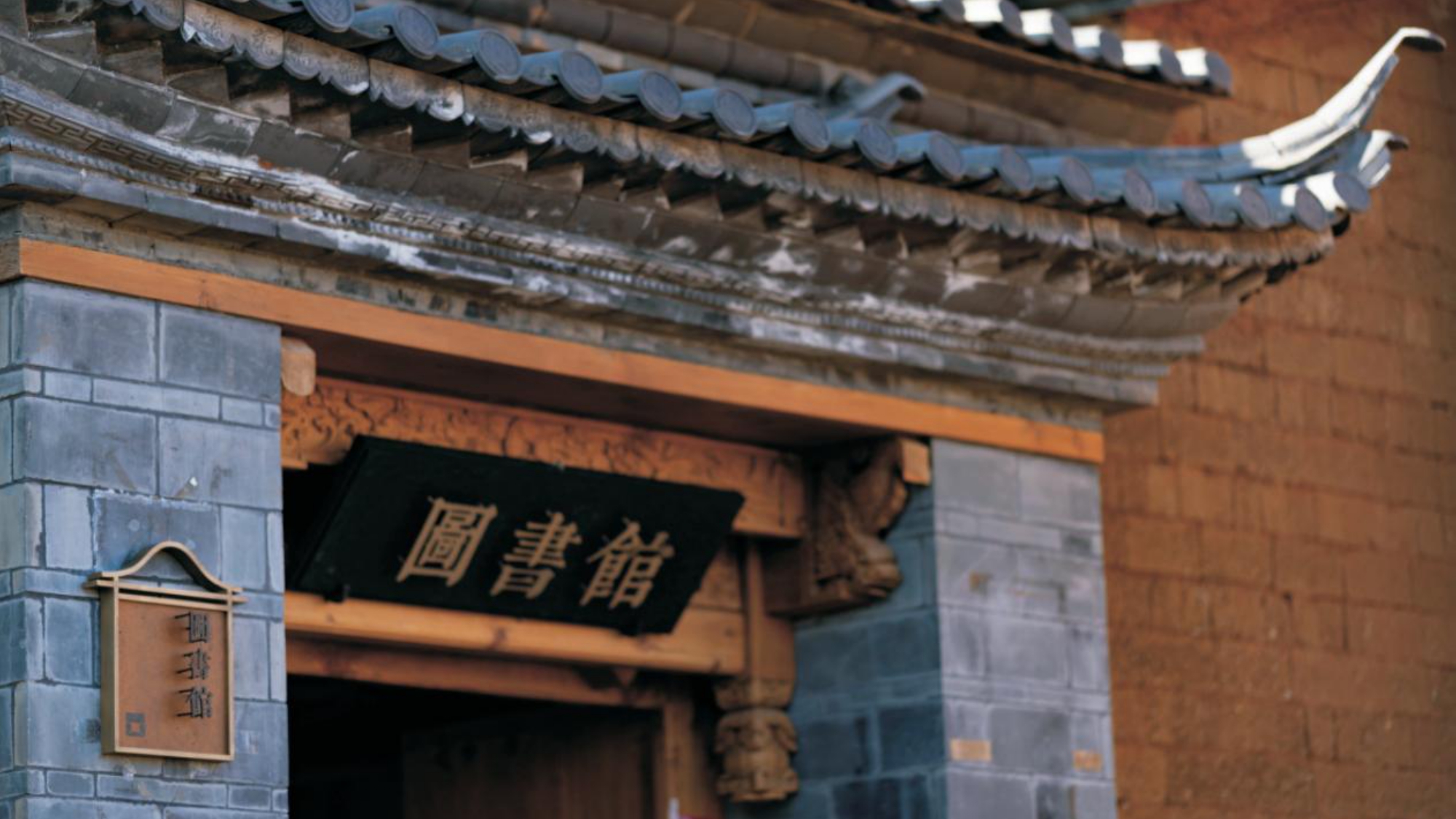
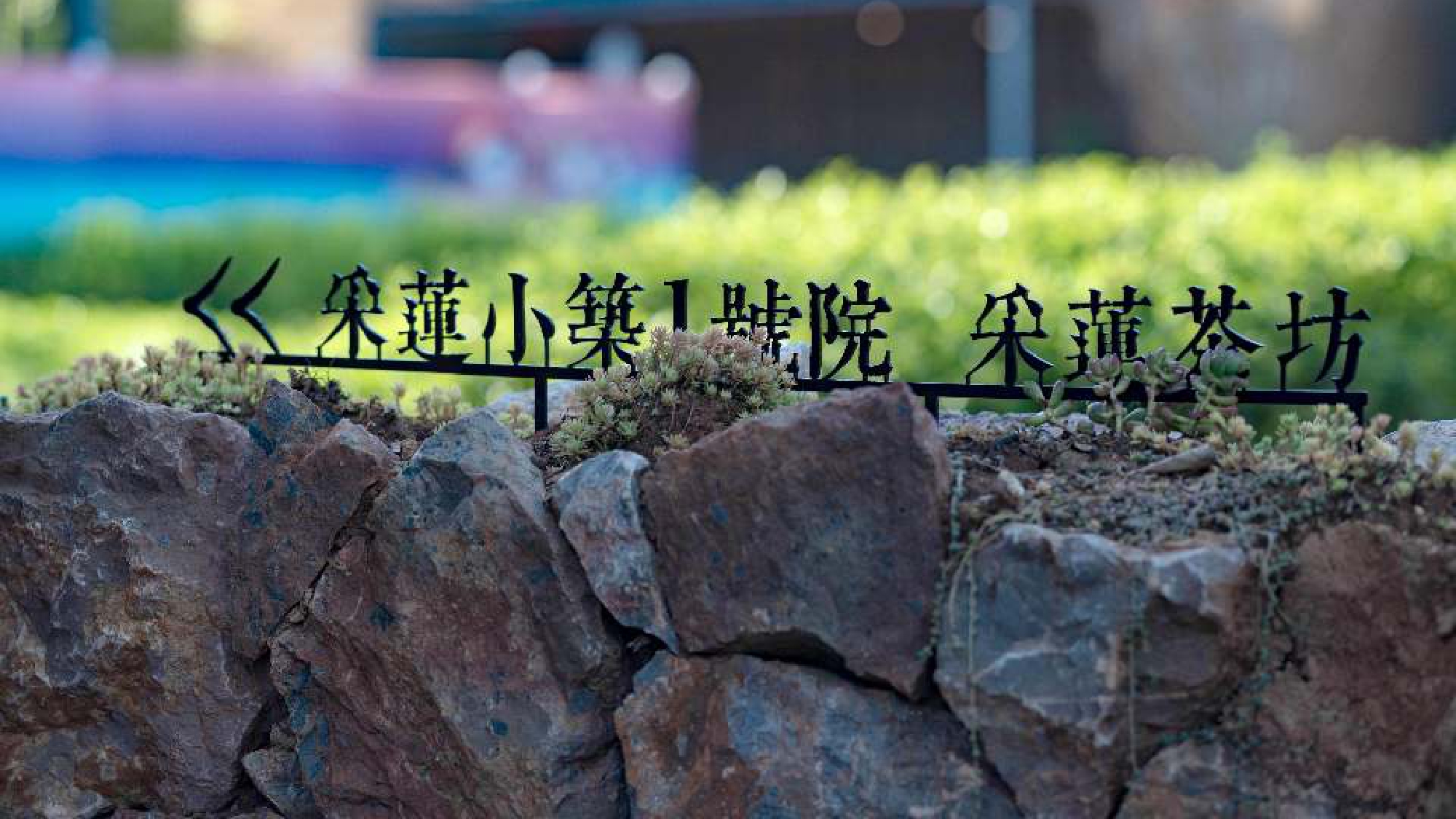
Wolong ancient fishing village logo system design, the design concept originated from the most essential architecture and environment of the ancient fishing village, 600 years of ancient fishing village cultural accumulation, architecture and nature interdependence, we only need to indulge in it, the sign board is also the most natural form "planted" on the earth, countryside, architecture, and the natural environment does not affect each other, integration and coexistence.
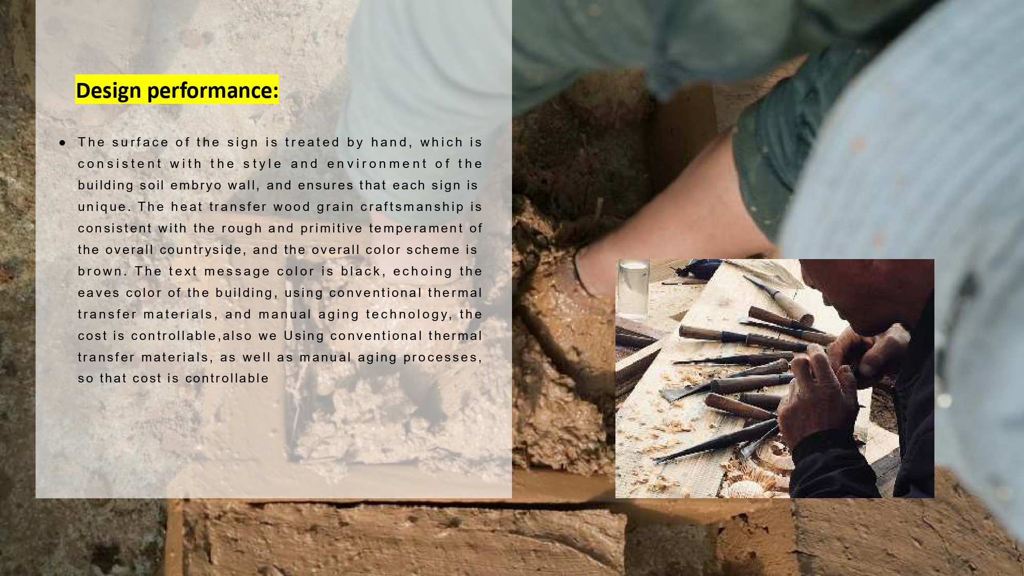
In terms of form, we break the previous conventional form of standing plaques and integrate the visual symbol representing traditional Chinese culture, "Chinese characters", throughout the entire identification system. Each building distills a representative Chinese character and integrates it with fishing gear and other items that represent "fishing life", conveying the information of signs and guidance, and evoking memories of traditional fishing life.Design performance:
Following the concept of "planting culture on the earth", the logo system design of Wolong Ancient Fishing Village
With Yunyun and one seal architectural culture throughout
With the shape, color and charm of the logo, the beauty of the symbiotic logo is the ultimate minimalist artistic technique
The intention is to convey the spatial scene, fishing scene and humanistic mood
Continue the cultural spirit, inherit historical and cultural products, enrich the inner world of modern people, abandon flashiness and loyalty to oneself
Selected based on the Qing Dynasty collection of Chinese character dictionaries "Kangxi Dictionary" and developed "Kangxi Dictionary" as the core of the identification system of the identification font, this font combination of traditional and simple, smooth strokes, structure left tight right loose, strong contrast between opening and closing, this font in one go, the line of writing is fast and free, is the representative of Chinese traditional cultural inheritance, the Chinese characters "seeded" on the earth, countryside, architecture, not only our guide sign guidance information display, but also a part of traditional culture.


Credits
Entrant Company
Artisan Council
Category
Best Agency Awards - Social Media Agency of the Year
Country / Region
United States

Entrant Company
Breakwater Studios
Category
Video - Financial Services
Country / Region
United States
Entrant Company
Imaginari
Category
Corporate Identity - Brand Identity
Country / Region
United States
Entrant Company
Recruit Rooster
Category
Video - Recruitment (NEW)
Country / Region
United States