2023
Song Banquet
Entrant Company
Hangzhou ICHdesign Cultural Creativity Co., Ltd
Category
Corporate Identity - Brand Identity
Client's Name
Country / Region
China
Song Banquet is a brand visual identity design inspired by the culture of the Song Dynasty. The main logo vertically arranges the Chinese characters for "宋宴" and horizontally arranges "Song Feast," with the two parts intersecting like a cross, and the center intersection forming a seal-like image. The design concept combines the logo with different cultural symbols, presenting the brand image through various presentation forms. The unique composition achieves visual contrast and embellishment, resulting in an overall design that is aesthetically pleasing and helps people from different countries understand the meaning of the brand. The Song Dynasty was a prosperous era in Chinese history known for its flourishing commodity economy, cultural achievements, and education. Song culture holds a significant position and influence in the development of Chinese culture. The logo in this design incorporates the imagery of a folding fan, a classic symbol of the Song Dynasty. The font choice for the text utilizes a thin gold style, reminiscent of calligraphy styles from the Song Dynasty. Users can instantly perceive the atmosphere of that historical period, and the logo embodies unparalleled cultural significance and design aesthetics. The upper part of the logo features the character "宋" (Song) written in the calligraphic style of the Song Dynasty. The brushstrokes are slender yet still maintain their substance, exhibiting a sleek and vigorous appearance. The thin and sharp strokes resemble the elegance of orchid bamboo. The nodes and variations in thickness are extracted to showcase the character's structure and vitality. The lower part of the logo presents the character "宴" (Banquet) in a contemporary sans-serif font. It emphasizes geometric lines with straight and unadorned strokes, devoid of varying stroke widths. The simplicity of the design captures attention and conveys a modern aesthetic. By combining these two different styles of typography from different eras into a unified logo, the overall visual effect becomes more diverse and harmoniously balanced.


Entrant Company
PACO Collective
Category
Video - Financial Services
Country / Region
United States


Entrant Company
Hot Frog Print & Media
Category
Website - Entertainment
Country / Region
United States


Entrant Company
Braithwaite Communications
Category
Social Media - Diversity / Equity / Inclusion (NEW)
Country / Region
United States

Entrant Company
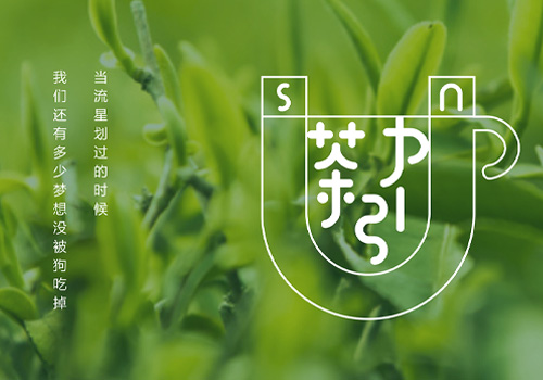
Shanghai Tea Gravity Brand Operator / Xianyuan Cultural Creativity (Shanghai) Co., Ltd, Ping Lang
Category
Corporate Identity - Brand Identity
Country / Region
China


