2023
Goldenbay Art Centre Logo and Branding Design
Entrant Company
Qingqing Lyu
Category
Corporate Identity - Logos
Client's Name
Qingqing Visual Art Design Studio
Country / Region
China
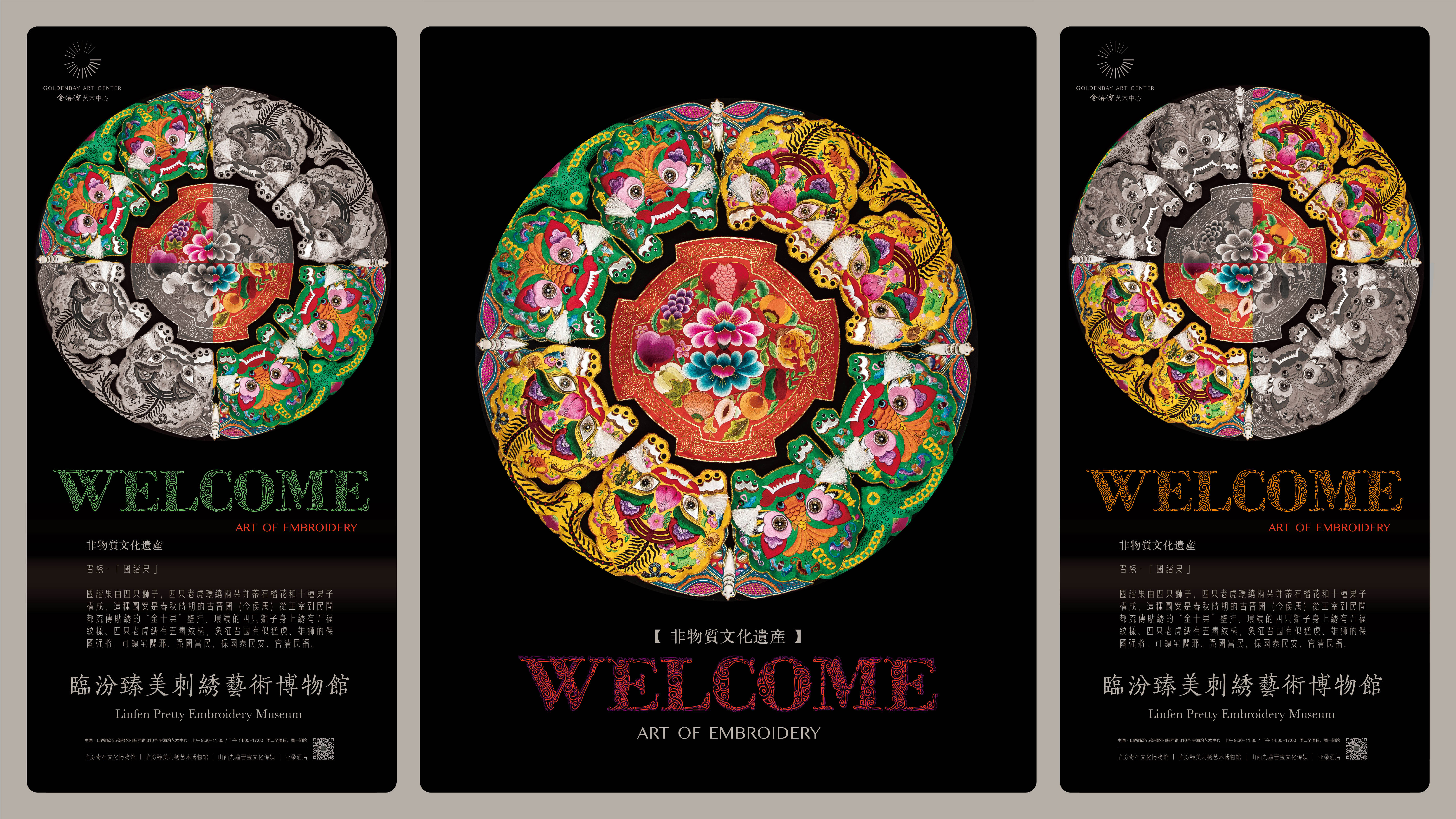
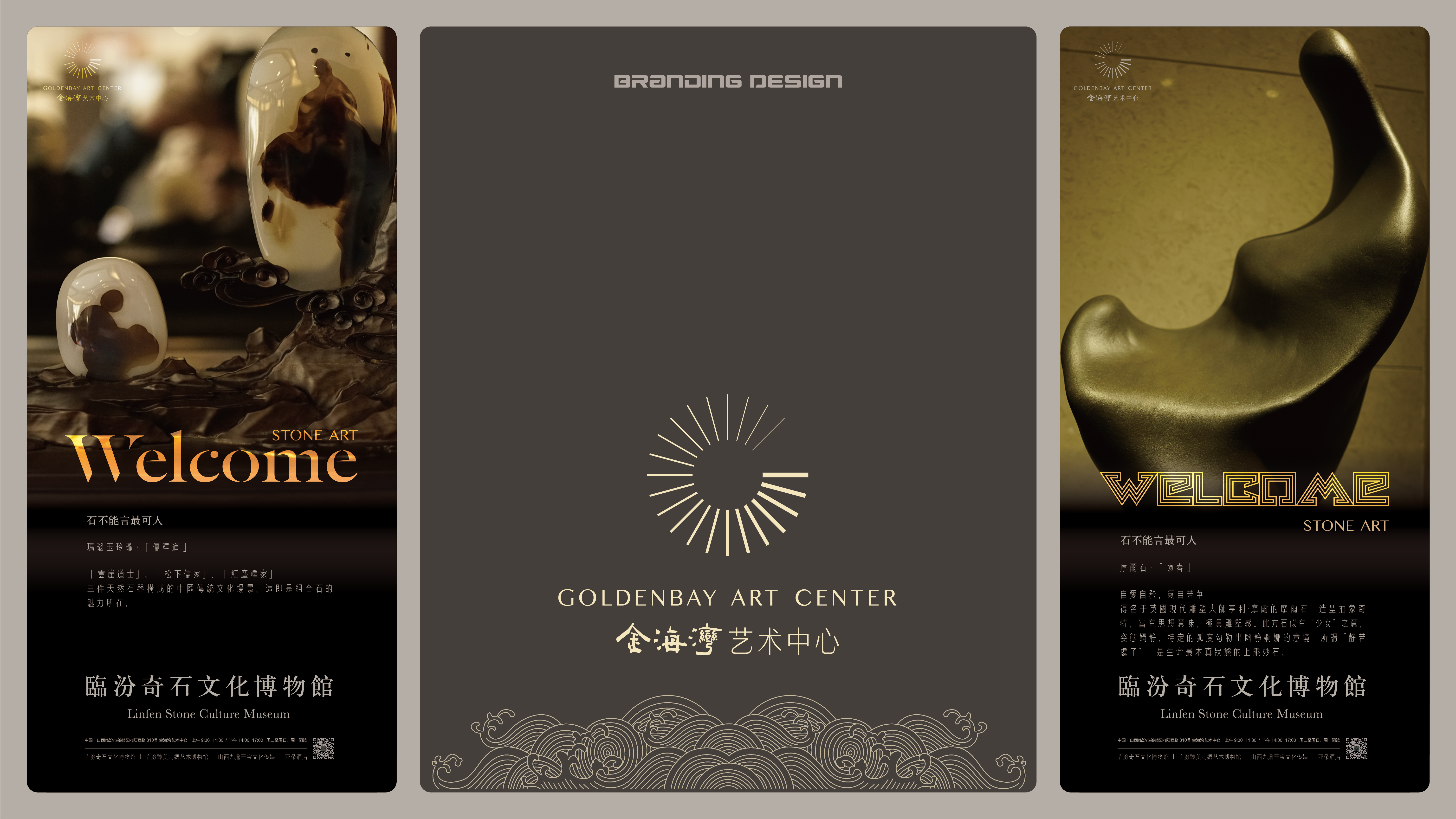
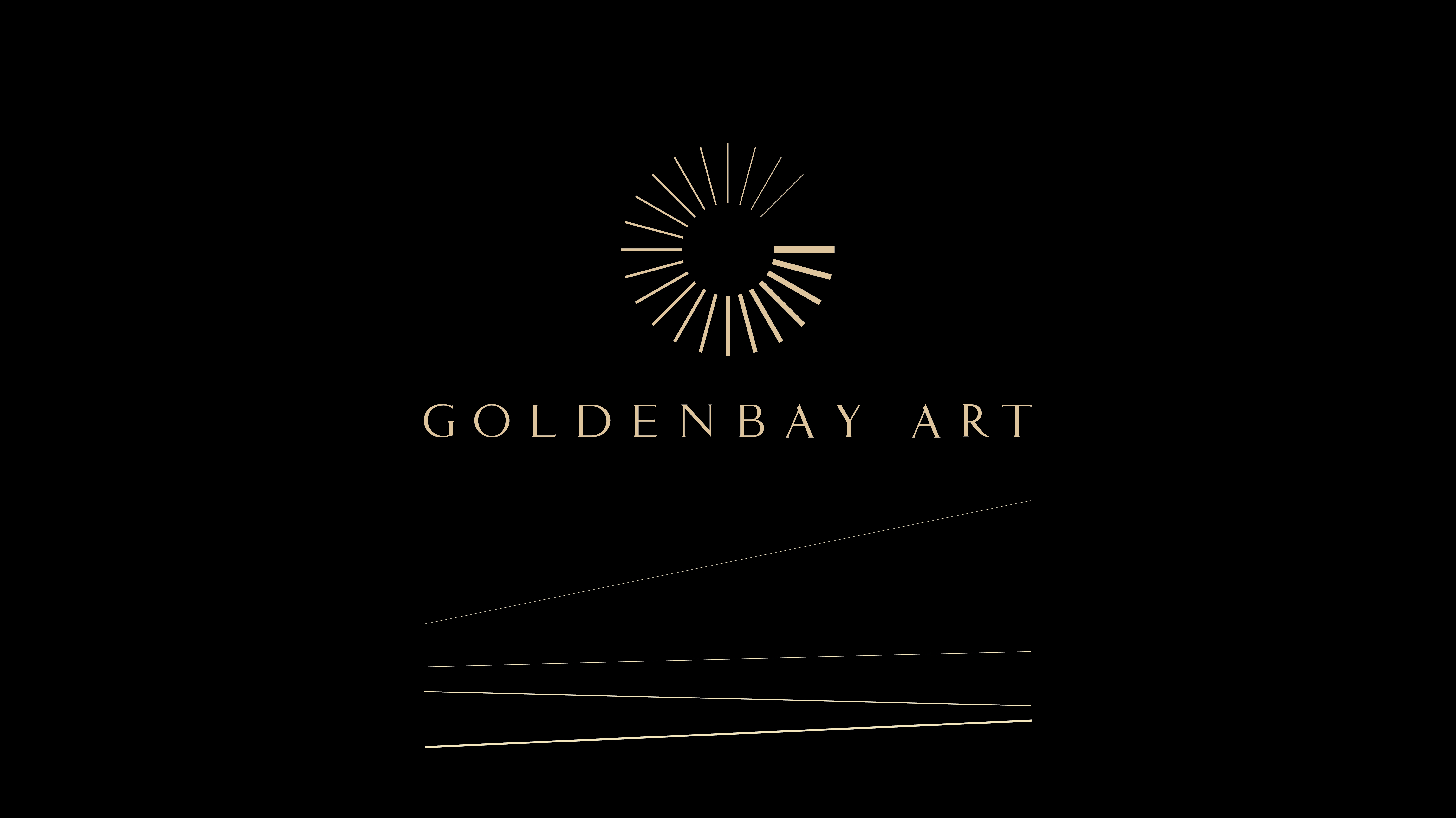
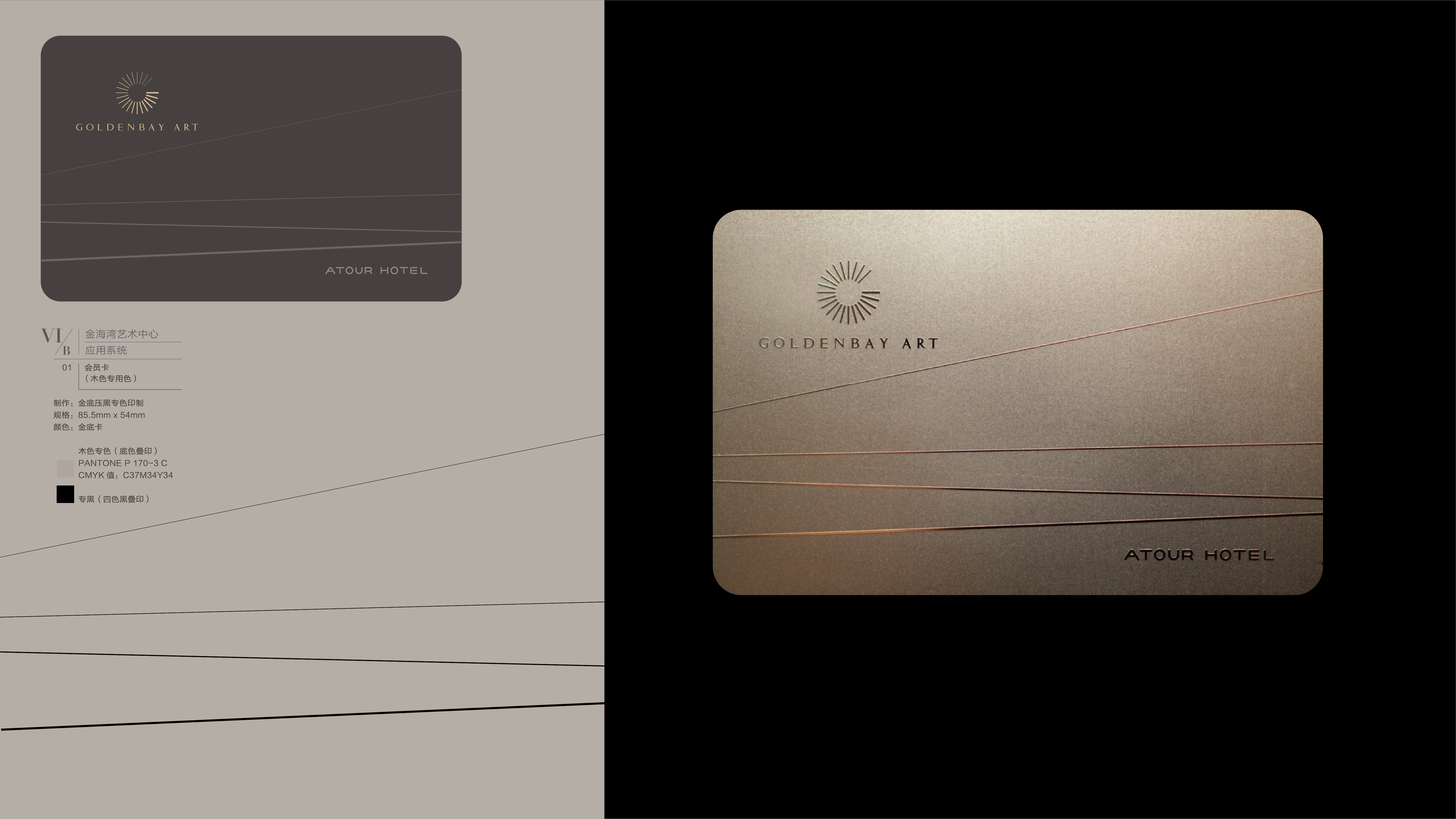
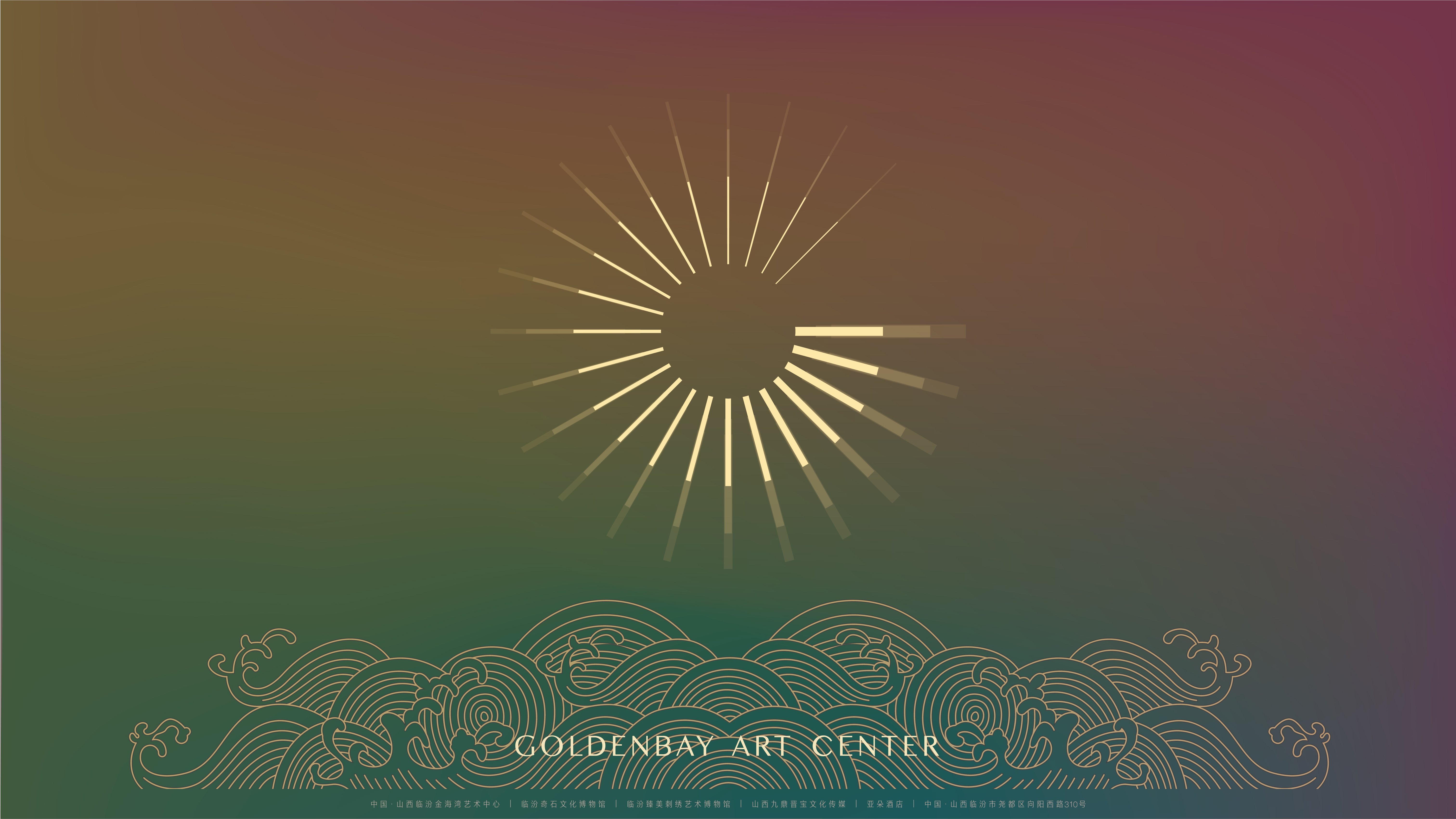
The Goldenbay logo continues the original design of the Goldenbay Hotel, taking the English letter "G" as its basis, representing Goldenbay. This design uses simple line arrangements to display a sense of light and movement, symbolizing the continuous 24-hour cycle. The logo utilizes the simplest lines as elements, gradually varying in thickness to form a two-dimensional spiral that converges from the center and extends outward. This spiral shape gradually extends and develops into a three-dimensional space, providing a dynamic and three-dimensional visual representation. In terms of appearance and symbolic meaning, the starting point and extension of the logo are located in the East, symbolizing the direction of sunrise. It draws inspiration from the traditional philosophy of the Eight Trigrams, where the "Zhen Gua" represents the wood element, symbolizing the emergence and growth of all things in spring. This starting point and direction of extension reference philosophical ideas in Eastern culture and correspond to the hotel's name, Goldenbay, conveying a vibrant and energetic atmosphere.


Credits

Entrant Company
Bojun Tan
Category
Corporate Identity - Brand Identity
Country / Region
United States

Entrant Company
COdesign
Category
Social Media - Viral Marketing
Country / Region
Bangladesh

Entrant Company
Savannah College of Art and Design
Category
Video - Nonprofit
Country / Region
United States
Entrant Company
Pence Media Group
Category
Event - Conference / Convention
Country / Region
United States