2023
Branding Image Design for Shuifu City
Entrant Company
Shandong Tianrui smart marketing planning Co., LTD
Category
Corporate Identity - Brand Identity
Client's Name
Country / Region
China
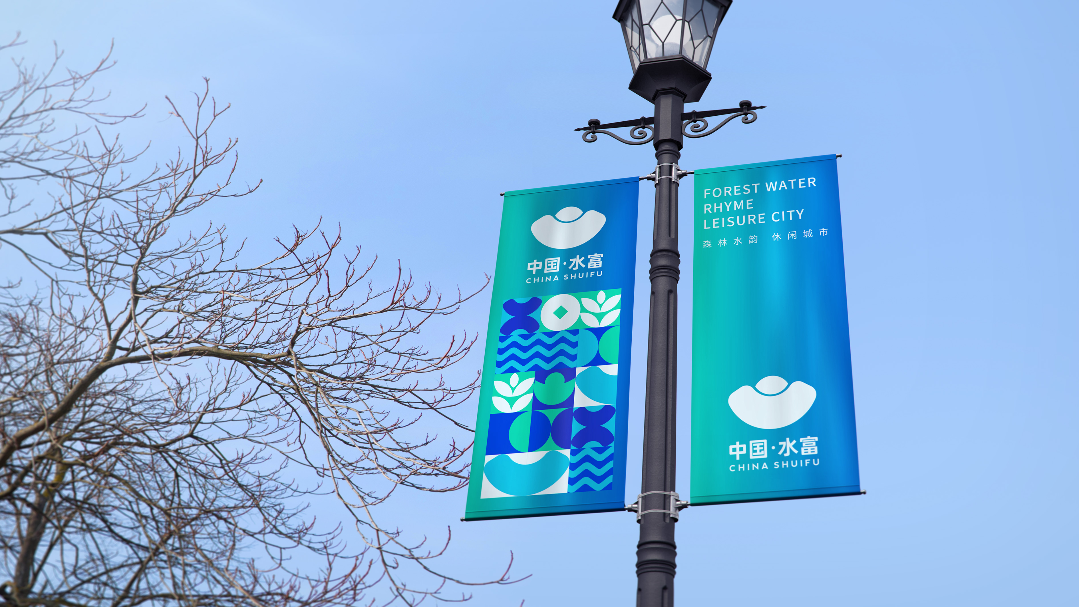
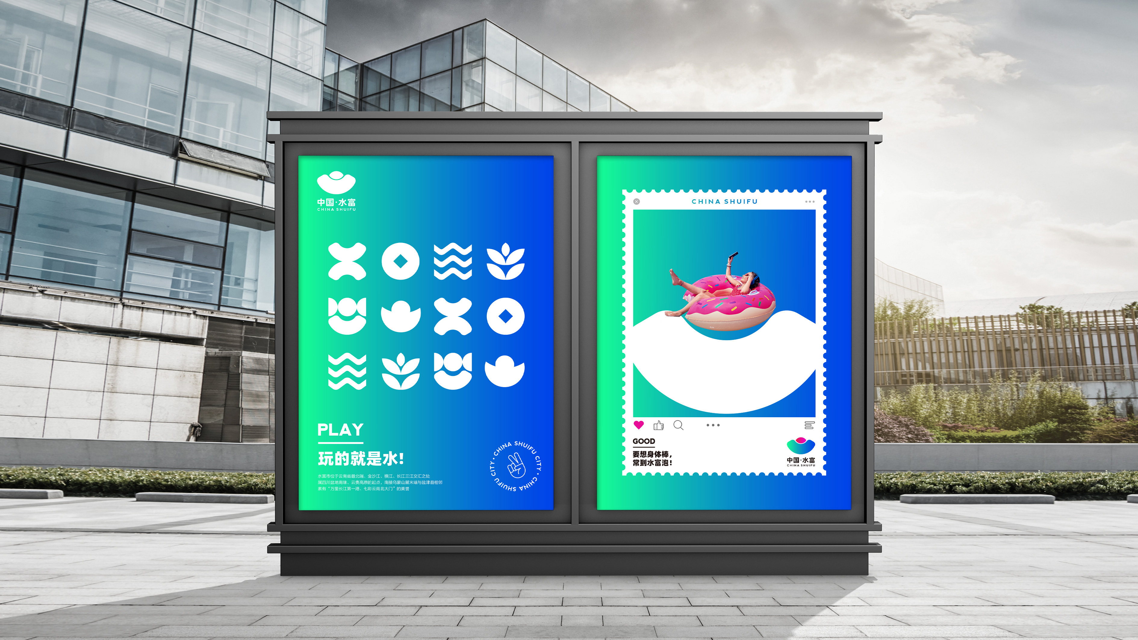
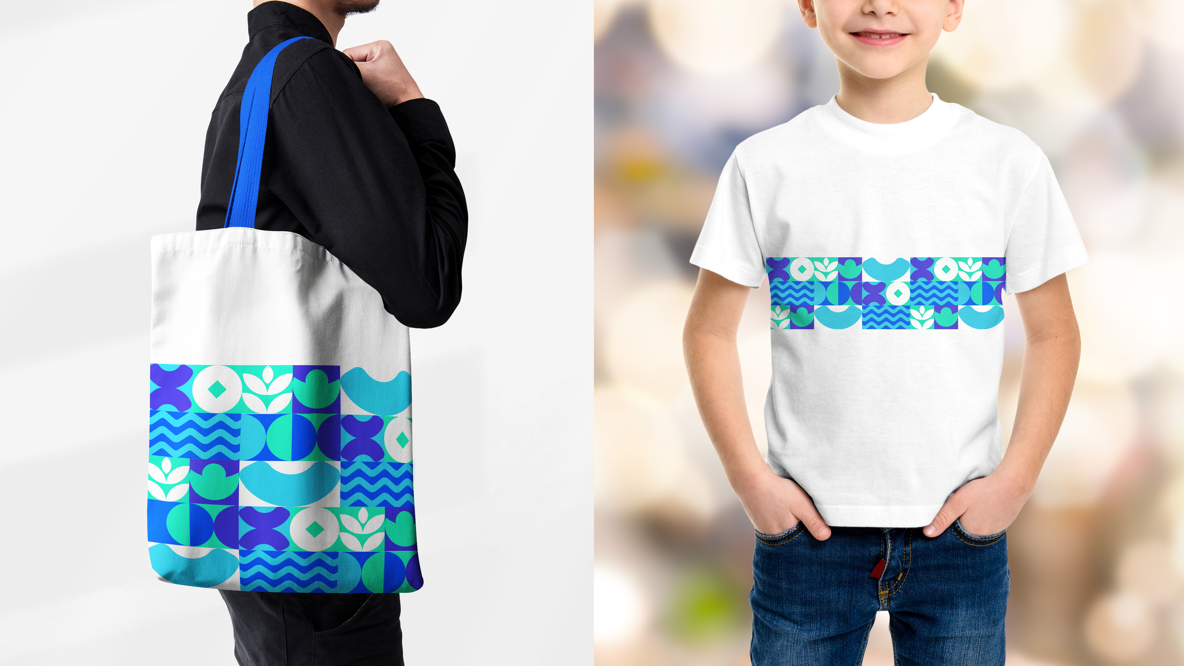
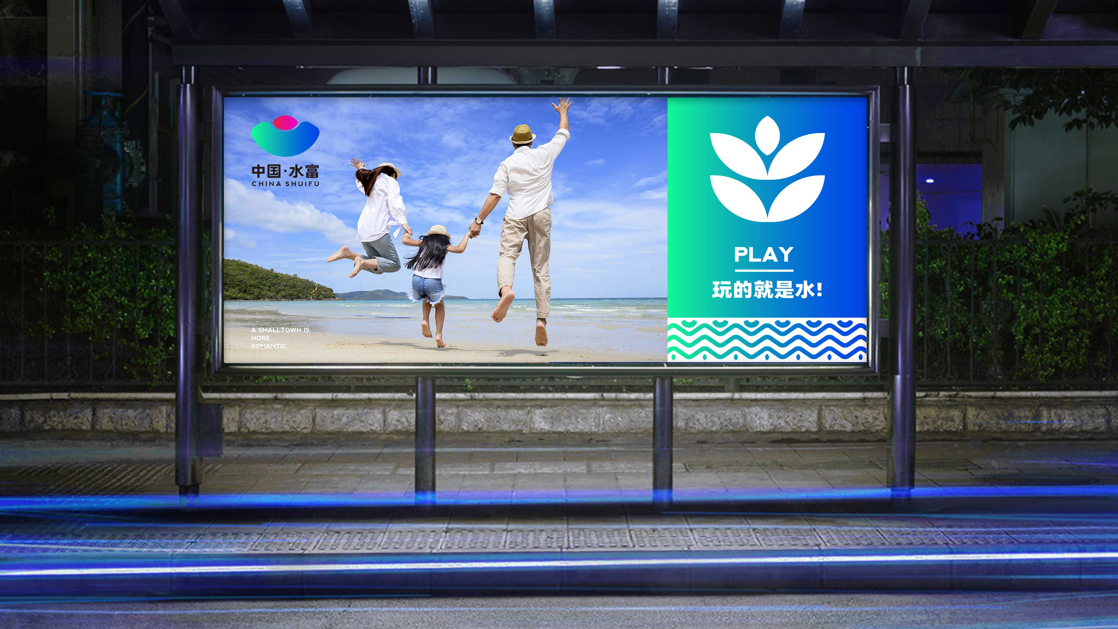
Geographically located in the southwestern part of China, Shuifu is endowed with abundant water resources due to the confluence of three rivers. Named after its abundance of water resources, this name also suggests how the city looks like - an abundance of water resources gives it wealth and prosperity. Water means wealth and hope for this city which is fully reflected in the new city brand design. The new logo pattern looks like a gold ingot which is always associated with wealth by Chinese people. The gold ingot boat as an element of the pattern triggers an association with the gold ingot boat, a traditional boat type in ancient times of China. This boat is named for the shape resembling a gold ingot. The image of gold ingot boat draws the public attention to the concept of water which accurately transmits the core idea that the city is affluent for water. The use of blue-green color gradient background speaks out the firm decision to guide the future track of green industries including tourism by an abundance of water resources. The slightly exposed half circle on top of the pattern is processed with subtle red-pink gradient, just like the sun slowly rising from green mountains and waters, a symbol of the city development backed by an abundance of water resources. The intense background color of the half circle pattern on top forms a prominent visual focus across the entire logo, coinciding with the key message intended to spread from the logo.
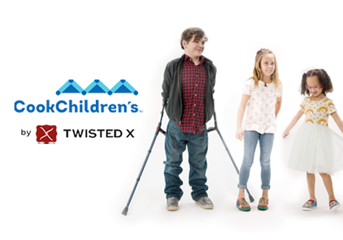

Entrant Company
Twisted X Global Brands
Category
Strategic Program - Video Campaign
Country / Region
United States
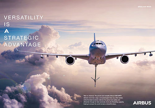
Entrant Company
Gravity Global
Category
Integrated Marketing - Green / Eco-Friendly
Country / Region
United Kingdom

Entrant Company
NBCUniversal
Category
Video - Social Video
Country / Region
United States
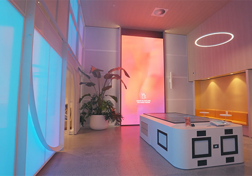

Entrant Company
Binyan Studios
Category
Experiential & Immersive - Experiential & Immersive / Other___
Country / Region
Australia


